RAL 290-3 # Design
How is RAL 290-3 color commonly used in design?
RAL 290-3 is a warm yellow color with a hue of 44 degrees, a saturation of 52%, and a lightness of 83%.
It is a bright and cheerful color that can create a sense of energy, optimism, and happiness.
This color can also stimulate the appetite and attention, as it is associated with food, sunshine, and warmth.
RAL 290-3 can be used in design to create contrast, highlight, or accentuate certain elements.
For example, it can be used as a background color for logos, icons, or buttons, to make them stand out and attract the eye.
This color can also be used as a complementary color for cooler hues, such as blues or greens, to create a balanced and harmonious color scheme.
RAL 290-3 can also be combined with other shades of yellow, orange, or red, to create a warm and cozy atmosphere.
It should be used with caution, as too much of it can be overwhelming, irritating, or distracting.
This color can also cause eye fatigue or strain, as it is a very bright and vivid color.
Therefore, it is advisable to use RAL 290-3 sparingly, and in moderation, to avoid negative effects.
RAL 290-3 should also be matched with appropriate lighting, as it can appear differently under different light sources.
In conclusion, RAL 290-3 is a color that can be used in design to create various effects, depending on the context, purpose, and preference.
It is a color that can convey positive emotions, such as joy, enthusiasm, and confidence, but also requires careful consideration, as it can also have negative impacts, such as annoyance, anxiety, or stress.
RAL 290-3 is a color that can enhance the visual appeal and functionality of a design, if used wisely and appropriately.
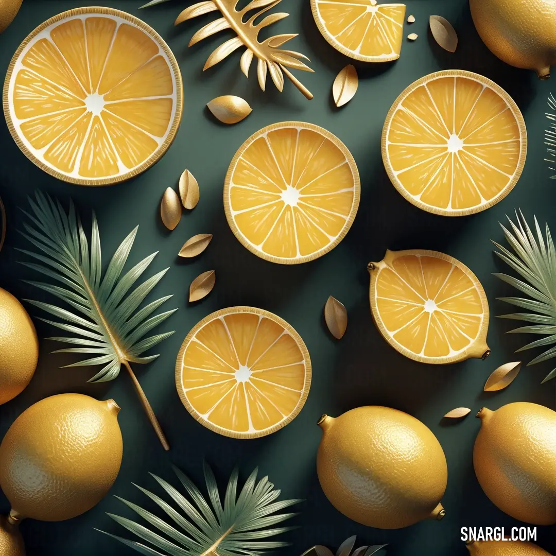
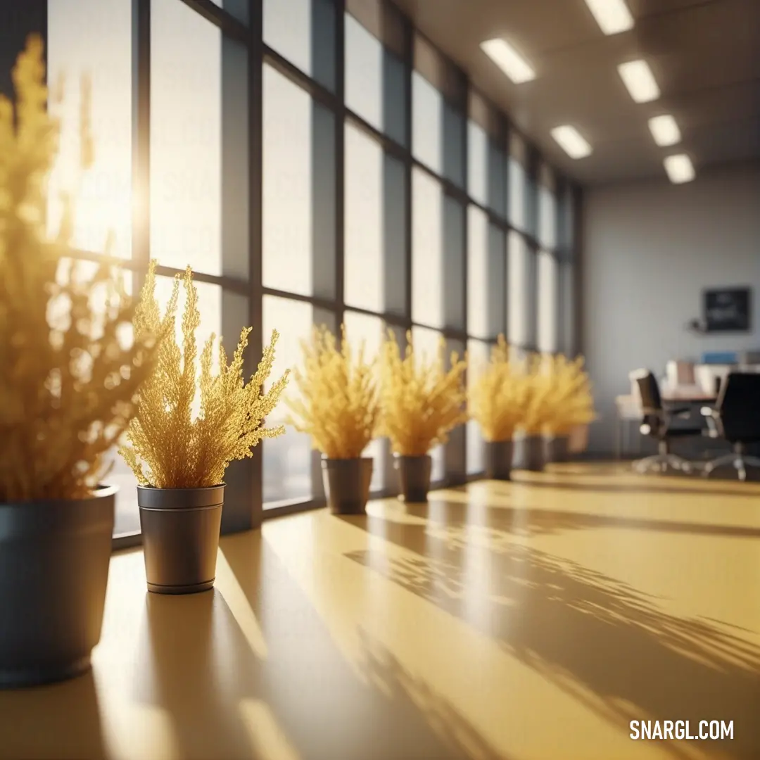
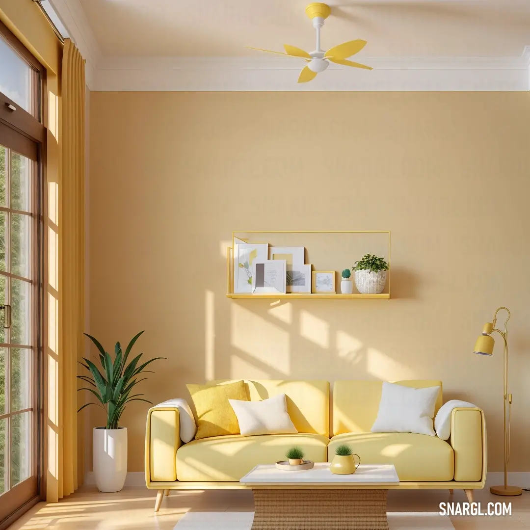
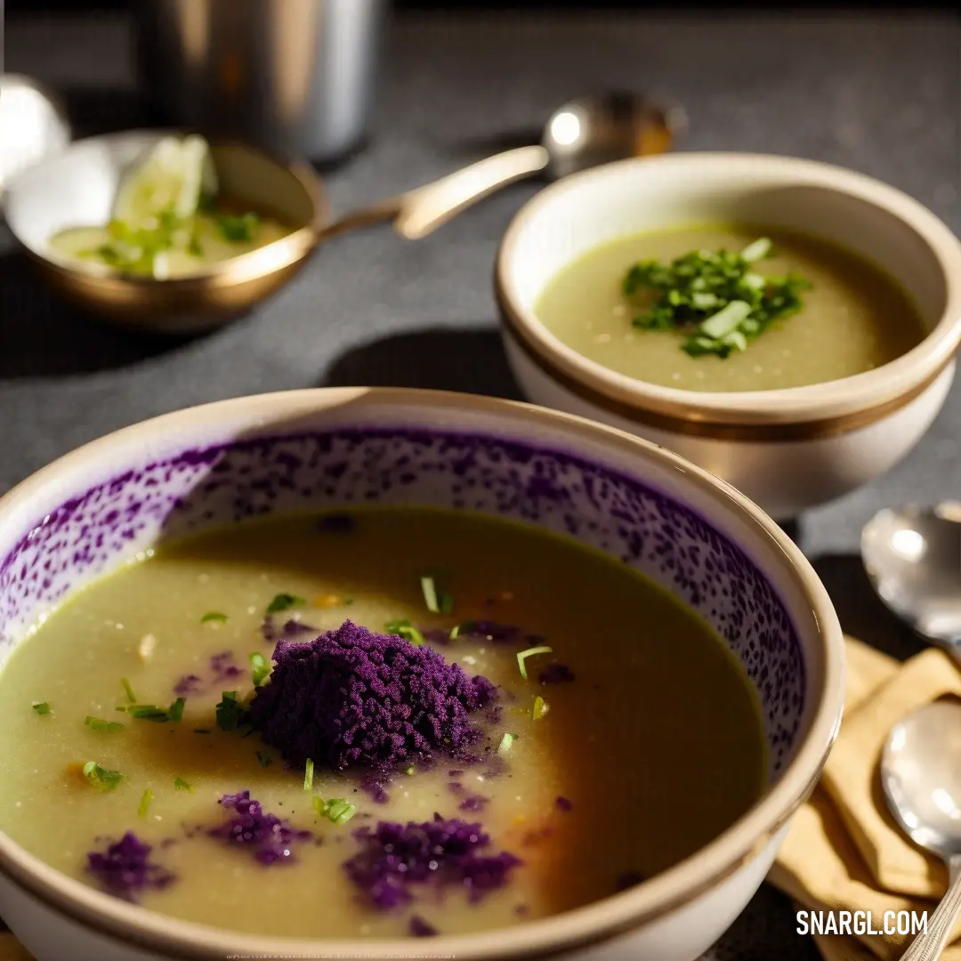
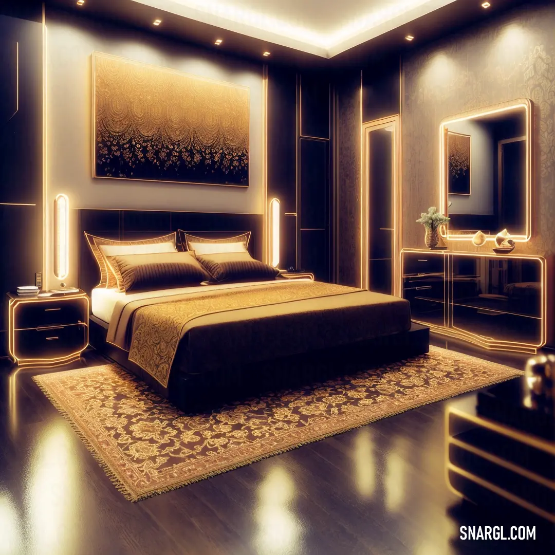
Example of the palette with the RAL 290-3 color

See these colors in NCS, PANTONE, RAL palettes...

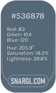 Dark electric blue
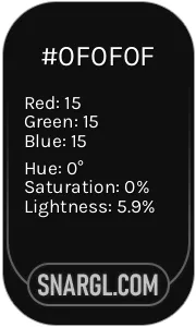 Onyx
Onyx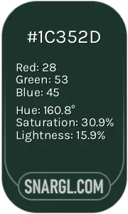 Medium jungle green
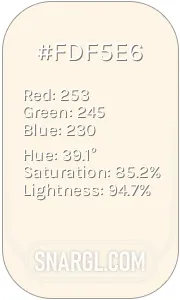 Old Lace
 Gray-Tea Green