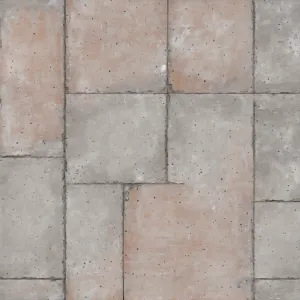
Home Colors PANTONE
PANTONE Warm Gray 6

PANTONE Warm Gray 6

Parameters:
HEX Triplet:
#A2988F
RGB:
162, 152, 143
CMYK:
14, 19, 21, 39
HSL:
28°, 12%, 64%
Closest colors:
in RGB:
Grullo
in PANTONE:
PANTONE 408
in RAL Classic:
RAL 1035
in RAL Design:
RAL 040 60 05
in RAL Effect:
RAL 120-M
What color is PANTONE Warm Gray 6? The Legend of Warm Gray 6: The Color that Broke the Internet
2024-09-12 Snargl 02:10

What color is PANTONE Warm Gray 6?

Woman in a silver bra on a chair with candles in the background. Example of #A2988F color.
PANTONE Warm Gray 6 color. Black truck driving through a desert filled with sand and rocks, with a sky background
White tiger with a leather armor and a tree in the background. Color CMYK 14,19,21,39.
Painting of a man on a hill with a tree in the background. Color #A2988F.
PANTONE Warm Gray 6 has different variations depending on the type of material and printing process.

For example, PANTONE Warm Gray 6 C is for coated paper, PANTONE Warm Gray 6 U is for uncoated paper, and PANTONE Warm Gray 6 CP is for process printing.

PANTONE Warm Gray 6 is a medium light shade of orange with a hint of brown.

It has a warm and neutral tone that can create a cozy and elegant atmosphere.

It can be used as a background color, a complementary color, or an accent color in various design projects.
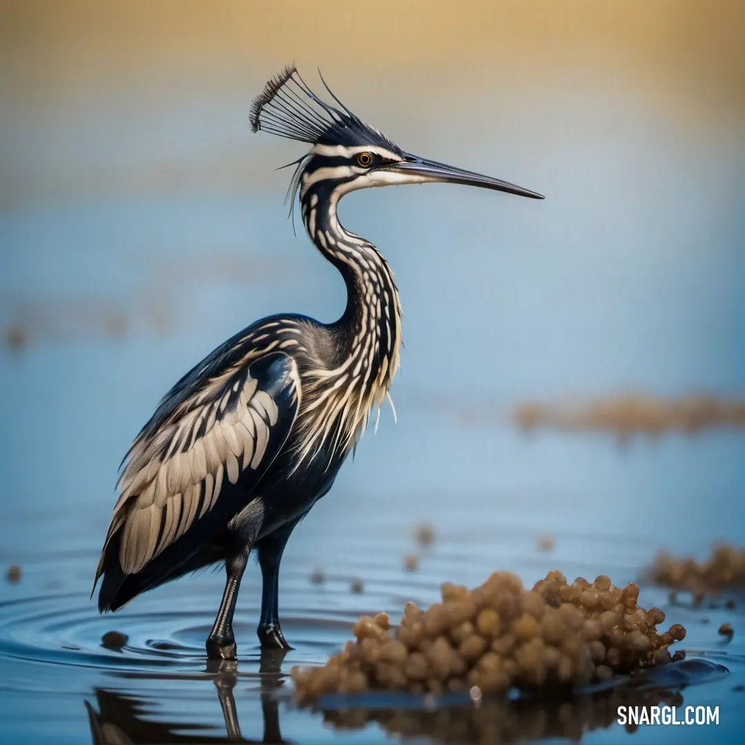
Example of the palette with the PANTONE Warm Gray 6 color

Picture with primary colors of Wild blue yonder, Dark jungle green, Grullo, Coffee and Camouflage green
Top 5 color shades of the illustration. Arranged in descending order of frequency of occurrence (first - more often, last - more rare).
See these colors in NCS, PANTONE, RAL palettes...
NCS (Natural Color System)
NCS S 2020-R70B
NCS S 8005-B80G
NCS S 3005-Y20R
NCS S 6020-Y10R
NCS S 4010-G50Y
RAL Classic
RAL 9006
RAL 8022
RAL 1035
RAL 8024
RAL 7003
RAL Design
RAL 270 70 15
RAL 160 20 20
RAL 040 60 10
RAL 040 30 30
RAL 090 50 10
Author:
Funny stories about the 'PANTONE Warm Gray 6'

The Legend of Warm Gray 6: The Color that Broke the Internet

Gianni Ford, a visionary entrepreneur known for his eccentric ideas, had a new obsession - PANTONE Warm Gray 6. This wasn’t just any color; it was the most "perfectly neutral" shade he had ever seen. To him, it was the epitome of subtle sophistication, the unsung hero of the color spectrum. While others fawned over vibrant hues, Gianni saw potential in Warm Gray 6 that no one else did. He was convinced it could become the cornerstone of the next big thing in motion design.

But Gianni wasn’t a designer; he was an entrepreneur with grand ideas but little knowledge of how to bring them to life. So, he turned to his trusted friend and genius engineer, Billy Stewart. Billy was known for his ability to transform the most outlandish ideas into reality. He was the kind of person who could build a robot out of paper clips if you asked him to. So when Gianni came to him with this crazy idea about a color, Billy was all ears.

"Billy, I want to create an animation using Warm Gray 6," Gianni said, excitement twinkling in his eyes.

"An animation? With just one color?" Billy asked, scratching his head.

"Not just any color, Billy. Warm Gray 6. It’s the perfect balance between warm and cool, between vibrant and muted. It’s everything! I want to create a motion design so mesmerizing, so revolutionary, that it will redefine how people think about color in digital media."

Billy was intrigued. The idea was absurd, but that’s what he loved about it. "Okay, I’m in. But what’s the concept?"

Gianni leaned in, lowering his voice as if he were about to reveal a great secret. "Imagine a world where everything is shades of gray - dull, boring, lifeless. But then, Warm Gray 6 enters the scene, and everything changes. It’s like the world comes alive, but in the most understated, elegant way possible. It’s not about being flashy; it’s about being sophisticated."

Billy nodded, a smirk forming on his lips. "I like it. Subtlety as a superpower. Let’s do it."

The two set to work. Billy began by building an algorithm that could animate Warm Gray 6 in ways no one had ever seen before. He programmed the color to shift, pulse, and morph, creating patterns that were hypnotic yet calming. It wasn’t just an animation; it was an experience - a meditative journey through shades of gray, with Warm Gray 6 at the helm, guiding viewers through an emotional landscape they didn’t know existed.

Gianni, meanwhile, began spreading the word. He hyped up the project on social media, teasing the world with glimpses of the animation. People were skeptical at first. "It’s just gray," they said. "What’s so special about that?"

But as the launch date approached, curiosity grew. The idea of an entire motion design built around a single shade of gray was so absurd that people couldn’t help but be intrigued.

Finally, the day arrived. Gianni and Billy uploaded the animation, titled "The Warm Gray 6 Experience," to every major platform. The internet braced itself for what many assumed would be a flop.

But then, something incredible happened.

As people watched the animation, they found themselves captivated by the subtle shifts and transitions of Warm Gray 6. It was like watching the tide come in, slow and steady, but impossible to look away from. The simplicity was breathtaking. People started sharing it, tweeting about it, and before long, it went viral.

Designers were in awe of how a single color could evoke such emotion, and tech enthusiasts marveled at the algorithm Billy had created. The motion design world was turned on its head. Everyone wanted to know the secret behind the magic of Warm Gray 6.

Gianni and Billy became overnight legends. Companies from around the world begged them to recreate the experience for their brands. Warm Gray 6 became the new black, the new white, the new everything. It was more than just a color; it was a phenomenon.

In the end, Gianni’s ridiculous idea had become a reality. He and Billy had not only redefined motion design but had also shown the world that even the most overlooked, understated things could hold immense power when seen in the right light - or rather, the right shade of gray.
Author:

Continue browsing posts in category "PANTONE"
You may find these posts interesting:
PANTONE 189 Color
10
0
2
12
0
PANTONE 189 Color
PANTONE 645 Color
5
0
2
7
0
PANTONE 645 Color
PANTONE 2013 Color
4
0
3
7
0
PANTONE 2013 Color
PANTONE 102 Color
4
0
2
7
2
PANTONE 102 Color
PANTONE 210 Color
5
0
2
9
0
PANTONE 210 Color
PANTONE 103 Color
3
0
2
13
2
PANTONE 103 Color
PANTONE 2210 Color
5
0
2
5
0
PANTONE 2210 Color
PANTONE 2166 Color
2
0
2
6
0
PANTONE 2166 Color
Home
Terms of Service
Contact Us

© 2023 Snargl.com