
PANTONE 7758
What color is PANTONE 7758? What are the examples of PANTONE 7758 color? What colors go well with the PANTONE 7758 color? The Pantone Prank and the Tale of Green Glory
What color is PANTONE 7758?
RGB: 222, 204, 8
CMYK: 1, 0, 97, 14
HEX: #DECC08
This color can evoke feelings of optimism, energy, and creativity.
It can also be associated with autumn, harvest, and sunshine.
PANTONE 7758 can be used for various purposes, such as:
Branding and logo design: This color can be a good choice for brands that want to convey a sense of quality, innovation, and confidence.
For example, some brands that use PANTONE 7758 or similar colors in their logos are Lipton, Nikon, and Best Buy.Graphic design and illustration: It can be a great color to add some contrast and interest to your designs and artworks.
It can also be used to create gradients and shadows with other colors, such as PANTONE 7759 or PANTONE 7760, which are darker shades of yellow.Fashion and interior design: This color can be a stylish color to wear or decorate your space with.
PANTONE 7758 can be paired with neutral colors, such as PANTONE Black or PANTONE Cool Gray 1, to create a sophisticated and modern look.
It can also be combined with complementary colors, such as PANTONE 2728 or PANTONE 7461, to create a fun and dynamic look.
Example of the palette with the PANTONE 7758 color

See these colors in NCS, PANTONE, RAL palettes...
Example of the palette with the PANTONE 7758 color

See these colors in NCS, PANTONE, RAL palettes...
What are the examples of PANTONE 7758 color?
Example of the palette with the PANTONE 7758 color

See these colors in NCS, PANTONE, RAL palettes...
Example of the palette with the PANTONE 7758 color
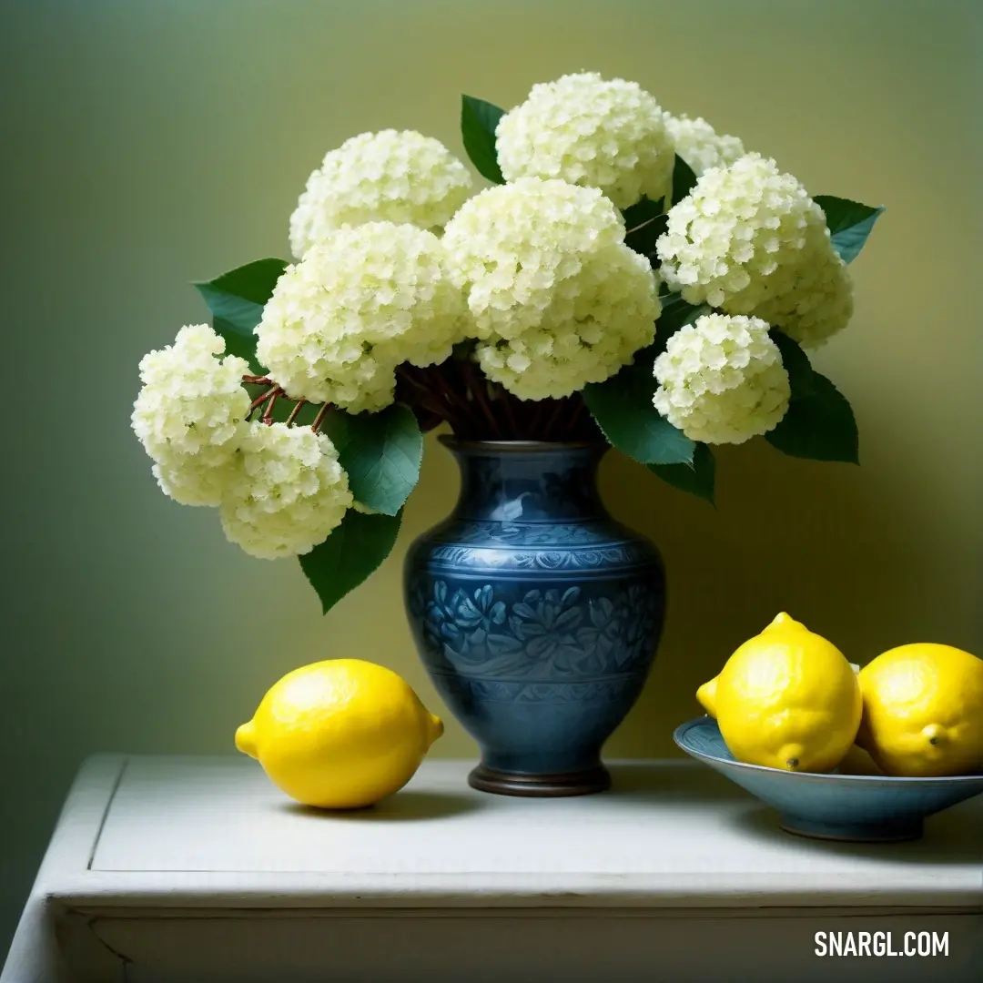
See these colors in NCS, PANTONE, RAL palettes...
What colors go well with the PANTONE 7758 color?
Example of the palette with the PANTONE 7758 color
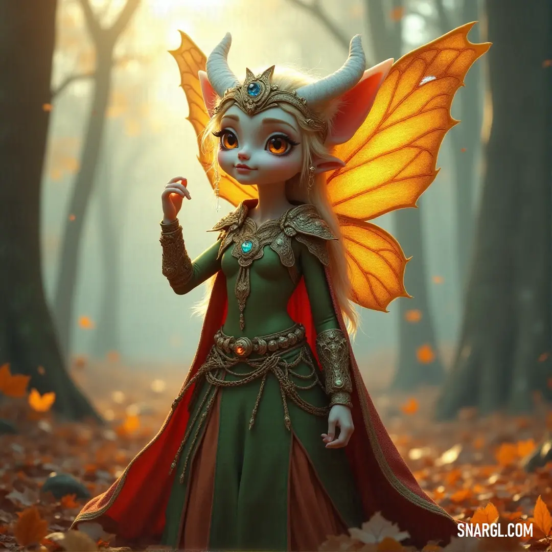
See these colors in NCS, PANTONE, RAL palettes...
Example of the palette with the PANTONE 7758 color
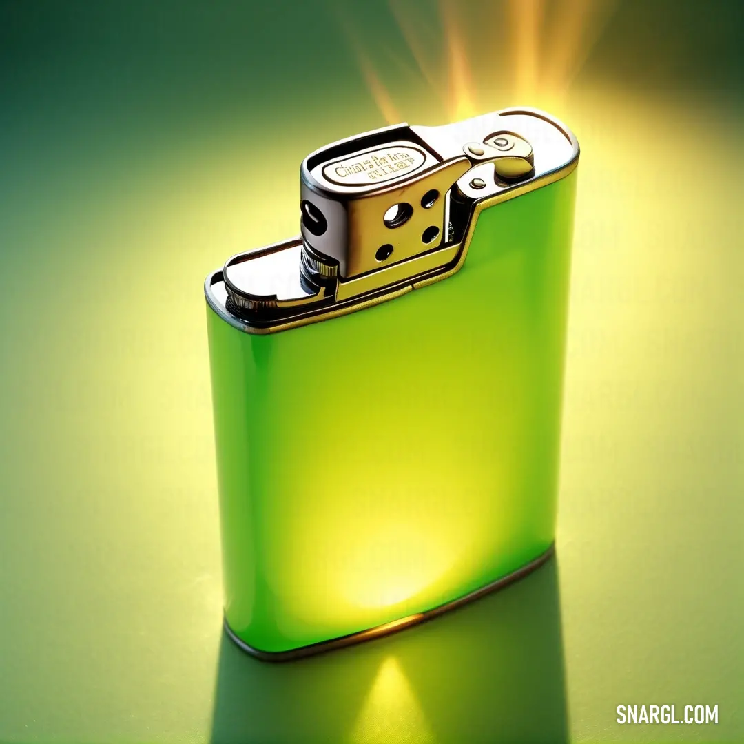
See these colors in NCS, PANTONE, RAL palettes...
The Pantone Prank and the Tale of Green Glory
One sunny afternoon, as Karl meticulously mixed his paints, Professor Betsey Lantern, an eccentric and brilliant scholar of color theory, burst into his studio. Known for her whimsical approach to science and her unyielding curiosity, Betsey had come with a challenge.
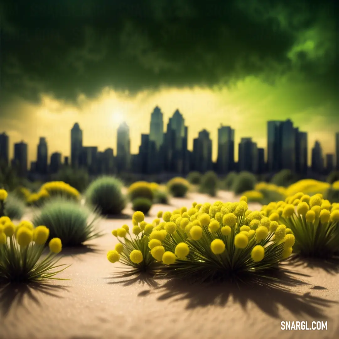
"Karl, I've devised an experiment," Betsey announced, her eyes sparkling with excitement. "We must use Pantone 7758 in a brand new design - a design so outlandish that it will change the way people view color forever!"
Karl raised an eyebrow, intrigued. "And what do you have in mind, Professor?"
"An interactive, magical garden!" Betsey exclaimed. "Picture this: a garden where the plants not only grow but also change their color and pattern based on the presence of Pantone 7758. Imagine the possibilities!"
Karl grinned, accepting the challenge. They set to work, turning Betsey's theoretical garden into a tangible masterpiece. First, they created a sprawling landscape of lush, green foliage. But this wasn't just any greenery - it was a complex tapestry of plants that responded to Pantone 7758 in the most extraordinary ways.

When Karl painted large swathes of Pantone 7758 on the ground, the plants would start to shimmer and shift, revealing hidden patterns and colors. One plant might transform from a deep emerald into a sparkling gold, while another might sprout delicate, iridescent leaves. It was like watching a garden dance to its own symphony of color.
To add an extra layer of whimsy, Betsey introduced a series of whimsical creatures called Colorsprites, who would flit about the garden, playfully interacting with the changing hues. These tiny, mischievous beings would paint themselves with Pantone 7758 and then leave trails of color wherever they went, further enhancing the garden's magical allure.
As the garden neared completion, the grand unveiling was set to take place. The entire city of Chromopolis gathered to witness this marvel of color and creativity. Karl and Betsey stood proudly beside their creation, brimming with anticipation.
The moment the crowd entered the garden, they were spellbound. The colors shifted and danced in ways they had never seen before. As they walked through the garden, the plants seemed to come alive, responding to their every movement. The Colorsprites darted around, painting everything with gleaming shades of Pantone 7758, leaving trails of shimmering hues in their wake.
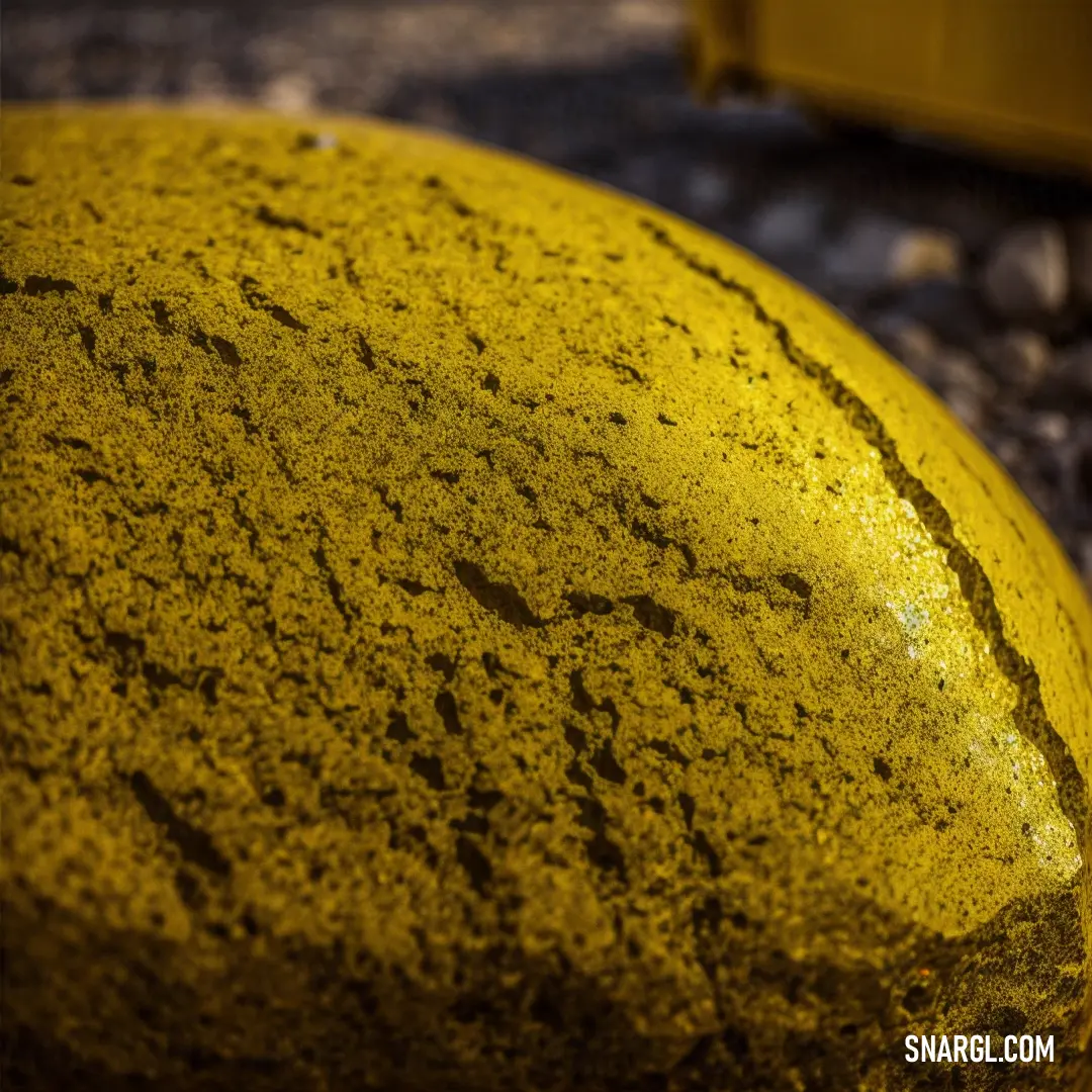
The garden became an overnight sensation. Visitors from around the world came to experience its enchantment, and Karl and Betsey were celebrated as pioneers in the art of interactive design. Pantone 7758 was no longer just a color; it was a gateway to a magical, ever-changing world.
Karl and Betsey continued to explore new ways to use Pantone 7758 in their designs, forever pushing the boundaries of creativity. Their partnership became legendary, proving that with a splash of imagination and a touch of Pantone 7758, even the most ordinary things could be transformed into extraordinary experiences.
And so, the tale of the Pantone Prank and the Garden of Green Glory became a cherished legend in Chromopolis, reminding everyone that sometimes, the most unexpected color can lead to the most spectacular adventures.








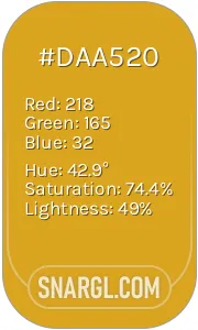 Goldenrod
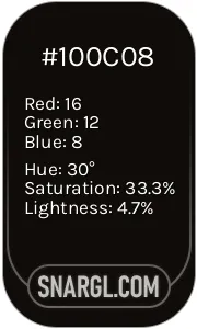 Smoky black
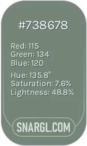 Xanadu
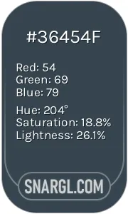 Charcoal
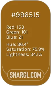 Golden brown
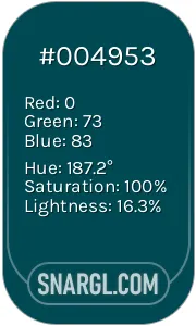 Midnight green
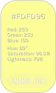 Pastel yellow
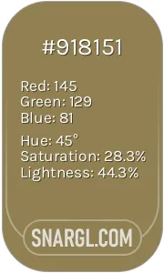 Dark tan
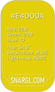 Citrine
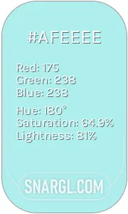 Pale blue

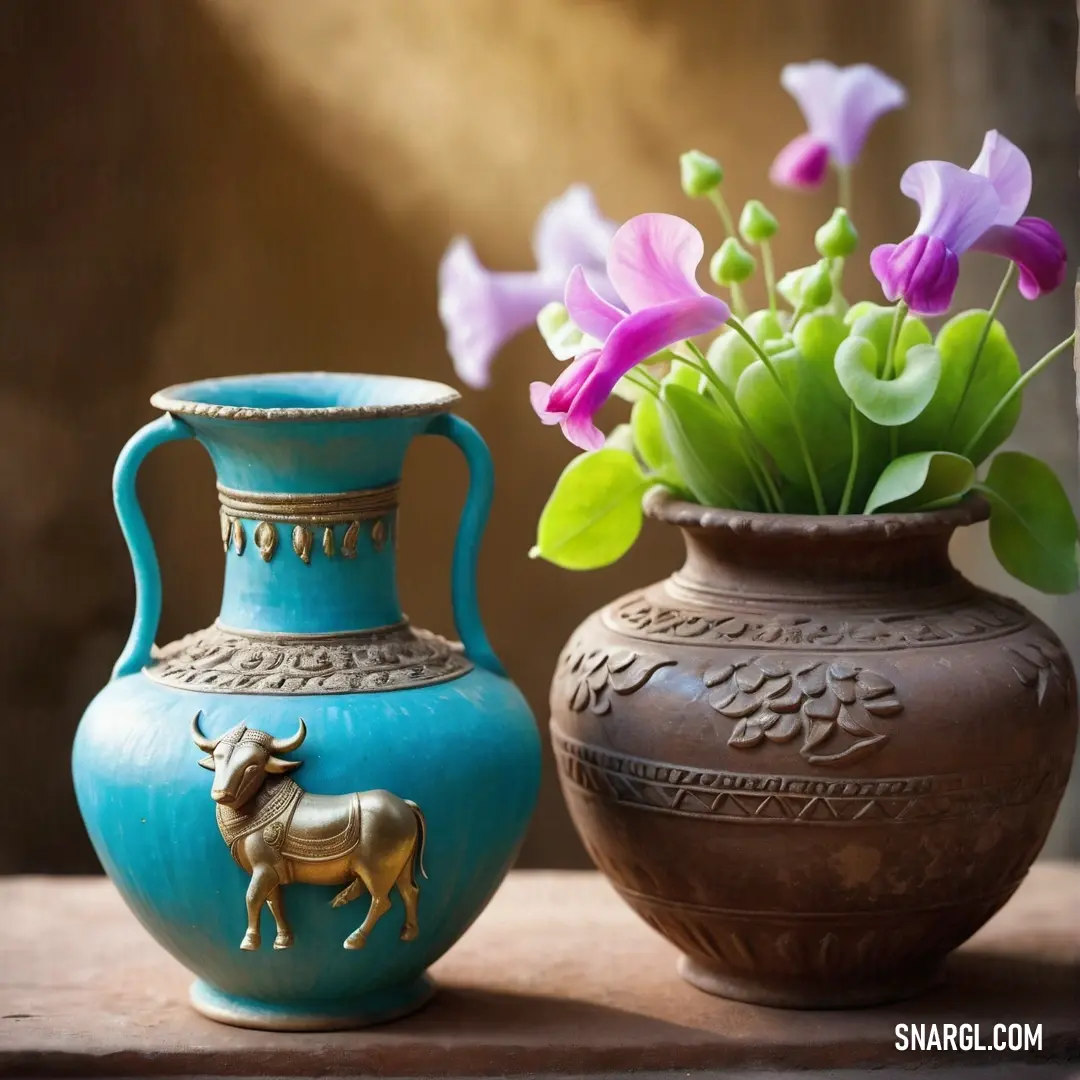




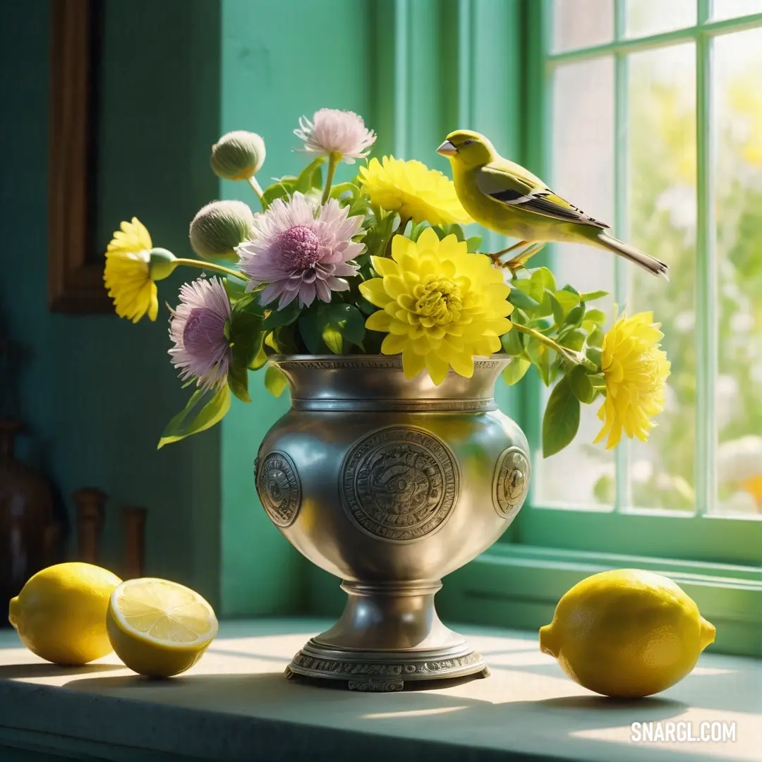

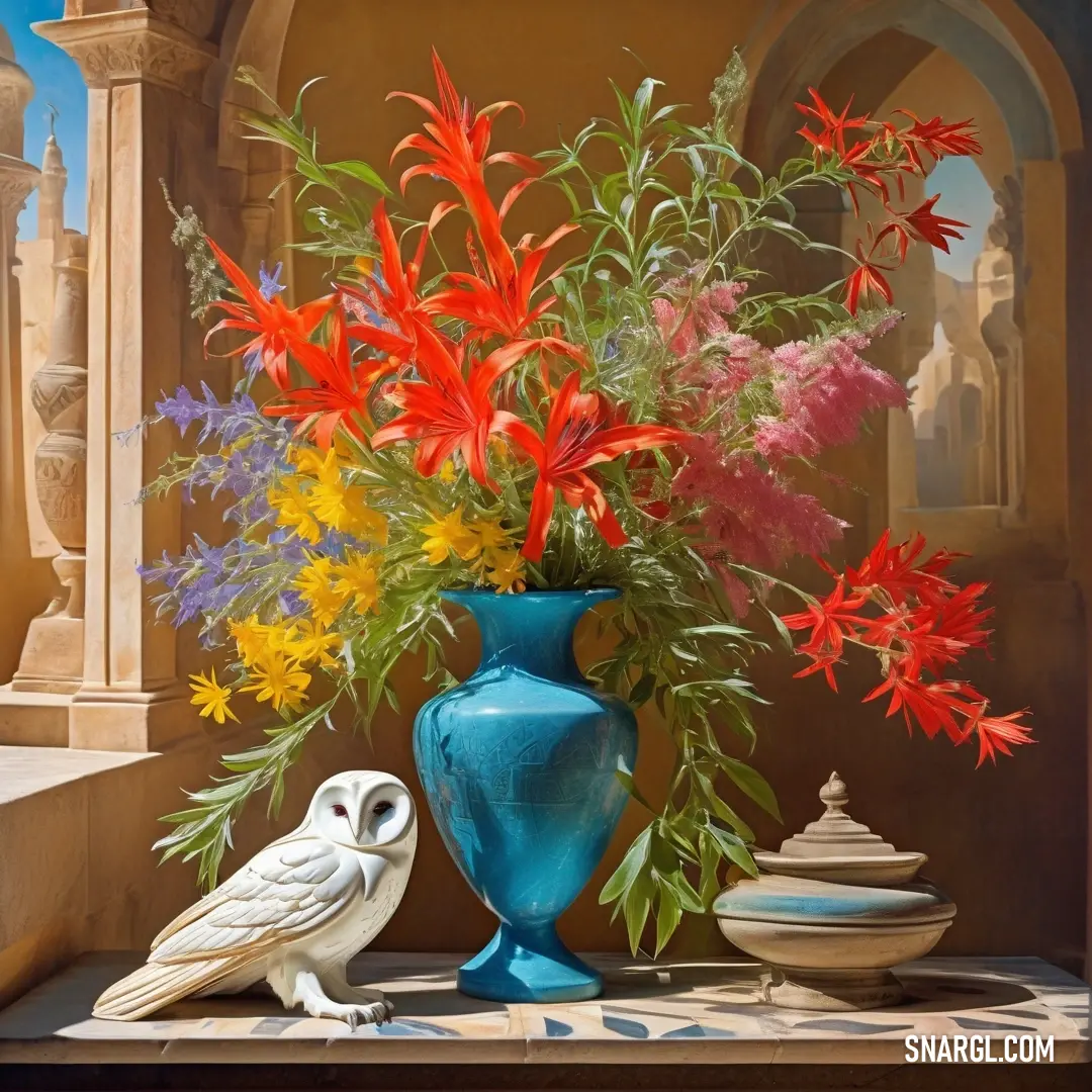

 Onyx
Onyx Cadet
Cadet Light slate gray
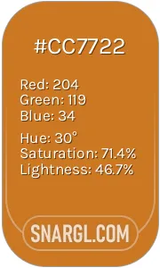 Ochre
Ochre Cal Poly Pomona green
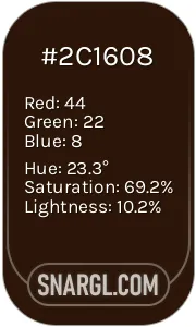 Zinnwaldite
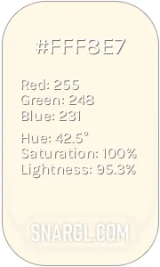 Cosmic latte
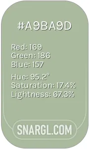 Laurel green








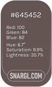 Wenge
Wenge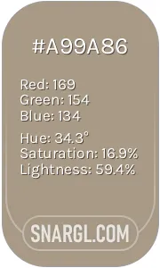 Grullo
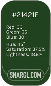 Myrtle
 Saffron
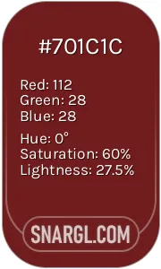 Persian plum
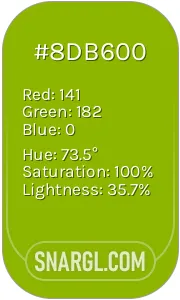 Apple Green
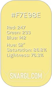 Flavescent
 Yellow green
 Light yellow