Home Colors PANTONE
PANTONE 7751

PANTONE 7751

Parameters:
HEX Triplet:
#D0BC5A
RGB:
208, 188, 90
CMYK:
2, 7, 75, 17
HSL:
50°, 57%, 82%
Closest colors:
in RGB:
Vegas gold
in PANTONE:
PANTONE 617
in RAL Classic:
RAL 1002
in RAL Design:
RAL 095 80 60
in RAL Effect:
RAL 280-4
in NCS:
NCS S 2040-Y
What color is PANTONE 7751? The Chromatic Catalyst
2024-09-21 Snargl 02:10

What color is PANTONE 7751?

Dirt path in a field with trees and yellow flowers on the side of it. Example of CMYK 2,7,75,17 color.
Gold and black machine with a clock on it's side and a glass case on top of it. Example of CMYK 2,7,75,17 color.
Stream running through a forest with rocks and plants in the foreground. Color PANTONE 7751.
PANTONE 7751 is a shade of yellow with a slight hint of brown.

It has the following color values in different color models:
  • RGB: 208, 188, 90 - It is composed of 81.57% red, 73.73% green, and 35.29% blue light.

  • HEX: #D0BC5A - This is the hexadecimal representation of the RGB values, which can be used in web design and coding.

  • CMYK: 2, 7, 75, 17 - PANTONE 7751 is composed of 2% cyan, 7% magenta, 75% yellow, and 17% black ink.

  • HSL: 50°, 57%, 82% - This means that the color has a hue of 51 degrees, a saturation of 55%, and a lightness of 54%.

PANTONE 7751 is available in various Pantone products, such as color guides, solid chips, and plastic chips.

This color can be used for various purposes, such as branding, packaging, fashion, interior design, and more.

Example of the palette with the PANTONE 7751 color

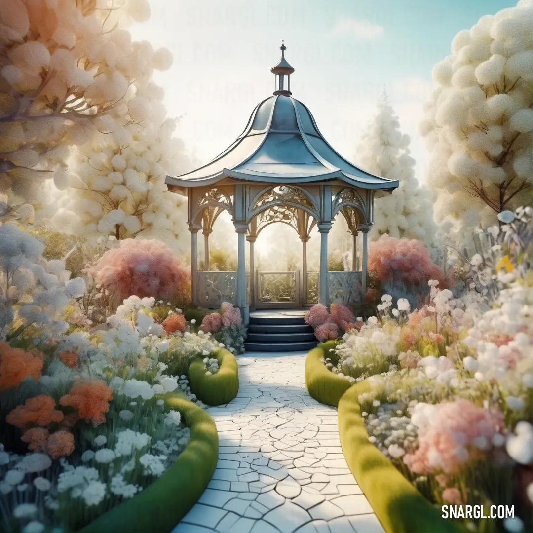
Picture with primary colors of Desert sand, Rose taupe, Ecru, Dark slate gray and Isabelline
Top 5 color shades of the illustration. Arranged in descending order of frequency of occurrence (first - more often, last - more rare).
See these colors in NCS, PANTONE, RAL palettes...
RAL Classic
RAL 1014
RAL 1036
RAL 1002
RAL 6028
RAL 9010
RAL Design
RAL 050 80 20
RAL 010 40 25
RAL 080 70 30
RAL 180 30 15
RAL 010 92 05
RAL Effect
RAL 430-1
RAL 340-3
RAL 320-1
RAL 710-6
RAL 150-2
Author:
Funny stories about the 'PANTONE 7751'

The Chromatic Catalyst

Far-far away, in the bustling heart of the design district, Connor Powell manned the counter at the Color Emporium, a haven for creatives seeking inspiration. It was an ordinary Wednesday when Igor Buffalo, a writer known for his avant-garde stories, burst into the store with a wild glint in his eye.

"Connor, you won't believe what I've come up with!" Igor exclaimed, clutching a well-worn notebook. "I need your expertise."
Yellow carpet with a brown border and a brown border on the bottom of it. Color PANTONE 7751.

Connor raised an eyebrow, intrigued. "Let's hear it."

Igor flipped open his notebook to reveal a series of rough sketches. "I'm working on a new book cover, and I want to use PANTONE 7751 in a way that's never been done before. It's a green shade, almost like a secret garden. But how can we make it pop in the world of design?"

Connor studied the sketches, his mind whirring with possibilities. "PANTONE 7751 is a versatile green - earthy and calming. What if we use it in an unconventional way, like integrating it into augmented reality?"

Igor's eyes widened. "Augmented reality? How?"

Connor leaned in, excited. "Imagine this: the book cover itself is an invitation. When someone scans it with their phone, PANTONE 7751 blossoms into a virtual garden that reflects the themes of your story. The green becomes more than a color - it becomes an interactive experience."

Igor's excitement was palpable. "Yes! The story revolves around hidden realms and secret worlds. This could be perfect."

They spent the next few weeks brainstorming and collaborating. Connor sourced eco-friendly materials to ensure the book's cover would complement the digital aspect. Igor crafted a narrative that would tie into the virtual garden, creating a seamless experience between the physical and digital realms.

When the book was finally released, the response was electric. Readers were entranced as their phones transformed the cover into a lush, interactive landscape. PANTONE 7751 became the gateway to a hidden world, captivating audiences and blurring the lines between reality and imagination.

The project was lauded for its innovative use of color and technology. Connor and Igor had not only redefined how a color could be used in design but had also created a new benchmark for interactive storytelling. The success cemented their reputations as pioneers in their respective fields.

As the accolades poured in, Connor and Igor celebrated their triumph, knowing they had pushed the boundaries of design and storytelling. Their collaboration had turned a simple shade of green into a catalyst for creativity, proving that sometimes, the most mundane elements can spark extraordinary innovations.

And so, PANTONE 7751, once just a color in a swatch book, became a symbol of the boundless possibilities that arise when imagination meets technology.
Author:

Continue browsing posts in category "PANTONE"
You may find these posts interesting:
PANTONE 104 Color
8
3
2
11
1
PANTONE 104 Color
PANTONE 2603 Color
1
0
1
13
0
PANTONE 2603 Color
PANTONE 194 Color
7
1
2
14
0
PANTONE 194 Color
PANTONE 2062 Color
2
1
2
14
0
PANTONE 2062 Color
PANTONE 645 Color
5
0
2
7
0
PANTONE 645 Color
PANTONE 2222 Color
4
1
2
11
0
PANTONE 2222 Color
PANTONE 140 Color
8
0
2
11
0
PANTONE 140 Color
PANTONE 2200 Color
3
2
2
6
0
PANTONE 2200 Color
Home
Terms of Service
Contact Us

© 2023 Snargl.com