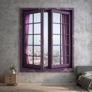
Home Colors PANTONE
PANTONE 7660

PANTONE 7660

Parameters:
HEX Triplet:
#A39AAC
RGB:
163, 154, 172
CMYK:
37, 37, 17, 0
HSL:
270°, 10%, 67%
Closest colors:
in RGB:
Rose quartz
in PANTONE:
PANTONE 422
in RAL Classic:
RAL 7040
in RAL Design:
RAL 000 65 00
in RAL Effect:
RAL 110-M
What color is PANTONE 7660? The PANTONE 7660 Design Revolution
2024-09-21 Snargl 02:10

What color is PANTONE 7660?

Robot with a large eye and a helmet on it's head in a forest with mountains and trees. Color CMYK 37,37,17,0.
Man with a purple shirt and a short haircut with a purple shirt on. Color PANTONE 7660.
Statue of a demon with purple hair and a purple mask on fire with a sword in his hand. Example of #A39AAC color.
PANTONE 7660 is a medium light shade of blue-magenta, with a hue of 270 degrees, a saturation of 10%, and a lightness of 67%.

In the RGB color model, it is composed of 63.92% red, 60.39% green, and 67.45% blue.

In the CMYK color model, it is composed of 37% cyan, 37% magenta, 17% yellow, and 0% black.

PANTONE 7660 is a color that can be used for various purposes, such as branding, packaging, graphic design, fashion, and interior design.

It can evoke a sense of elegance, sophistication, and creativity.
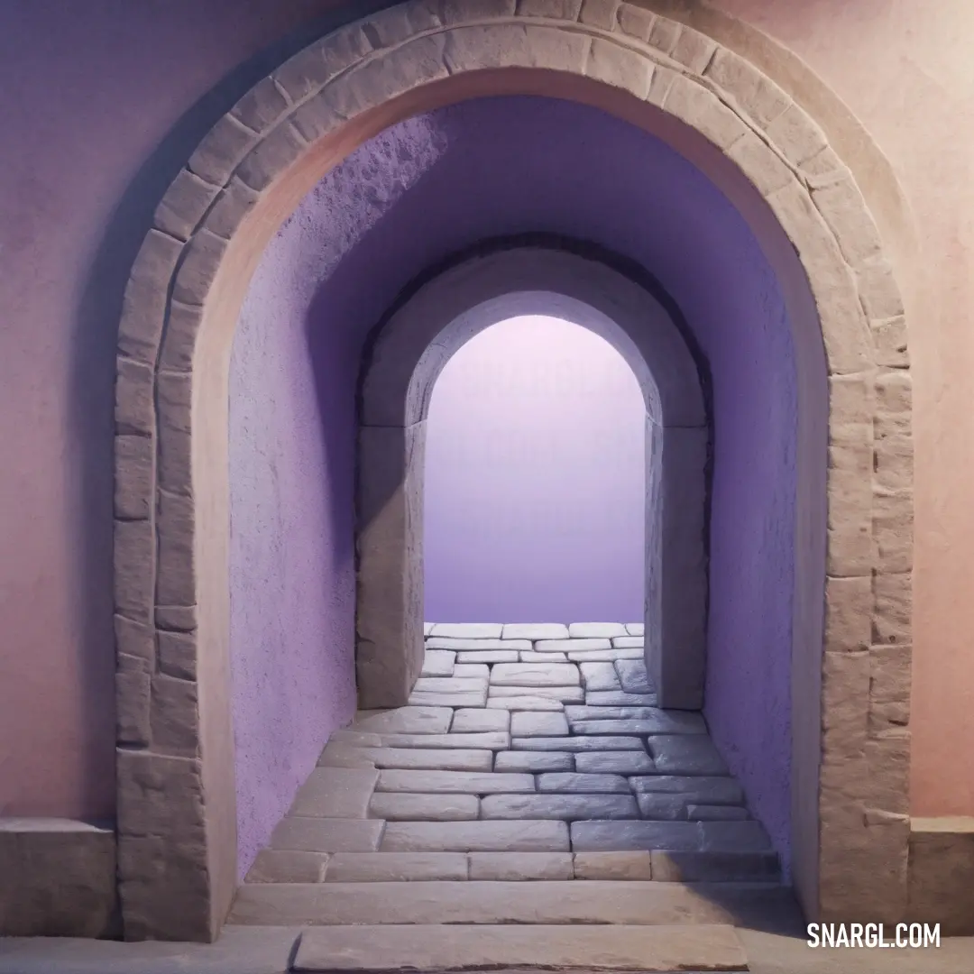
Example of the palette with the PANTONE 7660 color

Picture with primary colors of Rose quartz, Pang, Arsenic, French lilac and Platinum
Top 5 color shades of the illustration. Arranged in descending order of frequency of occurrence (first - more often, last - more rare).
See these colors in NCS, PANTONE, RAL palettes...
RAL Classic
RAL 9006
RAL 7015
RAL 7016
RAL 4005
RAL 9001
RAL Design
RAL 320 60 15
RAL 290 30 20
RAL 000 25 00
RAL 320 50 20
RAL 110 90 05
Author:
Funny stories about the 'PANTONE 7660'

The PANTONE 7660 Design Revolution

Long time ago, in the quaint village of Verdant Hills, where tradition and innovation often clashed, an exciting new project was about to unfold. Virgil Smith, a farmer with an extraordinary knack for creativity, and Professor Phoebe Lantern, a renowned design professor with a penchant for exploring new frontiers, were teaming up to showcase the stunning possibilities of PANTONE 7660 - a vibrant, deep plum color with a rich, almost regal quality.

Virgil Smith was known throughout Verdant Hills for his innovative farming methods, which included everything from vertical gardens to organic fertilization techniques. His farm was not only a source of fresh produce but also a living example of how tradition could meet modernity. When Virgil came across PANTONE 7660 in a local design magazine, he was captivated by its depth and elegance. "This color," he thought, "is like the twilight sky after a day of hard work. It's bold yet comforting."
PANTONE 7660 color. Man with purple hair and a white shirt is standing in front of a palm tree and blue sky

Professor Phoebe Lantern, who had recently taken a sabbatical from her teaching at the prestigious Design Institute, was exploring new ways to merge academic design theory with practical applications. She was intrigued by Virgil's enthusiasm for PANTONE 7660 and saw a unique opportunity to create something groundbreaking. "Virgil," she said, "this color has the potential to redefine our approach to trademark design. Let's use it to create a project that demonstrates both its aesthetic appeal and its functional versatility."

Their ambitious plan was to develop a new trademark design that would integrate PANTONE 7660 in both visual and practical elements. Their goal was to create a design that was not only visually striking but also demonstrated the color's impact on various aspects of branding and identity.

The first part of their project involved designing a new line of eco-friendly packaging for a local artisanal food company. Virgil, drawing on his farming expertise, suggested that the packaging should reflect the natural origins of the products while incorporating the rich tones of PANTONE 7660. Together, they created packaging made from recycled materials, adorned with intricate patterns and textures in the deep plum color. The design featured botanical illustrations and organic motifs, capturing the essence of Verdant Hills' agricultural heritage while showcasing the sophistication of PANTONE 7660.

Next, they focused on creating a series of branded items, such as reusable shopping bags, aprons, and stationery. These items were designed to enhance the brand's identity while promoting sustainability. Each item featured PANTONE 7660 prominently, with thoughtful design elements that highlighted the color's versatility. For example, the shopping bags had elegant, embossed patterns in the deep plum shade, while the aprons included vibrant, contrasting stitching and pockets that made them both functional and stylish.

The most innovative aspect of their project was the "Interactive Branding Experience," an installation that demonstrated the impact of PANTONE 7660 in various lighting and environmental conditions. Professor Lantern and Virgil created a pop-up exhibition where visitors could explore different settings, such as a cozy kitchen, a bustling farmer's market, and a chic urban café, all featuring the new trademark design elements. By adjusting the lighting and viewing angles, visitors could see how PANTONE 7660 adapted and enhanced the space, showcasing its depth and adaptability.

The grand unveiling of their project was met with enthusiastic acclaim. The packaging design was praised for its elegant integration of PANTONE 7660, and the branded items were celebrated for their practical and stylish appeal. The Interactive Branding Experience captivated visitors, demonstrating the color's transformative power and its ability to enhance various environments.

Virgil Smith and Professor Phoebe Lantern's collaboration was hailed as a triumph of creativity and practicality. Their project not only showcased the beauty of PANTONE 7660 but also highlighted its potential to elevate branding and design. Their work became a model for how colors could be used to create compelling, functional designs that resonated with both aesthetic and practical considerations.

Their story became a celebrated example in Verdant Hills of how tradition and innovation could come together to create something truly extraordinary. PANTONE 7660 continued to be recognized as a color that brought depth and elegance to design, proving that with imagination and expertise, even the most unexpected collaborations could lead to groundbreaking results.
Author:

Continue browsing posts in category "PANTONE"
You may find these posts interesting:
PANTONE 7620 Color
2
0
1
8
0
PANTONE 7620 Color
PANTONE 2222 Color
4
1
2
11
0
PANTONE 2222 Color
PANTONE 2617 Color
2
0
2
5
0
PANTONE 2617 Color
PANTONE 2200 Color
3
2
2
6
0
PANTONE 2200 Color
PANTONE 2166 Color
2
0
2
6
0
PANTONE 2166 Color
PANTONE 103 Color
3
0
2
13
2
PANTONE 103 Color
PANTONE 2240 Color
11
1
4
26
0
PANTONE 2240 Color
PANTONE 2013 Color
4
0
3
7
0
PANTONE 2013 Color
Home
Terms of Service
Contact Us

© 2023 Snargl.com