Home Colors PANTONE
PANTONE 7652

PANTONE 7652

Parameters:
HEX Triplet:
#69295A
RGB:
105, 41, 90
CMYK:
42, 92, 0, 50
HSL:
314°, 61%, 41%
Closest colors:
in PANTONE:
PANTONE 261
in RAL Classic:
RAL 4004
in RAL Design:
RAL 340 30 30
in RAL Effect:
RAL 530-6
What color is PANTONE 7652? The PANTONE 7652 Interior Shenanigans
2024-09-21 Snargl 02:12

What color is PANTONE 7652?

Sandwich with a purple frosting and a pink frosting on it on a plate next to a fork and a cup of fruit. Color PANTONE 7652.
Purple office chair in front of a window with the sun shining through it's windowsill. Example of PANTONE 7652 color.
PANTONE 7652 has different variations depending on the type of material or surface it is applied to, such as coated paper, uncoated paper, or plastic.

In the RGB color model, it is composed of 41.18% red, 16.08% green, and 35.29% blue.

In the CMYK color model, which is commonly used for printing, it is composed of 42% cyan, 92% magenta, 0% yellow, and 50% black.

PANTONE 7652 is a rich and elegant color that can be used for various purposes, such as branding, packaging, fashion, or interior design.

It can create a striking contrast with lighter colors, such as white, beige, or pink, or a harmonious blend with darker colors, such as black, purple, or navy.
Example of the palette with the PANTONE 7652 color

Picture with primary colors of Arsenic, Twilight lavender, Taupe gray, Pink pearl and Dark jungle green
Top 5 color shades of the illustration. Arranged in descending order of frequency of occurrence (first - more often, last - more rare).
See these colors in NCS, PANTONE, RAL palettes...
Author:
Funny stories about the 'PANTONE 7652'

The PANTONE 7652 Interior Shenanigans

Far away, in the lively town of Quirkville, where the unusual was ordinary and the whimsical was routine, an unlikely duo was about to embark on a hilariously ambitious interior design project. Meet Pier Krang, a charismatic car service worker with a knack for turning ordinary objects into art, and Sandy White, a writer renowned for her vivid imagination and unrestrained creativity. Together, they were set to explore the bold potential of PANTONE 7652, a color that promised to bring both excitement and comedy to their design venture.

Pier Krang was known for his inventive use of spare car parts - everything from hubcaps turned into wall art to exhaust pipes repurposed as stylish lampstands. His garage was a treasure trove of creative materials. One day, while browsing through paint samples, he stumbled upon PANTONE 7652 - a vibrant shade of cerulean blue that seemed to radiate an air of cheeky charm. "This color," Pier declared with a grin, "is like a mischievous splash of energy waiting to happen!"
Painting of jesus in a purple robe with his hands out in front of him and a full moon in the background. Example of RGB 105,41,90 color.

Sandy White, a writer with a flair for the dramatic and a love for quirky narratives, was intrigued by Pier's enthusiasm. She had recently been commissioned to design a set for her latest book, which revolved around a fantastical house full of surprises. When Pier suggested using PANTONE 7652 for the project, Sandy's eyes lit up with excitement. "Pier," she said, "this color could be the key to creating a space that's as lively and imaginative as my story!"

Their project was to redesign a cozy, albeit slightly dull, living room in Sandy's fictional book. The challenge was to use PANTONE 7652 in a way that would transform the space into something both comical and thrilling. They wanted to create an environment that felt like it had jumped out of one of Sandy's whimsical tales.

Their first idea was to paint the walls in PANTONE 7652, but with a twist. Instead of a solid color, they opted for an ever-changing pattern that mimicked the antics of a mischievous blue squirrel. With the help of Pier's mechanical skills and Sandy's imaginative flair, they rigged up a system of rotating panels and moving screens that made the walls appear as if they were constantly shifting and wriggling.
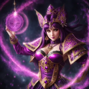
PANTONE 7652 color example: Man in armor with a sword and wings on a hill with buildings in the background

Next, they tackled the furniture. Pier suggested turning a set of old, mismatched chairs into a "Squirrel Throne Collection," each upholstered in PANTONE 7652 with whimsical patterns of squirrels in various comedic poses. Sandy added her touch by creating throw pillows shaped like acorns and nutty critters, all in shades of PANTONE 7652.

To complete the transformation, Pier and Sandy decided to add a touch of interactive fun. They installed a hidden "Squirrel Surprise" feature - an array of cleverly disguised compartments in the walls that, when opened, would reveal animated PANTONE 7652 squirrels performing hilarious antics, such as juggling tiny nuts or playing tiny tambourines.

The grand unveiling of the newly designed living room was nothing short of spectacular. As Sandy's friends and family stepped into the space, they were greeted by walls that playfully shifted and shimmered in PANTONE 7652. The Squirrel Thrones provided a comical seating experience, with everyone laughing at the exaggerated squirrel patterns and plush acorn-shaped pillows. And the "Squirrel Surprise" compartments provided endless amusement, with guests eagerly discovering the hidden, animated antics.
Man with a pink mohawk and a white shirt smiling at the camera with a purple background. Color CMYK 42,92,0,50.

The room quickly became the talk of Quirkville. People marveled at how PANTONE 7652 had been used to create a space that was as vibrant and playful as it was functional. The comical elements and interactive features made the room a hit for both children and adults, turning every visit into an adventure.

Pier and Sandy's collaboration proved that even the most straightforward color could be used to create something truly extraordinary. They demonstrated that with a splash of creativity, a dash of humor, and a whole lot of imagination, PANTONE 7652 could transform an ordinary space into a fantastical realm of fun and delight.

Their story became a cherished example in Quirkville of how the most unexpected partnerships and the quirkiest colors could lead to the most memorable and entertaining creations. And as for PANTONE 7652, it continued to be celebrated as the color that added a touch of mischief and joy to interior design, leaving everyone with a smile and a newfound appreciation for the playful side of color.
Author:

Continue browsing posts in category "PANTONE"
You may find these posts interesting:
PANTONE 7689 Color
1
0
2
9
0
PANTONE 7689 Color
PANTONE 2222 Color
4
1
2
11
0
PANTONE 2222 Color
PANTONE 7620 Color
2
0
1
8
0
PANTONE 7620 Color
PANTONE 107 Color
4
0
2
11
1
PANTONE 107 Color
PANTONE 108 Color
14
0
2
25
1
PANTONE 108 Color
PANTONE 100 Color
3
0
2
5
0
PANTONE 100 Color
PANTONE 140 Color
8
0
2
11
0
PANTONE 140 Color
PANTONE 130 Color
1
0
2
11
0
PANTONE 130 Color
Home
Terms of Service
Contact Us

© 2023 Snargl.com