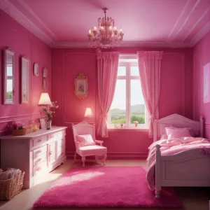
Home Colors PANTONE
PANTONE 7636

PANTONE 7636

Parameters:
HEX Triplet:
#C02250
RGB:
192, 34, 80
CMYK:
0, 100, 45, 12
HSL:
343°, 82%, 75%
Closest colors:
in PANTONE:
PANTONE 193
in RAL Classic:
RAL 3027
in RAL Design:
RAL 010 40 53
in RAL Effect:
RAL 470-5
What color is PANTONE 7636? The PANTONE 7636 Room Rumble
2024-09-21 Snargl 02:10

What color is PANTONE 7636?

Woman with pink hair and a pink jacket on a city street with a car in the background and a taxi cab behind her
Girl with pink hair and a pink outfit with a pink circle around her head
RGB 192,34,80 example: Woman with pink hair in front of a computer monitor and keyboard in a dark room with a neon pink background
What color is RGB 192,34,80? Example - Bunch of raspberries are shown in this image
The hexadecimal color code for PANTONE 7636 is #C02250, which means it has 75.29% red, 13.33% green and 31.37% blue in the RGB color model.
The hue angle of PANTONE 7636 is 343°, which means it is close to the red end of the color wheel.
The saturation and lightness of this color are 82% and 75%.
PANTONE 7636 can be used for various purposes, such as branding, packaging, fashion, home decor and more.
It can be matched with other colors using the PANTONE products.
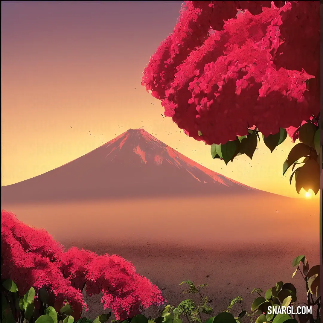
Example of the palette with the PANTONE 7636 color

Picture with primary colors of Dark chestnut, Bole, Macaroni and Cheese, Persian plum and Cerise
Top 5 color shades of the illustration. Arranged in descending order of frequency of occurrence (first - more often, last - more rare).
See these colors in NCS, PANTONE, RAL palettes...
RAL Classic
RAL 1036
RAL 8002
RAL 1001
RAL 3032
RAL 3018
RAL Design
RAL 050 50 20
RAL 030 30 30
RAL 060 80 40
RAL 020 20 29
RAL 020 50 58
Author:
Funny stories about the 'PANTONE 7636'

The PANTONE 7636 Room Rumble

Far-far away, in the bustling city of Metropolisville, where skyscrapers glittered and neon lights danced, Pier Nova, an entrepreneur with a flair for the dramatic, had a vision. Pier wanted to launch a revolutionary new room design trend that would sweep across the city like wildfire. His weapon of choice? A bold, audacious color named PANTONE 7636 - a daring, zesty orange that practically shouted, "I'm here, and I'm fabulous!"

But there was a problem. To bring his vision to life, Pier needed the expertise of Raj Korr, a quirky engineer known for his impeccable design sense and somewhat eccentric approach to problem-solving. Raj's reputation for turning ordinary objects into marvels of modern engineering made him the perfect candidate for the job. There was just one catch: Raj had a peculiar aversion to anything orange.

Despite his reservations, Raj agreed to help Pier, intrigued by the challenge and the potential for a colorful breakthrough. The duo set up camp in Raj's cluttered workshop, where prototypes and half-finished projects were strewn about like a chaotic, creative tornado.

Pier, armed with swatches and sample boards, enthusiastically pitched his vision. "Raj, imagine an entire room drenched in PANTONE 7636. It'll be a game-changer! People will walk in and say, ‘Wow, I've never seen a room like this before!'"

Raj, adjusting his mismatched glasses and peering skeptically at the vibrant orange swatch, replied, "Sure, Pier, but how do we make it work without it looking like a traffic cone exploded?"

Pier's eyes twinkled with excitement. "That's why I need you, Raj! We'll need to blend this color with innovative design elements to make it truly pop!"

And so began the "Room Rumble," a whirlwind of design experiments, engineering tweaks, and, inevitably, a few hilariously orange mishaps. Raj, in his quest to make PANTONE 7636 palatable, experimented with every possible combination. From orange-hued furniture that doubled as secret compartments to walls that could switch between bright orange and calming neutral tones with a simple flick of a switch, Raj pushed the boundaries of room design.

One particularly memorable day, Raj proudly presented his creation: an armchair that played cheerful jingles whenever someone sat in it. The chair, clad in PANTONE 7636, was an instant hit - albeit for all the wrong reasons. It jingled so enthusiastically that guests felt like they were in a never-ending carnival. Despite the chaos, Raj and Pier couldn't help but laugh at the absurdity of it all.

Finally, after many trials and errors, they crafted a room design that was both striking and sophisticated. The key? PANTONE 7636 was used as an accent color, paired with sleek, modern furnishings and subtle, complementary tones. The result was a space that was vibrant yet tasteful, energetic yet calming.

When the grand unveiling came, the room's unique charm won over even the most skeptical critics. People marveled at how PANTONE 7636 added a burst of personality without overwhelming the space. The design was a hit, and Pier's innovative approach became the talk of the town.

Raj, who had once shuddered at the thought of orange, found himself strangely fond of the color's new, refined look. "I have to admit, Pier," Raj said with a grin, "PANTONE 7636 isn't so bad when it's not blinding you from every angle."

The success of the "Room Rumble" solidified Pier Nova and Raj Korr's place in design history, proving that with a bit of creativity, a dash of humor, and a willingness to embrace the unconventional, even the boldest colors can find their perfect place in the spotlight. And so, the story of PANTONE 7636 became a testament to the power of collaboration and the art of turning even the most eccentric ideas into a stunning reality.
Author:

Continue browsing posts in category "PANTONE"
You may find these posts interesting:
PANTONE 104 Color
8
3
2
11
1
PANTONE 104 Color
PANTONE 194 Color
7
1
2
14
0
PANTONE 194 Color
PANTONE 2062 Color
2
1
2
14
0
PANTONE 2062 Color
PANTONE 100 Color
3
0
2
5
0
PANTONE 100 Color
PANTONE 140 Color
8
0
2
11
0
PANTONE 140 Color
PANTONE 566 Color
4
0
2
7
0
PANTONE 566 Color
PANTONE 102 Color
4
0
2
7
2
PANTONE 102 Color
PANTONE 2240 Color
11
1
4
26
0
PANTONE 2240 Color
Home
Terms of Service
Contact Us

© 2023 Snargl.com