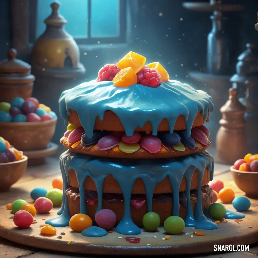
Home Colors PANTONE
PANTONE 7601

PANTONE 7601

Parameters:
HEX Triplet:
#84412A
RGB:
132, 65, 42
CMYK:
14, 82, 100, 50
HSL:
15°, 68%, 52%
Closest colors:
in RGB:
Russet
in PANTONE:
PANTONE 1685
in RAL Classic:
RAL 8029
in RAL Design:
RAL 050 30 36
in RAL Effect:
RAL 350-4
What color is PANTONE 7601? Manolo, Kate, and the Verdant Revolution
2024-09-21 Snargl 02:10

What color is PANTONE 7601?

Futuristic city with a lot of water and mountains in the background. Color RGB 132,65,42.
Car driving down a road next to a forest and a lake in the background. Example of RGB 132,65,42 color.
PANTONE 7601 has a hexadecimal value of #84412A, which means it is composed of 51.76% red, 25.49% green and 16.47% blue.
It is a medium dark shade of red-orange that may vary slightly depending on the lighting conditions, pigments, substrates and color capabilities of the paint.
This color has a hue of 15°, saturation 68%, lightness 52%.
PANTONE 7601 can be matched to different materials and products using Pantone products such as guides, chips, books and devices.

Example of the palette with the PANTONE 7601 color

Picture with primary colors of Dark sienna, Dark electric blue, Blue green, Fulvous and Deep carmine
Top 5 color shades of the illustration. Arranged in descending order of frequency of occurrence (first - more often, last - more rare).
See these colors in NCS, PANTONE, RAL palettes...
Author:
Funny stories about the 'PANTONE 7601'

Manolo, Kate, and the Verdant Revolution

Long time ago, far away, in the bustling city of Urbania, where skyscrapers cast long shadows and the hum of industry never ceased, a curious event was unfolding. Manolo Storm, a shop assistant known for his keen eye for detail, and Kate Gonzalez, a top model with a flair for dramatic fashion, were about to ignite a revolution in industrial design with a color that had everyone scratching their heads: PANTONE 7601, a vibrant and slightly mysterious shade of green.

Manolo worked at "Storm's Specialty Supplies," a shop known for its eclectic collection of industrial design tools and materials. His job was to help clients find just the right products for their projects, and he took immense pride in his work. Kate, on the other hand, was a glamorous top model who had recently developed an interest in industrial design, fascinated by the transformation of raw materials into functional art.
Christmas deer with a red and green headband and a gift box in front of a christmas tree. Example of PANTONE 7601 color.

One fateful afternoon, Kate wandered into Storm's Specialty Supplies looking for inspiration for her latest project - a fashion line that aimed to blend industrial elements with high fashion. As she browsed through the racks of materials and paints, her eye was caught by a small swatch of PANTONE 7601, a color she'd never seen before. It was a deep, rich green, almost like the color of lush forest canopies.

"What's this?" Kate asked Manolo, holding up the swatch.

Manolo, who had seen many colors come and go, was intrigued. "Ah, PANTONE 7601! That's a new addition. It's meant to be used in industrial design, but I've never seen anyone use it in fashion before."

Kate's eyes sparkled with excitement. "I think this could be revolutionary! What if we combined this color with industrial design elements to create something completely new? Imagine if industrial design could be both functional and strikingly stylish!"

Manolo, ever the enthusiast for a new challenge, eagerly agreed. Together, they devised a plan to incorporate PANTONE 7601 into industrial design in an innovative way. Their idea was to use the color to create a line of fashion-forward, industrial-inspired accessories, like belts, bags, and even shoes, that would blend high fashion with utilitarian design.
Futuristic space station with a lot of lights and smoke coming out of it's stacks and flying through the air. Example of RGB 132,65,42 color.

Kate took the lead on the fashion side, designing striking pieces that featured bold geometric patterns and sleek, industrial finishes. Meanwhile, Manolo delved into the world of industrial design, working with engineers and manufacturers to incorporate the deep green hue into various functional items, from machinery parts to tool handles.

Their collaboration culminated in a showcase event at a prominent design fair in Urbania. The presentation was nothing short of spectacular. The audience was greeted by a runway show where Kate's fashion creations were paired with industrial accessories featuring PANTONE 7601. The garments were paired with belts and bags that were not just stylish but also functional, featuring durable materials and innovative designs.

The centerpiece of the event was an industrial-themed installation where machinery parts, painted in PANTONE 7601, were transformed into sleek, modern art pieces. The machinery, usually considered cold and impersonal, took on a new life with the verdant green, creating a striking contrast that highlighted both the beauty and functionality of industrial design.

The crowd was captivated. The once-unlikely pairing of high fashion and industrial design created a visual and functional feast that left everyone in awe. The deep green of PANTONE 7601, which had initially seemed an odd choice, proved to be a stunning bridge between the two worlds. The color's rich, vibrant quality brought warmth and energy to the cold, hard edges of industrial materials.

As the event drew to a close, Kate and Manolo received rave reviews. The fashion industry was buzzing about the innovative use of PANTONE 7601, and industrial designers were inspired by the fresh perspective that the color brought to their field.

Kate beamed with pride as she thanked Manolo. "Who would have thought that a simple color could bring so much change?"

Manolo chuckled. "Sometimes, it's not just about the color, but about how you use it. And I think we've shown that with a bit of creativity, even the most unexpected colors can have a huge impact."

Their collaboration became the talk of Urbania, illustrating that with imagination and bold choices, even the most unconventional ideas could lead to something truly groundbreaking. And so, in the heart of the city, PANTONE 7601 emerged as the color that bridged the gap between fashion and industry, proving that in design, there are no boundaries - just endless possibilities.
Author:

Continue browsing posts in category "PANTONE"
You may find these posts interesting:
PANTONE 103 Color
3
0
2
13
2
PANTONE 103 Color
PANTONE 7718 Color
2
0
2
7
0
PANTONE 7718 Color
PANTONE 189 Color
10
0
2
12
0
PANTONE 189 Color
PANTONE 107 Color
4
0
2
11
1
PANTONE 107 Color
PANTONE 305 Color
1
0
1
10
0
PANTONE 305 Color
PANTONE 2210 Color
5
0
2
5
0
PANTONE 2210 Color
PANTONE 7620 Color
2
0
1
8
0
PANTONE 7620 Color
PANTONE 400 Color
2
0
2
9
0
PANTONE 400 Color
Home
Terms of Service
Contact Us

© 2023 Snargl.com