Home Arts Colors PANTONE
PANTONE 7599

PANTONE 7599

Parameters:
HEX Triplet:
#BB4628
RGB:
187, 70, 40
CMYK:
0, 85, 98, 20
HSL:
12°, 79%, 73%
Closest colors:
in PANTONE:
PANTONE 7598
in RAL Classic:
RAL 2001
in RAL Design:
RAL 040 40 67
in RAL Effect:
RAL 440-6
Best Pictures:
Articles:
What color is PANTONE 7599? What are the examples of PANTONE 7599 color? What colors go well with the PANTONE 7599 color? What color is PMS 7599? Shivansh Chun, Vivienne Jacobs, and the PANTONE 7599 Revelation
2025-03-13 Snargl 13:14 4645 70
# General # Fashion # Design

What color is PANTONE 7599?

A woman donned in a sleek, futuristic suit walks through a bustling city at night, illuminated by vibrant city lights that dance around her, creating an atmosphere of adventure.
A stylish man in a crisp white shirt and fashionable sunglasses captures the bustling ambiance of a lively street corner, beautifully illuminated by city lights at dusk.
A warrior with fiery red hair and a beard stands proudly in a forest, clad in intricate suit of armor, embodying bravery amidst a picturesque natural backdrop of trees.
A man dressed in a traditional costume stands confidently in a serene forest, surrounded by towering trees and natural beauty, epitomizing harmony between culture and nature.
A fashionable woman with striking red hair and a stylish black and white jacket stands confidently amidst a city backdrop, with towering skyscrapers defining the urban landscape.
A tree stands at the center of this painting, its vibrant red leaves contrasting with the barren landscape around it. A solitary figure stands in the distance, dwarfed by the sweeping rocky terrain.
A fierce woman with red hair and horns stands before a glowing full moon, her sword raised in defiance. The moon's light casts an eerie glow on her figure, enhancing the power and intensity of the moment.
A bright red sports car races down a winding street, its engine roaring as flames lick the sky above a fiery forest. The orange and yellow flames rise from a dense mix of trees and bushes, creating a dramatic and intense scene.
A woman with striking orange eyes stands out against a clean white background, wearing a simple brown shirt. The deep red hue of her eyes contrasts beautifully with the softness of her outfit, giving her an air of mystery and elegance.
A dark, cavernous space glows with a mysterious light, as a small stream winds through the cave. Red plants grow out of the cave walls, bathed in a soft, natural light streaming from the entrance, creating an enchanting, otherworldly atmosphere.
The PANTONE 7599 can be described as a shade of red with a hint of orange.
This color has a hexadecimal code of #BB4628, which means it is composed of 73.33% red, 27.45% green and 15.96% blue in the RGB color model.
It has a hue of 12°, a saturation of 79% and a lightness of 73% in the HSL color space.
The CMYK values of PANTONE 7599 are 0%, 85%, 98%, 20%.

Example of the palette with the PANTONE 7599 color

Picture with primary colors of Caput mortuum, Rose taupe, Smoky black, Gainsboro and Carolina blue
63 %
14 %
11 %
5 %
5 %

Click to see these colors in NCS, PANTONE, RAL palettes...

Example of the palette with the PANTONE 7599 color

Picture with primary colors of Dark brown, Chestnut, Silver, Glitter and Dim gray
53 %
14 %
14 %
9 %
8 %

Click to see these colors in NCS, PANTONE, RAL palettes...
Author:

What are the examples of PANTONE 7599 color?

A mesmerizing flow of liquid ripples down a vibrant purple surface adorned with rich gold and brown hues, creating a captivating visual experience that draws the viewer in.
An intricate close-up reveals a stunning blend of rich brown and serene blue textures, showcasing a vibrant interplay of colors that invites the viewer to explore its details further.
A striking arrangement of shiny metal discs gleams under a soft light, set against a bold blue background that enhances their reflective surfaces and intricate textures.
A captivating arrangement of copper coins sits elegantly atop a table against a vivid blue background, reflecting light with their warm, metallic sheen and creating a rich visual contrast.
An enchanting collection of shiny metal objects rests against a pristine white backdrop, their reflective surfaces creating a magical interplay of light and shadow and inviting admiration.
A large-eyed red creature stands poised on a rugged terrain, surrounded by towering mountains; its color echoes the warm tones of RGB 187,70,40, creating a striking visual effect.
A charming collection of copper-colored cups is stacked playfully, creating a textured centerpiece against an elegant black background, radiating warmth and character.
Two statuesque red figures reminiscent of gorillas stand alert in a snowy expanse, with a formidable mountain rising majestically in the background, exhibiting the bold color #BB4628.
Three humanoid shapes colored in striking red and silver stand boldly on a rocky formation, set against a breathtaking mountain range covered in glistening snow, invoking a sense of adventure.
A group of majestic red gorilla statues command the rocky beach, standing firmly beside the rugged coastline, with snow-blanketed mountains towering in the distance, creating a stunning focal spectacle.
PANTONE 7599 is a rich, earthy red that exudes warmth and sophistication. This color, reminiscent of terracotta, is often associated with traditional craftsmanship and rustic aesthetics. Examples of its use include upscale packaging in the wine industry, where it complements the elegance of red wines beautifully. Designers also frequently incorporate PANTONE 7599 into branding for organic and artisanal products, reflecting a commitment to quality and authenticity. Its versatility allows it to pair well with neutral shades, lush greens, and metallics, making it a popular choice in fashion and interior design as well.

Example of the palette with the PANTONE 7599 color

Picture with primary colors of Persian plum, Antique brass, Beige, Smoky black and Desert sand
38 %
22 %
16 %
14 %
8 %

Click to see these colors in NCS, PANTONE, RAL palettes...

Example of the palette with the PANTONE 7599 color

Picture with primary colors of Cordovan, Onyx, Pale silver, Gray and Bistre
38 %
28 %
19 %
11 %
2 %

Click to see these colors in NCS, PANTONE, RAL palettes...
Author:

What colors go well with the PANTONE 7599 color?

A woman adorned with large pink flowers on her head commands attention in a delightful pink dress, standing out amid a vivid backdrop of lush color.
A stylish woman in a vibrant red shirt stands confidently against a muted background, showcasing her poised demeanor. The light catches her features beautifully, highlighting her radiant smile while the CMYK color scheme adds depth to the image.
A woman draped in a stylish jacket with a luxurious fur collar stands in a soft pink light, blending elegance with contemporary fashion amid an enchanting atmosphere.
An intriguing visual displaying the letter
A woman in a lovely purple dress stands out against a bold red background, embodying vibrancy and charisma in this colorful portrait.
A sleek white motorcycle, featuring a unique helmet on its headlight, sits against a shimmering silver background, showcasing the elegance of CMYK 0,85,98,20 color.
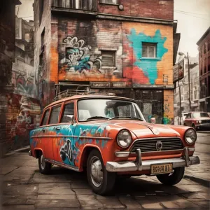
A sleek black car parked gracefully in a garage, adjacent to a building adorned with a visible sign. A stunning representation of the RGB 187,70,40 color scheme.
A striking image of a toy car gleaming on a reflective surface, its vibrant color and curves mirrored beautifully, set against a subtle backdrop, creating an enchanting visual play of reflections.
A refreshing glass of ice water sits gracefully on a tabletop, glistening with ice cubes, while soft light filters through a light background, creating a serene atmosphere of hydration and tranquility.
PANTONE 7599 is a rich, earthy red that evokes warmth and sophistication. To complement this color effectively, consider pairing it with cool tones like teal or deep turquoise. These hues create a striking contrast that enhances the vibrancy of PANTONE 7599. Neutrals like cream or light beige work beautifully, providing balance and allowing the red to stand out. For a bolder look, try gold or mustard yellow accents; they add a touch of glamour. Finally, rustic greens, like olive or sage, evoke a natural feel, bringing harmony to designs featuring PANTONE 7599.

Example of the palette with the PANTONE 7599 color

Picture with primary colors of UP Maroon, Vivid burgundy, Cerise, Light salmon pink and Seal brown
64 %
11 %
8 %
8 %
5 %

Click to see these colors in NCS, PANTONE, RAL palettes...

Example of the palette with the PANTONE 7599 color

Picture with primary colors of Gray, Dark jungle green, Davy grey, Sienna and Pastel brown
88 %
2 %
2 %
2 %
2 %

Click to see these colors in NCS, PANTONE, RAL palettes...
Author:

What color is PMS 7599?

A surprising close-up of a bedbug resting on a pristine white sheet, surrounded by others in a revealing yet alarming scene. The subtle coloration of CMYK 0,85,98,20 draws attention to this distressing but intriguing nature moment.
A striking image of a glowing red light on a sleek black wall-mounted switch box, nestled against a white wall backdrop, creating a powerful visual contrast that commands attention and sparks curiosity.
A detailed view of a modern control panel featuring a striking red button contrasting against a sleek black backdrop, perfect for high-tech environments and machinery.
An idle snow blower nestled in freshly fallen snow, surrounded by a serene wooded landscape, showcasing the beauty of winter and the utility of outdoor equipment.
A snow blower sits among the white blanket of snow, framed by towering trees that enhance the winter atmosphere, demonstrating the perfect combination of functionality and nature.
A powerful image of a truck navigating a winding road beneath a dramatic stormy sky, illuminated by flashes of lightning. The striking contrast of the landscape and the bold tones of #BB4628 evoke a sense of adventure and intensity.
A vibrant scene featuring a delightful spread of golden potato chips artistically arranged on a table next to a knife, capturing a casual yet inviting atmosphere. The rich PANTONE 7599 color energizes the composition.
A beautifully textured wooden wall displaying a rich brown grain pattern, elegantly framed in black. This delightful composition, characterized by CMYK 0,85,98,20, resonates with warmth and character.
A tranquil arrangement of assorted rocks placed against a stark white backdrop. The simplicity and texture of each stone evoke a sense of calmness, enhanced beautifully by the contrasting shade of #BB4628.
PMS 7599 is a deep, rich red color that often evokes feelings of warmth and strength. It is part of the Pantone Matching System, notably used in branding and product design. This particular shade is frequently associated with earthy elements, making it a popular choice in the fashion and home decor industries. With an RGB value of 183, 25, 30 and a hex code of #B7211E, PMS 7599 can embody everything from luxury to tradition. This color is especially significant in cultural contexts, representing various themes of passion and resilience across many societies.

Example of the palette with the PANTONE 7599 color

Picture with primary colors of Deep chestnut, Smoky black, Dim gray, Silver and Pale copper
30 %
28 %
25 %
9 %
5 %

Click to see these colors in NCS, PANTONE, RAL palettes...

Example of the palette with the PANTONE 7599 color

Picture with primary colors of Copper, Dark chestnut, Dark brown, Pastel brown and Smokey topaz
40 %
27 %
16 %
9 %
6 %

Click to see these colors in NCS, PANTONE, RAL palettes...
Author:
Funny stories about the 'PANTONE 7599'

Shivansh Chun, Vivienne Jacobs, and the PANTONE 7599 Revelation

Long time ago, far away, in the bustling city of Metropolis, where innovation was as common as coffee shops, a new color was about to cause a stir in the design world. PANTONE 7599, a deep, rich green with a mysterious, almost otherworldly quality, was about to make its grand debut thanks to an unlikely duo: Shivansh Chun, a quirky shop assistant with a knack for spotting hidden potential, and Vivienne Jacobs, a brilliant but reclusive engineer known for her groundbreaking work in sustainable design.

Shivansh Chun worked at a modest design supply store, where he spent his days recommending paints and materials to local artists and designers. One day, while sorting through a shipment of new paint colors, he stumbled upon PANTONE 7599. The deep, enigmatic green immediately captivated him. It wasn't just a color; it was a statement, evoking both the lushness of an ancient forest and the sleekness of futuristic technology.
A man in a striking red leather outfit stands confidently, a metal belt around his waist and a green jewel glowing on his chest. His attire, bold and unique, creates a commanding presence in the scene.
With his powerful stance and bold attire, the man in red commands attention, a beacon of strength and mystery.

Intrigued by its potential, Shivansh decided to experiment with the color, envisioning its use in ways that were entirely unconventional. However, he knew he needed someone with the technical expertise to bring his ideas to life. That's when he thought of Vivienne Jacobs, the enigmatic engineer who had a reputation for creating revolutionary designs but was notoriously elusive.

Shivansh reached out to Vivienne, presenting his idea of using PANTONE 7599 in a series of innovative projects that combined art and technology. Despite her initial skepticism, Vivienne agreed to meet, intrigued by Shivansh's passionate pitch and the potential of the color.

When Shivansh arrived at Vivienne's lab, he found it to be a maze of blueprints, prototypes, and cutting-edge technology. Vivienne, with her steely gaze and precise movements, listened intently as Shivansh explained his vision. He proposed using PANTONE 7599 in a range of designs - from interactive art installations to eco-friendly product designs. Vivienne, impressed by the color's potential, decided to collaborate.

Their first project was nothing short of revolutionary. They designed a line of interactive, eco-friendly urban furniture, including benches, bike racks, and street lamps, all in the striking PANTONE 7599. These pieces were equipped with solar-powered LED lights that changed hues based on environmental data, making them not only functional but also visually captivating.
A woman in a red dress and hat sits elegantly on a bench, her gaze distant. The room around her is bathed in soft light, with windows framing a view of the outside world, evoking a sense of tranquility and poise.
Amidst a tranquil room, a woman in red sits, lost in thought, as the world outside quietly unfolds through the window.

The launch of their project was set to be a high-profile event at Metropolis's annual design expo. As the opening night approached, anticipation and excitement built up. The expo hall was transformed into a vibrant display of PANTONE 7599, with the new urban furniture showcased under dramatic lighting.

When the doors opened, the crowd was astonished. The deep green of PANTONE 7599, with its subtle metallic sheen and immersive depth, drew people in. The interactive elements of the furniture responded to environmental changes, illuminating in various shades of green and creating a mesmerizing dance of light and color. Visitors marveled at the innovation, and the designs quickly became the talk of the event.

The success was both thrilling and shocking. The revolutionary application of PANTONE 7599 not only captivated the audience but also demonstrated the color's versatility in blending art with technology. Critics and designers alike praised Shivansh and Vivienne for their audacious approach and their ability to push the boundaries of traditional design.
In a futuristic city, a giant orange object dominates the road while a sleek train glides along nearby tracks. The bustling, high-tech landscape is alive with movement, color, and innovation.
A glimpse into the future: A glowing orange object commands attention as the city pulses with innovation, trains, and possibilities.

In the wake of the expo, the PANTONE 7599 collection gained widespread acclaim and was featured in design magazines and journals. Shivansh and Vivienne's collaboration opened new avenues for how colors could be used in design, blending aesthetic appeal with technological innovation.

The story of Shivansh Chun and Vivienne Jacobs became a legend in the design community. Their pioneering use of PANTONE 7599 proved that sometimes, the most unexpected ideas could lead to the most groundbreaking results. Their work inspired others to explore new possibilities in design, showing that with a bit of creativity and courage, even a color could become a catalyst for change.

In the end, the ascension of PANTONE 7599 wasn't just about a new color; it was about how a shop assistant and an engineer, through their bold and imaginative approach, transformed a simple shade into a symbol of innovation and creativity.
Author:
Continue browsing posts in category "PANTONE"
Take a look at this Music Video:
Morrigan
Lyrics for the 'Morrigan'
You may find these posts interesting:
PANTONE 211 Color
76
11
86
0
PANTONE 211 Color
PANTONE 228 Color
78
12
98
0
PANTONE 228 Color
PANTONE 277 Color
159
12
83
0
PANTONE 277 Color
PANTONE 356 Color
47
11
83
0
PANTONE 356 Color
PANTONE 546 Color
156
12
72
0
PANTONE 546 Color
PANTONE 614 Color
95
11
63
0
PANTONE 614 Color
PANTONE 1955 Color
102
12
86
0
PANTONE 1955 Color
PANTONE 2965 Color
148
12
75
0
PANTONE 2965 Color
Home
Terms of Service
Contact Us
Music Videos
Music

© 2023 Snargl.com