Home Colors PANTONE
PANTONE 7580

PANTONE 7580

Parameters:
HEX Triplet:
#C45729
RGB:
196, 87, 41
CMYK:
0, 77, 97, 15
HSL:
18°, 79%, 77%
Closest colors:
in RGB:
Titian
in PANTONE:
PANTONE 7584
in RAL Classic:
RAL 2001
in RAL Design:
RAL 050 50 70
in RAL Effect:
RAL 420-6
What color is PANTONE 7580? Manolo Moon, Julio Sweetheart, and the PANTONE 7580 Print Revolution
2024-09-21 Snargl 02:16

What color is PANTONE 7580?

Cartoon fish with its mouth open and eyes wide open. Example of #C45729 color.
Woman in a brown dress with a black background. Color RGB 196,87,41.
Room with a desk and a chair with orange paint on the floor and a painting on the wall. Example of RGB 196,87,41 color.
Person walking down a path in the woods at night with a full moon in the background. Color RGB 196,87,41.
Large balloon with a face on it flying over a city street with cars and buildings in the background. Example of PANTONE 7580 color.
Building with lots of windows and lights on it's sides at night time with a city in the background. Example of #C45729 color.
Woman with a headdress and feathers on her head is staring at the camera with a serious look on her face. Color CMYK 0,77,97,15.
PANTONE 7580 has the following color values in different color models:
  • Hexadecimal: #C45729

  • RGB: 196, 87, 41

  • CMYK: 0, 77, 97, 15

  • HSL: 18, 79, 77

It is a shade of red-orange that has a warm and earthy tone.

This color can be described as a dark sienna or a raucous orange.

It is a relatively saturated and bright color, with a hue angle of 18 degrees and a perceived brightness of 111 out of 255.

PANTONE 7580 can be used for various purposes, such as branding, packaging, graphic design, fashion, home decor, and more.

It can create a warm, inviting, and energetic mood, depending on the context and the colors that it is paired with.
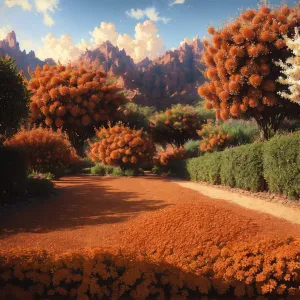
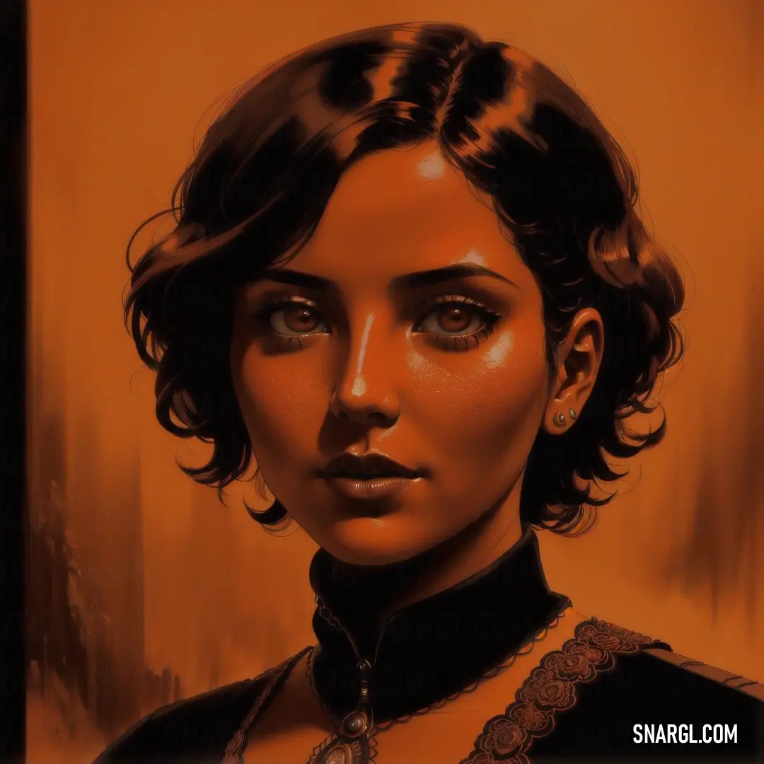
Example of the palette with the PANTONE 7580 color

Picture with primary colors of Black, Saddle brown, Light brown, Rust and Onyx
Top 5 color shades of the illustration. Arranged in descending order of frequency of occurrence (first - more often, last - more rare).
See these colors in NCS, PANTONE, RAL palettes...
Author:
Funny stories about the 'PANTONE 7580'

Manolo Moon, Julio Sweetheart, and the PANTONE 7580 Print Revolution

In a far away place, in the picturesque seaside town of Marlin Bay, where the salty sea breeze mixed with the scent of freshly printed paper, a captivating and unexpected story was unfolding. The protagonists of this tale were Manolo Moon, a rugged fisherman with a passion for the art of polygraphy, and Julio Sweetheart, a factory worker known for his meticulous attention to detail. Their journey began when they stumbled upon a color that would change the world of printing forever - PANTONE 7580.

Manolo Moon was more than just a fisherman; he was a local legend with a secret hobby. When he wasn't out at sea, he could often be found tinkering with his old printing press in a corner of his cozy workshop. One stormy evening, as the waves crashed against the shore, Manolo discovered an ancient box tucked away beneath a pile of nautical charts. Inside was a collection of color samples, including a swatch of PANTONE 7580 - a deep, earthy green with a rich, almost mystical quality.

Manolo's eyes widened as he admired the swatch. "This color," he mused, "is like the heart of the forest meeting the soul of the sea. It's something special." Enthralled by its beauty, he decided to experiment with it, believing that it could bring something extraordinary to the world of printing.

The following day, Manolo sought out Julio Sweetheart at the local print factory. Julio was known for his precise work and innovative ideas in the field of polygraphy. When Manolo showed him the PANTONE 7580 swatch, Julio's interest was piqued. "This color is remarkable," Julio said, examining the hue closely. "I've never seen anything like it. What if we use it to create something truly groundbreaking?"

Manolo and Julio decided to collaborate on a project that would showcase the unique qualities of PANTONE 7580 in a new and stunning way. They envisioned a series of print designs that would capture the essence of the color and push the boundaries of traditional polygraphy.

Their first innovation was the "Mystic Green Collection," a series of prints that featured PANTONE 7580 in various applications. They created intricate, nature-inspired patterns that evoked the feeling of wandering through an enchanted forest. The prints ranged from lush, leafy designs to abstract, swirling patterns that seemed to come alive with the depth of PANTONE 7580.

One of their most notable creations was the "Ocean's Embrace" print series, which used the color to depict scenes of underwater exploration. The prints featured mesmerizing depictions of coral reefs, sea creatures, and sunken treasures, all rendered in rich, evocative shades of PANTONE 7580. The result was a collection that felt both serene and dynamic, capturing the magic of the ocean in a way that had never been seen before.

As the Mystic Green Collection and Ocean's Embrace series gained attention, Manolo and Julio received an invitation to showcase their work at a prestigious design expo in the city. The expo was filled with designers, artists, and printmakers from around the world, all eager to see the latest innovations in their field.

When the expo opened, Manolo and Julio's booth quickly became the center of attention. Visitors marveled at the depth and vibrancy of PANTONE 7580, captivated by the way it transformed their prints into immersive experiences. The Mystic Green Collection drew viewers into its lush, magical world, while the Ocean's Embrace series evoked a sense of wonder and exploration.

One particularly memorable moment occurred when a renowned designer, after seeing the prints, exclaimed, "PANTONE 7580 is like the color of dreams! It's as if you've captured the very essence of nature and the ocean in a single hue." The designer's enthusiastic endorsement sparked a flurry of interest, and soon, PANTONE 7580 was the talk of the expo.

The success of their work marked the beginning of a new era in polygraphy. PANTONE 7580 became synonymous with creativity and innovation, and Manolo and Julio were celebrated as pioneers in the field. Their collaboration demonstrated that even the most unexpected colors could inspire groundbreaking designs and transform traditional practices.

In the end, Manolo Moon and Julio Sweetheart's venture into the world of PANTONE 7580 showcased the power of imagination and teamwork. Their story became a testament to how a single color could ignite a revolution in design, turning an obscure shade into a symbol of artistic brilliance and ingenuity. The rich, earthy hue of PANTONE 7580 continued to shine brightly, reminding everyone that the magic of creativity often begins with the most unexpected discoveries.
Author:

Continue browsing posts in category "PANTONE"
You may find these posts interesting:
PANTONE 194 Color
7
1
2
14
0
PANTONE 194 Color
PANTONE 575 Color
5
0
2
10
0
PANTONE 575 Color
PANTONE 101 Color
2
0
2
7
1
PANTONE 101 Color
PANTONE 189 Color
10
0
2
12
0
PANTONE 189 Color
PANTONE 210 Color
5
0
2
9
0
PANTONE 210 Color
PANTONE 2013 Color
4
0
3
7
0
PANTONE 2013 Color
PANTONE 2166 Color
2
0
2
6
0
PANTONE 2166 Color
PANTONE 100 Color
3
0
2
5
0
PANTONE 100 Color
Home
Terms of Service
Contact Us

© 2023 Snargl.com