Home Colors PANTONE
PANTONE 7521

PANTONE 7521

Parameters:
HEX Triplet:
#C7A38E
RGB:
199, 163, 142
CMYK:
6, 32, 32, 12
HSL:
22°, 29%, 78%
Closest colors:
in RGB:
Khaki
in PANTONE:
PANTONE 7612
in RAL Classic:
RAL 1001
in RAL Design:
RAL 060 70 20
in RAL Effect:
RAL 780-4
What color is PANTONE 7521? The Orchard of Innovation
2024-09-08 Snargl 02:24

What color is PANTONE 7521?

Woman in a pink helmet with gold accents and a pink feathered hat on her head and shoulders. Example of PANTONE 7521 color.
Brown sports car driving down a race track in the dark night time with a city in the background. Color RGB 199,163,142.
Woman in a bikini top and pants standing in front of a building with a large dome in the background. Color #C7A38E.
Woman with a cowboy hat and a jacket on is looking at the camera with a serious look on her face. Color RGB 199,163,142.
PANTONE 7521 color example: Painting of flowers in a rocky area with a mountain in the background
Woman in a short and shirt dress posing for a picture with a black background. Color #C7A38E.
Desert with several white balls in the middle of it and a mountain in the background. Color RGB 199,163,142.
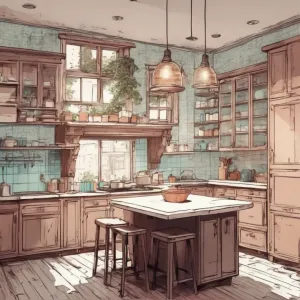
PANTONE 7521 color. Kitchen with a lot of counter space and a window in the corner of the room with a view of the snow outside
River running through a lush green forest filled with trees and flowers next to a mountain range with a pink sky
Man with a mohawk and a blue shirt on, with a futuristic background. Example of RGB 199,163,142 color.
Snowy landscape with a sun shining through a cave entrance and a snowy mountain landscape with rocks and snow. Example of #C7A38E color.
PANTONE 7521 has different variations depending on the type of material and printing process.
PANTONE 7521 C is for coated paper, PANTONE 7521 U is for uncoated paper, PANTONE 7521 UP is for uncoated paper with optical brighteners, and PANTONE 7521 XGC is for extended gamut printing.

PANTONE 7521 is a warm and muted shade of pinkish-brown that can evoke feelings of comfort, elegance and sophistication.
It can be used to create harmonious color palettes with other shades of brown, beige, cream, peach, coral or rose.
PANTONE 7521 can also contrast well with colors like blue, green, purple or gray.
The HEX code of PANTONE 7521 is #C7A38E, and the RGB values are 199, 163, 142.
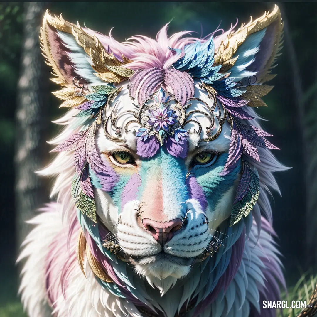
Example of the palette with the PANTONE 7521 color

Picture with primary colors of Purple taupe, Pale mauve, Dark cerulean, Almond and Slate gray
Top 5 color shades of the illustration. Arranged in descending order of frequency of occurrence (first - more often, last - more rare).
See these colors in NCS, PANTONE, RAL palettes...
RAL Classic
RAL 7024
RAL 7032
RAL 5010
RAL 1013
RAL 5014
RAL Design
RAL 340 30 05
RAL 040 70 10
RAL 260 30 35
RAL 080 90 10
RAL 270 50 10
RAL Effect
RAL 330-6
RAL 340-1
RAL 640-M
RAL 120-5
RAL 610-2
Author:
Funny stories about the 'PANTONE 7521'

The Orchard of Innovation

Far-far away, in the serene countryside of Verdant Valley, where rolling fields met a sky of endless blue, Iona Gold, a farmer with an innovative spirit, was known for her unparalleled apple orchards. Her farm, brimming with diverse apple varieties, was a local treasure. Recently, Iona had developed an interest in the world of design, spurred by her desire to create something extraordinary with her apple harvests.

One crisp autumn morning, Iona met with Vivienne White, an esteemed engineer renowned for her expertise in sustainable design and her knack for turning the ordinary into the extraordinary. Vivienne was intrigued by the idea of integrating agricultural elements into design and was eager to explore new possibilities.

"Iona!" Vivienne greeted with enthusiasm, "I’ve been looking forward to discussing your idea. What’s the latest?"

Iona, holding a vibrant swatch of PANTONE 7521, a deep, rich red reminiscent of ripe apples, beamed. "Vivienne, I want to explore how we can use this color in innovative ways. I believe PANTONE 7521, with its earthy and bold tone, can be transformative."

Vivienne’s eyes sparkled with curiosity. "I’m excited to see where this leads. What do you have in mind?"

Together, they decided to integrate PANTONE 7521 into a series of design projects that celebrated both nature and innovation. Their goal was to create something that was not only visually striking but also environmentally conscious.

Their first project was a series of eco-friendly, apple-themed home decor items. They used PANTONE 7521 to dye organic cotton fabrics, creating a collection of tablecloths, cushions, and curtains. The deep red hue, evocative of fresh apples, added a touch of warmth and sophistication to the home. Each piece was designed with intricate patterns inspired by apple blossoms and orchard scenes, blending nature with artistry.

Next, they ventured into creating sustainable packaging solutions for local farmers. They developed biodegradable containers for apple products, such as juices and jams, using PANTONE 7521 as the primary color. The packaging featured beautiful, nature-inspired designs that celebrated the apple harvest, while the color provided a vibrant and appealing aesthetic that stood out on store shelves.

Their final project was a community garden initiative. Iona and Vivienne designed a series of interactive garden installations where PANTONE 7521 was used to create striking garden pathways, planters, and trellises. The bold red color contrasted beautifully with the greenery of the plants, creating an inviting and visually stimulating environment. The installations were not only functional but also served as educational tools, teaching visitors about sustainable gardening practices and the importance of local agriculture.

The grand reveal of their projects took place at a local community fair. The eco-friendly home decor, innovative packaging solutions, and vibrant garden installations were showcased in a beautifully arranged exhibition. The visitors were captivated by the imaginative use of PANTONE 7521, appreciating how the color had been thoughtfully integrated into various aspects of design while promoting sustainability.

The Orchard of Innovation was celebrated as a groundbreaking success. Iona’s farm and Vivienne’s engineering expertise had combined to transform PANTONE 7521 into a symbol of creativity and environmental stewardship. Their projects demonstrated that with a bit of vision and collaboration, even the simplest color could be used to inspire and innovate in meaningful ways.

As they looked back on their achievements, Iona and Vivienne shared a moment of satisfaction. Their story proved that the true power of design lay in its ability to blend beauty with purpose, and that with the right blend of creativity and practicality, even the most unexpected colors could spark revolutionary ideas. The Orchard of Innovation had turned PANTONE 7521 into a beacon of transformative design, celebrating the harmony between nature and innovation.
Author:

Continue browsing posts in category "PANTONE"
You may find these posts interesting:
PANTONE 101 Color
2
0
2
7
1
PANTONE 101 Color
PANTONE 400 Color
2
0
2
9
0
PANTONE 400 Color
PANTONE 210 Color
5
0
2
9
0
PANTONE 210 Color
PANTONE 194 Color
7
1
2
14
0
PANTONE 194 Color
PANTONE 7620 Color
2
0
1
8
0
PANTONE 7620 Color
PANTONE 102 Color
4
0
2
7
2
PANTONE 102 Color
PANTONE 2062 Color
2
1
2
14
0
PANTONE 2062 Color
PANTONE 2200 Color
3
2
2
6
0
PANTONE 2200 Color
Home
Terms of Service
Contact Us

© 2023 Snargl.com