Home Arts Colors PANTONE
PANTONE 7506

PANTONE 7506

Parameters:
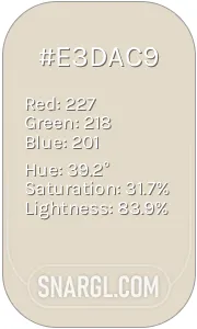
HEX Triplet:
#F2DBB3
RGB:
242, 219, 179
CMYK:
0, 7, 25, 1
HSL:
38°, 26%, 95%
Closest colors:
in RGB:
Wheat
in PANTONE:
PANTONE 7500
in RAL Classic:
RAL 1015
in RAL Design:
RAL 080 90 20
in RAL Effect:
RAL 310-1
Articles:
What color is PANTONE 7506? What are the examples of PANTONE 7506 color? What colors go well with the PANTONE 7506 color? What color is Viva Magenta? What color is PMS 7506? What color is 7506 PMS? The Beige Conundrum
2025-03-13 Snargl 14:54
# General # Fashion # Design

What color is PANTONE 7506?

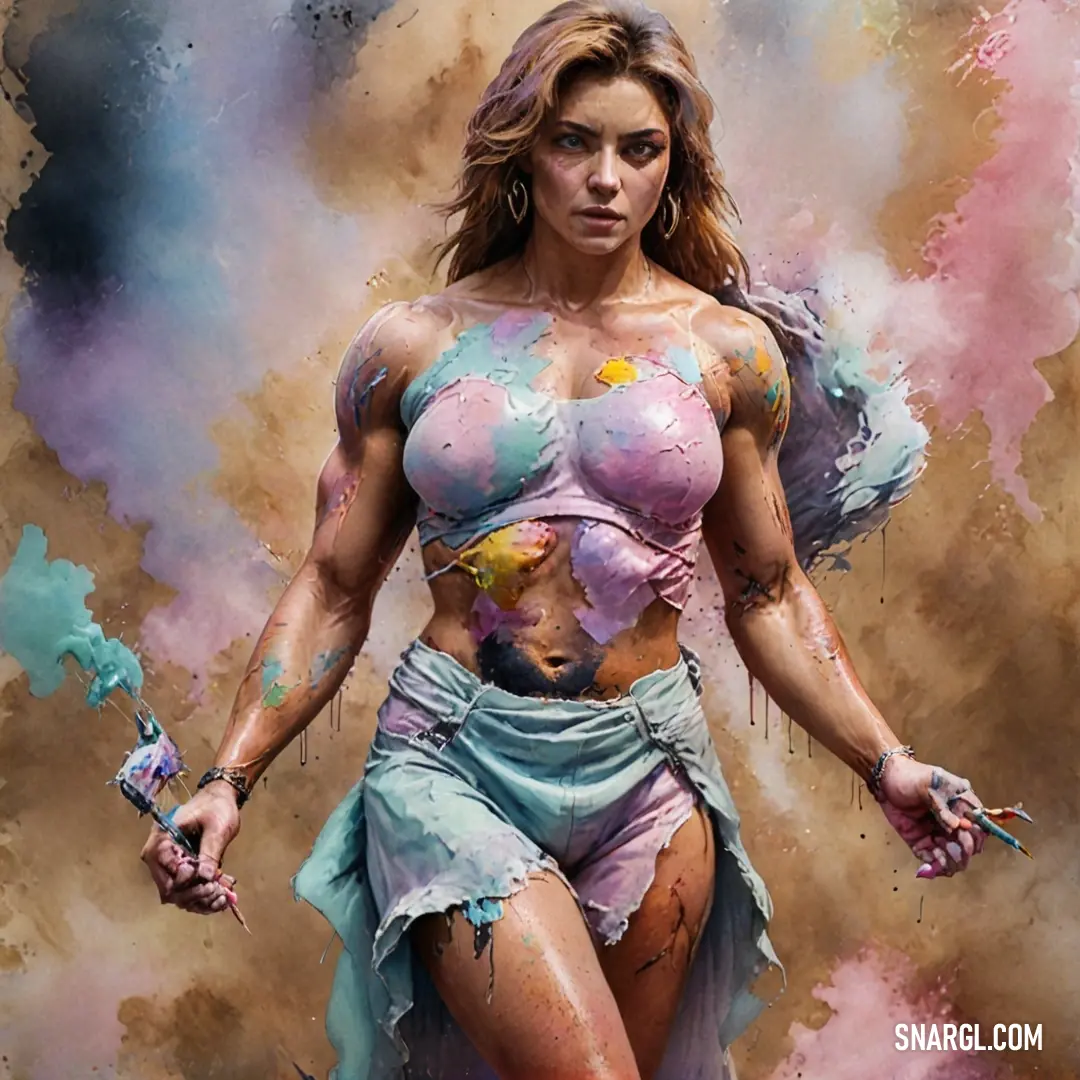
A captivating painting depicts a woman adorned in vibrant colors, her body covered in paint while striking a confident pose, evoking a celebration of creativity and self-expression.
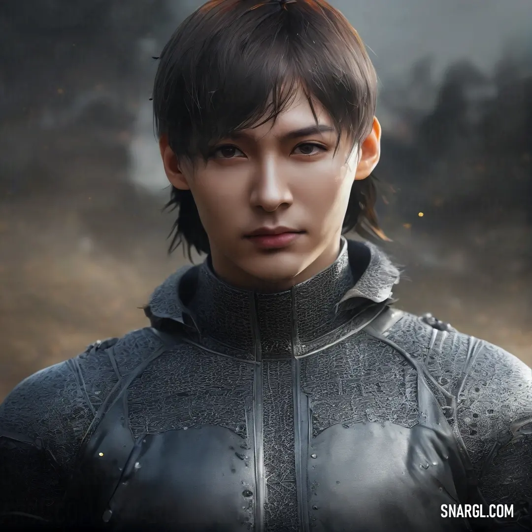
A striking man with a mohawk, clad in a leather jacket, stands amidst an enchanting fantasy landscape, surrounded by swirling smoke and ancient trees, evoking mystery and adventure.
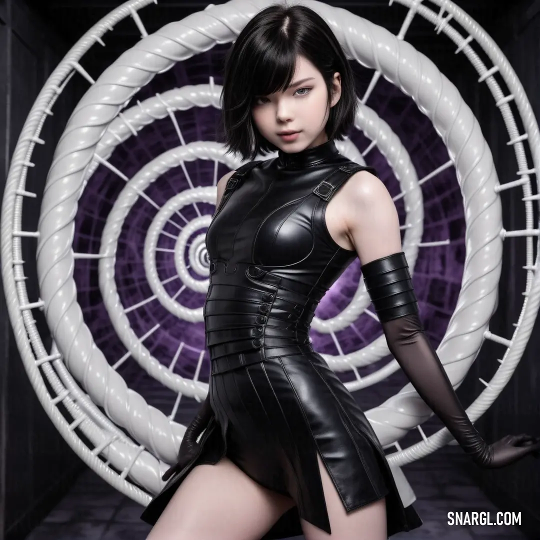
A confident woman in a black leather outfit poses strikingly in front of a circular object, set against a backdrop of mesmerizing purple, infusing the scene with energy and fashion-forward style.
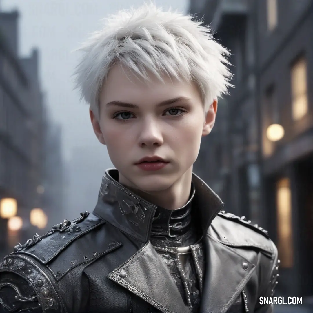
A woman with striking white hair and a stylish leather jacket stands illuminated by warm street lights, her cool demeanor perfectly enhancing the vibrant atmosphere of a bustling city night.
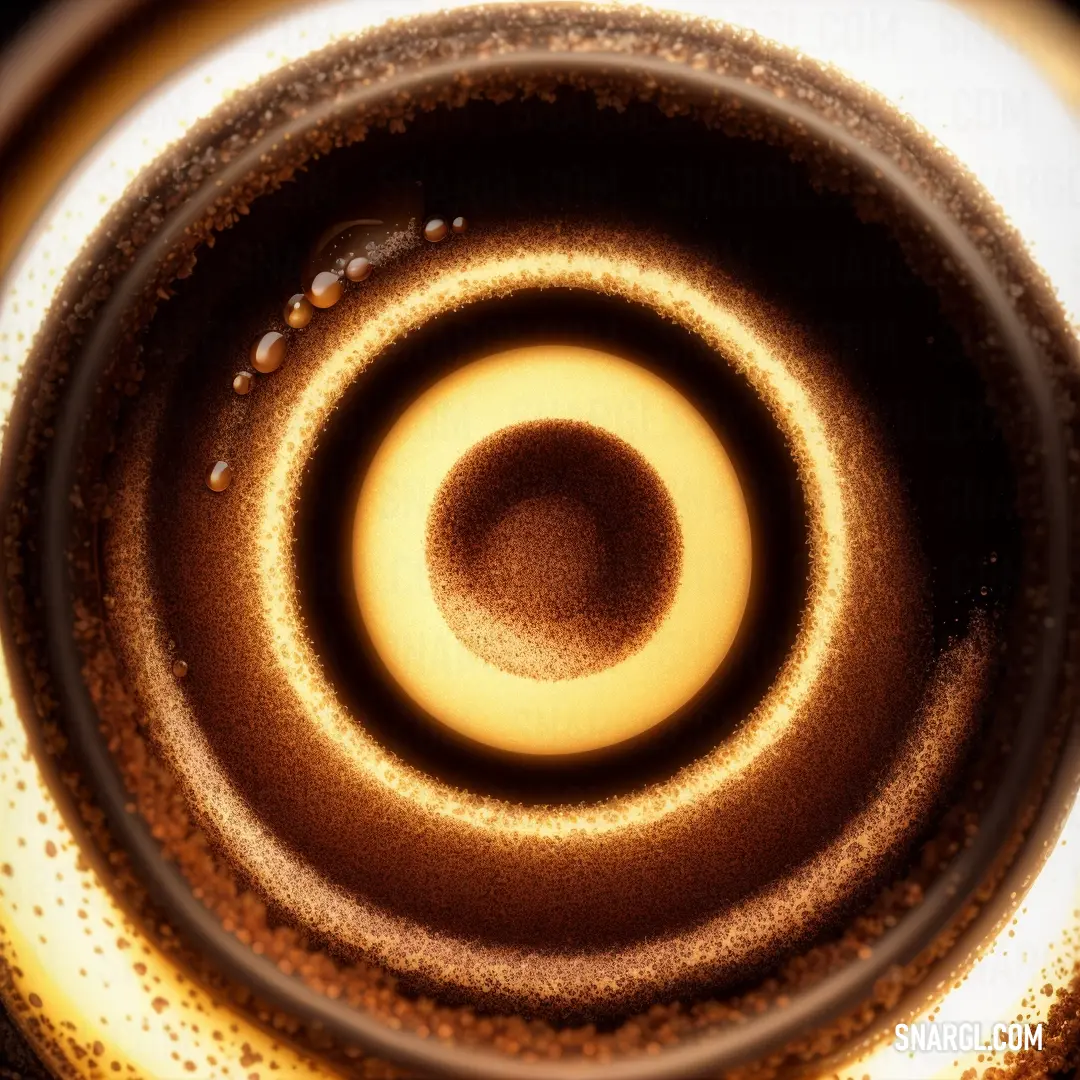
A close-up of a delicate object with intricate circular patterns on its surface. The dark background creates a striking contrast, bringing out the detailed design in shades of brown and white, with a soft golden hue.
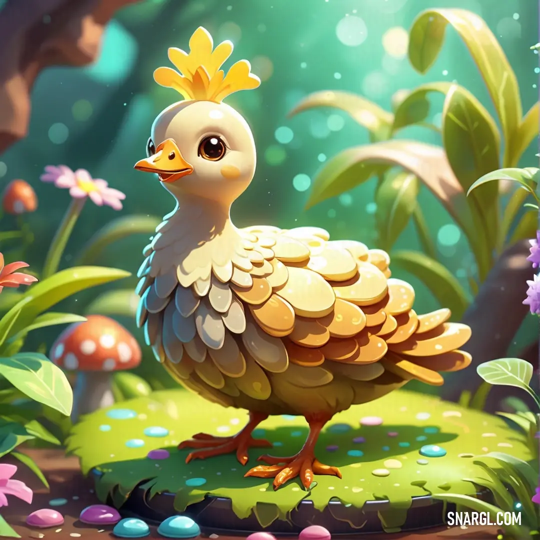
A cheerful cartoon chicken stands in a vibrant garden, surrounded by flowers and mushrooms, its feathers echoing the soft warmth of the RGB 242,219,179 color.
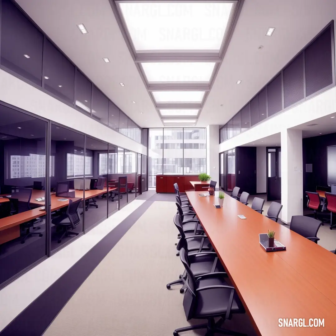
A spacious conference room filled with sunlight, featuring a long wooden table surrounded by chairs. At the center of the table, a plant in a vase adds a touch of nature to the professional setting.
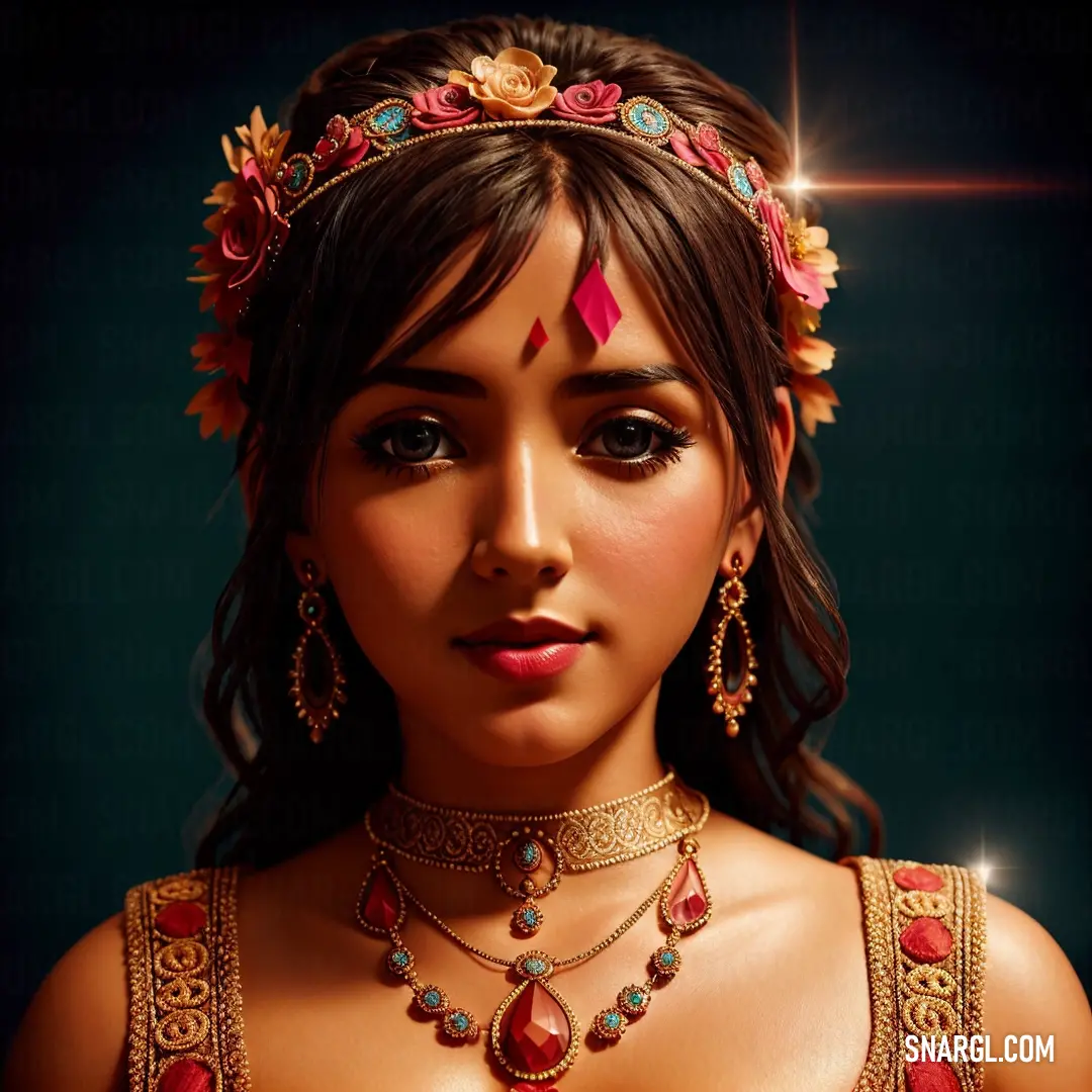
A woman adorned with a necklace and a tiara stands gracefully, a star glowing above her head. Her serene expression and elegant attire radiate a sense of celestial beauty.
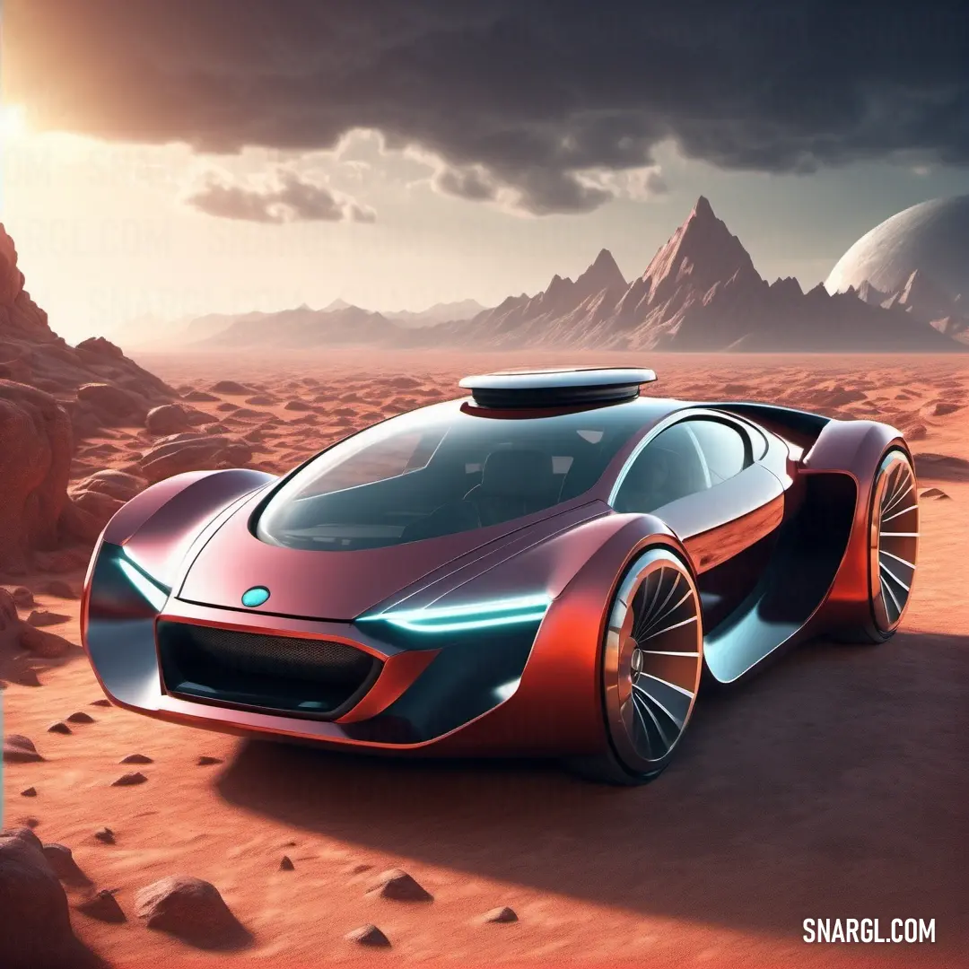
A sleek, futuristic car races across a vast desert, leaving tracks in the sand as mountains rise in the distance. The sun reflects off its smooth, high-tech design in the desert’s golden light, creating an aura of adventure and speed.
PANTONE 7506 has the following color values in different color spaces:
  • RGB: 242, 219, 179

  • CMYK: 0, 7, 25, 1

  • HEX: #F2DBB3

It is a warm and soft color that can create a cozy and inviting atmosphere.

Some possible applications of PANTONE 7506 are:
  • Interior design: PANTONE 7506 can be used as a wall color or an accent color for furniture, curtains, pillows, etc.
    It can match well with other warm colors, such as browns, oranges, yellows, and reds, or contrast with cool colors, such as blues, greens, and purples.

  • Fashion: PANTONE 7506 can be worn as a neutral or a statement color, depending on the outfit.
    It can complement skin tones and hair colors, and pair well with denim, leather, or lace.
    This color can also be accessorized with gold or silver jewelry, or colorful scarves, hats, or bags.

  • Graphic design: PANTONE 7506 can be used as a background color or a text color for logos, flyers, posters, websites, etc.
    This color can convey a sense of warmth, elegance, and sophistication, or a touch of vintage, rustic, or retro style.
    It can also be combined with other colors to create different moods and effects.

Example of the palette with the PANTONE 7506 color
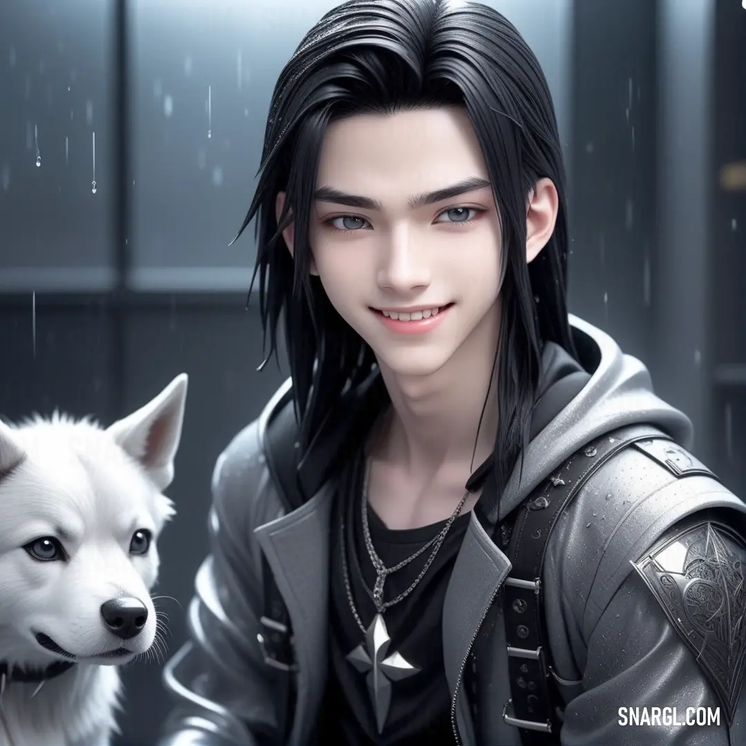
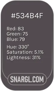
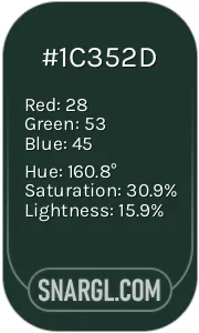
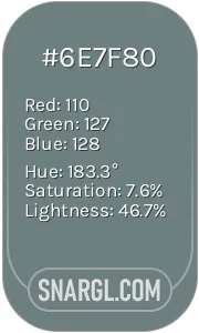
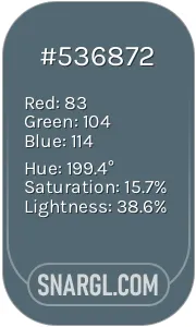
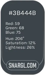
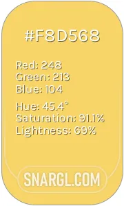
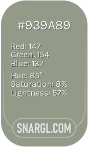
Picture with primary colors of Liver, Medium jungle green, AuroMetalSaurus, Black and Rose quartz
Top 5 color shades of the illustration.
See these colors in NCS, PANTONE, RAL palettes...

Example of the palette with the PANTONE 7506 color
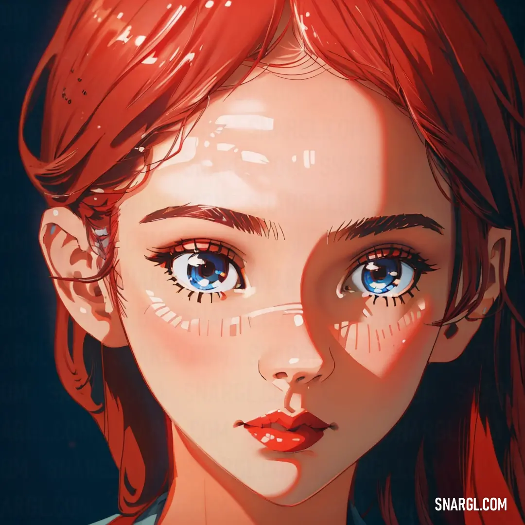
Picture with primary colors of Tumbleweed, Deep chestnut, Light apricot, Seal brown and Falu red
Top 5 color shades of the illustration.
See these colors in NCS, PANTONE, RAL palettes...

Example of the palette with the PANTONE 7506 color
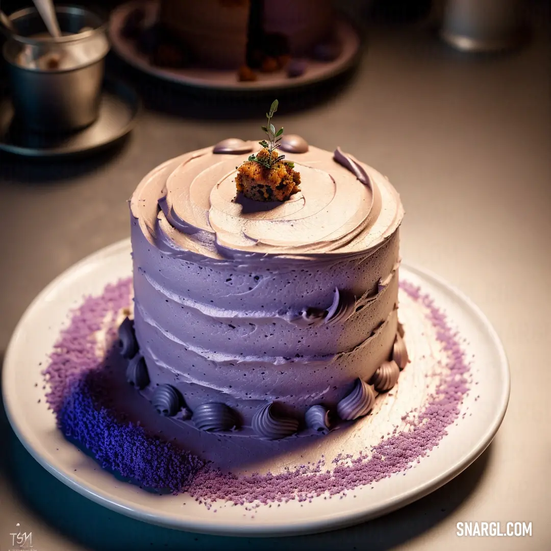
Picture with primary colors of Pale pink, Pang, Lavender purple, Onyx and Khaki
Top 5 color shades of the illustration.
See these colors in NCS, PANTONE, RAL palettes...
Author:

What are the examples of PANTONE 7506 color?

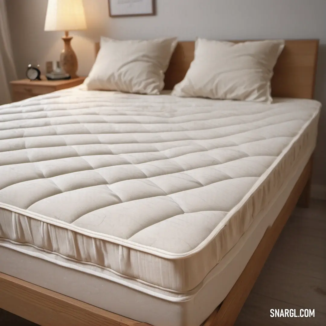
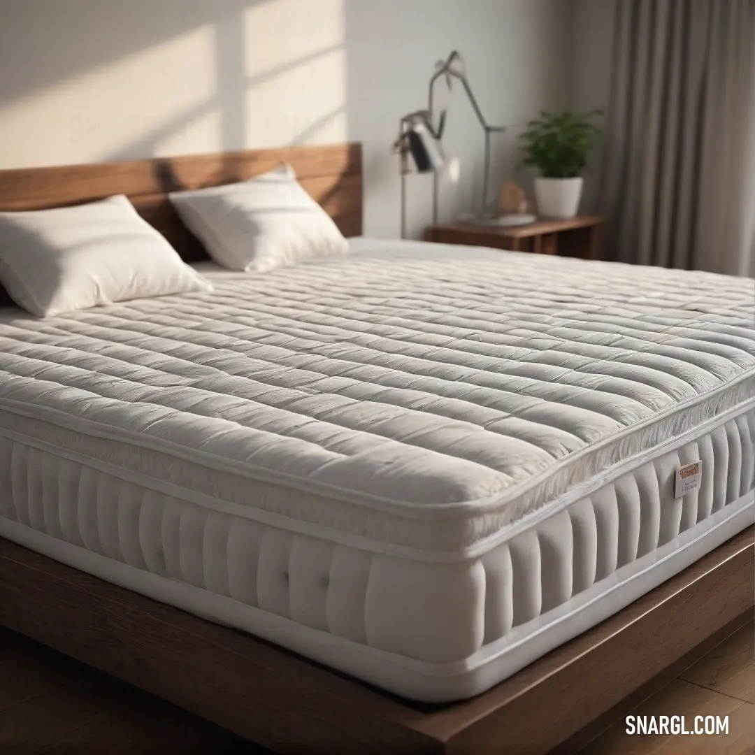
A serene bedroom scene featuring a pristine white mattress adorned with fluffy pillows, a stylish nightstand, and a cozy lamp casting a gentle light. The soft hues create a tranquil ambiance for restful nights and peaceful mornings.
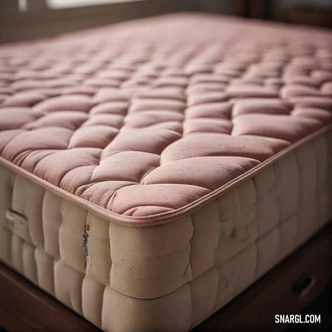
A charming display featuring a pink-covered mattress resting against a backdrop of a window, allowing warm sunlight to filter through. The rosy tones and natural light foster an uplifting ambiance perfect for relaxation and joyful reflections.
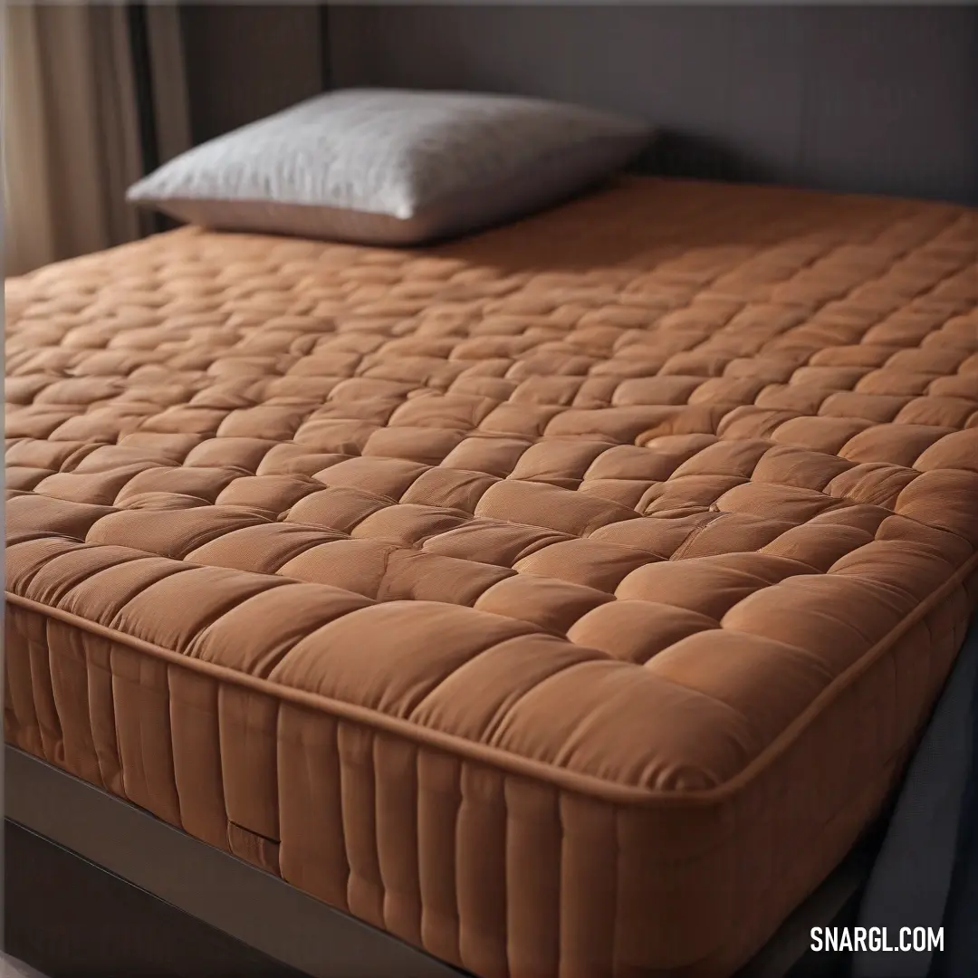
A carefully arranged bed in a cozy room featuring a brown mattress and a plush pillow, illuminated by natural light streaming through a window adorned with elegant curtains, showcasing the calming PANTONE 7506 color palette.
A stylish bedroom with a wooden platform supporting a cozy mattress, surrounded by a lively green plant in the corner, brightened by a window that brings in a refreshing ambiance, exemplifying the soothing shades of PANTONE 7506.
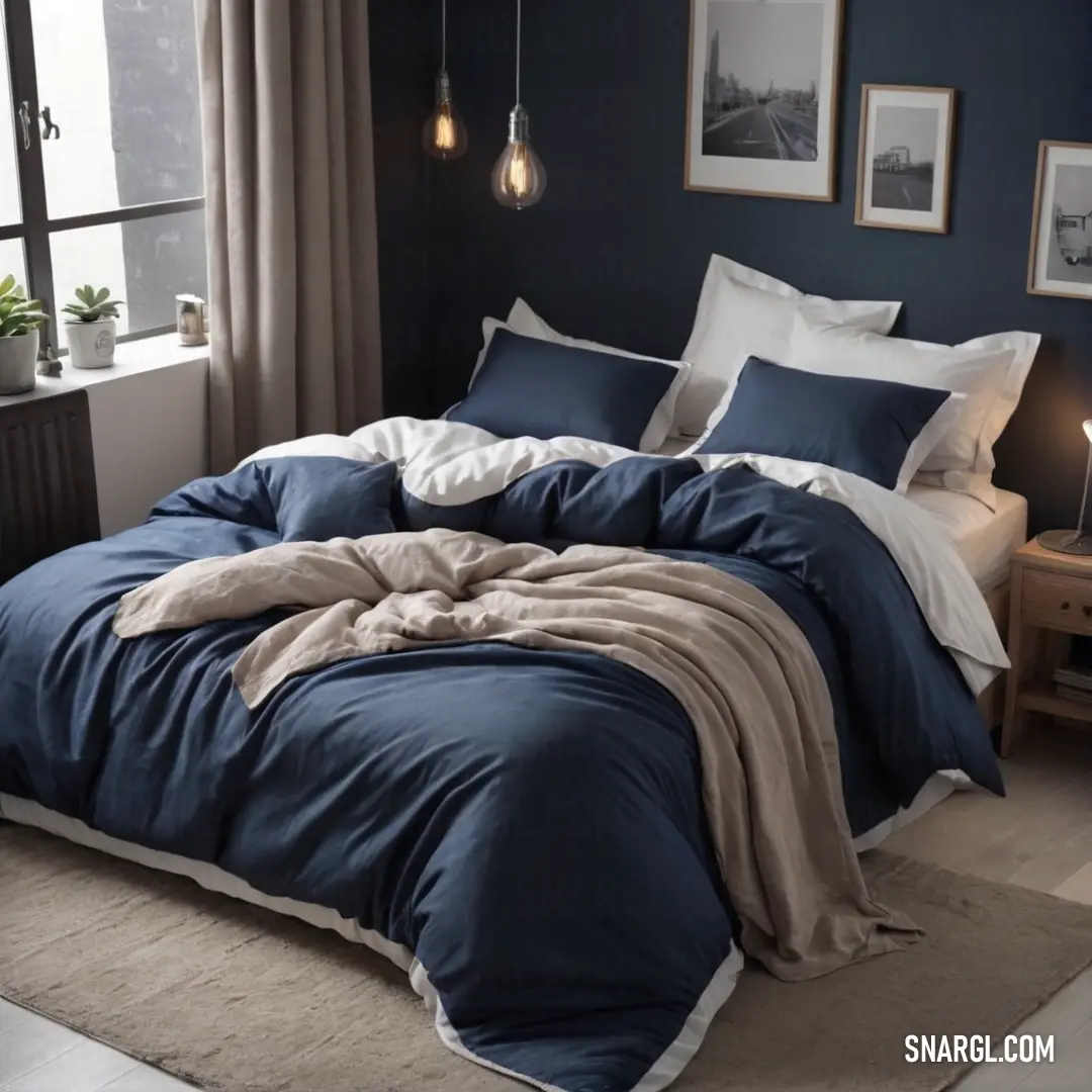
A neatly made bed dressed in a blue comforter and a crisp white blanket, set within a beautifully lit room that features a window and a tasteful table, showcasing the serene elegance of the #F2DBB3 color.
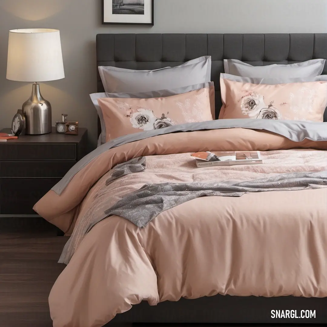
A beautifully styled bed with a soft pink comforter and gray pillowcase, underlined by an engaging picture on the wall, all harmonizing with the gentle tones exemplified by the CMYK 0,7,25,1 color spectrum.
A striking robot with luminous eyes stands boldly in a desert landscape, seamlessly blending its mechanical essence with the richness of nature, while clouds dance majestically overhead.
A quirky alien clad in a leather jacket, with vivid orange eyes and a spider embellishment, stands confidently, embodying a unique fusion of style and otherworldly charm in its atmospheric surroundings.
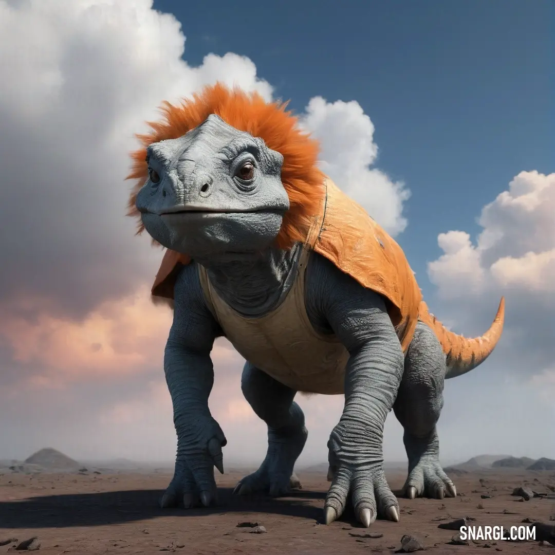
A vibrant, large dinosaur boasting an eye-catching orange mohawk confidently stands on earthy terrain, with a dramatic cloudy sky enhancing its majestic appearance. This striking creature captures the imagination of all who gaze upon it.
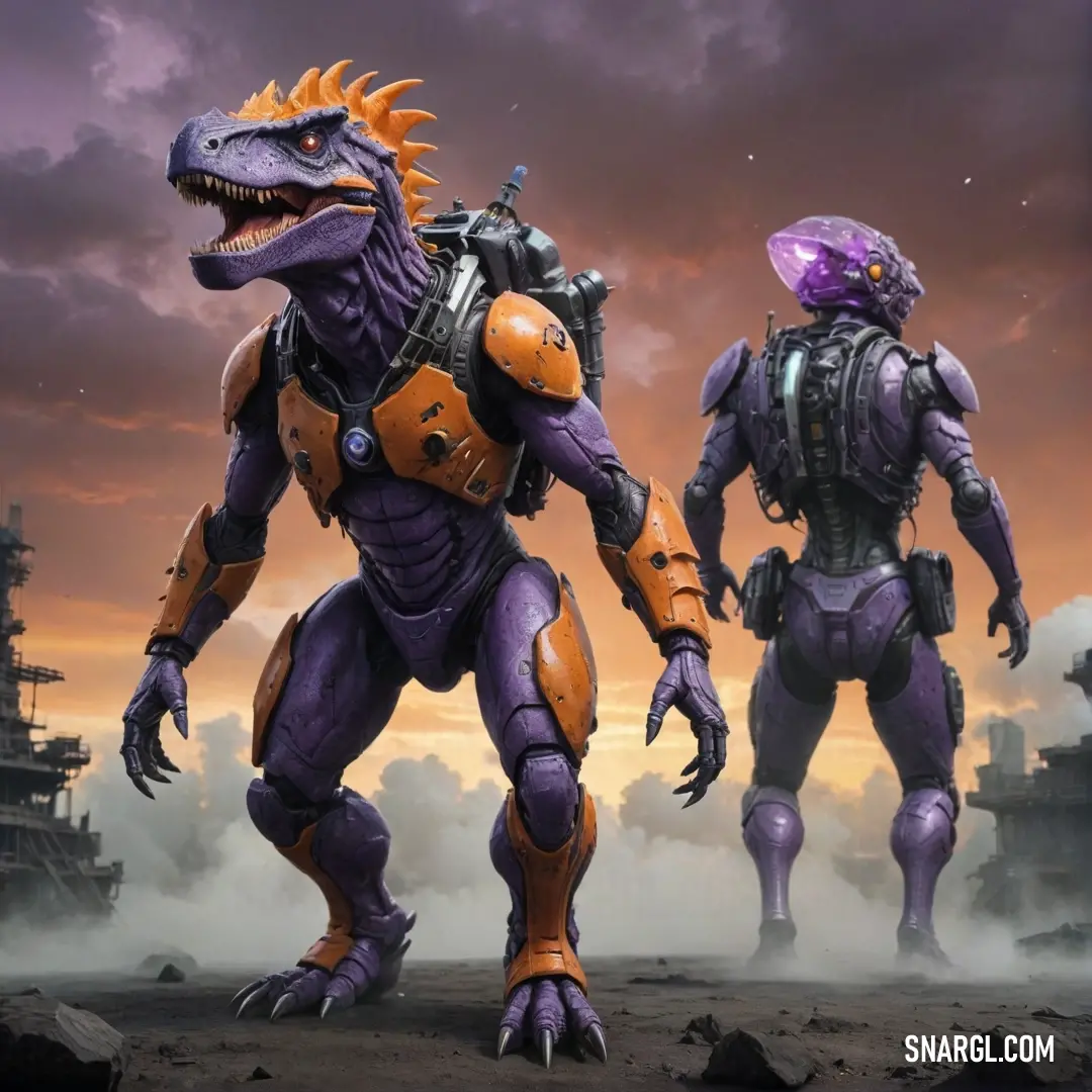
Two whimsical alien-like beings stand side by side against a surreal backdrop of purple and orange hues, while puffs of clouds drift above, creating a fantastical atmosphere that invites users to enter a world of imagination.
PANTONE 7506 is a warm, sandy beige that evokes a sense of calm and subtle elegance, making it perfect for various design applications. Commonly used in interior design, fashion, and graphic arts, it pairs beautifully with soft pastels and rich earth tones. Examples of its use include home décor items like cushions and wall paints, as well as wedding invitations that seek a romantic yet understated flair. Brands often incorporate PANTONE 7506 in packaging to convey a natural, organic feel, appealing to eco-conscious consumers. This versatile hue promotes warmth and inclusivity across aesthetic disciplines.

Example of the palette with the PANTONE 7506 color
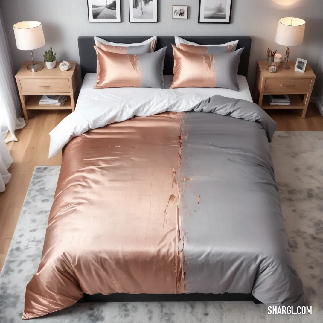
Picture with primary colors of Platinum, Chamoisee, Dark gray, Wenge and Taupe gray
Top 5 color shades of the illustration.
See these colors in NCS, PANTONE, RAL palettes...

Example of the palette with the PANTONE 7506 color
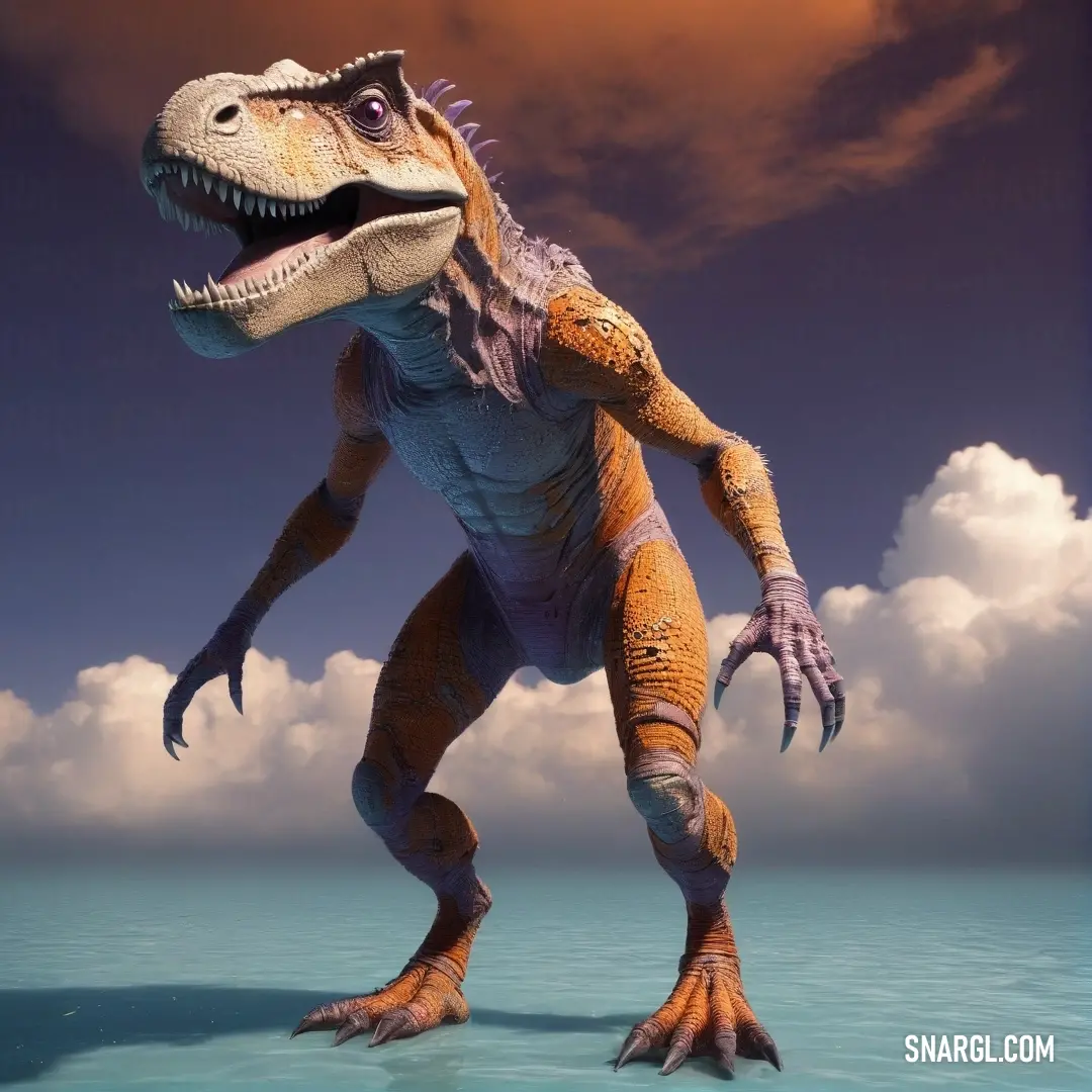
Picture with primary colors of Dark jungle green, Taupe gray, Cadet, Arsenic and Orange Yellow
Top 5 color shades of the illustration.
See these colors in NCS, PANTONE, RAL palettes...
Author:

What colors go well with the PANTONE 7506 color?

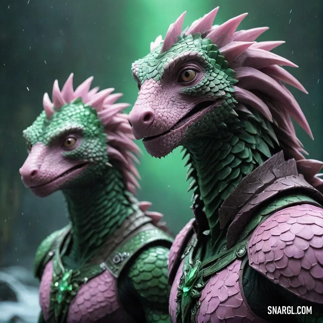
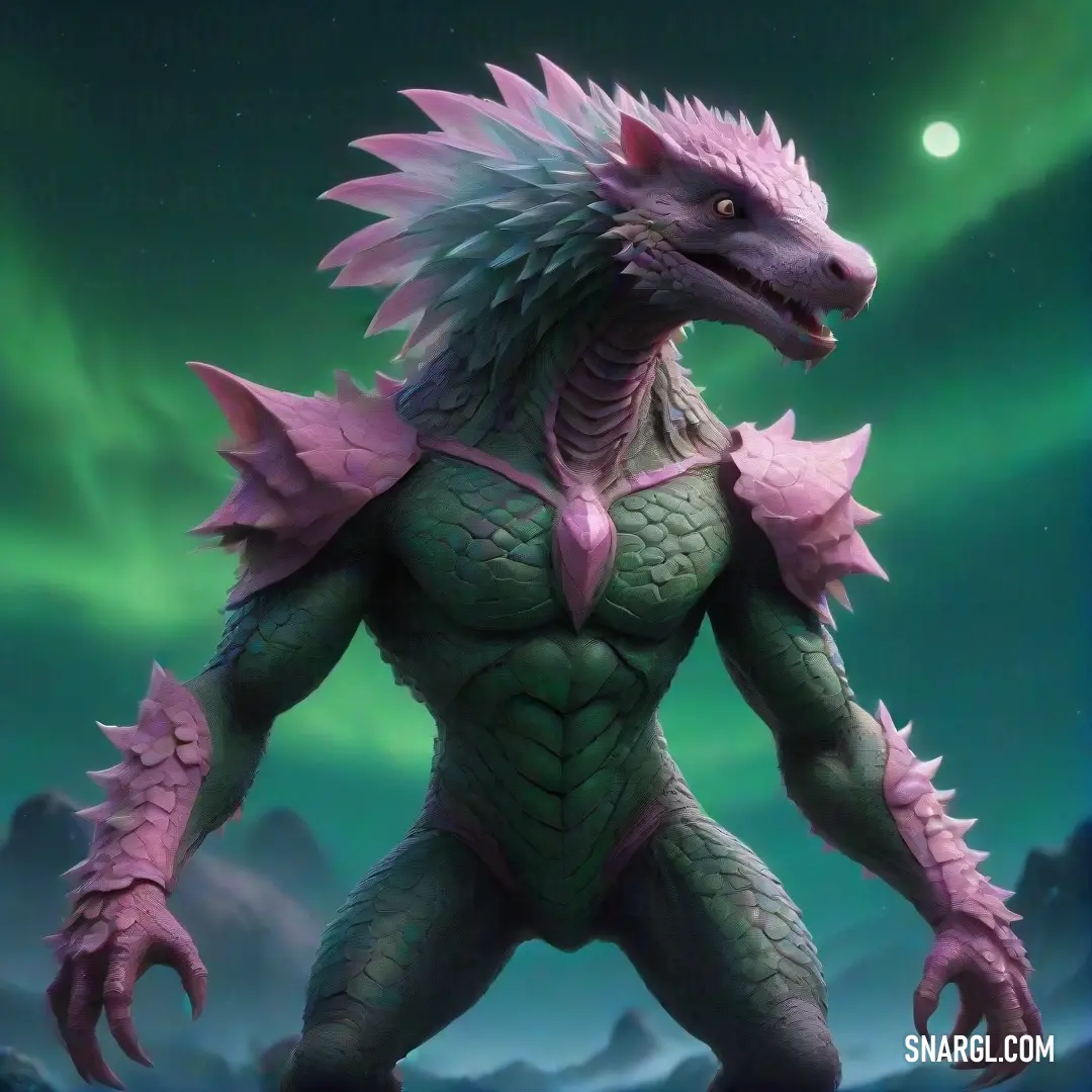
A striking scene featuring two dragon statues, one in green and the other in pink, positioned before a lush green backdrop, vibrant with the subtle tones related to CMYK 0,7,25,1, evoking a playful fantasy world.
An intriguing creature with a large, fluffy head and an equally substantial mass of hair captures attention, offering a unique perspective on the vibrant hues represented by CMYK 0,7,25,1 against a playful backdrop.
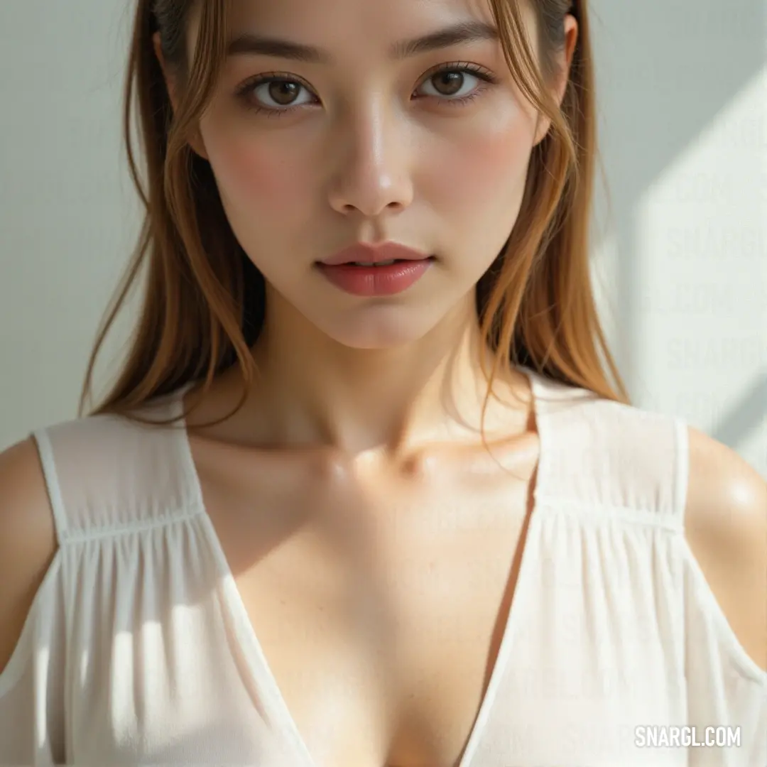
A captivating portrayal of a woman with an alluring presence, proudly donning a white background, accentuating her large features while evoking the delicate warmth of PANTONE 7506 in the atmosphere.
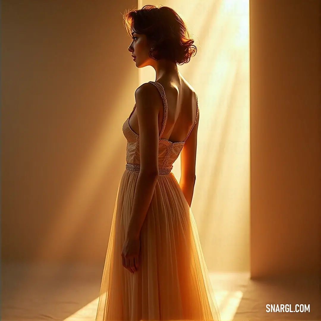
A serene image of a woman dressed elegantly in soft fabric, standing gracefully in a well-lit room, where sunlight streams through a window, showcasing the delicate RGB 242,219,179 tones.
PANTONE 7506 is a warm, sandy beige that evokes a sense of calm and serenity. To create a harmonious palette, pair it with colors like soft sage green for an earthy vibe or dusty rose for a romantic touch. Rich terracotta enhances its warmth, while muted blues provide a refreshing contrast. For a sophisticated look, combine it with classic navy or charcoal gray. Bright accents like mustard yellow or coral can add a cheerful pop, making 7506 versatile for both modern and rustic designs. Embrace these combinations to elevate any space.

Example of the palette with the PANTONE 7506 color
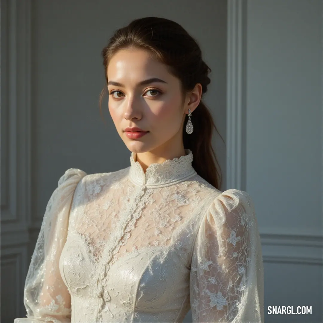
Picture with primary colors of Cadet, Bone, Gray-Tea Green, Dark lava and Smoky black
Top 5 color shades of the illustration.
See these colors in NCS, PANTONE, RAL palettes...
Author:

What color is Viva Magenta?

Delicious stack of golden pancakes drizzled with rich syrup, placed on a sleek countertop beside a vibrant blender and a refreshing glass of orange juice, creating a warm and inviting breakfast scene.
An enticing display of stacked pancakes rests atop a vibrant green blender, accompanied by a fresh strawberry on a table beside a knife. The tasty scene is accentuated by the warm RGB 242,219,179 colors, inviting breakfast enthusiasts to indulge.
A tempting stack of pancakes sizzling on a hot pan, accompanied by a beautifully arranged plate of pancakes in the background, offering a delightful glimpse into a breakfast lover's paradise.
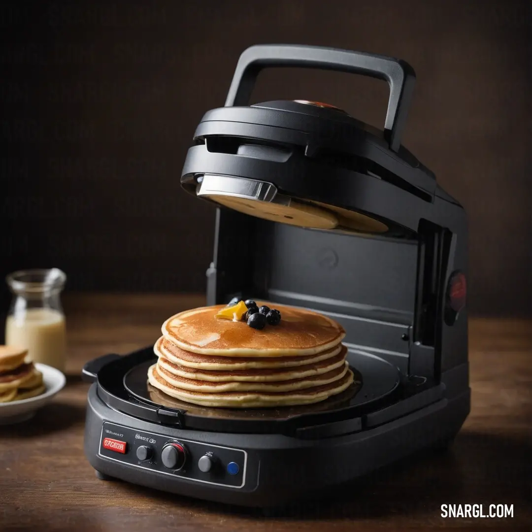
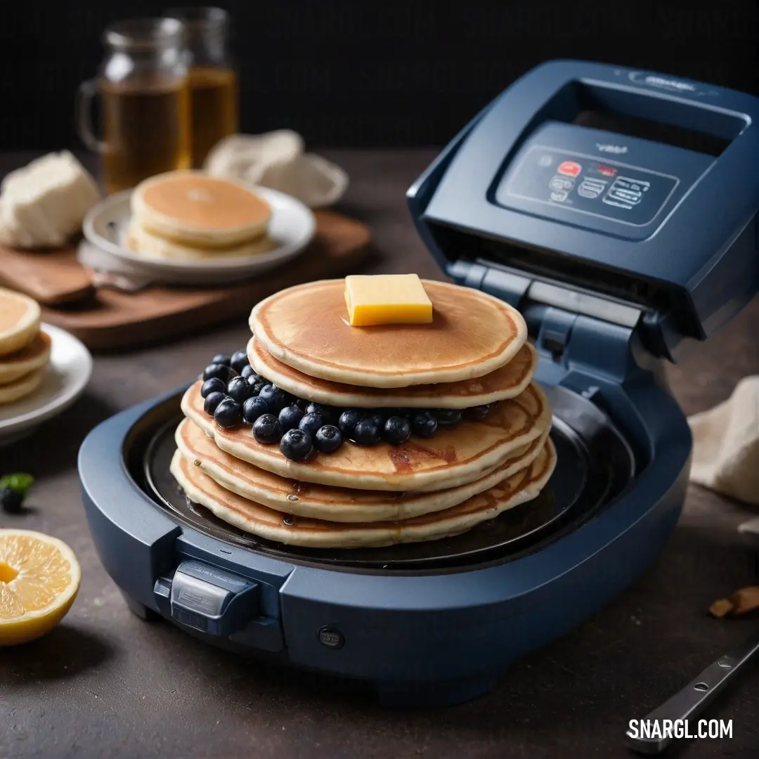
A mesmerizing feast for the eyes showing a stack of fluffy pancakes topped with fresh blueberries and a dollop of creamy butter, resting on a pancake maker that adds to the charm of breakfast preparation.
Viva Magenta, a vibrant hue officially recognized as Pantone 18-1750, is a striking blend of crimson and fuchsia, embodying boldness and vitality. Introduced as the Color of the Year for 2023, it symbolizes resilience and optimism in an ever-changing world. This dynamic color draws inspiration from nature, particularly the cochineal beetle, a historical source of crimson dye. Magenta's versatility allows it to shine in fashion, design, and art, making bold statements in various applications. Its energetic presence encourages self-expression and creativity, resonating with a broad audience.

Example of the palette with the PANTONE 7506 color
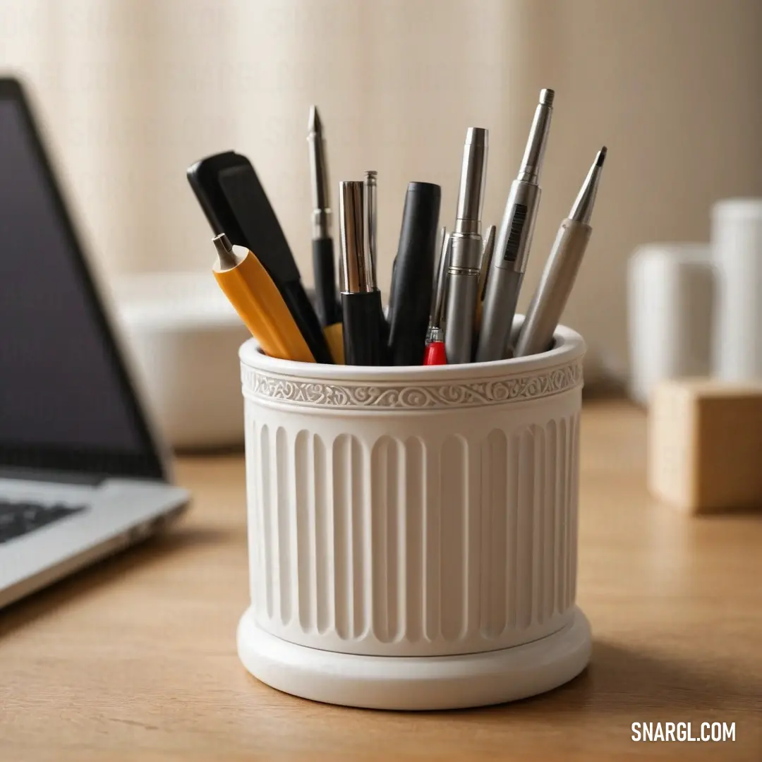
Picture with primary colors of Grullo, Pastel brown, Anti-flash White, Smoky black and Dark brown
Top 5 color shades of the illustration.
See these colors in NCS, PANTONE, RAL palettes...
Author:

What color is PMS 7506?

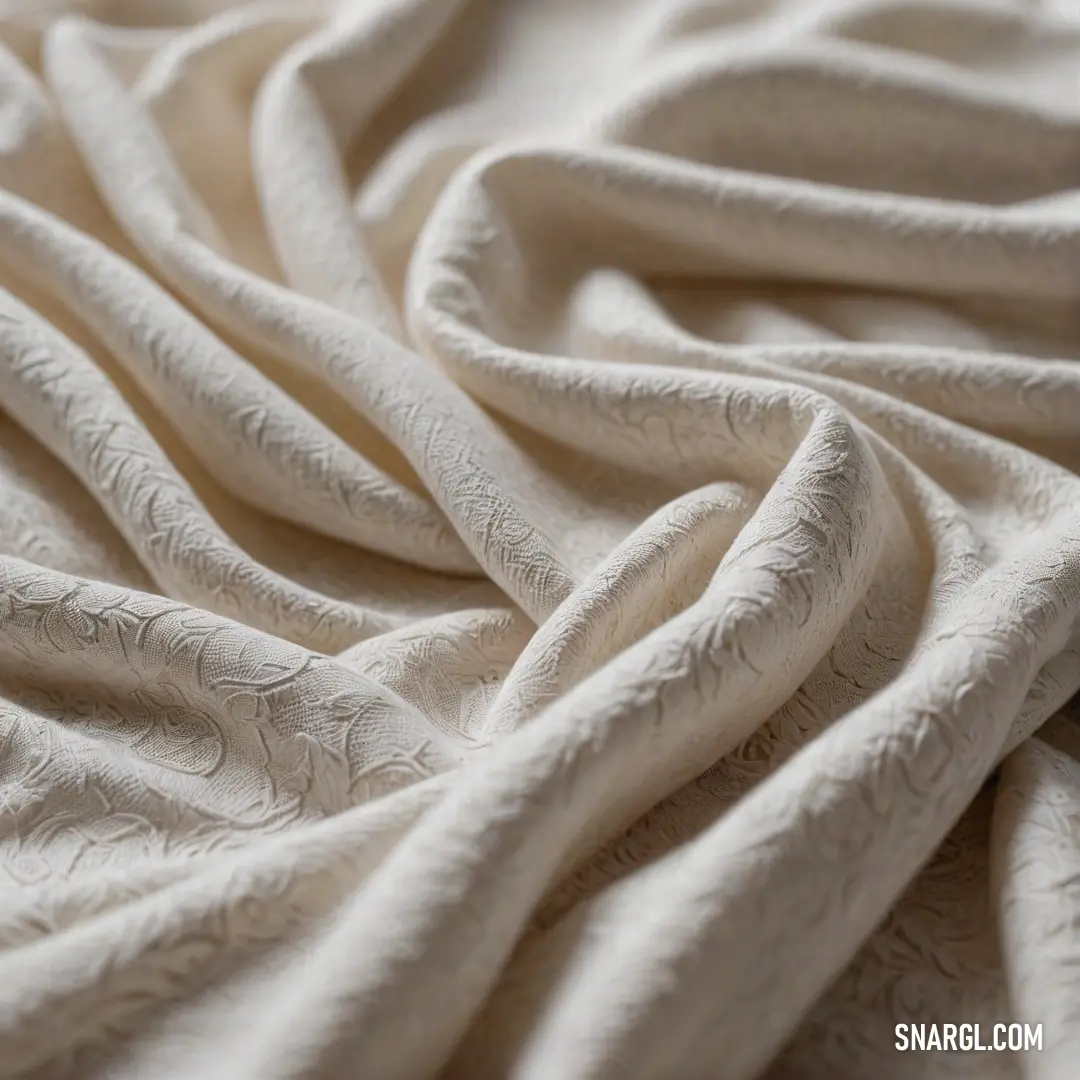
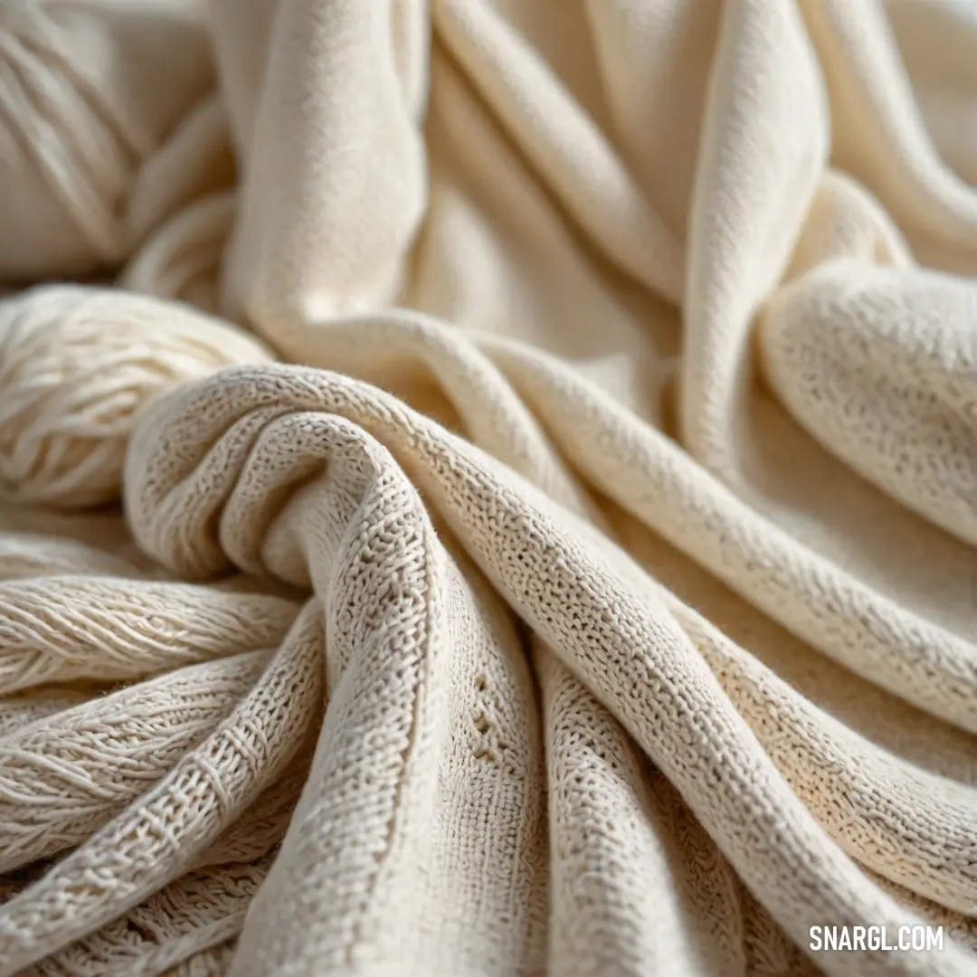
A textured white fabric featuring a gentle wavy pattern, creating an inviting and serene appearance. The fabric's delicate movement catches the light beautifully, enhancing its ethereal quality in the design, capturing attention effortlessly.
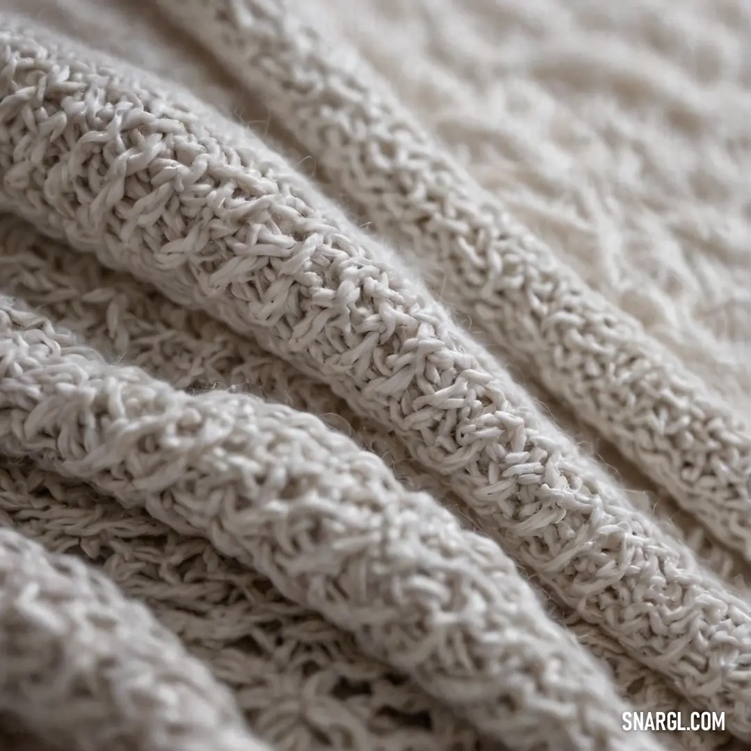
A close-up view of a soft, cozy blanket resting on a smooth white surface, showcasing its gentle textures and warm hues. This inviting piece combines a delicate blend of colors, resembling shades of creamy beige and light tan.
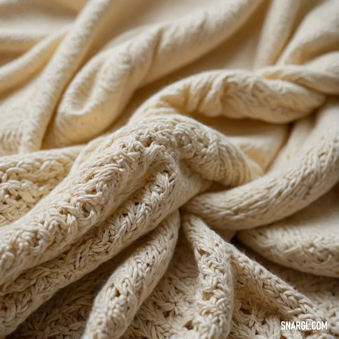
A charming blanket neatly knotted at the top, laid out on a pristine bed sheet with a bright white background. This delightful piece features a warm, neutral tone reminiscent of sandy beaches and sunny days.
A close-up depiction of a charming white blanket showcasing a unique knotted design along the edge, making it a perfect blend of coziness and artistry. The soft fabric invites touch and enhances any modern aesthetic.
PMS 7506 is a warm, earthy beige color that radiates a sense of warmth and comfort. Recognized in the Pantone Matching System, this color reflects the trend towards natural tones in design and fashion. It features a blend of soft peach undertones, giving it a versatile charm suitable for various applications, from interior design to branding. Ideal for creating a calming atmosphere, PMS 7506 pairs well with a wide range of colors, making it a popular choice in palettes focused on sustainability and organic aesthetics. Its subtle elegance has made it a favorite for modern minimalistic themes.

Example of the palette with the PANTONE 7506 color
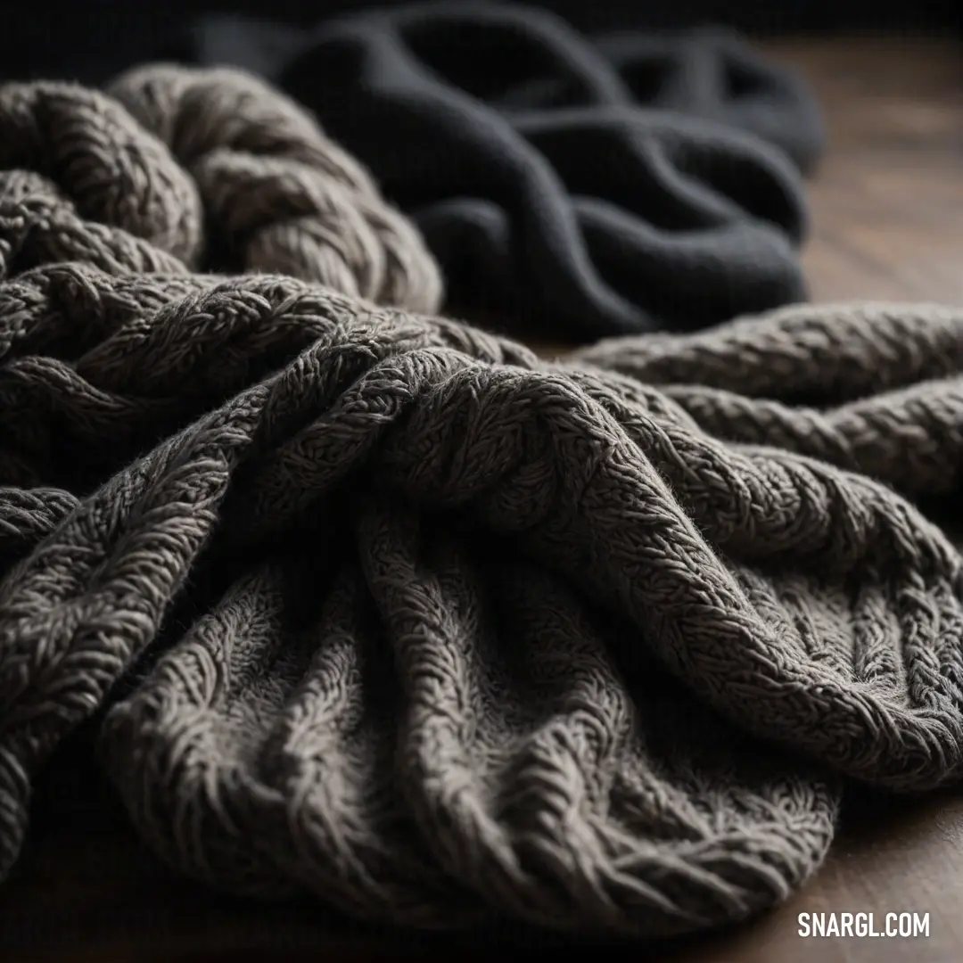
Picture with primary colors of Onyx, Bistre, Rifle green, Dark gray and Gray-Tea Green
Top 5 color shades of the illustration.
See these colors in NCS, PANTONE, RAL palettes...
Author:

What color is 7506 PMS?

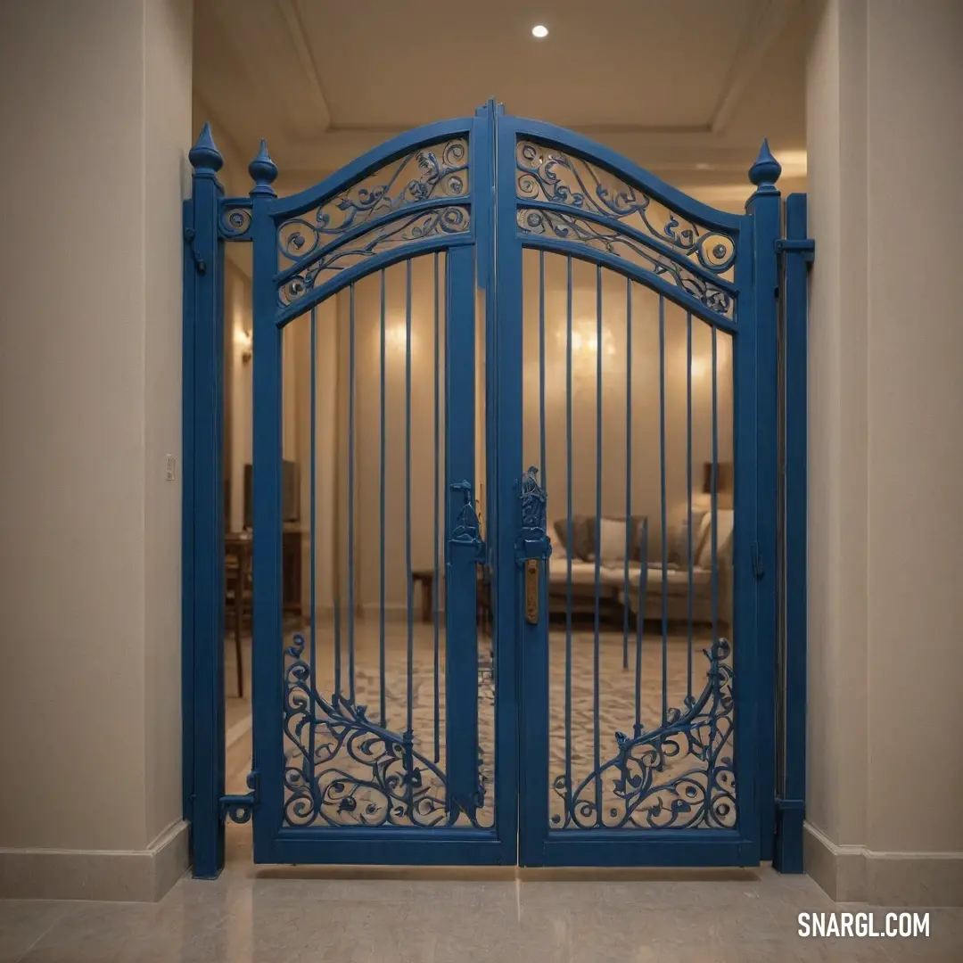
An inviting blue gate stands ajar, revealing a cozy living room scene with a plush couch partially visible in the backdrop. The overall hue reflects the serene shades of CMYK 0,7,25,1, drawing attention to comfort and warmth.
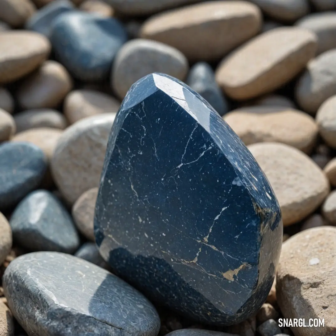
A rugged rock perched atop a pile of pebbles, each one unique in form and texture, masterfully illustrating the earthy tones of PANTONE 7506, creating a captivating focal point in nature's composition.
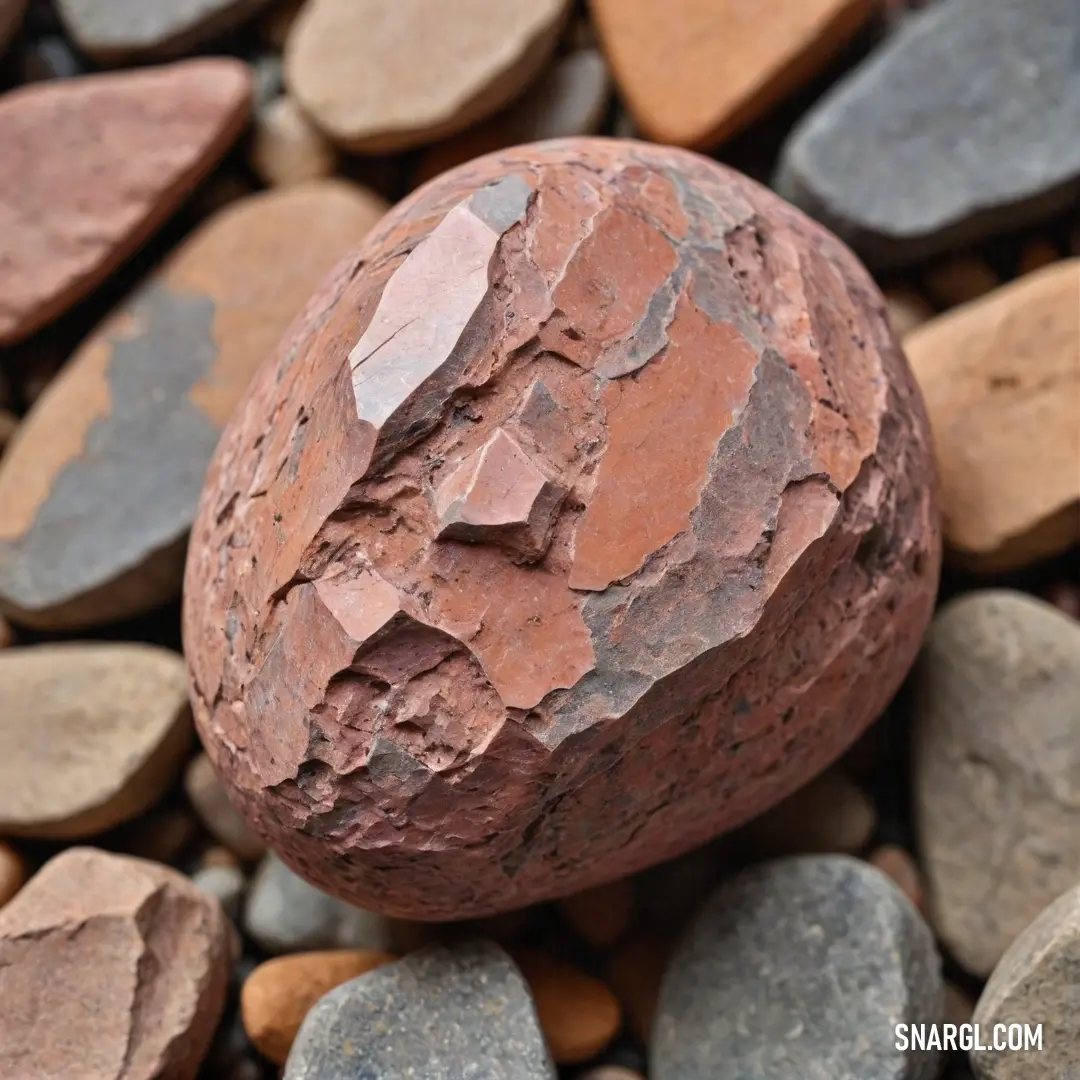
A weathered rock featuring a prominent crack sits amidst a varied collection of stones and gravel, showcasing the unique characteristics of PANTONE 7506 - an embodiment of nature's artistry and resilience.
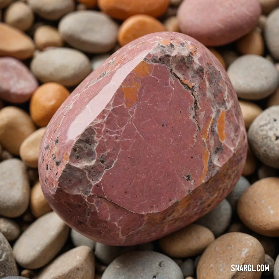
A stunning arrangement showcasing a rough rock positioned atop a pile of gravel, each element echoing the gentle shades of PANTONE 7506 and exemplifying the natural beauty found in simple formations.
7506 PMS, according to the Pantone color system, is a warm, earthy beige hue that evokes a sense of comfort and calm. This versatile shade is often used in interior design and fashion for its ability to blend seamlessly with both bold and neutral palettes. Its warmth makes it a popular choice for creating inviting spaces. In branding, 7506 PMS is thought to convey reliability and stability, appealing to consumers seeking comfort in their choices. As the trend for terracotta and warm tones rises, 7506 maintains its status as a timeless classic.

Example of the palette with the PANTONE 7506 color
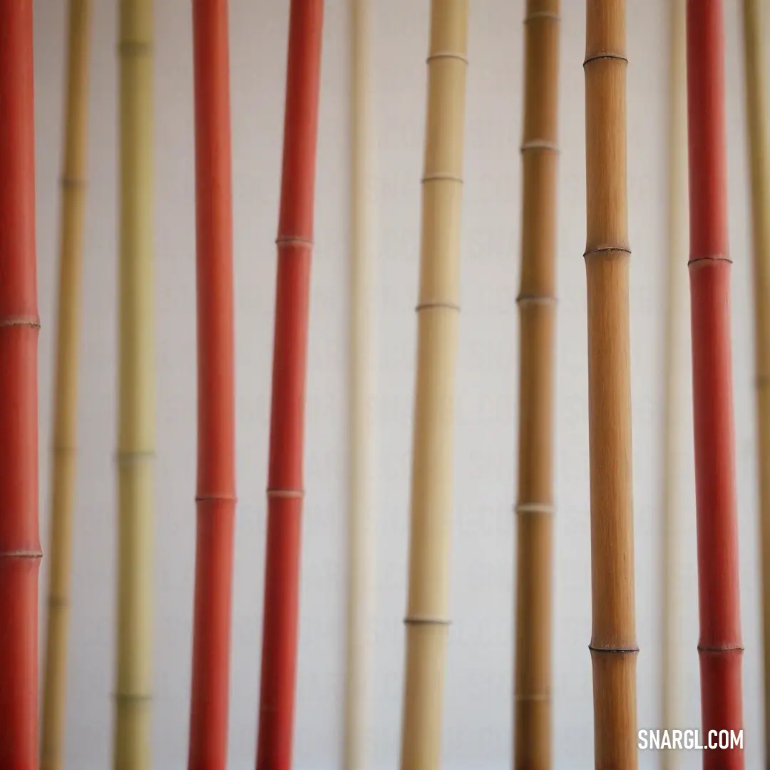
Picture with primary colors of Light gray, Golden brown, Fuzzy Wuzzy, Old rose and Cafe au lait
Top 5 color shades of the illustration.
See these colors in NCS, PANTONE, RAL palettes...
Author:
Funny stories about the 'PANTONE 7506'

The Beige Conundrum

Long time ago, far away, in the bustling metropolis of Grafitopia, Zahir Angelos was an artist renowned for his vibrant and eccentric prints. His studio was a kaleidoscope of colors and creative chaos. However, Zahir's latest artistic venture involved a color that seemed utterly dull compared to his usual palette - PANTONE 7506, a muted beige with the charm of a forgotten dust bunny.

Raphael Phoenix, an engineer with a penchant for precision and a love for quirky challenges, was an unexpected ally in this venture. Raphael's engineering projects ranged from hyper-efficient wind turbines to robotic coffee machines, but he had never ventured into the realm of color, let alone a beige one.
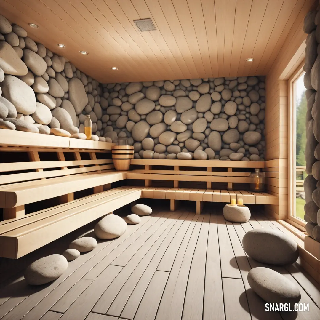
A cozy room with benches and rocky walls, where natural light spills through a window that offers a scenic view of the outdoors. The color of the surroundings mirrors the warm beige tones of PANTONE 7506.
The earthy tones of PANTONE 7506 envelop this serene space, creating a harmonious blend of rock textures, wooden benches, and a beautiful outdoor view.

One day, Zahir burst into Raphael's workshop, clutching a swatch of PANTONE 7506. "Raphael, I need your help with a new project. I'm diving into the world of typography and print design using this beige color. I think it could be revolutionary!"

Raphael raised an eyebrow, peering at the bland swatch. "Beige? Really? It looks like something that's been left out in the sun too long. What's so special about this color?"

Zahir's eyes gleamed with excitement. "That's the point! It's so understated that it could become the new frontier in typography. Imagine a font that's both classic and avant-garde, blending seamlessly with any background. It's practically a blank canvas!"

Raphael, ever the enthusiast for offbeat projects, agreed to help. He was curious about how such a mundane color could make waves in the world of design.

Their first task was to test how PANTONE 7506 interacted with various printing techniques. Raphael engineered a contraption that could print in the beige shade using different types of ink and substrates, from glossy paper to textured canvas.
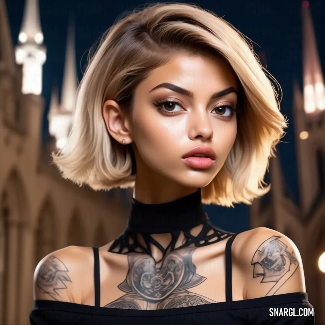
A woman in a black dress, her chest adorned with a tattoo, stands confidently in front of a majestic castle, with the warm PANTONE 7506 color enriching the scene.
The combination of PANTONE 7506’s earthy tones and the woman’s striking presence in front of the grand castle creates a captivating contrast of strength and serenity.

The duo embarked on a series of trials, each more bizarre than the last. Zahir experimented with fonts ranging from whimsical and curvy to stark and geometric. Raphael, meanwhile, designed and built a rotating printer that could layer different textures onto the beige background, creating an unexpected depth.

One particularly memorable experiment involved a giant rotating billboard that Zahir and Raphael installed in the center of Grafitopia. The billboard, entirely in PANTONE 7506, featured a series of typographic messages that changed every few hours. The messages were initially mundane, like "Welcome to Grafitopia," but gradually evolved into more peculiar phrases such as "Beige is the New Black" and "Fifty Shades of Beige."

To the surprise of both Zahir and Raphael, the billboard became a sensation. People flocked to see the ever-changing messages, taking selfies and posting them on social media. The beige billboard's unexpected popularity sparked a wave of curiosity about PANTONE 7506. People began to appreciate the subtleties of the color, finding beauty in its simplicity and versatility.

As the project gained momentum, Zahir and Raphael began receiving requests from local businesses and designers interested in incorporating PANTONE 7506 into their own work. The once-dull beige had become a symbol of understated elegance and innovation.
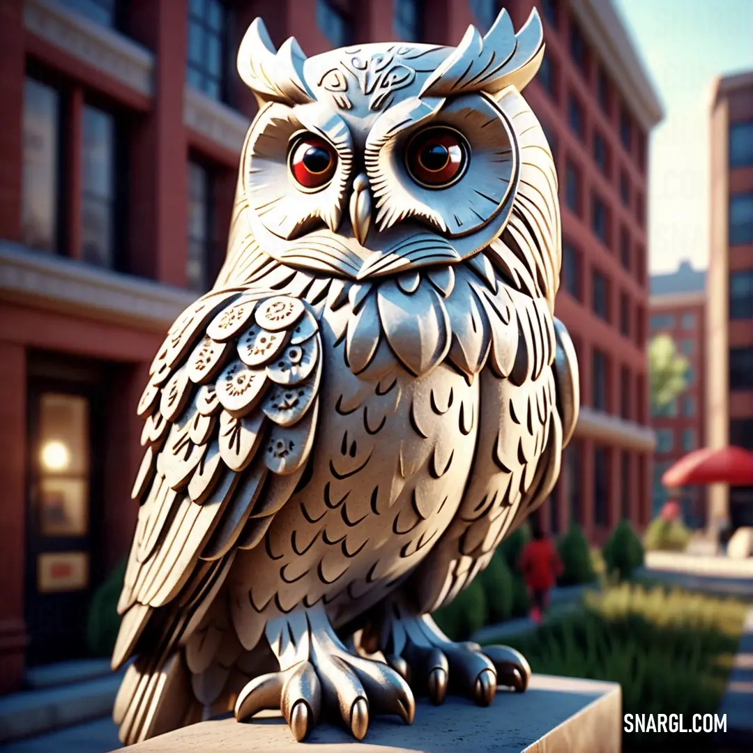
A detailed owl statue perches on a ledge, with a red umbrella creating a striking contrast in the background against the building’s historic architecture, all seen in the gentle hue of PANTONE 7506.
The wise owl statue and the bright red umbrella create a captivating juxtaposition, framed by the muted hues of PANTONE 7506, bringing a timeless moment to life.

The grand finale of their project was an exhibition titled "The Beige Odyssey," held in Grafitopia's main gallery. The exhibition featured a range of typographic prints and interactive installations, all centered around the theme of PANTONE 7506. Visitors marveled at the ways the beige color could be transformed through different printing techniques and design approaches.

Zahir and Raphael's partnership proved that even the most unremarkable color could be a powerful tool in design. Their work with PANTONE 7506 demonstrated that creativity could turn the mundane into the magnificent and that innovation often lies in the most unexpected places.

The Beige Conundrum became a celebrated story in Grafitopia, a testament to the power of imagination and the beauty of embracing the seemingly ordinary. Zahir and Raphael's journey showed that with a bit of ingenuity and a lot of enthusiasm, even a color as unassuming as PANTONE 7506 could lead to extraordinary and surprising results.
Author:
Continue browsing posts in category "PANTONE"
Take a look at this Music Video:
Legolas Song
Lyrics for the 'Legolas Song'
You may find these posts interesting:
PANTONE 2125 Color
75
11
84
0
PANTONE 2125 Color
PANTONE 4995 Color
88
12
71
0
PANTONE 4995 Color
PANTONE 7705 Color
43
10
71
0
PANTONE 7705 Color
PANTONE 7526 Color
83
14
83
0
PANTONE 7526 Color
PANTONE Warm Gray 7 Color
70
13
51
0
PANTONE Warm Gray 7 Color
PANTONE 7594 Color
99
10
52
0
PANTONE 7594 Color
PANTONE 2072 Color
112
10
67
0
PANTONE 2072 Color
PANTONE 7632 Color
75
10
44
0
PANTONE 7632 Color
Home
Terms of Service
Contact Us

© 2023 Snargl.com