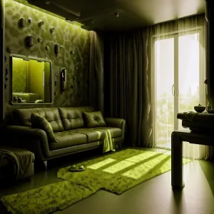
Home Colors PANTONE
PANTONE 7497

PANTONE 7497

Parameters:
HEX Triplet:
#7F7457
RGB:
127, 116, 87
CMYK:
22, 23, 47, 57
HSL:
44°, 31%, 50%
Closest colors:
in RGB:
Pastel brown
in PANTONE:
PANTONE 2327
in RAL Classic:
RAL 6013
in RAL Design:
RAL 085 50 20
in RAL Effect:
RAL 780-6
What color is PANTONE 7497? The Verdant Vision
2024-09-21 Snargl 01:00

What color is PANTONE 7497?

PANTONE 7497 is a color that’s hard to define
It’s a dark grayish yellow with a warm hue of 44°
It’s not very bright, it has a low luminance of 50%
But it’s still a Pantone color, so it deserves some respect

PANTONE 7497 is a color that may not catch your eye
But it’s still a part of the Pantone family, so don’t pass it by
Maybe you’ll find a use for it someday, who knows why
PANTONE 7497 is a color that’s hard to define
Author:
Funny stories about the 'PANTONE 7497'

The Verdant Vision

Gianni Xiang was a car service worker with an unexpected passion for interior design. His garage was filled with sketches of fantastical room layouts and vibrant color schemes, but his real-world applications were limited to the occasional paint job for his friends. Recently, he'd become enamored with PANTONE 7497, a rich, earthy green that he believed could transform any space into a calming oasis.

Jacob Phoenix, on the other hand, was a factory worker known for his skilled craftsmanship and a flair for creative problem-solving. He worked at a local textile factory and had an eye for unique fabric applications. When Gianni shared his enthusiasm for PANTONE 7497 and his dream of incorporating it into interior design, Jacob was intrigued.

"Gianni, that green you're so excited about has potential," Jacob said one day as they were catching up over coffee. "But if we're going to use it, we need to go beyond just painting walls. Let's create something truly memorable."

Gianni's eyes lit up. "Exactly! I've been thinking of using PANTONE 7497 to design an entire room - a living space that feels both rejuvenating and inspiring. But I need someone with your skills to help me turn this vision into reality."

With Jacob's agreement, they set to work on their ambitious project. They decided to transform an old, unused warehouse into a cozy, inviting living area. Their goal was to use PANTONE 7497 in every element of the design, from walls and furniture to textiles and décor.

Jacob's first contribution was to create custom fabric panels in PANTONE 7497 that would serve as both wall coverings and upholstery. He experimented with different textures, finally crafting a fabric that was both elegant and durable, with just the right amount of sheen to make the color pop.

Gianni focused on the room's layout. He envisioned a space where PANTONE 7497 would be the centerpiece, complemented by neutral tones and natural materials. He arranged for the walls to be painted in a subtle gradient of the green shade, from deeper tones at the bottom to lighter hues near the ceiling. This created an effect of a lush green landscape stretching upward.

The pièce de résistance was a series of modular furniture pieces upholstered in the custom fabric. Jacob's craftsmanship turned simple designs into functional art. The furniture included a large, comfortable sectional sofa, ottomans, and a set of pillows, all in the rich green. They also added accent pieces like curtains and rugs in the same hue to tie the room together.

When it came time to unveil their creation, Gianni and Jacob hosted a small gathering for friends and family. The reactions were immediate and positive. The space was transformed into a verdant haven, a relaxing retreat where the deep green created a soothing, yet invigorating atmosphere.

One of the guests, a local interior designer, remarked, "The way you've used PANTONE 7497 is brilliant. It's not just a color; it's an experience. The room feels alive and yet incredibly serene."

As the evening wore on, everyone enjoyed the room's ambiance. The combination of PANTONE 7497 and the carefully chosen design elements created a space that felt both natural and modern. The green tone brought a sense of tranquility, making the room perfect for relaxation or creative gatherings.

Gianni and Jacob's project was a resounding success. The Verdant Vision, as they dubbed it, became a showcase for how color could be used in innovative ways to create a meaningful and enjoyable living space. Their collaboration demonstrated that with creativity and teamwork, even a simple color could inspire a new approach to interior design.

Their story spread through word of mouth, and soon, Gianni and Jacob were approached by others eager to transform their spaces with PANTONE 7497. They continued to work together, always finding new ways to infuse their designs with the same warmth and charm that had made their first project so special.

And so, the Verdant Vision lived on, a testament to the power of color and collaboration, and a reminder that sometimes the most beautiful transformations come from the simplest of ideas.
Author:

Continue browsing posts in category "PANTONE"
You may find these posts interesting:
PANTONE 2240 Color
11
1
4
26
0
PANTONE 2240 Color
PANTONE 2013 Color
4
0
3
7
0
PANTONE 2013 Color
PANTONE 2222 Color
4
1
2
11
0
PANTONE 2222 Color
PANTONE 101 Color
2
0
2
7
1
PANTONE 101 Color
PANTONE 140 Color
8
0
2
11
0
PANTONE 140 Color
PANTONE 102 Color
4
0
2
7
2
PANTONE 102 Color
PANTONE 2210 Color
5
0
2
5
0
PANTONE 2210 Color
PANTONE 645 Color
5
0
2
7
0
PANTONE 645 Color
Home
Terms of Service
Contact Us

© 2023 Snargl.com