Home Arts Colors PANTONE
PANTONE 7451

PANTONE 7451

Parameters:
HEX Triplet:
#9AB1D7
RGB:
154, 177, 215
CMYK:
46, 23, 0, 0
HSL:
217°, 28%, 84%
Closest colors:
in PANTONE:
PANTONE 2128
in RAL Classic:
RAL 6034
in RAL Design:
RAL 270 70 25
in RAL Effect:
RAL 610-4
Articles:
What color is PANTONE 7451? What are the examples of PANTONE 7451 color? What colors go well with the PANTONE 7451 color? What color is pms 7451? The Vibrant Blueprint: Sonja and Leonardo's Colorful Collaboration
2025-03-13 Snargl 13:38
# General # Fashion # Design

What color is PANTONE 7451?

A fashionable woman with blonde hair dons a shimmering golden jacket, standing gracefully on a snow-laden street corner. The gentle illumination from a nearby lamppost casts a warm glow, contrasting beautifully with the icy backdrop of a tranquil winter n
A striking image of a woman with golden hair, styled boldly with a skull motif on her jacket, stands amidst a snowy city landscape. The softly falling snowflakes around her enhance the captivating scene, symbolizing resilience against the chill of winter.
A confident woman dressed in a modern futuristic suit stands poised on a bustling city street at night. The vibrant cityscape glimmers behind her, capturing the essence of urban life infused with a sense of adventure and innovation in every corner.
A woman with striking white hair dons a sleek black jacket, elegantly framed against a vibrant city street at night. The illuminated facades of nearby buildings create a captivating glow, highlighting her fashionable presence in the bustling atmosphere.
A sleek car is parked in front of a grand house with elegant balconies on the second floor. The building exudes timeless beauty, its soft blue exterior blending harmoniously with the surrounding environment.
A cozy bedroom features a soft blue bed with a white owl statue sitting gracefully on the floor. A chandelier overhead adds a touch of elegance, and the calming hues create a peaceful, inviting atmosphere.
A vast desert landscape stretches endlessly, dotted with ancient columns and bathed in the warm light of the sky. The colors of the desert evoke a sense of calm, with the soft blues of the sky meeting the earthy tones of the sand and columns.
A vibrant bowl of fresh oranges resting on a kitchen countertop, next to a sink and stovetop oven. A window allows natural light to fill the space, creating a warm, inviting kitchen atmosphere.
A woman wearing a hoodie stands in front of a large plant with a framed picture of another woman in the background. The calm, soft color palette gives the scene a relaxed, intimate atmosphere.
A grand building with a towering structure and sweeping steps leading to its entrance, bathed in sunlight under a sky dotted with clouds. The exterior is a soft, elegant shade of blue, radiating sophistication and charm.
PANTONE 7451 is a color that’s hard to describe.

It’s a medium light shade of cyan-blue.

It has a hue of 217 degrees and a saturation of 28.

It’s like the sky on a clear summer day or the ocean reflecting the sun’s rays.

PANTONE 7451, you are so serene
You make me feel calm and peaceful within
You remind me of nature and beauty sublime
You are one of my favorite colors of all time

Example of the palette with the PANTONE 7451 color

Picture with primary colors of Black, Dark sienna, Umber, Pale taupe and Cadet grey
Top 5 color shades of the illustration.
See these colors in NCS, PANTONE, RAL palettes...

Example of the palette with the PANTONE 7451 color

Picture with primary colors of Smoky black, UCLA Blue, Pale cornflower blue, Steel blue and Dark cerulean
Top 5 color shades of the illustration.
See these colors in NCS, PANTONE, RAL palettes...
Author:

What are the examples of PANTONE 7451 color?

An inviting blue and white wall, flanked by brickwork that conveys strength and stability, showcases subtle variations in texture and color, emphasizing the serene tone of RGB 154,177,215.
A simple yet elegant blue sheet features a subtle pattern, gracefully displayed to highlight its soft texture and soothing colors that bring serenity to the bedroom.
An intricate view of a wall crafted from cement blocks, featuring a striking blue background that highlights the wall's rugged texture and depth, effectively captured in rich CMYK colors.
A roll of brown tape rests elegantly on a pristine white surface, illuminated by a delicate light reflection, set against a soft gray background that enhances its subtle nuances.
An intriguing close-up of ropes woven against a stylish black background captures the interplay of textures, with the color #9AB1D7 adding a cool touch to the scene.
A vibrant roll of blue tape with a bright blue stripe stands against a crisp white background, exuding a sense of organization and creativity amidst clear, clean lines.
A playful blue and orange toy dinosaur dressed with quirky horns and a tiny jacket stands proudly on its back legs, adding whimsy to a vibrant world. Its joyful demeanor brightens the scene and captivates the imagination of all who view it.
A humanoid figure with glowing eyes stands mysteriously in front of a canvas of clouds, illuminated by an ethereal light. Its captivating appearance sparks intrigue, as the clouds swirl around, creating an enchanting atmosphere of wonder.
A vibrant dinosaur clad in a striking yellow suit stands assertively on rocky terrain, held against a mystical backdrop of swirling clouds. Its bold colors and fierce stance inspire awe and curiosity about the world it inhabits.
A curious creature with oversized eyes stands in a snowy landscape, its whimsical appearance drawing attention. Its playful expression and the delicate snowflakes create a serene yet magical environment, exuding charm and enchantment.
PANTONE 7451 is a soft, airy blue that evokes tranquility and freshness. This color is often associated with spring and is widely used in fashion, home décor, and graphic design. Its light tone pairs beautifully with pastels and neutrals, making it a favorite for wedding palettes and branding aimed at relaxation. Notable examples include its use in the 2023 Summer Fashion shows, where designers incorporated it into casual wear, and in home furnishings, where it creates serene environments. Its versatility and calming effect have made it a staple in modern design trends.

Example of the palette with the PANTONE 7451 color

Picture with primary colors of Charcoal, Pastel blue, Dark jungle green, Slate gray and Granny Smith Apple
Top 5 color shades of the illustration.
See these colors in NCS, PANTONE, RAL palettes...

Example of the palette with the PANTONE 7451 color

Picture with primary colors of Wild blue yonder, Medium jungle green, Cool grey, Lavender gray and AuroMetalSaurus
Top 5 color shades of the illustration.
See these colors in NCS, PANTONE, RAL palettes...
Author:

What colors go well with the PANTONE 7451 color?

A darkly enchanting scene featuring a man dressed as a demon, blending seamlessly into a misty forest setting with tall trees shrouded in ethereal light. The vivid hues and eerie atmosphere create a captivating yet haunting visual.
A demon with an imposing head and a beard looms in a forest, surrounded by towering trees and intricate branches. The captivating PANTONE 7451 color casts a unique spell on this intriguing creature, evoking both mystery and allure.
A car idly rests in a reflective puddle on a street, accompanied by a lush hedge in the background. The scene captures the tranquil beauty of everyday life, evoking a sense of peace amidst a vibrant urban landscape.
Behold a fearsome demonic creature adorned with spikes atop its head and a giant mouth filled with sharp teeth. This extraordinary marvel of nature practically radiates a PANTONE 7451 color, showcasing both beauty and menace in its presence.
A bearded man in a fascinating horned costume stands beside a snow-covered tree, the icy landscape creating a striking contrast against the vibrant PANTONE 7451 colors. This unique scene invites exploration of winter's magic and mystery.
A charming baby's room is adorned with soft blue walls, featuring a cozy white crib, a gentle chair, and a warm lamp creating a nurturing space, radiating tranquility and inviting moments of love and care.
An inviting baby's room featuring a warm combination of a crib, stylish dresser, and plush rug, all harmonizing in gentle shades, creating an ideal environment for comfort and imaginative playtime moments.
A dynamic scene of a sleek car surging through a large puddle, splashes of water flying in the air against a backdrop of tall trees, evoking a sense of adventure and nature's beauty. The peaceful greenery offers a serene contrast to the motion of the car.
PANTONE 7451, a soft, calming shade of light blue, acts as a versatile backdrop for various color pairings. Its delicate hue complements pastel tones like blush pink and pale lilac, creating a serene palette perfect for spring and summer designs. For a bolder contrast, rich shades such as charcoal gray or deep navy enhance its brightness, adding sophistication. Earthy colors like terracotta or sage green evoke a natural feel, while metallics like gold or silver introduce a glamorous touch. This adaptability makes PANTONE 7451 an essential choice in fashion and interior design.

Example of the palette with the PANTONE 7451 color

Picture with primary colors of Powder blue, Dark tea green, Charcoal, Davy grey and Light slate gray
Top 5 color shades of the illustration.
See these colors in NCS, PANTONE, RAL palettes...

Example of the palette with the PANTONE 7451 color

Picture with primary colors of Black, Mauvelous, Copper rose, White smoke and Myrtle
Top 5 color shades of the illustration.
See these colors in NCS, PANTONE, RAL palettes...
Author:

What color is pms 7451?

An enchanting close-up of a delicate chain against a softly blurred background, revealing intricate details and textures that evoke a sense of elegance and sophistication.
A striking purple chain gracefully hangs from a vibrant purple wall, illuminated by soft, enchanting lights in the background, creating a mesmerizing atmosphere of color and texture.
A delicate chain radiating the serene PANTONE 7451 color dangles against a soft purple backdrop, blending effortlessly into the peaceful ambiance and evoking feelings of calmness.
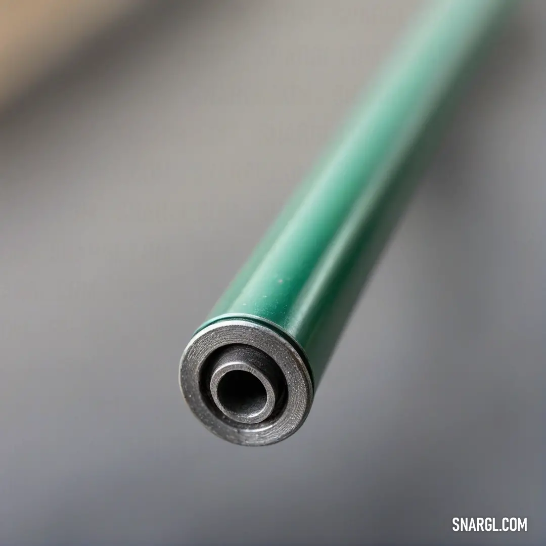
An exquisite metal object rests on a sleek table, contrasting with a deep black background that accentuates its polished surface, embodying a sense of modern sophistication and artistry.
A picturesque scene showcasing a vibrant red fence contrasting beautifully against a tranquil lake. The calming water reflects the surrounding nature, infusing the landscape with an air of serenity and peace.
A cozy living room scene featuring a plush couch and chair, enveloped in a relaxing atmosphere. The soft hues of RGB 154, 177, 215 transport you to a space designed for comfort and warmth, inviting you to unwind and relax.
A charming wooden house featuring a welcoming porch, surrounded by a serene field dotted with vibrant trees. The soft hues and tranquil ambiance invite you to appreciate the peaceful rural lifestyle. Color PANTONE 7451 enhances its fresh appearance.
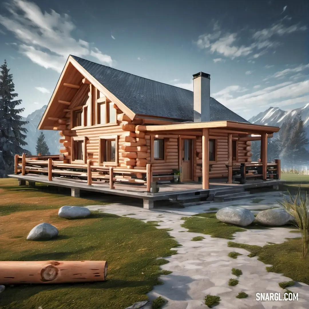
A striking purple log house with an inviting balcony adorned with a stylish railing, set against a backdrop of lush green lawn and stepping stones leading to the entrance. The PANTONE 7451 color brings it to life with cheerful vibrancy.
PMS 7451 is a light, soft blue shade recognized in the Pantone Matching System, primarily used in design and printing. It is known as "Ice Blue" and is appreciated for its calm and refreshing qualities. Often associated with tranquility and clarity, PMS 7451 evokes feelings of serenity and peace. This hue is widely used in branding and marketing, particularly for products related to health, wellness, and relaxation. Its complementary nature makes it an excellent choice for pairing with warmer tones, providing a harmonious and visually appealing palette in various applications.

Example of the palette with the PANTONE 7451 color

Picture with primary colors of Cambridge Blue, Cadet, Dark sea green, MSU Green and Onyx
Top 5 color shades of the illustration.
See these colors in NCS, PANTONE, RAL palettes...

Example of the palette with the PANTONE 7451 color

Picture with primary colors of Sepia, Pastel blue, Dim gray, Dark jungle green and Battleship Grey
Top 5 color shades of the illustration.
See these colors in NCS, PANTONE, RAL palettes...
Author:
Funny stories about the 'PANTONE 7451'

The Vibrant Blueprint: Sonja and Leonardo's Colorful Collaboration

Far away, in the bustling city of Verona, where art and innovation intertwined like the vines on an ancient trellis, there lived two visionaries who, though from different worlds, shared a passion for pushing boundaries. Sonja Westwood, an artist known for her vibrant murals, had a keen eye for color and a heart that beat to the rhythm of creativity. Leonardo Goowanni, an engineer with a fascination for precision and innovation, spent his days in a workshop filled with gears, gadgets, and endless possibilities.

Their paths first crossed at a design expo, where Sonja's latest mural - a breathtaking swirl of colors that seemed to leap off the wall - had captured the attention of everyone present. Leonardo, who had always appreciated art but never quite understood its magic, found himself mesmerized. As he gazed at the mural, his mind buzzed with questions about how such vibrancy could be captured in more than just paint on a wall.
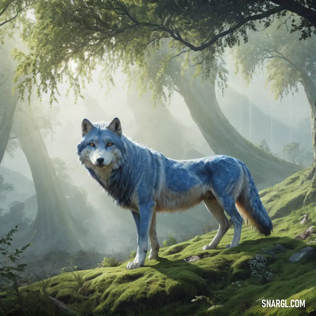
A majestic wolf standing on a lush, green hillside, surrounded by trees and tall grass. Sunlight filters through the forest canopy, casting a golden glow on the wild animal in its natural habitat.
A quiet moment in nature, as a lone wolf surveys its surroundings, bathed in the warmth of sunlight and the tranquility of the forest.

After the expo, Leonardo approached Sonja, his curiosity getting the better of him. "Your work is extraordinary," he said, his voice tinged with both admiration and intrigue. "How do you make the colors so... alive?"

Sonja smiled, sensing a kindred spirit in the meticulous engineer. "It's not just about choosing colors, but about understanding them. Each color has a life of its own, and when you find the right way to use it, it sings."

Their conversation sparked a friendship and a collaboration that neither could have anticipated. As they spent time together, Sonja introduced Leonardo to the world of colors, teaching him how each shade could evoke different emotions and tell different stories. Leonardo, in turn, shared his knowledge of polygraphy - the art and science of printing. He explained the technical challenges of reproducing colors with the same vibrancy on paper as they had on canvas or a screen.

One day, while experimenting in Leonardo's workshop, Sonja stumbled upon a shade of blue that caught her eye. It was PANTONE 7451, a color that seemed to dance between sky blue and a soft violet. Sonja was captivated. "This color," she said, holding up the swatch, "has so much potential. It's calming, yet it has a depth that draws you in. Imagine what we could create if we could bring this color to life in print."

Leonardo examined the swatch, his mind already racing with possibilities. "PANTONE 7451... it's a complex color. Reproducing it accurately in print would be challenging, but not impossible. We'd need to find the right balance of inks and materials. But if we could do it... the results could be revolutionary."
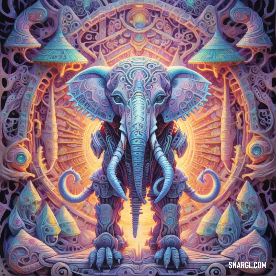
An intricate and beautifully detailed elephant adorned with patterns, standing gracefully against a bright, soft light. The combination of the elephant’s elegance and the warm background creates a calming yet powerful scene.
A symbol of wisdom and strength, this elephant stands in serene splendor, its intricate details glowing in the light, reminding us of nature’s beauty and power.

They decided to take on the challenge together. Over the next few weeks, they experimented tirelessly, blending different ink formulations and testing various printing techniques. They faced setbacks - colors that bled into one another, prints that looked dull and lifeless - but they refused to give up. Each failure only fueled their determination.

During one late-night session, as they prepared to test yet another batch of prints, Sonja had an idea. "What if we used a special layering technique? Instead of trying to capture the color in a single pass, we could build it up gradually, layer by layer, to mimic the depth and complexity of the original."

Leonardo's eyes lit up. "That could work! By using transparent inks and layering them carefully, we might be able to achieve the vibrancy we're looking for."

They worked through the night, applying layer after layer of ink to their test prints. When the sun began to rise, they stepped back to admire their work. The result was astonishing. PANTONE 7451, in all its vibrant glory, had come to life on the page. The color was rich and full, with a depth that seemed almost impossible to achieve in print.
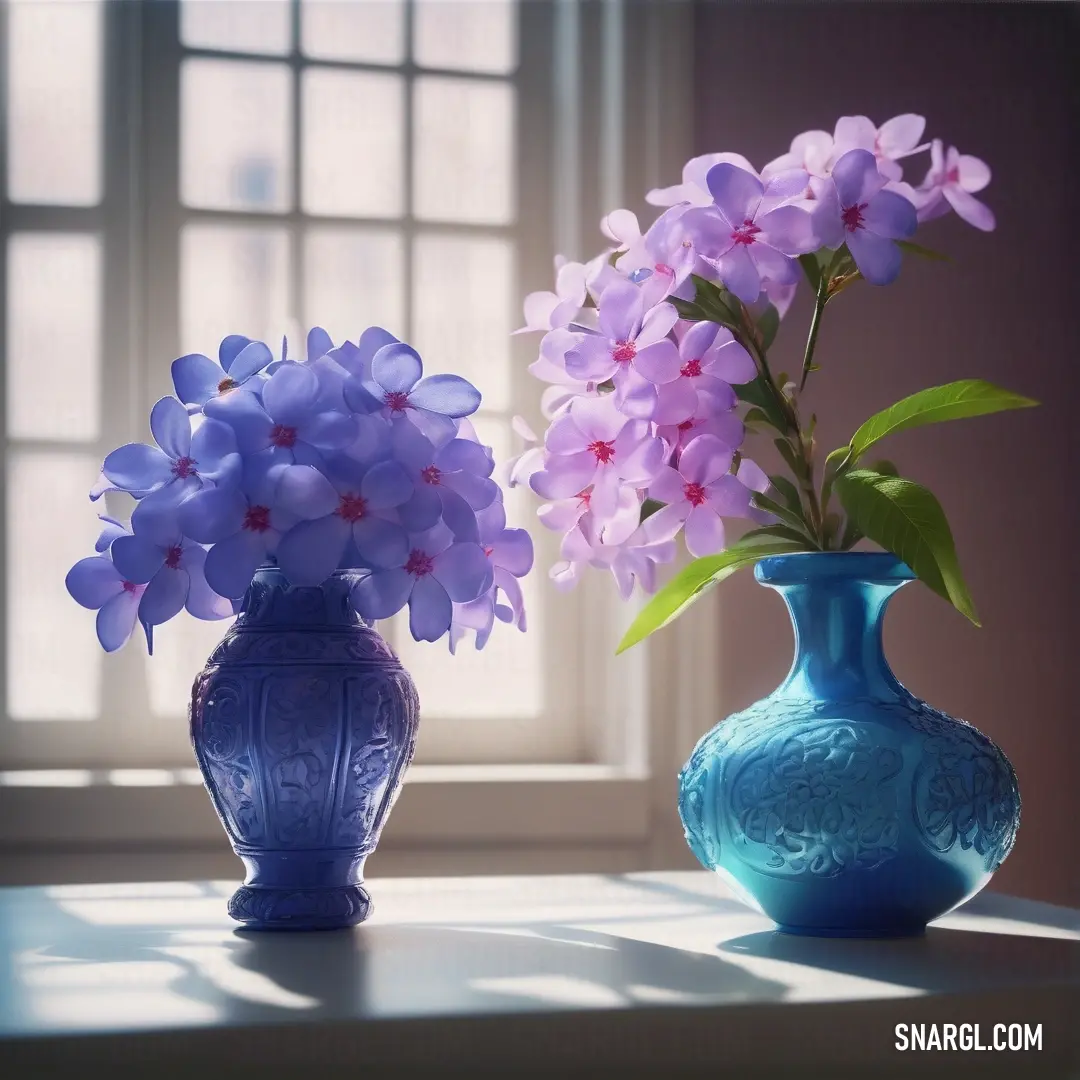
A striking blue vase with purple flowers sits on a surface, casting a calm and serene vibe. The elegant simplicity of the colors evokes a feeling of tranquility and balance.
A perfect blend of calm and color—a blue vase with purple blooms, bringing a touch of beauty and peace to any space.

Their breakthrough didn't go unnoticed. The prints they produced became the talk of the town, catching the attention of artists, designers, and printers alike. Soon, PANTONE 7451 was being hailed as a revolutionary color in the world of polygraphy, thanks to the innovative layering technique that Sonja and Leonardo had developed.

But for Sonja and Leonardo, the true victory wasn't in the accolades or the fame. It was in the journey they had taken together - combining art and science, creativity and precision - to achieve something that neither could have done alone. They had not only brought a color to life but had also discovered the power of collaboration.

From that day on, whenever they looked at a print in PANTONE 7451, they were reminded of the magic that happens when two different worlds come together to create something truly extraordinary.

Author:
Continue browsing posts in category "PANTONE"
Take a look at this Music Video:
Gimli Song
Lyrics for the 'Gimli Song'
You may find these posts interesting:
PANTONE 2374 Color
118
11
66
0
PANTONE 2374 Color
PANTONE 7581 Color
99
10
46
0
PANTONE 7581 Color
PANTONE 300 Color
64
10
75
0
PANTONE 300 Color
PANTONE 2110 Color
115
10
61
0
PANTONE 2110 Color
PANTONE 7506 Color
72
13
57
0
PANTONE 7506 Color
PANTONE 135 Color
128
12
99
0
PANTONE 135 Color
PANTONE 7522 Color
65
12
56
0
PANTONE 7522 Color
PANTONE 2006 Color
80
11
87
0
PANTONE 2006 Color
Home
Terms of Service
Contact Us

© 2023 Snargl.com