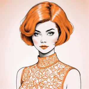
Home Colors PANTONE
PANTONE 717

PANTONE 717

Parameters:
HEX Triplet:
#E37A33
RGB:
227, 122, 51
CMYK:
0, 68, 100, 0
HSL:
24°, 78%, 89%
Closest colors:
in RGB:
Bronze
in PANTONE:
PANTONE 165
in RAL Classic:
RAL 2011
in RAL Design:
RAL 050 60 70
in RAL Effect:
RAL 380-4
What color is PANTONE 717? The Peculiar Pursuit of Pantone 717
2024-09-03 Snargl 02:16

What color is PANTONE 717?

Woman in a chair with a robot on her lap next to a giant alien creature in a futuristic setting. Color RGB 227,122,51.
Close up of a doll with a smile on her face and a leather jacket on her shoulders and a white shirt on. Color CMYK 0,68,100,0.
Close up of a brown eye with drops of water on it's iris and a white stripe. Color PANTONE 717.
Bunch of graffiti on a building with a lot of windows and doors that are painted orange. Example of CMYK 0,68,100,0 color.
PANTONE 717 is a shade of orange with a high saturation and brightness.

It has different variations depending on the type of material and coating, such as C (coated), U (uncoated), and XGC (extended gamut coated).

This color has a hexadecimal color code of #E37A33, which means it has 89.02% red, 47.84% green, and 20% blue in the RGB color model.

In the HSL color space it has a hue of 24°, a saturation of 78%, and a lightness of 89%.

It has a wavelength of about 593.83 nm.

PANTONE 717 can be used to create warm, energetic, and stimulating effects in design and branding.
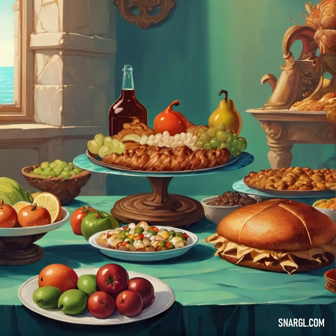
Example of the palette with the PANTONE 717 color

Picture with primary colors of Tiger eye, Seal brown, Mint, Hunter green and Burnt umber
Top 5 color shades of the illustration. Arranged in descending order of frequency of occurrence (first - more often, last - more rare).
See these colors in NCS, PANTONE, RAL palettes...
Author:
Funny stories about the 'PANTONE 717'

The Peculiar Pursuit of Pantone 717

In a far away place, in the bustling metropolis of Printopia, a land where colors danced on paper and typography spoke in whispered hues, there existed a legendary shade known only as Pantone 717. This color, rumored to possess mystical properties, was said to bring its essence to life and unravel the mysteries of polyghaphy - a forgotten art of interlocking typefaces.

Adam Steel, a student of color theory and typographic mysteries, had long been fascinated by the legend of Pantone 717. His obsession had led him to the renowned Polyghaphy Academy, where he was determined to decode the secrets of this elusive color. Little did he know that his quest would lead him into a peculiar adventure, guided by none other than Mustafa Rodriguez, a top model with a penchant for peculiarities.
Glass vase with a orange in it and a wine glass on top of it with water splashing on it. Example of CMYK 0,68,100,0 color.

Mustafa Rodriguez, known for his stunning photographs and eccentric personality, had a secret: he was the only person who could see Pantone 717. It was said that this color was so rare it could only be perceived by someone who had mastered the art of standing perfectly still while surrounded by a cacophony of moving colors. Mustafa's talent for striking the perfect pose made him the ideal guide for Adam’s quest.

Their adventure began in the enchanted library of Printopia, where books fluttered like birds and ink pots bubbled with secrets. Adam, clutching a magnifying glass and a notebook filled with scribbles about color theory, approached Mustafa.

"Welcome, Adam," Mustafa greeted, striking a dramatic pose with a perfectly synchronized bow. "Are you ready to embark on a journey to find Pantone 717?"

Adam, trying to hide his awe, nodded enthusiastically. "Yes! I’ve studied the legends, but they’re all so vague. I need to understand the essence of Pantone 717."

Mustafa grinned. "Very well. Our first step is to navigate the Kaleidoscope Forest, where the colors are in constant motion and the trees are made of shifting fonts. We must look for the elusive Pantone 717, which is said to be hiding among the ever-changing typography."

As they ventured into the forest, Adam was awestruck by the sight of trees adorned with letters that swirled into whimsical shapes. "Look at that! The ‘A’ is dancing with the ‘G’!"

Mustafa, ever the model, struck a series of dramatic poses as they walked. "Ah, the typography here is quite playful. To find Pantone 717, we must synchronize our movements with the letters."
Computer generated image of a snowy landscape with a lake and houses in the background. Color CMYK 0,68,100,0.

Adam, trying his best to match Mustafa’s poses, found himself tumbling through the forest, laughing at the absurdity of the situation. Each pose Mustafa struck seemed to unlock new paths and reveal hidden messages.

After hours of navigating through floating fonts and twirling colors, they arrived at a shimmering clearing where the trees had turned into giant paintbrushes dipped in vibrant hues. In the center stood a pedestal with a small vial of liquid that glowed with a peculiar light.

"This is it!" Adam exclaimed, his eyes wide with wonder.

Mustafa approached the vial with a flourish. "Pantone 717 is not just a color, Adam. It’s an essence that reflects the harmony of colors and the rhythm of typography."

As Adam carefully opened the vial, a warm, glowing light spilled out, casting a gentle hue over the forest. The colors around them began to harmonize, and the letters on the trees settled into a beautiful pattern.

Adam realized that Pantone 717 was not merely a color but a symbol of balance and unity in the world of polyghaphy. It embodied the essence of creativity and the intricate dance between color and type.

With newfound wisdom, Adam and Mustafa made their way back to the academy, their hearts light and their minds full of inspiration. Pantone 717 had taught them that the true magic of color lay in its ability to bring harmony and coherence to the art of typography.
Woman in a futuristic suit with a cat ears on her head and a cat ears on her head. Color RGB 227,122,51.

As they parted ways, Mustafa struck one last dramatic pose, tipping his hat with a wink. "Remember, Adam, the pursuit of Pantone 717 is not just about finding a color but about discovering the beauty in the blend."

Adam smiled, his notebook now filled with a new understanding of color theory. "Thank you, Mustafa. I’ll never look at typography the same way again."

And so, in the whimsical world of Printopia, the legend of Pantone 717 lived on, inspiring all who dared to seek its essence with creativity and a touch of eccentricity.
Author:

Continue browsing posts in category "PANTONE"
You may find these posts interesting:
PANTONE 400 Color
2
0
2
9
0
PANTONE 400 Color
PANTONE 2617 Color
2
0
2
5
0
PANTONE 2617 Color
PANTONE 459 Color
1
0
2
6
0
PANTONE 459 Color
PANTONE 634 Color
2
0
1
9
0
PANTONE 634 Color
PANTONE 108 Color
14
0
2
25
1
PANTONE 108 Color
PANTONE 7718 Color
2
0
2
7
0
PANTONE 7718 Color
PANTONE 140 Color
8
0
2
11
0
PANTONE 140 Color
PANTONE 5255 Color
1
0
2
5
0
PANTONE 5255 Color
Home
Terms of Service
Contact Us

© 2023 Snargl.com