Home Colors PANTONE
PANTONE 714

PANTONE 714

Parameters:
HEX Triplet:
#EEAF7A
RGB:
238, 175, 122
CMYK:
0, 40, 59, 0
HSL:
27°, 49%, 93%
Closest colors:
in RGB:
Fawn
in PANTONE:
PANTONE 1565
in RAL Classic:
RAL 1034
in RAL Design:
RAL 050 70 40
in RAL Effect:
RAL 310-3
What color is PANTONE 714? The Crimson Revelation
2024-09-03 Snargl 02:12

What color is PANTONE 714?

Desert with a large ball in the distance and a desert landscape with a few plants and bushes in the foreground
Couple of asian people standing next to each other in front of a building with a lantern on it. Example of RGB 238,175,122 color.
Car and a demon in a desert setting with a car in the background. Example of CMYK 0,40,59,0 color.
PANTONE 714 color example: Car driving down a road with smoke coming out of it's back end and the front end of the car
PANTONE 714 is a bright neon orange color that has a hue value of 27°, indicating that it is a warm color.

It has high saturation and brightness, making it a vibrant and attractive color.

The hexadecimal color code for PANTONE 714 is #EEAF7A, which is composed of 93.33% red, 68.63% green, and 47.84% blue in the RGB color model.

The approximate wavelength of this color is 585.6 nm.

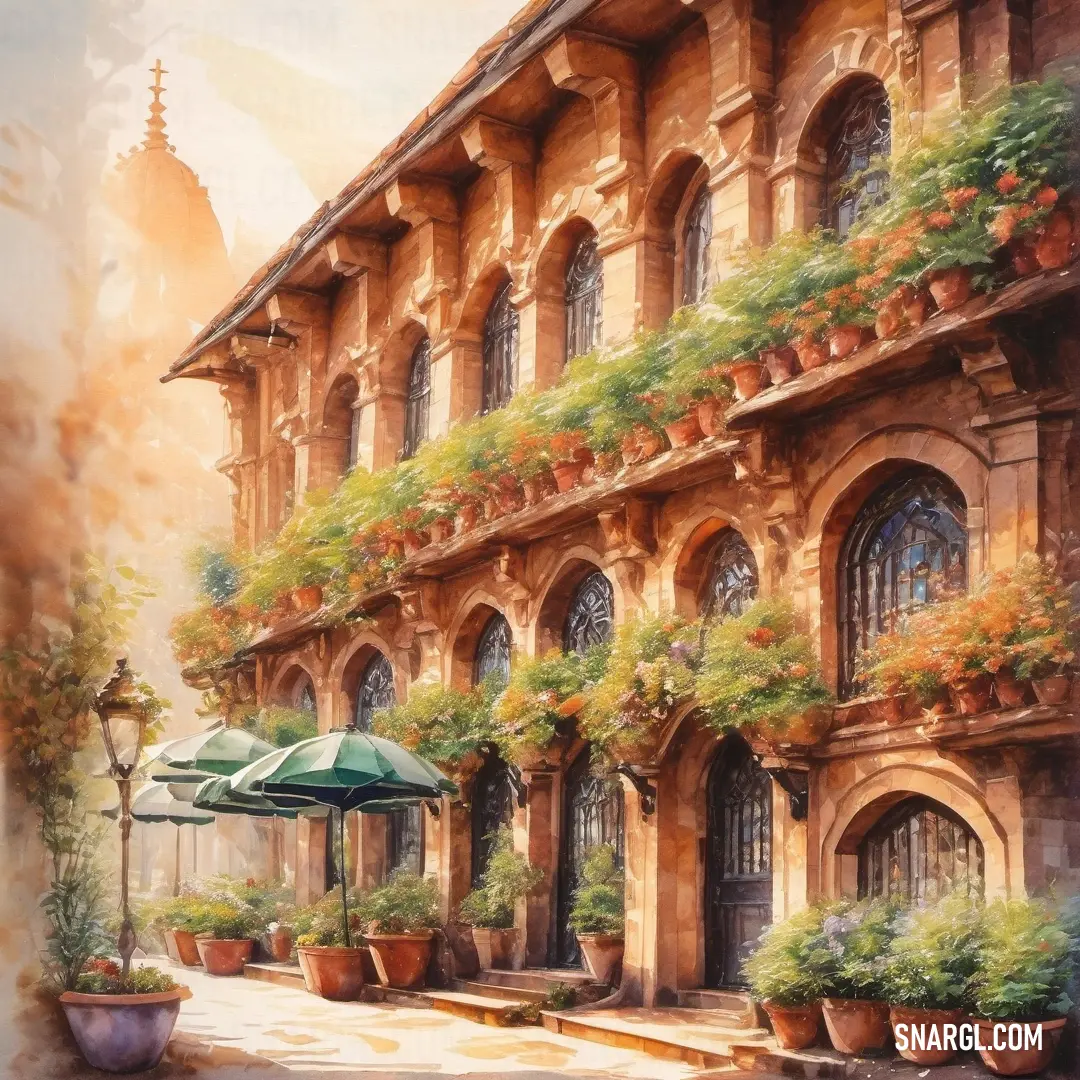
Example of the palette with the PANTONE 714 color

Picture with primary colors of Raw Sienna, Sienna, Champagne, Dim gray and Copper
Top 5 color shades of the illustration. Arranged in descending order of frequency of occurrence (first - more often, last - more rare).
See these colors in NCS, PANTONE, RAL palettes...
Author:
Funny stories about the 'PANTONE 714'

The Crimson Revelation

Far away, in the heart of Manhattan, where art and commerce intertwine, there was a unique collaboration brewing between two seemingly disparate worlds: the avant-garde realm of polygraphy and the glitzy world of high fashion. At the center of this synergy stood Dr. Christian Ford, a brilliant but reclusive color theorist, and Hubert Frost, a top model with an instinct for striking aesthetics.

Christian Ford had always been fascinated by the subtleties of color. His latest obsession was PANTONE 714, a brilliant hue of orange-red that he believed held the key to a new era in print and design. This color, vibrant and enigmatic, seemed to dance with its own light, and Christian was determined to uncover its full potential.
Computer generated image of a desert with a staircase leading to a building with a dome on top of it. Example of CMYK 0,40,59,0 color.

Enter Hubert Frost, whose reputation for transforming ordinary garments into sensational pieces had made him a fashion icon. Hubert was known not just for his looks but for his innovative taste and flair. When a fashion magazine suggested he collaborate with Christian to create a unique editorial spread featuring PANTONE 714, Hubert was intrigued but skeptical.

Their first meeting was a study in contrasts. Christian, with his lab coat and glasses, was absorbed in stacks of color theory books and print samples. Hubert, in his sleek designer suit, oozed charisma and sophistication. Their conversations were a mix of Christian’s technical jargon and Hubert’s fashion-forward enthusiasm.

"I don’t just see colors," Christian said one afternoon, holding up a sample of PANTONE 714. "I see possibilities. This shade, it's not just a color - it's a statement."

Hubert tilted his head, studying the vibrant hue. "And how does it translate into fashion? Can it turn a simple dress into something unforgettable?"

Christian’s eyes sparkled with excitement. "Exactly. It's about impact and emotion. PANTONE 714 can evoke warmth, energy, and even a sense of rebellion. Imagine that on the runway!"

They decided to put their theories into practice. Christian crafted a series of experimental prints, each layer meticulously designed to enhance the depth and radiance of PANTONE 714. Hubert, meanwhile, selected a range of garments - from sleek evening gowns to edgy streetwear - all to be infused with this singular color.

The photo shoot was a spectacle. Hubert, adorned in garments splashed with PANTONE 714, became a living canvas. The color seemed to come alive, interacting with the light and shadow, creating a hypnotic visual symphony. The results were nothing short of mesmerizing. Each photo captured not just a moment but a story, a dynamic blend of emotion and color that leaped off the page.

The magazine spread was an instant sensation. Critics hailed it as a groundbreaking fusion of art and fashion, with PANTONE 714 at its heart. The color had transcended its role as mere pigment to become a symbol of innovation and collaboration.

For Christian and Hubert, the project was more than a success; it was a revelation. They had demonstrated that color, when used with creativity and vision, could bridge disparate worlds and create something truly extraordinary. PANTONE 714 had become more than a shade - it had become a beacon of artistic synergy and possibility.

In the end, their partnership was a testament to the power of color and creativity. Christian Ford and Hubert Frost had shown the world that with imagination and collaboration, even the most singular hues could paint new realities.
Author:

Continue browsing posts in category "PANTONE"
You may find these posts interesting:
PANTONE 189 Color
10
0
2
12
0
PANTONE 189 Color
PANTONE 2210 Color
5
0
2
5
0
PANTONE 2210 Color
PANTONE 7620 Color
2
0
1
8
0
PANTONE 7620 Color
PANTONE 101 Color
2
0
2
7
1
PANTONE 101 Color
PANTONE 2617 Color
2
0
2
5
0
PANTONE 2617 Color
PANTONE 2013 Color
4
0
3
7
0
PANTONE 2013 Color
PANTONE 194 Color
7
1
2
14
0
PANTONE 194 Color
PANTONE 2603 Color
1
0
1
13
0
PANTONE 2603 Color
Home
Terms of Service
Contact Us

© 2023 Snargl.com