2025-03-13 Snargl 15:30
What color is PANTONE 666?
PANTONE 666 has two variants: PANTONE 666 C and PANTONE 666 XGC.
The letter C stands for coated paper, while the letters XGC stand for extended gamut coated paper.
The difference between them is that the extended gamut has more colors available than the standard one, resulting in more vibrant and accurate colors.
The color of PANTONE 666 C is a light shade of purple with a hint of gray.
It has a HEX code of #9F94B8, which means it is composed of 63.14% red, 57.25% green, and 70.59% blue in RGB color space.
The color of PANTONE 666 XGC is slightly darker and more saturated than PANTONE 666 C.
Both colors can be used for various purposes, such as branding, packaging, or graphic design.
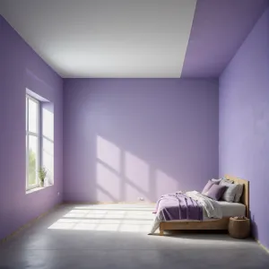
Example of the palette with the PANTONE 666 color
Top 5 color shades of the illustration.
See these colors in NCS, PANTONE, RAL palettes...
NCS (Natural Color System) Example of the palette with the PANTONE 666 color
Top 5 color shades of the illustration.
See these colors in NCS, PANTONE, RAL palettes...
NCS (Natural Color System) What are the examples of PANTONE 666 color?
PANTONE 666 is a distinctive color that straddles the line between mauve and light brown, evoking warmth and sophistication. It is often used in branding and design to convey a sense of comfort and approachability. You can find PANTONE 666 in various applications like home decor, particularly in textiles and paint, as well as in wedding themes for a romantic touch. Additionally, it pairs well with earthy tones like olive green and soft creams, making it a popular choice for autumnal palettes. This versatile hue is recognized for its ability to evoke emotions and create inviting atmospheres.
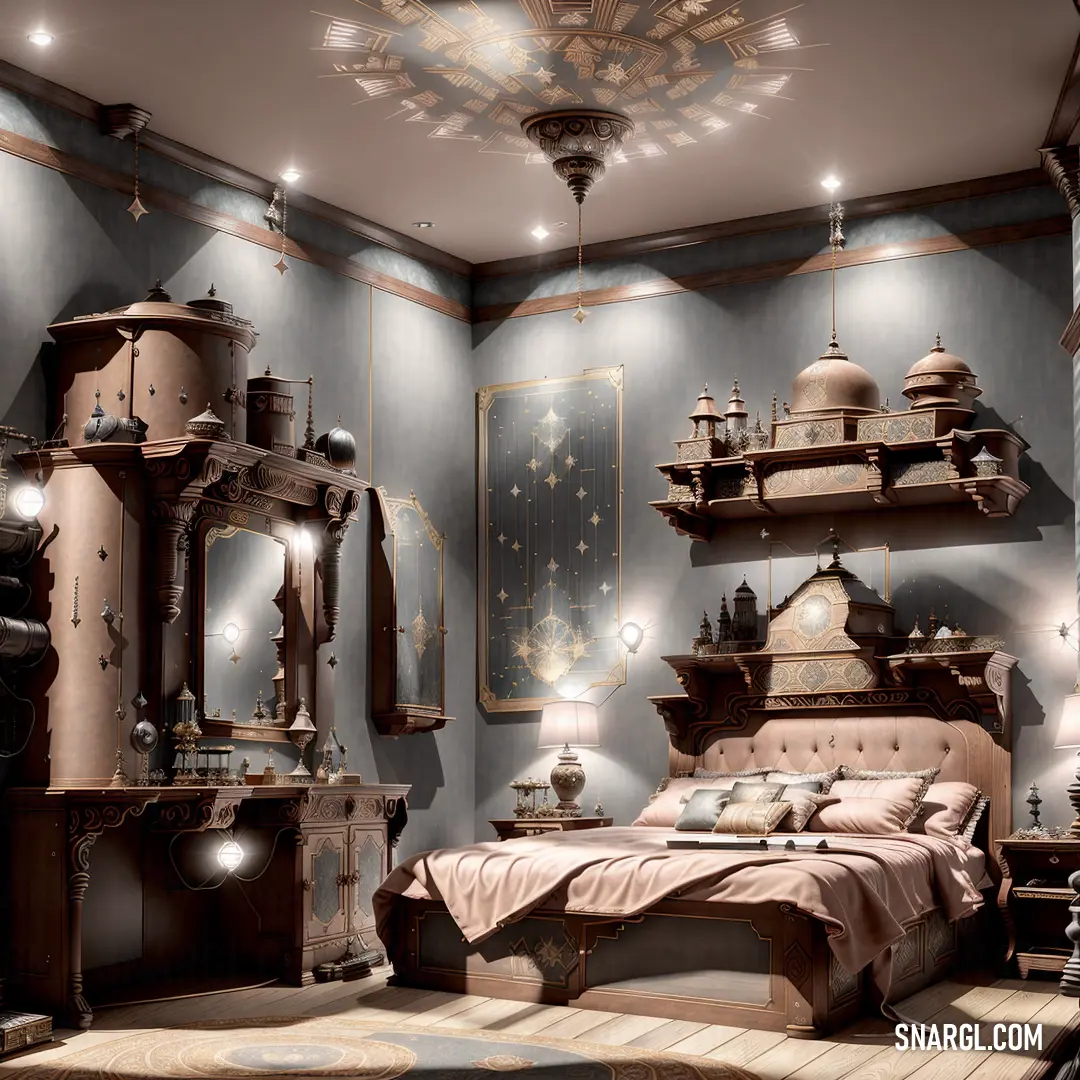
Example of the palette with the PANTONE 666 color
Top 5 color shades of the illustration.
See these colors in NCS, PANTONE, RAL palettes...
NCS (Natural Color System) Example of the palette with the PANTONE 666 color
Top 5 color shades of the illustration.
See these colors in NCS, PANTONE, RAL palettes...
NCS (Natural Color System) What colors go well with the PANTONE 666 color?
PANTONE 666 is a rich, warm mauve with nuanced undertones. It harmonizes well with earthy colors such as terracotta and muted greens, creating a natural and serene palette. For a sophisticated touch, pair it with deep navy or charcoal gray, enhancing its elegance. Soft creams and ivories provide a fresh contrast, lightening the overall look. For a bold statement, add accents of gold or brass, which elevate the warmth of PANTONE 666 and add a touch of luxury. Whether in fashion or interiors, this versatile hue inspires creativity.
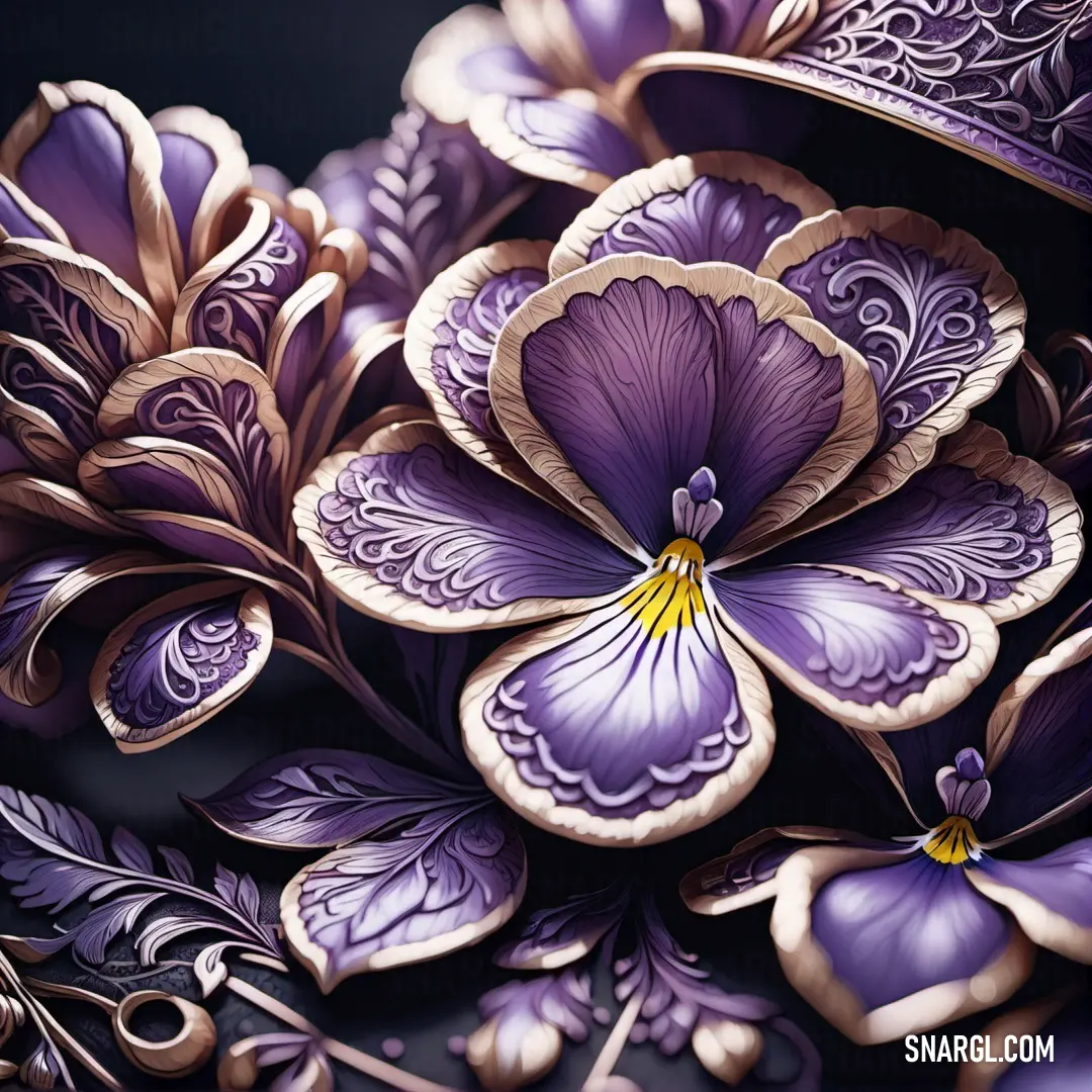
Example of the palette with the PANTONE 666 color
Top 5 color shades of the illustration.
See these colors in NCS, PANTONE, RAL palettes...
NCS (Natural Color System) What color is PMS 666?
PMS 666 is a distinctive shade of deep, rich red with purple undertones, often associated with luxury and elegance. It is part of the Pantone Matching System, widely used in printing and design to ensure color accuracy. Designers often select PMS 666 for high-end branding, packaging, and fashion items due to its unique, sophisticated appearance. This shade can evoke feelings of warmth and passion, making it ideal for products aimed at a bold, confident consumer base. The intriguing combination of red and purple also creates an eye-catching contrast, drawing attention effectively.
Example of the palette with the PANTONE 666 color
Top 5 color shades of the illustration.
See these colors in NCS, PANTONE, RAL palettes...
NCS (Natural Color System) What color is 666?
The number 666, often associated with superstition and the occult, prompts intriguing questions about its color representation. In color theory, numbers can evoke specific hues, and 666 is frequently linked to deep red, a color symbolizing power, danger, and passion. The Ancient Greeks believed that colors could influence moods and behavior, hinting at why this number might lean towards such an intense shade. Moreover, art interpretations often portray 666 adorned in fiery tones, depicting chaos and intensity. Hence, 666 can be seen as a vivid representation of humanity's fears and fascinations.
Example of the palette with the PANTONE 666 color
Top 5 color shades of the illustration.
See these colors in NCS, PANTONE, RAL palettes...
NCS (Natural Color System) What color is #666666?
The color represented by the hex code #666666 is a shade of gray that is often associated with neutrality and balance. With its RGB composition of 102 for red, 102 for green, and 102 for blue, this muted gray has equal intensity across all channels, resulting in a harmonious tone. In design, #666666 is frequently used for backgrounds, text, and user interfaces, as it offers readability without the harshness of pure black. Interestingly, this color can evoke a sense of calmness and reliability, making it popular in branding for technology and finance industries.
Example of the palette with the PANTONE 666 color
Top 5 color shades of the illustration.
See these colors in NCS, PANTONE, RAL palettes...
NCS (Natural Color System) Funny stories about the 'PANTONE 666'
The Crimson Catalyst
Once upon a time in the bustling city of Colorville, where every hue and shade played a role in the grand tapestry of design, there was a vibrant university known for its cutting-edge interior design programs. Among its students was Pier Rocket, a young and ambitious designer with a knack for blending the unconventional with the traditional. Pier had a dream - to create a color so striking that it would become a staple in the world of interior design.
One fateful semester, Pier was assigned a project that would test his creativity and technical skills. His task was to develop a new color that could evoke strong emotions and make a bold statement in interior spaces. Pier knew he needed a partner to help bring his vision to life, so he sought out Igor Goowanni, a brilliant engineer known for his expertise in color science.

Amid the tranquility of the woods, these two share a moment of quiet connection, surrounded by the beauty of nature.
Igor was a meticulous and inventive engineer who had spent years developing new pigments and studying their effects. When Pier approached him with the idea of creating a groundbreaking color, Igor was intrigued but skeptical. "Creating a new color isn't just about mixing pigments," Igor explained. "It's about understanding how people perceive it and what emotions it can evoke."
Undeterred, Pier and Igor embarked on their creative journey. They spent countless hours in Igor’s lab, experimenting with different pigments, blending techniques, and light conditions. Pier was inspired by the idea of a color that would feel both luxurious and mysterious, a color that would command attention and spark curiosity.

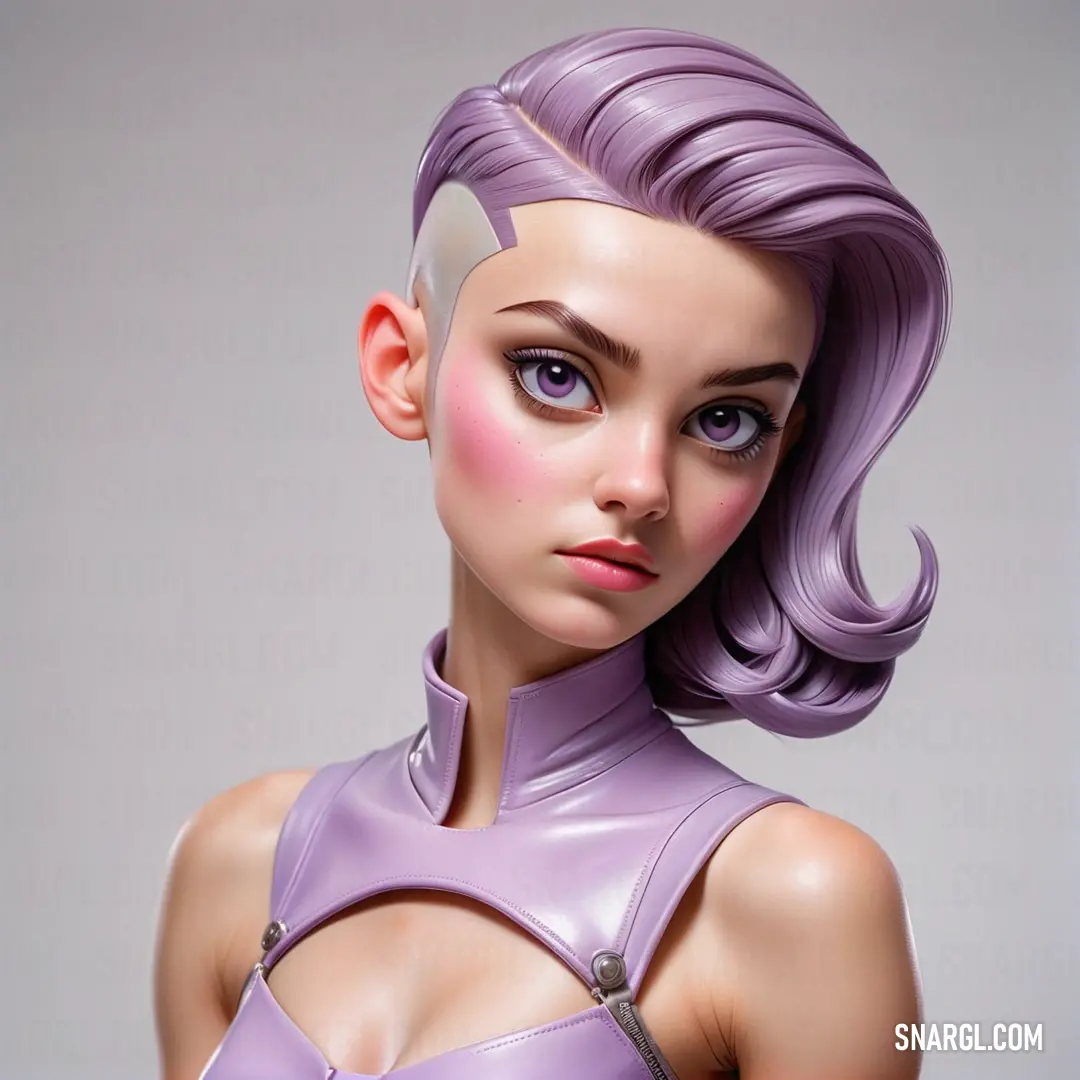
With a graceful pose and vibrant purple attire, this woman embodies elegance and beauty, captured in a moment of timeless charm.
After weeks of trial and error, they finally discovered a unique blend. It was a deep, rich red with undertones of dark purple - both intense and enigmatic. Igor fine-tuned the formulation, ensuring it would be consistent and vibrant under various lighting conditions. They named the color "PANTONE 666," a bold choice that evoked a sense of intrigue and provoked conversation.
The unveiling of PANTONE 666 was met with excitement in the design community. It was introduced at the annual Colorville Design Expo, where it quickly captivated the audience. Designers were fascinated by its ability to create dramatic contrasts and rich atmospheres in interior spaces. PANTONE 666 became a sensation, finding its way into luxury hotels, trendy restaurants, and avant-garde art galleries.

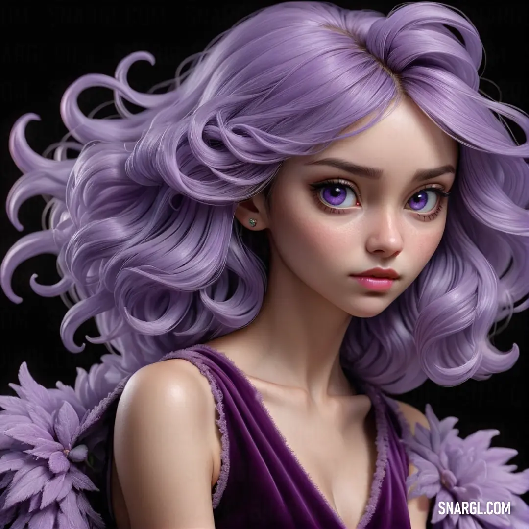
This doll with purple hair and delicate flower accents brings a whimsical sense of serenity and charm to the scene.
Pier Rocket and Igor Goowanni’s creation was more than just a color - it was a symbol of innovation and collaboration. Their work showed that when creativity meets scientific precision, the result can be extraordinary. The story of PANTONE 666 became legendary in Colorville, a testament to the power of imagination and the magic of turning a dream into reality.
And so, in the world of design, PANTONE 666 became a staple, a reminder that the intersection of art and science can create something truly unforgettable. Pier and Igor’s journey was a vibrant chapter in the ongoing story of color, inspiring future generations to push boundaries and explore new horizons in the world of design.
Continue browsing posts in category "PANTONE"
Take a look at this Music Video:
You may find these posts interesting:
