PANTONE 651
What color is PANTONE 651?
PANTONE 651 is composed of a red value of 163, a green value of 186, and a blue value of 216.
In percentage terms, this means that there is approximately 63.92% red, 72.94% green, and 84.71% blue.
This hue captures the essence of a serene sky just after the break of dawn, where the first light of day touches the heavens and paints it with a gentle brush of warmth and tranquility.
In a more tangible sense, imagine holding a piece of the sky in your hands, its texture smooth like satin and its color a blend of light blue with hints of gray, reflecting the early morning light.
It's the color of tranquility, of a gentle sea caressing the shore under a clear sky, and of the soft petals of a morning glory flower as it greets the new day.
PANTONE 651 is a color that designers and brands use to convey a message of reliability and trustworthiness, of professionalism, yet with a touch of approachability.
It stands out in its subtlety, a backdrop that supports and enhances, a foundation that is both versatile and timeless.
This color encourages you to pause, to breathe, and to appreciate the simple beauty that surrounds us every day.
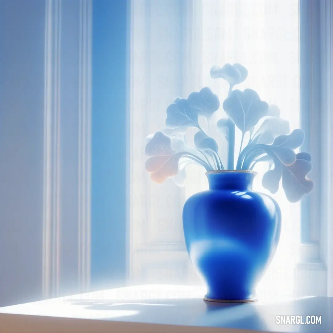
Example of the palette with the PANTONE 651 color

See these colors in NCS, PANTONE, RAL palettes...



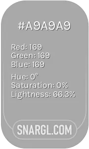 Dark gray
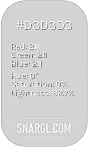 Light gray
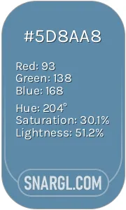 Air Force Blue
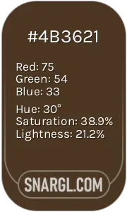 Cafe noir
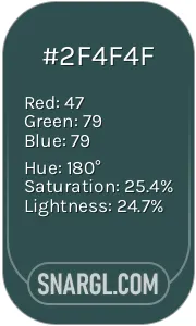 Dark slate gray
