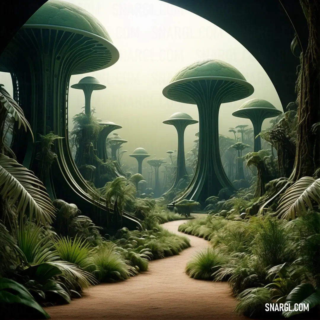
PANTONE 626 is a unique and evocative color that belongs to the PANTONE color system, which is widely used in various industries for color identification, specification, and matching.
This particular shade, PANTONE 626, is a deep and cool shade of green.
It carries with it a sense of nature, freshness, and harmony, reminiscent of a dense forest canopy or the deep, still waters of a secluded lake.
The technical specifications for PANTONE 626 are as follows:
RGB: 58, 106, 88
HEX: #3A6A58
CMYK: 80, 18, 56, 54
This color can evoke feelings of growth, stability, and balance, making it a popular choice for brands and designers looking to convey these attributes.
PANTONE 626's rich hue can be both calming and invigorating, offering a versatile palette for creative projects.
Complementary colors that pair well with PANTONE 626 include lighter shades such as PANTONE 1767, a soft light pink, or PANTONE 7459, a gentle light blue.
These combinations can create a visually appealing contrast that highlights the depth and serenity of PANTONE 626.
In design applications, PANTONE 626 can be used to create a sophisticated and organic aesthetic.
It's suitable for a wide range of design elements, from logos and branding materials to interior decor and fashion.
Its association with the natural world makes it an excellent choice for products and services related to outdoor activities, environmental conservation, and wellness.
Overall, PANTONE 626 is a color that offers a bridge between the tranquility of nature and the dynamic world of design, providing a timeless and elegant solution for a multitude of creative endeavors.

