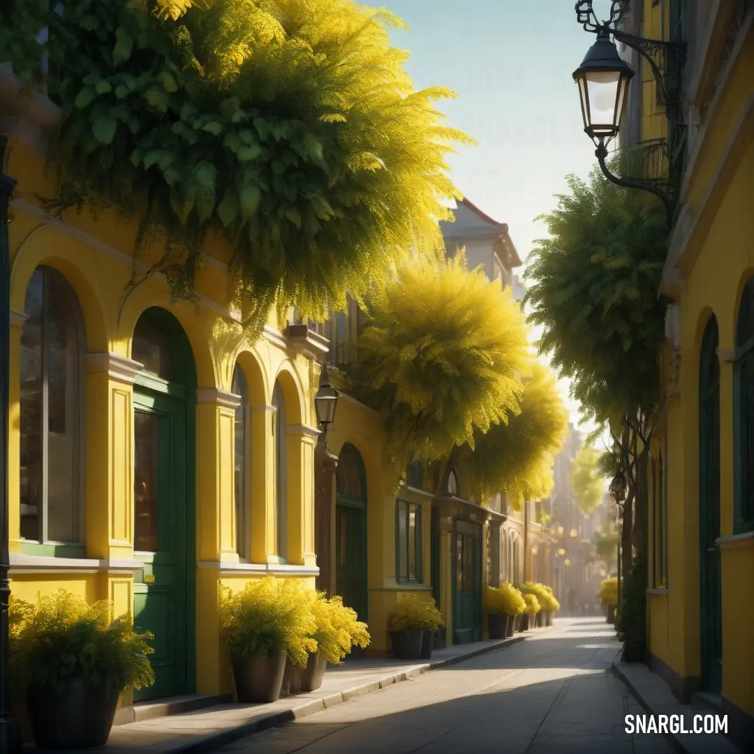
Home Colors PANTONE
PANTONE 613

PANTONE 613

Parameters:
HEX Triplet:
#BCA705
RGB:
188, 167, 5
CMYK:
8, 11, 100, 28
HSL:
53°, 97%, 74%
Closest colors:
in PANTONE:
PANTONE 3975
in RAL Classic:
RAL 1005
in RAL Design:
RAL 090 70 80
in RAL Effect:
RAL 250-3
in NCS:
NCS S 2070-Y
What color is PANTONE 613? The Golden Thread
2024-09-03 Snargl 02:10

What color is PANTONE 613?

Bunch of yellow flowers with the sun shining through them and some water droplets on them. Color RGB 188,167,5.
PANTONE 613 color example: Woman with long blonde hair and a blue shirt on a black background
PANTONE 613 is a pastel yellow color with a warm hue.

It has the following color values in different color spaces:
  • HEX: #BCA705

  • RGB: 188, 167, 5

  • CMYK: 8, 11, 100, 28

  • HSL: 53°, 97%, 74%

PANTONE 613 can be used for various purposes, such as graphic design, fashion, home decor, and more.

It is a bright and cheerful color that can evoke feelings of optimism, happiness, and energy.

Example of the palette with the PANTONE 613 color

Picture with primary colors of Zinnwaldite, Jasmine, Drab, Camel and Gray
Top 5 color shades of the illustration. Arranged in descending order of frequency of occurrence (first - more often, last - more rare).
See these colors in NCS, PANTONE, RAL palettes...
Author:
Funny stories about the 'PANTONE 613'

The Golden Thread

Long time ago, far away, in the quaint coastal town of Miramar, where the sea and sky blended into an endless blue, Duncan Nova, a grizzled fisherman, spent his days mending nets and casting lines. Duncan’s life had always been tied to the rhythm of the tides, but his curiosity about colors, particularly the vivid yellow known as PANTONE 613, was as boundless as the ocean he navigated.

Duncan’s fascination began when he stumbled upon an old, faded fabric at a local flea market. The yellow was unlike any he had ever seen - bright, almost otherworldly, as if it captured the essence of sunlight itself. Determined to understand more, Duncan sought out Professor Kate Gonzalez, a renowned expert in textile design at the nearby university. Her reputation for exploring unconventional materials and hues had intrigued him.
Cartoon picture of a squirrel with a backpack on his back and a backpack on his back. Example of CMYK 8,11,100,28 color.

Professor Gonzalez was intrigued by Duncan's unorthodox approach to color study. When Duncan explained his desire to explore the potential of PANTONE 613 - a specific shade of yellow known for its vibrant and energizing quality - she agreed to help him, sensing the potential for a fascinating research project.

In her studio, surrounded by an array of fabric swatches and dye samples, Kate carefully explained the significance of PANTONE 613. "This color is more than just yellow," she said. "It’s vibrant, dynamic, and full of energy. It’s known to evoke feelings of optimism and vitality."

Duncan listened intently, his eyes reflecting the same intensity as the color they were discussing. "So how can we use it in clothing design?" he asked.
Close up of a plant with the sun shining through the leaves and the sun shining down on the leaves. Example of PANTONE 613 color.

Kate suggested they start with a series of experiments. They began by dyeing various fabrics with PANTONE 613, observing how the color transformed each material. They discovered that the yellow took on different characteristics depending on the fabric's texture and weave. On silk, it shimmered with an ethereal glow, while on cotton, it was bold and earthy.

As they delved deeper, they designed a collection of garments, from flowing dresses to practical workwear, all featuring PANTONE 613. Duncan's initial skepticism about whether such a bright color could be versatile in clothing gradually turned into enthusiasm as he saw how the color brought life and vibrancy to every piece.

The real breakthrough came when Duncan suggested incorporating elements from his fishing life into the designs. He proposed using patterns inspired by the sea - waves, nets, and marine life - printed in PANTONE 613. Kate was intrigued and agreed to explore this direction.

Together, they created a striking collection: vibrant yellow dresses adorned with abstract wave patterns, rugged jackets with net-like designs, and even accessories featuring subtle hints of marine motifs. The garments were displayed at a local fashion show, where they captured the attention of critics and the public alike. The unique blend of Duncan’s maritime influences and Kate’s expert design work brought a fresh perspective to the use of color in fashion.

The success of their collection went beyond mere aesthetics; it symbolized a bridge between two worlds - the practical, weathered life of a fisherman and the sophisticated realm of fashion design. Duncan and Kate’s collaboration not only showcased the power of PANTONE 613 but also demonstrated how creativity and passion could weave together the most unexpected threads.

In the end, Duncan returned to his fishing, but with a newfound appreciation for the art of design. Kate continued her research, often inspired by the vibrant yellow that had bridged their worlds. Their story became a testament to the endless possibilities that arise when diverse perspectives come together, turning a simple shade of yellow into a beacon of innovation and collaboration.
Author:

Continue browsing posts in category "PANTONE"
You may find these posts interesting:
PANTONE 7689 Color
1
0
2
9
0
PANTONE 7689 Color
PANTONE 2062 Color
2
1
2
14
0
PANTONE 2062 Color
PANTONE 459 Color
1
0
2
6
0
PANTONE 459 Color
PANTONE 2200 Color
3
2
2
6
0
PANTONE 2200 Color
PANTONE 108 Color
14
0
2
25
1
PANTONE 108 Color
PANTONE 102 Color
4
0
2
7
2
PANTONE 102 Color
PANTONE 400 Color
2
0
2
9
0
PANTONE 400 Color
PANTONE 2166 Color
3
0
2
6
0
PANTONE 2166 Color
Home
Terms of Service
Contact Us

© 2023 Snargl.com