Home Colors PANTONE
PANTONE 581

PANTONE 581

Parameters:
HEX Triplet:
#655F1C
RGB:
101, 95, 28
CMYK:
25, 19, 100, 70
HSL:
55°, 72%, 40%
Closest colors:
in RGB:
Field drab
in PANTONE:
PANTONE 3995
in RAL Classic:
RAL 8008
in RAL Design:
RAL 080 40 40
in RAL Effect:
RAL 250-6
What color is PANTONE 581? The Spectrum of Innovation
2024-09-21 Snargl 02:10

What color is PANTONE 581?

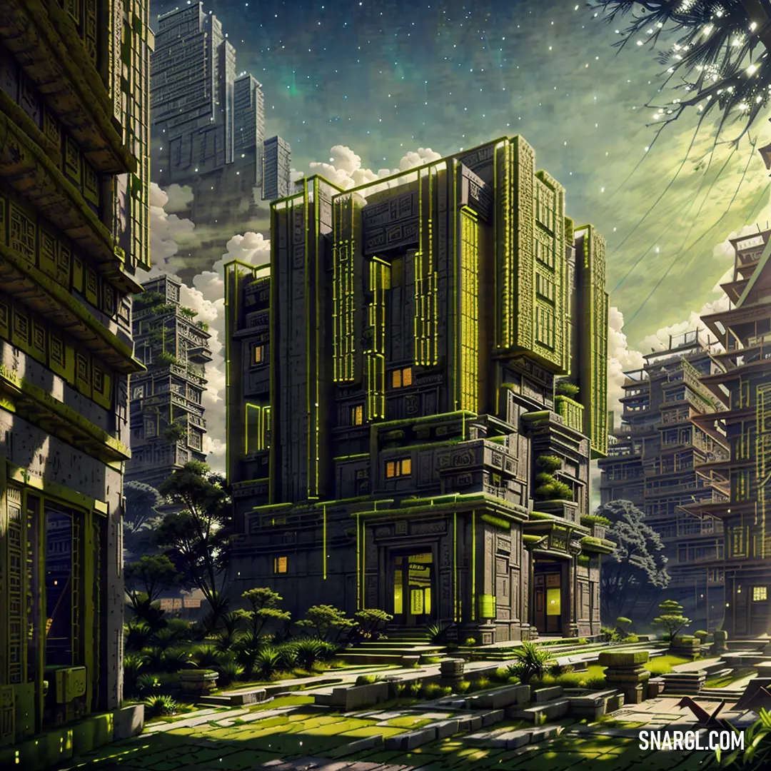
Fantasy landscape with a house on a cliff and a waterfall in the foreground. Example of PANTONE 581 color.
Bowl of almonds and a spoon on a table with a spoon and spoon rest on the table. Example of PANTONE 581 color.
PANTONE 581 has the following color values:
  • Hexadecimal: #655F1C

  • RGB: 101, 95, 28

  • CMYK: 25, 19, 100, 70

  • HSL: 55, 72, 40

It is a dark olive green color with a hint of brown.

This color can be used to create a natural, earthy, or military look in design.

Example of the palette with the PANTONE 581 color

Picture with primary colors of Onyx, Dark khaki, Field drab, Camouflage green and Pale spring bud
Top 5 color shades of the illustration. Arranged in descending order of frequency of occurrence (first - more often, last - more rare).
See these colors in NCS, PANTONE, RAL palettes...
Author:
Funny stories about the 'PANTONE 581'

The Spectrum of Innovation

Far away, in the bustling metropolis of Veridion, a city renowned for its cutting-edge designs and vibrant industry, a revolution was brewing. This revolution, however, wasn't in technology or architecture but in a color. The hue in question was PANTONE 581 - a shade of green that was both earthy and electric, poised to change the landscape of industrial design.

Rohan Angelos, a visionary painter, had long been fascinated by the interplay of colors and materials. For years, he had experimented with countless shades, but none had captivated him quite like PANTONE 581. Its unique blend of green and yellow seemed to hold the promise of something new, something transformative. Rohan believed that this color could breathe new life into industrial design, infusing spaces with a fresh energy that balanced both nature and modernity.
Cake with a lot of yellow frosting on it and some flowers in the background on a table. Color RGB 101,95,28.

Monica White, on the other hand, was a dedicated delivery worker at a design firm known for pushing the boundaries of conventional aesthetics. Her days were filled with hauling materials, but her evenings were spent studying design trends. When she first heard about Rohan's fascination with PANTONE 581, she was intrigued. Monica had always believed that good design could make a real difference in people's lives, and she saw in Rohan's work an opportunity to be part of something extraordinary.

Their paths crossed when Rohan's latest project - a revolutionary line of eco-friendly furniture - was ready for its first prototype. To ensure its success, Rohan needed to transport the pieces to a major industry showcase. Monica, with her thorough knowledge of logistics and her keen eye for detail, was entrusted with this crucial task.
CMYK 25,19,100,70 example: Large open office with a lot of desks and chairs in it and a plant in the middle

As Monica carefully loaded the final pieces into her truck, she and Rohan struck up a conversation about the color that had brought them together. Rohan explained how PANTONE 581's subtle vibrancy could evoke a sense of renewal and harmony. Monica, in turn, shared her observations about how people responded to colors in different contexts and how PANTONE 581 might influence their perceptions of space and functionality.

Their collaboration blossomed as they worked together to fine-tune the presentation. Monica's expertise ensured the prototypes arrived in pristine condition, while Rohan's artistic vision came to life through the furniture's elegant, earthy tones. The duo spent long hours preparing for the showcase, their conversations weaving together technical precision with creative imagination.

The day of the industry showcase arrived, and the reaction was nothing short of electrifying. The industrial design community was enchanted by the prototypes bathed in PANTONE 581. Designers and critics alike praised the color for its ability to merge industrial aesthetics with a natural, refreshing vibe. It seemed to symbolize a new era of design where functionality and beauty coexisted in perfect harmony.

Rohan and Monica stood side by side, witnessing the fruits of their labor. The success of the project was a testament to their unique partnership - an artist and a delivery worker who saw beyond their roles to create something that resonated with people on a profound level. Their story became a celebrated example of how collaboration and innovation could redefine the boundaries of design.

As the city of Veridion embraced PANTONE 581, it marked not just the rise of a new color in industrial design but also the beginning of a lasting friendship between two people who dared to dream and innovate together.
Author:

Continue browsing posts in category "PANTONE"
You may find these posts interesting:
PANTONE 2603 Color
1
0
1
13
0
PANTONE 2603 Color
PANTONE 7620 Color
2
0
1
8
0
PANTONE 7620 Color
PANTONE 194 Color
7
1
2
14
0
PANTONE 194 Color
PANTONE 7718 Color
2
0
2
7
0
PANTONE 7718 Color
PANTONE 140 Color
8
0
2
11
0
PANTONE 140 Color
PANTONE 101 Color
2
0
2
7
1
PANTONE 101 Color
PANTONE 459 Color
1
0
2
6
0
PANTONE 459 Color
PANTONE 4635 Color
4
0
1
5
0
PANTONE 4635 Color
Home
Terms of Service
Contact Us

© 2023 Snargl.com