Home Colors PANTONE
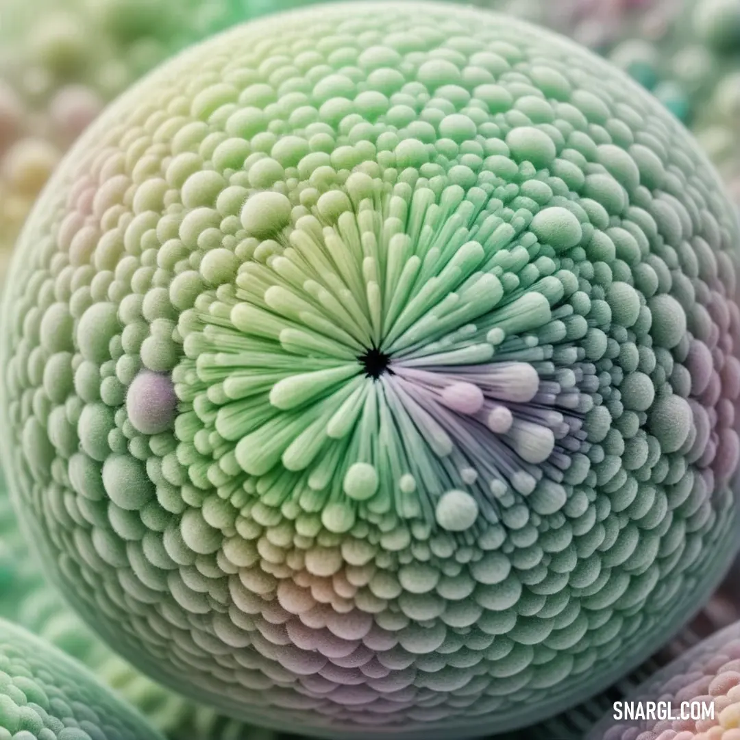
PANTONE 572

PANTONE 572

Parameters:
HEX Triplet:
#BEDDCE
RGB:
190, 221, 206
CMYK:
27, 0, 18, 0
HSL:
151°, 14%, 87%
Closest colors:
in PANTONE:
PANTONE 331
in RAL Classic:
RAL 7035
in RAL Design:
RAL 220 80 05
in RAL Effect:
RAL 750-1
What color is PANTONE 572? The Spectrum of Success
2024-09-21 Snargl 02:14

What color is PANTONE 572?

Man with purple hair and a green jacket smiling at the camera with his hands in his pockets
PANTONE 572 color. Painting of a woman with green hair and horns on her head and a green dress with a green necklace
Man in a green outfit with a green crown on his head and a green beard and mustache. Example of PANTONE 572 color.
PANTONE 572 color example: Woman with green hair and a green dress in front of a building with a pagoda in the background
Woman in a green dress standing in front of a house with a green roof and a green plant. Color #BEDDCE.
PANTONE 572 color example: Woman in a green and black outfit posing for a picture with a building in the background
PANTONE 572 has the following color values:
  • RGB: 190, 221, 206

  • HEX: #BEDDCE

  • CMYK: 27, 0, 18, 0

It is a cool and soothing color that can evoke feelings of calmness, freshness, and harmony.

This color is used to create contrast with darker or warmer colors, or to create a serene and tranquil atmosphere with similar colors.

PANTONE 572 can be found in various Pantone products, such as color guides, chips, and bridge sets.

Example of the palette with the PANTONE 572 color

Picture with primary colors of Light slate gray, MSU Green, Tea Green, Laurel green and Smoky black
Top 5 color shades of the illustration. Arranged in descending order of frequency of occurrence (first - more often, last - more rare).
See these colors in NCS, PANTONE, RAL palettes...
RAL Classic
RAL 7000
RAL 6005
RAL 9018
RAL 7032
RAL 9005
RAL Design
RAL 270 50 15
RAL 180 20 15
RAL 130 90 20
RAL 110 70 10
RAL 170 20 20
Author:
Funny stories about the 'PANTONE 572'

The Spectrum of Success

Long time ago, far away, in the heart of a bustling city, where glass skyscrapers kissed the clouds and neon lights painted the streets, there was a legend taking shape. It was the story of a color that would revolutionize interior design, and at the center of it were two unlikely heroes: Gianni Jet, a visionary entrepreneur, and Kate Black, a top model with an eye for elegance.

Gianni Jet was renowned for his groundbreaking ideas in the world of design. His latest obsession was a color named PANTONE 572, a soothing, tranquil green that reminded him of a serene forest glade. Gianni was convinced that this color had the power to transform spaces and elevate moods, but he needed a grand way to prove his theory.

Kate Black, on the other hand, was not just a top model; she was a trendsetter, admired for her sophisticated taste and ability to see beauty where others might overlook it. She had an innate talent for blending style with innovation, making her the perfect partner for Gianni's vision.

The two met at a high-profile fashion event. Gianni approached Kate with a gleam in his eye, a hint of mischief on his lips. "Kate," he began, "I have a color that will change the world of interior design. It's called PANTONE 572. I need someone with your flair to help me bring it to life."

Kate raised an eyebrow, intrigued. "A color, you say? I'm all ears. But why should I be interested?"

Gianni leaned in. "Because this isn't just any color. It's a game-changer. Imagine transforming a room into a sanctuary with just one hue. I need your unique touch to make this vision irresistible."

Kate, always up for a challenge, agreed to collaborate. They set off on their journey, starting with a grand plan to create a showcase that would captivate the design world. They chose a high-profile gallery space, known for hosting avant-garde exhibitions, and transformed it into a living canvas of PANTONE 572.

Gianni and Kate worked tirelessly, infusing the space with this calming green in various forms. Walls were painted in the hue, furniture was upholstered in fabrics of the same shade, and even the lighting was adjusted to enhance the color's natural allure. They named their creation "The Oasis of Serenity."

The opening night arrived, and the gallery buzzed with excitement. Influencers, designers, and media flocked to see the phenomenon that Gianni and Kate had orchestrated. As guests stepped into "The Oasis of Serenity," they were enveloped in a wave of tranquility. The soothing green brought a sense of calm that was palpable, transforming the gallery into a retreat from the chaotic city outside.

Reviews were ecstatic. The innovative use of PANTONE 572 was hailed as a revolutionary leap in interior design. People marveled at how a single color could so profoundly affect their mood and perception of space. The success was immediate and resounding.

As the weeks went by, PANTONE 572 became a sought-after shade in homes and businesses alike. Gianni Jet and Kate Black's partnership became legendary, symbolizing a perfect blend of vision and style. Their "Oasis of Serenity" had proven that the right color could indeed transform the world.

Gianni and Kate continued to push boundaries, but they always remembered the lesson they learned from their adventure: that sometimes, the smallest details - like a single, serene color - can make the biggest impact. And thus, the spectrum of success was painted forever in the vibrant hue of PANTONE 572.
Author:

Continue browsing posts in category "PANTONE"
You may find these posts interesting:
PANTONE 210 Color
5
0
2
9
0
PANTONE 210 Color
PANTONE 2210 Color
5
0
2
5
0
PANTONE 2210 Color
PANTONE 102 Color
4
0
2
7
2
PANTONE 102 Color
PANTONE 2200 Color
3
2
2
6
0
PANTONE 2200 Color
PANTONE 645 Color
5
0
2
7
0
PANTONE 645 Color
PANTONE 2240 Color
11
1
4
26
0
PANTONE 2240 Color
PANTONE 575 Color
5
0
2
10
0
PANTONE 575 Color
PANTONE 2166 Color
2
0
2
6
0
PANTONE 2166 Color
Home
Terms of Service
Contact Us

© 2023 Snargl.com