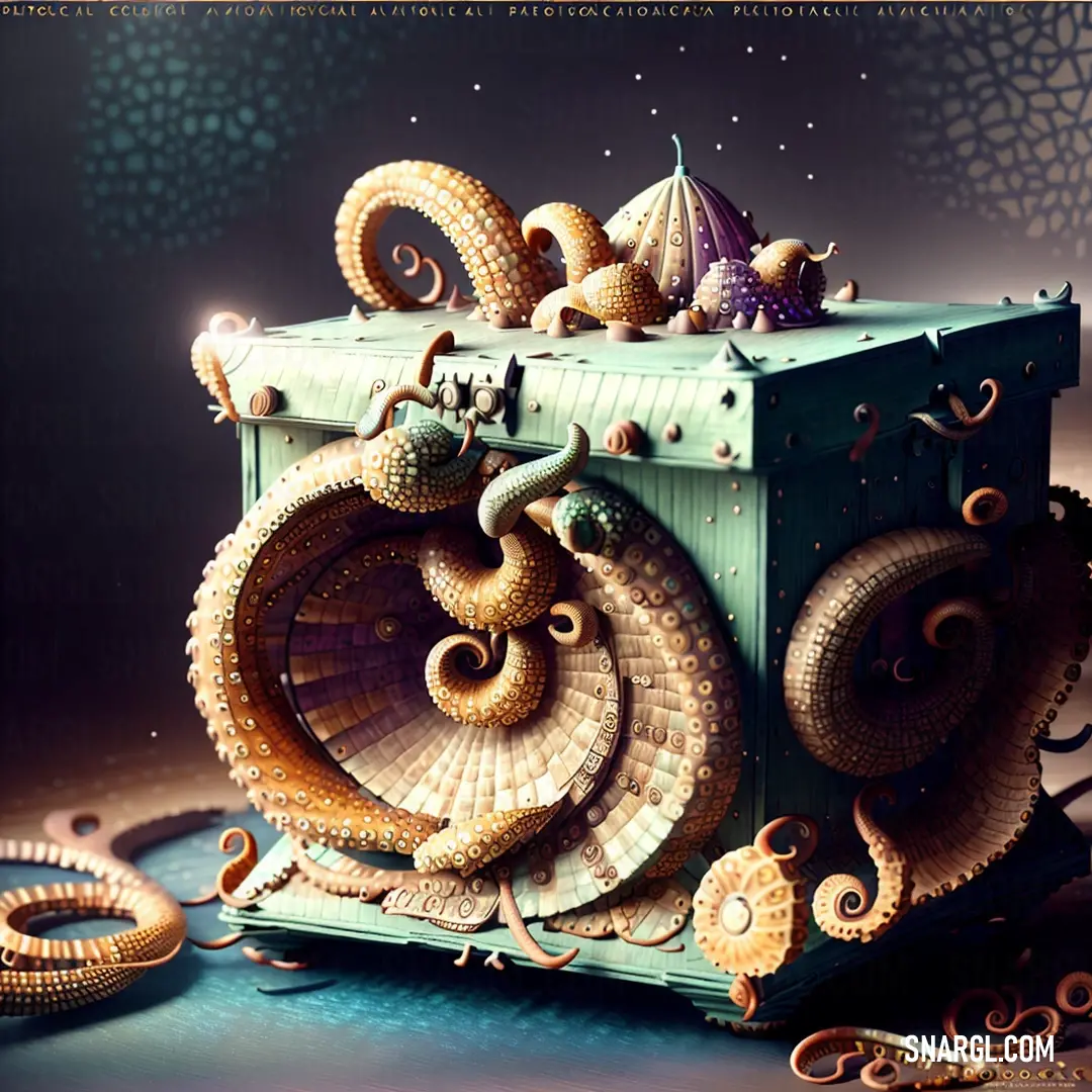
Home Colors PANTONE
PANTONE 465

PANTONE 465

Parameters:
HEX Triplet:
#BB9959
RGB:
187, 153, 89
CMYK:
9, 29, 66, 24
HSL:
39°, 52%, 73%
Closest colors:
in RGB:
Camel
in PANTONE:
PANTONE 7562
in RAL Classic:
RAL 1024
in RAL Design:
RAL 060 60 40
in RAL Effect:
RAL 280-M
in NCS:
NCS S 3030-Y
What color is PANTONE 465? The Golden Paradox: A Tale of Pantone 465
2024-09-03 Snargl 02:08

What color is PANTONE 465?

PANTONE 465 color example: Scarecrow in a scarecrow costume walking through a cornfield with a scarecrow on his head
Painting of a futuristic car in a desert setting with a flying object in the background. Example of #BB9959 color.
PANTONE 465 has different variations depending on the type of material and printing process, such as coated, uncoated, or plastic.

It is a shade of yellow with the following color values:
  • RGB: 187, 153, 89

  • HEX: #BB9959

  • CMYK: 9, 29, 66, 24

PANTONE 465 is a warm and earthy color that can be used for various purposes, such as branding, packaging, interior design, or fashion.

Example of the palette with the PANTONE 465 color

Picture with primary colors of Seal brown, Bisque, Slate gray, Antique brass and Topaz
Top 5 color shades of the illustration. Arranged in descending order of frequency of occurrence (first - more often, last - more rare).
See these colors in NCS, PANTONE, RAL palettes...
Author:
Funny stories about the 'PANTONE 465'

The Golden Paradox: A Tale of Pantone 465

Long time ago, in the heart of Milan, where fashion and art intertwined like the most delicate threads of silk, there was a legend about a certain shade of gold that could mesmerize anyone who saw it. The color was known only by its code: Pantone 465. It was a hue not of pure gold, nor of yellow, but something in between - warm, earthy, with a touch of luxury that spoke to the soul. Few knew its true potential, and fewer still dared to wield it.

One such person was Dr. Cassandra Angelos, a visionary in the world of color theory and polygraphy. Cassandra wasn’t just a scientist; she was an artist, seeing colors not merely as shades, but as emotions, stories, and even worlds. Her laboratory, nestled in an old, unassuming building, was a sanctuary of creativity and innovation, filled with books, samples, and machines that hummed with the potential to transform the ordinary into the extraordinary.
PANTONE 465 color example: Man in a suit with a flower in his hand and a giant robot behind him, with a sky background

It was here, amidst her research, that Cassandra stumbled upon an ancient manuscript, tucked away in a forgotten corner of her library. The manuscript, written in an elegant script, detailed the properties of Pantone 465. According to the text, the color was more than just a shade; it was a paradox. When used in printing, it could create an optical illusion, shifting from matte to metallic under different lights. The manuscript spoke of how this color, when used correctly, could evoke feelings of nostalgia, warmth, and a strange sense of familiarity, as though it connected to some primal part of the human psyche.

Intrigued, Cassandra began to experiment with Pantone 465, testing it on different materials and papers. But no matter what she tried, she couldn’t unlock the full potential of the color. It was as if the shade was holding back, waiting for the right moment or the right person to reveal its true nature.

That moment came when Vivienne Goowanni, the world-renowned top model, entered Cassandra’s life. Vivienne was not just a model; she was a muse, a living work of art. Her beauty was ethereal, and she had a natural ability to bring life to any creation she was a part of. She was set to grace the cover of a groundbreaking fashion magazine, one that aimed to merge art, fashion, and technology in a way that had never been done before.

Vivienne had heard of Cassandra’s work and sought her out, believing that Cassandra could create something that would transcend the boundaries of traditional magazine covers. When Vivienne arrived at Cassandra’s lab, the two women felt an immediate connection, as if they had known each other in a past life. They spent hours discussing art, fashion, and the power of color.

Cassandra showed Vivienne the manuscript and shared her experiments with Pantone 465. Vivienne was captivated by the color’s potential and suggested they use it for the magazine cover. But it wasn’t enough to simply print the cover in Pantone 465 - they needed to find a way to make the color come alive, to make it resonate with everyone who saw it.

After days of brainstorming and sleepless nights in the lab, Cassandra and Vivienne finally had a breakthrough. They realized that the key to unlocking Pantone 465’s power was to pair it with Vivienne’s image in a way that would evoke the feeling of a living, breathing presence. They decided to print the cover using a special technique that layered Pantone 465 with a subtle overlay of transparent gloss, creating a dynamic effect that made the color shift as the viewer moved, capturing the essence of Vivienne’s ethereal beauty.

The day the magazine was released, it caused an instant sensation. People were entranced by the cover, which seemed to glow and shift in the light, as if Vivienne herself was stepping out of the pages. The use of Pantone 465 was hailed as a revolutionary moment in the world of printing and design. It wasn’t just a color; it was an experience, a story that each viewer could connect with on a deeply personal level.

Cassandra and Vivienne’s collaboration became legendary, and the cover was immortalized in the annals of fashion history. But more than that, it was a testament to the power of creativity and the magic that happens when art and science come together.

As for Pantone 465, it remained a symbol of that golden paradox, a color that could never be fully defined or replicated, but only experienced. And those who had the privilege to witness it knew that they had seen something truly extraordinary.
Author:

Continue browsing posts in category "PANTONE"
You may find these posts interesting:
PANTONE 2603 Color
1
0
1
13
0
PANTONE 2603 Color
PANTONE 108 Color
14
0
2
25
1
PANTONE 108 Color
PANTONE 5255 Color
1
0
2
5
0
PANTONE 5255 Color
PANTONE 2210 Color
5
0
2
5
0
PANTONE 2210 Color
PANTONE 104 Color
8
3
2
11
1
PANTONE 104 Color
PANTONE 210 Color
5
0
2
9
0
PANTONE 210 Color
PANTONE 101 Color
2
0
2
7
1
PANTONE 101 Color
PANTONE 140 Color
8
0
2
11
0
PANTONE 140 Color
Home
Terms of Service
Contact Us

© 2023 Snargl.com