Home Colors PANTONE
PANTONE 440

PANTONE 440

Parameters:
HEX Triplet:
#3D3836
RGB:
61, 56, 54
CMYK:
63, 62, 59, 88
HSL:
17°, 11%, 24%
Closest colors:
in RGB:
Taupe
in PANTONE:
PANTONE 412
in RAL Classic:
RAL 8019
in RAL Design:
RAL 060 20 05
in RAL Effect:
RAL 790-M
What color is PANTONE 440? The Color of Elegance
2024-09-03 Snargl 02:14

What color is PANTONE 440?

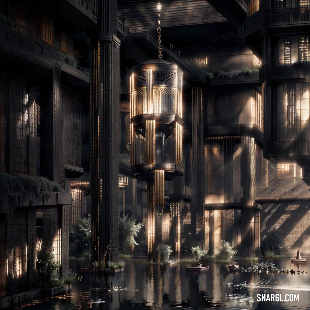
Large building with a lot of windows and a clock on the side of it's face and a light fixture hanging from the ceiling
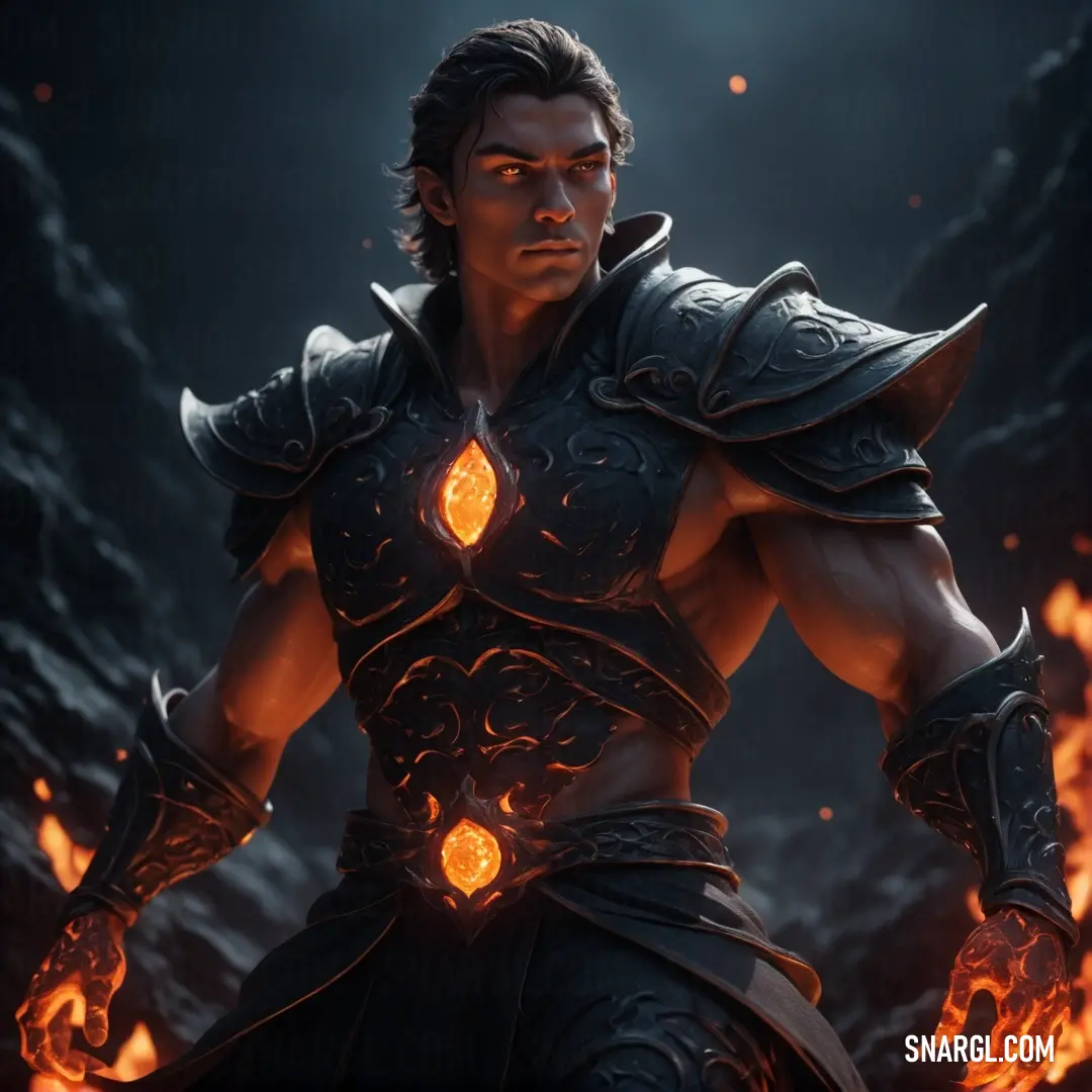
Man in armor with flames around his shoulders and arms, standing in front of a dark background. Color CMYK 63,62,59,88.
Man with green hair and a beard in a black jacket and green hair and a green - haired beard. Example of #3D3836 color.
Close up of a raccoon in a forest with leaves on the ground and a light shining on it. Color #3D3836.
City with a lot of smoke and buildings in it and a lot of smoke coming out of the buildings. Color #3D3836.
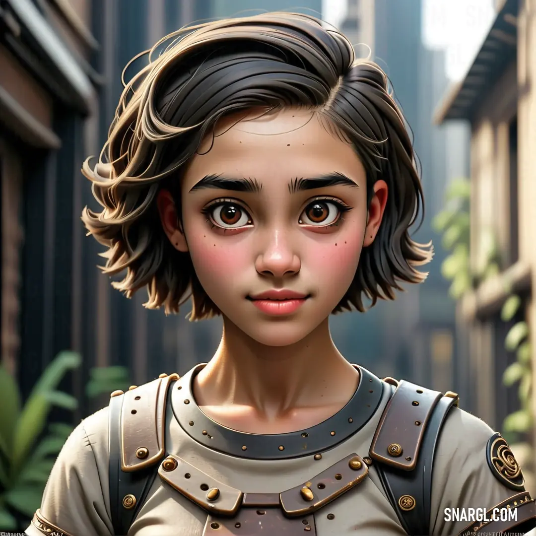
Digital painting of a young girl in a city setting with a cityscape in the background. Example of PANTONE 440 color.
PANTONE 440 is a dark brown color with a hexadecimal code of #3D3836 and a RGB value of 61, 56, 54.

It is used in various applications, such as graphic design, fashion, home, and plastics.

PANTONE 440 is a dark and neutral color that can create a sense of elegance, sophistication, and mystery.

It can also evoke feelings of earthiness, warmth, and comfort.

It can be paired with lighter or brighter colors to create contrast and balance.

PANTONE 440 is a versatile color that can be used for various purposes and occasions.

This color can be a great choice for logos, packaging, clothing, furniture, and more.

It can also be a good option for creating a cozy and relaxing atmosphere in your home or office.

PANTONE 440 is a color that can express your style and personality in a subtle and elegant way.

Example of the palette with the PANTONE 440 color

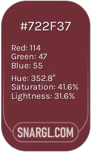
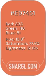
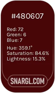
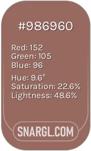
Picture with primary colors of Dark jungle green, Wine, Burnt Sienna, Bulgarian rose and Dark chestnut
Top 5 color shades of the illustration. Arranged in descending order of frequency of occurrence (first - more often, last - more rare).
See these colors in NCS, PANTONE, RAL palettes...
NCS (Natural Color System)
NCS S 8005-B80G
NCS S 5030-R10B
NCS S 2040-Y60R
NCS S 5540-Y90R
NCS S 3030-R
RAL Classic
RAL 8022
RAL 3009
RAL 2012
RAL 3007
RAL 1036
RAL Design
RAL 160 20 20
RAL 040 30 30
RAL 040 60 60
RAL 040 20 19
RAL 050 50 20
Author:
Funny stories about the 'PANTONE 440'

The Color of Elegance

In a far away place, in the heart of the fashion capital, there was a quaint studio where color danced in the light. This was the domain of Pier Chen, a painter whose works were renowned for their unique ability to breathe life into even the most subdued hues. His latest fascination was PANTONE 440, a color described as a deep, muted grayish-blue. It was a shade that, to many, seemed uninspiring, but Pier saw something magical in it.

One sunny afternoon, Pier's curiosity about PANTONE 440 led him to seek the wisdom of Professor Betsey Gonzalez, an esteemed fashion historian known for her profound understanding of color psychology in high fashion. The professor’s office was a haven of books and fabrics, where the walls were adorned with swatches of every conceivable color.

"Professor Gonzalez," Pier began, "I’ve been captivated by PANTONE 440. I sense it holds a special essence, but I can't quite grasp it. Could you help me understand?"

Betsey adjusted her glasses and smiled. "Ah, PANTONE 440! It’s not just a color; it’s a statement. In the world of high fashion, every hue tells a story, and this particular shade carries a whisper of subtle sophistication."

Pier looked puzzled. "Subtle sophistication? But it’s so muted."

"Exactly," Betsey replied, "and that’s its strength. This color is a blend of resilience and calmness, often associated with modern minimalism. It’s not about shouting for attention but creating an atmosphere of refined elegance. Its muted quality allows it to serve as a canvas for other colors, making it versatile and timeless."

As Betsey spoke, Pier imagined PANTONE 440 as a backdrop in a grand fashion show. He saw it draped in luxurious fabrics, understated yet making a profound impact. "So, it's about creating a foundation, rather than being the focal point itself?"

"Precisely," Betsey confirmed. "In high fashion, designers use such colors to emphasize the intricate details of their designs. PANTONE 440 works in harmony with more vibrant shades, grounding them and allowing them to shine without overwhelming the senses."

Pier nodded thoughtfully. "I see now. It’s like a silent partner, quietly enhancing the beauty of what stands out."

"Well put," Betsey said, her eyes twinkling. "Colors like PANTONE 440 bring depth and balance. They are the unsung heroes of fashion, providing a sophisticated backdrop against which other hues can truly flourish."

Inspired by their conversation, Pier returned to his studio with a renewed sense of purpose. He began to experiment with PANTONE 440, pairing it with bold colors and intricate textures. The results were stunning - pieces that were both striking and subtly elegant.

In the end, Pier realized that the true essence of PANTONE 440 was not in its outward appearance but in its ability to elevate and complement. It was a color of quiet strength, demonstrating that sometimes, the most profound beauty lies in the understated.

And so, in the world of high fashion, PANTONE 440 became a symbol of elegant restraint, a testament to the wisdom of subtlety and the art of balance.
Author:

Continue browsing posts in category "PANTONE"
You may find these posts interesting:
PANTONE 100
3
0
2
5
0
PANTONE 100
PANTONE 566
4
0
1
7
0
PANTONE 566
PANTONE 103
3
0
2
13
2
PANTONE 103
PANTONE 400
2
0
2
9
0
PANTONE 400
PANTONE 4635
4
0
1
5
0
PANTONE 4635
PANTONE 2210
5
0
1
5
0
PANTONE 2210
PANTONE 101
2
0
2
7
0
PANTONE 101
PANTONE 106
2
0
2
8
0
PANTONE 106
Home
Terms of Service
Contact Us

© 2023 Snargl.com