Home Arts Colors PANTONE
PANTONE 409

PANTONE 409

Parameters:
HEX Triplet:
#8B807A
RGB:
139, 128, 122
CMYK:
17, 25, 22, 51
HSL:
21°, 12%, 55%
Closest colors:
in RGB:
Cinereous
in PANTONE:
PANTONE 403
in RAL Classic:
RAL 7048
in RAL Design:
RAL 010 50 10
in RAL Effect:
RAL 830-M
Best Pictures:
Articles:
What color is PANTONE 409? What are the examples of PANTONE 409 color? What colors go well with the PANTONE 409 color? What color is 409? What color is PMS 409? The Curious Case of PANTONE 409
2025-03-13 Snargl 14:12 3446 155
# General # Fashion # Design

What color is PANTONE 409?

An eerie green demon with twisted horns and a single glowing eye glares menacingly, cloaked in a deep green robe that evokes an unsettling yet mystical aura, representing the darkness captured in PANTONE 409.
A resilient woman stands in the pouring rain, dressed in a fitted wet suit, confidently holding a vibrant purple and yellow soda can, embodying a striking contrast against the moody atmosphere around her.
An inspired artist stands poised with a paintbrush in hand, surrounded by an intense backdrop of fire and smoke that ignites creativity, while PANTONE 409 enhances the dramatic flair of the scene.
In a hazy atmosphere, a man with vibrant red hair kneels, hands resting on his knees, embodying a moment of reflection as smoke envelops him, accentuated by the muted tones of PANTONE 409.
A fierce woman in a stylish leather jacket braves the rain in a bustling city at night, neon lights reflecting her fierce spirit, showcasing the beauty that arises in the midst of chaos and darkness exemplified by #8B807A.
A breathtaking landscape of rolling green hills under a vast, cloudy sky. The contrast between the bright grass and the soft, dark clouds above creates a feeling of peaceful isolation in the open landscape.
A fierce monster with large, sharp teeth stands menacingly, its face twisted in a primal expression. In the background, a city looms, contrasting the creature's wild appearance with the urban landscape.
A woman in a bikini, riding a horse on a sunlit beach. With a spear in one hand and a sword in the other, she exudes strength and confidence, her silhouette framed by the ocean breeze and golden sands.
A man in an elaborate costume, complete with helmet and sword, walks down a bustling street. His attire stands out against the modern surroundings, creating a sense of timeless adventure and strength.
The color of PANTONE 409 is a shade of red-orange with a slight brown tint.

It has a hexadecimal value of #8B807A, which means it is composed of 54.51% red, 50.2% green, and 47.84% blue in the RGB color model.

In the CMYK color model, which is used for printing, it has 17% cyan, 25% magenta, 22% yellow, and 51% black.

The hue of PANTONE 409 is 21°, and the saturation is 12%, which means it is not very vivid or intense.

PANTONE 409 is a color that can be used for various purposes, such as branding, packaging, fashion, or interior design.

It can create a warm, cozy, and elegant atmosphere when paired with other colors.

PANTONE 409 is a color that can convey different meanings and emotions depending on the context and culture.

It is a color that can be found in various products, artworks, and places.

This color can be used to create different effects, moods, and impressions.

Example of the palette with the PANTONE 409 color

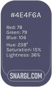
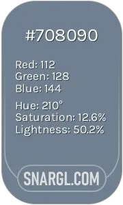
Picture with primary colors of Battleship Grey, Onyx, Davy grey, Snow and Lavender gray
30 %
29 %
19 %
11 %
8 %

Click to see these colors in NCS, PANTONE, RAL palettes...

Example of the palette with the PANTONE 409 color

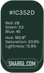
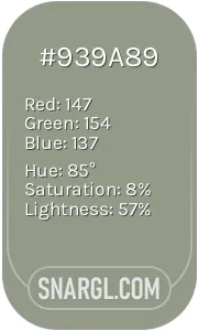
Picture with primary colors of Ash grey, Medium jungle green, Pang, Gray-Tea Green and Slate gray
32 %
28 %
28 %
8 %
2 %

Click to see these colors in NCS, PANTONE, RAL palettes...
Author:

What are the examples of PANTONE 409 color?

A person stands in a dramatic mountain landscape, holding a staff and star. Fog and mist swirl in the background, with the RGB 139,128,122 color adding to the mysterious, atmospheric scene.
A close-up view of a blue-and-white tiled wall with intricate patterns, where light streams through the middle, highlighting the warm tones of the surrounding space.
A bathroom with a tiled wall and a toilet in its corner is bathed in a gentle, muted light. The CMYK 17,25,22,51 color scheme offers a peaceful, understated aesthetic.
A bathroom features a blue-tiled wall and a white toilet tucked into the corner. The PANTONE 409 color softens the look, adding a touch of calm to the functional space.
A person stands in front of a striking wall of blue tiles, their shadow cast against the surface. The blend of blue and shadow creates an almost surreal, artistic effect.
A green portable heater stands tall with a small light perched on top, showcasing the PANTONE 409 color. Its simple design makes it an unassuming yet practical addition to any room.
A heroic figure clad in shining armor grips a sword tightly, standing defiantly in a sunlit courtyard, while a mysterious demon-like creature lurks in the shadows behind - a clash of two worlds.
A gallant character strikes a heroic pose, wielding a spear and shield, adorned in vibrant colors that contrast starkly with the mysterious world around it - a symbol of bravery and adventure.
In a fantastical world, a determined character stands boldly against a backdrop of an imposing giant demon. Their expressions reflect courage in a setting that blends danger with wonder.
PANTONE 409, often referred to as "Gray Brown," is a neutral hue with a touch of warmth, making it versatile in both fashion and design. It finds use in furniture, packaging, and graphic design, serving as a perfect backdrop for vibrant colors. Notably, it's been featured in several high-profile fashion collections, symbolizing sophistication and earthiness. Brands appreciate its adaptability, using it for marketing materials that aim for a premium feel. In interior design, PANTONE 409 complements natural wood tones, creating a harmonious, balanced space that resonates tranquility.

Example of the palette with the PANTONE 409 color

Picture with primary colors of Umber, Cinereous, Pastel brown, Shadow and Dark lava
75 %
2 %
13 %
2 %
5 %

Click to see these colors in NCS, PANTONE, RAL palettes...

Example of the palette with the PANTONE 409 color

Picture with primary colors of Onyx, Dark jungle green, Arsenic, Bistre and Davy grey
50 %
17 %
14 %
8 %
8 %

Click to see these colors in NCS, PANTONE, RAL palettes...
Author:

What colors go well with the PANTONE 409 color?

A fearless man in white stands valiantly in a snowy landscape, sword in hand, framed by majestic columns and a wide window. His expression radiates determination, preparing him for an impending challenge.
An enigmatic woman in a sleek black dress confidently holds oversized metal scissors, her poised stance and intense gaze hinting at the power of transformation and creativity embodied in her presence.
A determined woman clad in a flowing dress, wielding a sword confidently. Surrounding her are shadowy figures blurred by the fog, creating an air of mystery in an enigmatic landscape.
PANTONE 409, a warm taupe, embodies an earthy, sophisticated charm. Its muted tone harmoniously pairs with various colors. For a balanced palette, combine it with soft whites and creams, offering a fresh contrast. Dusty blues and slate grays provide a serene backdrop, enhancing its warmth. To add depth, try rich burgundies or olive greens, which evoke a natural, organic feel. Bright accents, like mustard yellow or burnt orange, can energize the scheme, making it lively. This versatile color not only enhances spaces but also complements varied styles, from modern minimalism to rustic charm.

Example of the palette with the PANTONE 409 color

Picture with primary colors of Onyx, Teal blue, Cadet blue, Rose ebony and Cafe au lait
71 %
16 %
5 %
2 %
2 %

Click to see these colors in NCS, PANTONE, RAL palettes...
Author:

What color is 409?

A playful black cat dons a charming pink scarf as it curiously explores a colorful tableau of Easter decorations, toys, and a teddy bear, creating a delightful narrative filled with whimsy and joy.
A curious cat investigates a vibrant array of toys scattered on a table, accentuated by glimmering lights in the background, creating a playful and enchanting atmosphere that sparks joy.
A sophisticated black cat comfortably sprawls on a table, playfully surrounded by shiny Christmas ornaments, with a beautifully decorated tree twinkling softly in the background, creating a festive atmosphere.
A captivating cat sits gracefully on a plush purple surface, surrounded by vibrant eggs and charming decorations illuminated by soft lights, creating a magical Easter-inspired tableau.
The question "What color is 409?" may initially confuse, as 409 is commonly recognized as a cleaning product rather than a hue. However, it also represents a code in the Pantone color system, designated as a muted grey. This color embodies sophistication and versatility, often favored in minimalist design. Interestingly, 409 is also associated with a unique wavelength of light in the RGB spectrum, blending warm and cool tones to create a balanced visual experience. The versatility of 409 allows it to complement both vibrant colors and subdued shades in various artistic applications.

Example of the palette with the PANTONE 409 color

Picture with primary colors of Medium jungle green, Black, Chamoisee, Sepia and Taupe gray
75 %
13 %
5 %
2 %
2 %

Click to see these colors in NCS, PANTONE, RAL palettes...
Author:

What color is PMS 409?

A stunning array of diverse foods and beverages gracefully arranged on a beautifully set table, surrounded by a wooden surface that frames the delightful feast. The vibrant colors and textures invite you to join in on the culinary celebration.
An elegant row of pristine white pillars set against a soft pink wall, topped with a stylish clock that adds a touch of charm. This composition creates a serene atmosphere filled with architectural beauty and simplicity.
Three striking white pillars stand tall in a room adorned with a chevron-patterned floor, creating a captivating visual interplay of lines and shapes. The backdrop hints at sophistication and architectural elegance.
A thoughtful arrangement of pillars in a cozy room adorned with soft pink walls and a clean white floor, illustrating PANTONE 409 color in a harmonious setting. The ambiance whispers a gentle elegance and tranquility.
PMS 409, also known as "Gray Brown," is a unique color in the Pantone Matching System. This muted, earthy hue is characterized by its unassuming blend of gray and subtle brown tones, making it versatile for various applications, especially in fashion and interior design. Interestingly, PMS 409 has been employed as a color trend in eco-friendly packaging due to its organic appearance. Historically, it gained attention during the early 2000s for its association with sustainability. Today, PMS 409 continues to evoke a sense of stability and nature, appealing to brands that value authenticity.

Example of the palette with the PANTONE 409 color

Picture with primary colors of Medium jungle green, Davy grey, Taupe gray, Sepia and Camel
44 %
28 %
14 %
8 %
2 %

Click to see these colors in NCS, PANTONE, RAL palettes...
Author:
Funny stories about the 'PANTONE 409'

The Curious Case of PANTONE 409

Once upon a time in the colorful town of Chromaville, there lived an inventive soul named Pier Chen. Pier was known for his dazzling designs that turned bland spaces into vibrant havens of creativity. One fine morning, he had just completed his latest masterpiece, a room filled with sunshine yellows and ocean blues, when suddenly, his cat, Sir Fluffington, accidentally knocked over a can of PANTONE 409 - a gray-brown color as unremarkable as a soggy slice of toast.

"Yikes, Sir Fluffington! This is hideous!" exclaimed Pier with dramatic flair, waving his paintbrush. Little did he know that PANTONE 409 was destined for greatness. Meanwhile, across town, a quirky engineer named Jacob Abloh had always been fascinated by the art of room design. He believed every room had a personality and that PANTONE 409 was waiting to tell its story.
A woman in a green hooded attire stands surrounded by a lush forest, holding flickering fire in her hands. The vibrant greenery envelops her, creating a captivating scene of nature's power and warmth.
This enchanting figure masters the elemental forces of nature, embodying the balance of fire and foliage as she illuminates the tranquil forest with her flickering flame.

Pier and Jacob were unlikely friends, but they shared a dream: to create the first 'room of the future' - a space that could evoke every emotion and brighten even the cloudiest day. When Jacob heard about Pier's unintentional splash of PANTONE 409, he rushed over.

"Let's make it work!" Jacob said with enthusiasm, only slightly less dreamy than a marshmallow cloud. Pier scratched his head, considering the potential disaster of transforming a dull color into a triumph of design.

"Are you serious? You want to use that dreary color on purpose?!" Pier replied, his voice close to a squeak.

"Absolutely! Just think of it - I'll engineer a wall that changes its vibe depending on mood! PANTONE 409 will be the perfect chameleon color!" Jacob declared, his eyes sparkling with madness. Pier was caught in a whirlwind of colors in his mind. They decided to team up for their whimsical challenge.
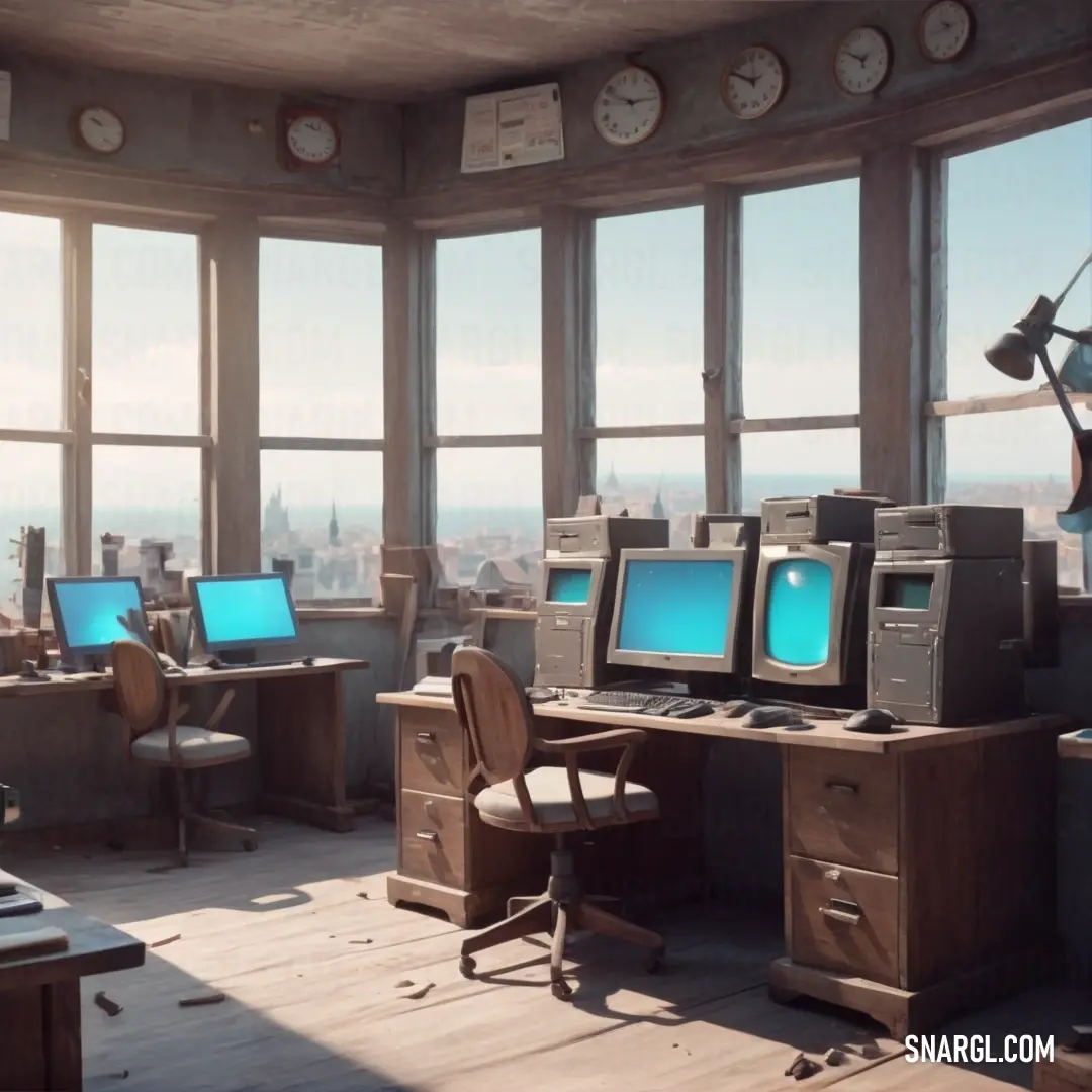
A busy, modern workspace filled with desks lined up with computers, and a large wall clock hanging above. The room feels energetic and functional, with a sense of constant motion in the air as people work through the day.
In the heart of a bustling workspace, the combination of computers, desks, and a ticking clock creates a vibrant atmosphere of constant activity and focus.

After weeks of experiments, laughter, and the occasional paint fight, they finally crafted a spectacular room that embraced PANTONE 409. The walls were adorned with high-tech displays that shifted the hue of the gray-brown based on the occupants' emotions. Feeling happy? The walls warmed up to cheerful yellows and greens. Sad? They morphed into cool blues that soothed the soul.

On the grand unveiling day, the entire town gathered. Pier and Jacob stood proudly in front of the crowd. The moment arrived, and with a dramatic flourish, they revealed the room. The audience gasped in unison as PANTONE 409 transformed before their eyes. One moment, it was a wistful taupe, and in a blink of an eye, it burst into sunny lemon zest as laughter filled the air.

People danced, celebrated, and even cried in delight as they experienced the emotional revolution of color. Sir Fluffington, initially skeptical, perched on a shelf, watching with disdain before promptly falling asleep in a pool of lavender light that washed over everyone during the moment of joy.
A striking cartoon character with a massive axe, draped in a vibrant purple outfit, finds itself amidst a drenched landscape, showcasing resilience in the midst of a storm.
Against the backdrop of a relentless rain, this courageous character showcases its might with a colossal axe, symbolizing persistence and strength beyond nature's fury.

After the event, everyone in Chromaville wanted a PANTONE 409 room. People lined up for weeks, clamoring for their own transformative spaces. Pier and Jacob became national icons, dubbed the 'Dynamic Duo of Design' by the media who rushed to capture their creative magic. They were invited to creativity festivals, and their designs inspired people worldwide to embrace even the most 'noteworthy' shades of color.

In the end, they decided to open a cozy little café nearby featuring PANTONE 409 pastries - muffins that changed flavors with every bite depending on your mood, of course! Sir Fluffington retired happily to a cozy throne made of giant catnip cushions, forever grateful that a simple accident had propelled him and his friends to fame.

And so, Pier and Jacob taught everyone to never underestimate the power of an ordinary shade of gray-brown. Whether it was paint or life, change could come from the most unexpected places. And in the end, they found joy simply in daring to be different together.
Author:
Continue browsing posts in category "PANTONE"
Take a look at this Music Video:
Imp Rock and Roll
Lyrics for the 'Imp Rock and Roll'
You may find these posts interesting:
PANTONE 323 Color
65
10
75
0
PANTONE 323 Color
PANTONE 374 Color
147
13
106
0
PANTONE 374 Color
PANTONE 450 Color
89
10
63
0
PANTONE 450 Color
PANTONE 481 Color
80
10
61
0
PANTONE 481 Color
PANTONE 604 Color
51
11
85
0
PANTONE 604 Color
PANTONE 2107 Color
124
10
57
0
PANTONE 2107 Color
PANTONE 4665 Color
52
11
66
0
PANTONE 4665 Color
PANTONE 7510 Color
61
11
59
0
PANTONE 7510 Color
Home
Terms of Service
Contact Us
Music Videos
Music

© 2023 Snargl.com