Home Arts Colors PANTONE
PANTONE 3935

PANTONE 3935

Parameters:
HEX Triplet:
#F5E97B
RGB:
245, 233, 123
CMYK:
2, 0, 60, 0
HSL:
54°, 50%, 96%
Closest colors:
in RGB:
Jasmine
in PANTONE:
PANTONE 100
in RAL Classic:
RAL 1016
in RAL Design:
RAL 095 90 50
in RAL Effect:
RAL 270-1
Best Pictures:
Articles:
What color is PANTONE 3935? What are the examples of PANTONE 3935 color? What colors go well with the PANTONE 3935 color? What color is PMS 3395? What color is Pantone 485c? Pantone 3935: The Day the World Turned Yellow
2025-03-13 Snargl 15:10 4338 131
# General # Fashion # Design

What color is PANTONE 3935?

A striking figure of a man clad in golden armor stands valiantly against a breathtaking sunset, embodying the vibrant essence of PANTONE 3935 while wielding a gleaming sword.
A brightly colored yellow train gracefully travels through a lush forest, bordered by vibrant greenery, illustrating the warmth and charm of color #F5E97B in a serene natural environment.
A colossal robot majestically stands amidst a serene forest, its luminous features glowing softly in the dappled light, uniquely embodied in the RGB color of 245,233,123.
A majestic white tiger adorned with a glowing ring around its neck and tail stands regally, embodying the unique CMYK color of 2,0,60,0, set against a rich environment that highlights its beauty.
A plump pumpkin rests on a table next to a wooden wall, its vibrant green stem contrasting beautifully with the rich orange hue. The soft light highlights the smooth texture of the pumpkin, creating a cozy, harvest-inspired atmosphere.
A glowing jack-o’-lantern grins widely amidst a collection of smaller pumpkins, its face lit up with warm, inviting light, while a light switch on the wall hints at a cozy, seasonal ambiance.
A pair of bright yellow boots placed on a wooden table, surrounded by seashells. In the distance, you can see a building with a warm, golden hue blending with the soft surroundings.
A carved pumpkin, halved with a candle flickering inside, sits on a black background. The warm, golden light from the candle contrasts with the dark shadows, creating a mysterious and festive atmosphere perfect for the autumn season.
A mystical woman with intricate horns adorning her head stands under a glowing moon, her gaze enigmatic and serene, surrounded by a celestial atmosphere. The moonlight casts a soft glow on her horned silhouette.
The color of PANTONE 3935 can be described as a light yellow with a hint of green.

It has a hexadecimal value of #F5E97B, which means it is composed of 96.08% red, 91.37% green, and 48.24% blue in the RGB color model.

PANTONE 3935 is a bright and cheerful color that can evoke a sense of energy, optimism, and creativity.

This color is used to attract attention, stimulate the mind, and convey a positive message.

Some possible applications of PANTONE 3935 are in advertising, branding, fashion, interior design, and art.

However, it should be used with caution, as it can also be overwhelming, distracting, or annoying if used too much or in the wrong context.

Some colors that can complement PANTONE 3935 are purple, blue, and gray.

PANTONE 3935 is used to create vibrant, modern, and fun designs that can appeal to a wide range of audiences.

This color can express personality, innovation, and happiness.

However, it is also a color that requires careful and strategic use, as it can have different effects depending on the purpose, audience, and context of the design.

Example of the palette with the PANTONE 3935 color
Picture with primary colors of Onyx, Medium champagne, AuroMetalSaurus, Drab and Dark sea green
49 %
19 %
19 %
5 %
5 %

Click to see these colors in NCS, PANTONE, RAL palettes...

Example of the palette with the PANTONE 3935 color

Picture with primary colors of Smoky black, Falu red, Sinopia, Selective yellow and Bulgarian rose
50 %
21 %
16 %
5 %
5 %

Click to see these colors in NCS, PANTONE, RAL palettes...
Example of the palette with the PANTONE 3935 color

Picture with primary colors of Onyx, Pale magenta, Teal blue, Rich maroon and Flax
46 %
19 %
16 %
11 %
5 %

Click to see these colors in NCS, PANTONE, RAL palettes...
Author:

What are the examples of PANTONE 3935 color?

Two gold-colored tubes rest on a table, their sleek design and metallic shine contrasting with a smooth blue background. The composition feels both modern and sophisticated.
A yellow and red truck drives down a street, passing a red pipe and a building. The truck’s bold colors and the vibrant street details evoke a sense of motion and urban energy.
A pile of white powder rests on a dark background, its texture and purity stark against the black surface. The clean, simple composition highlights the powder’s delicate form and fine detail.
A glass of wine on a table beside a wooden barrel and a barrel opener with a cork. The deep red of the wine contrasts with the rustic wooden elements, evoking a feeling of tradition and relaxation.
A close-up of a delicate flower resting on a white cloth, with orange trimmings and a wooden frame with a black stitcher. The soft details and contrasting colors create a balanced, serene image.
Draped in a cozy yellow scarf, a sloth stands proudly against a backdrop of a softly clouded sky. The gentle colors of the scene create a soothing atmosphere, showcasing the charm and delight of this lovable creature.
Slotty, clad in a lively mix of yellow and red, strikes a pose on a rocky outcrop overlooking a bustling city skyline. The combination of urban and nature hints at an adventurous spirit, ready to conquer any journey ahead.
A basket filled with fresh lemons and green leaves, accompanied by a pair of scissors resting nearby on the table. The vibrant yellow of the lemons contrasts beautifully with the surrounding natural elements.
A sloth, dressed in a cheerful yellow jacket, lounges against a backdrop of vivid red shades in the sky. The depth of color contrasts dramatically with the sloth's soft fur, creating a delightful visual experience that sparks joy.
A baby sloth clad in a stylish yellow fuzzy coat looks curiously at the camera, framed by the soft textures of a cloudy sky. The gentle hues of pink and cream envelop the scene, highlighting the charm of this adorable creature.
PANTONE 3935, known as 'Sunshine Yellow', is recognized for its bright, vivid hue that radiates positivity. This color is often associated with happiness, warmth, and energy, making it a popular choice in design projects that aim to evoke feelings of cheerfulness. Examples of PANTONE 3935 can be seen in contemporary branding, such as in the logos of cheerful food brands or vibrant children's products. Additionally, it finds niche applications in fashion, particularly in spring collections where vibrant colors dominate. Its versatility allows it to pair well with both dark and light colors, enhancing visual appeal.

Example of the palette with the PANTONE 3935 color

Picture with primary colors of Grullo, Smoky black, Pastel brown, Sepia and Champagne
47 %
19 %
18 %
8 %
5 %

Click to see these colors in NCS, PANTONE, RAL palettes...
Example of the palette with the PANTONE 3935 color

Picture with primary colors of Field drab, Pale copper, Rose taupe, Bistre and Mountbatten pink
47 %
32 %
8 %
5 %
5 %

Click to see these colors in NCS, PANTONE, RAL palettes...

Author:

What colors go well with the PANTONE 3935 color?

A powerful demon brandishes two swords, standing boldly in front of a breathtaking sunset that paints the sky in hues of orange and pink, while buildings emerge in the distance, grounding the fantasy in reality.
A demon with striking horns and a long, curled tail holds a staff, set against a golden sunset over a field of golden wheat. The vivid colors create an ethereal atmosphere filled with myth and magic.
A valorous man adorned with a hat and sword stands amidst a mesmerizing forest, where towering trees and dancing clouds weave a picturesque backdrop, adding drama to his courageous stance.
An animated skeleton in an elaborate costume stands confidently, pointing a stick towards a glowing sun in the distant horizon while wearing a whimsical hat that adds a playful touch to its eerie demeanor.
Intriguing close-up of a bold yellow and black amplifier, showcasing its intricate knobs and controls against a contrasting black and white backdrop, perfect for music lovers.
Bright yellow toy car parked on a sunlit street, cheerfully positioned in front of an eye-catching red car, creating a playful scene full of childhood nostalgia.
Picturesque view of a variety of tents dotted in a vibrant field, framed by a lush landscape of trees, evoking the spirit of outdoor adventure and camaraderie.
Modern kitchen featuring a spacious center island adorned with fresh fruit, while the sun illuminates an inviting countertop in front of a gleaming sink.
Scenic view of colorful tents set amidst a serene forest, surrounded by vibrant trees, inviting adventure and exploration in nature's tranquility.
PANTONE 3935, a vibrant shade of yellow, exudes warmth and positivity. To complement this lively hue, opt for deep blues, such as navy or cerulean, which create a striking contrast and evoke a sense of balance. Soft grays can add sophistication, while crisp white enhances brightness. For a more playful palette, combine it with shades of teal or aqua for a refreshing vibe. Earthy tones like terracotta or olive green can ground the energy of 3935, making it versatile for various designs. Embrace these combinations to elevate your creative projects!

Example of the palette with the PANTONE 3935 color

Picture with primary colors of Dark jungle green, Cafe au lait, Tiger eye, Sandy brown and Sepia
60 %
19 %
8 %
8 %
2 %

Click to see these colors in NCS, PANTONE, RAL palettes...
Example of the palette with the PANTONE 3935 color

Picture with primary colors of Meat brown, Wenge, Ginger, Platinum and Rose quartz
50 %
19 %
18 %
5 %
5 %

Click to see these colors in NCS, PANTONE, RAL palettes...
Author:

What color is PMS 3395?

An intricate arrangement of yellow pipes, stacked high against a dramatic black background, showcasing their vibrant color and sturdy structure alongside the unique PANTONE 3935 hue.
A bright yellow water heater is elegantly mounted to a wall, its cheerful hue creating a warm atmosphere in a cozy living room furnished with a chair and table. The design captures the essence of RGB 245,233,123, exuding comfort and inviting homeliness.
A close-up view of a ball bearing unit, highlighted against a vibrant pink backdrop, showcasing its intricate design and smooth metallic surface that reflects the PANTONE 3935 color brilliantly.
A bright yellow raft with a striking red engine rests on the water's surface, with a picturesque boat in the distance, creating a dynamic and colorful image inspired by PANTONE 3935.
An array of colorful discs spread artistically across a tabletop, each hue catching the light and captivating the gaze. This playful display invites curiosity and wonder, showcasing the beauty of color in harmonious arrangement.
A close-up view captures the beauty of bamboo sticks, showcasing their lush yellow and green stems standing proudly. This tranquil image emphasizes the natural beauty and texture of bamboo, exuding a serene and organic vibe.
A bold fire pattern dances across vibrant fabric, illuminated against a striking black background. The flames and colors create a sense of dynamic energy, inviting the viewer into a world of warmth and passion.
A charming pile of logs, each stacked with natural moss gently draping over them, creates a rustic outdoor feel. The rich textures and colors evoke the warmth of nature, inviting the viewer to appreciate the beauty of simple elements.
A delightful arrangement of bright oranges sprawls across a tabletop, their vibrant color against a dark background adding a lively contrast. This composition captures the joy and freshness of citrus, creating a festive and inviting scene.
PMS 3395 is a vibrant, striking shade of green that is widely recognized in the Pantone Matching System (PMS). It is often associated with nature, growth, and vitality, making it a popular choice for brands that want to convey freshness and eco-friendliness. This specific shade has an RGB value of 0, 138, 69 and is often used in sports logos, fashion, and marketing materials aimed at a youthful audience. Additionally, PMS 3395 is pivotal in environmental branding, symbolizing sustainability and a commitment to green initiatives. Its versatility allows it to complement other colors beautifully, making it a favorite in design palettes.

Example of the palette with the PANTONE 3935 color

Picture with primary colors of Dark jungle green, Dark brown, Pastel brown, Cinereous and Titian
47 %
29 %
14 %
5 %
2 %

Click to see these colors in NCS, PANTONE, RAL palettes...

Example of the palette with the PANTONE 3935 color

Picture with primary colors of Light slate gray, Umber, Ash grey, Anti-flash White and Onyx
42 %
32 %
14 %
8 %
2 %

Click to see these colors in NCS, PANTONE, RAL palettes...
Author:

What color is Pantone 485c?

A sleek microphone captured with a soft, blurred background, symbolizing the creative energy of performance and music, enhanced by the warm tones of PANTONE 3935.
A dynamic microphone resting on a table, connected by a cord, under soft lights that provide a warm glow, beautifully illustrating the essence of live performances with PANTONE 3935.
Another captivating view of a microphone connected to its cord, poised on a table with vibrant lights illuminating the background, representing the energy of music infused with CMYK 2,0,60,0 hues.
A close-up of a refined microphone against a gently blurred background in soft tones, highlighting its craftsmanship and elegance with a touch of color #F5E97B.
A vibrant display of purple flowers flourishing in a greenhouse, surrounded by lush green leaves, inviting an atmosphere of serenity. A perfect showcase of the delightful shade represented by PANTONE 3935.
An intricate close-up revealing a unique rock formation illuminated against a bright yellow backdrop, evoking feelings of warmth and adventure. The radiant color RGB 245,233,123 adds a cheerful touch.
An elegant golden anchor rests gracefully on a rustic brown tile floor, contrasting beautifully with serene water nearby and a sturdy stone wall that whispers tales of adventure. A striking representation of PANTONE 3935.
A tranquil car is parked along a peaceful road, adjacent to a shimmering lake framed by lush trees, captured during the soft light of sunset or dawn, invoking a sense of serenity and reflection, highlighted by PANTONE 3935 color.
A cozy couch adorned with a variety of plush pillows, inviting relaxation and comfort, highlighting the rich tones of CMYK 2,0,60,0 in a stylish living space that beckons you to unwind.
Pantone 485c is a vivid, bold red that has become synonymous with passion and energy. Renowned for its striking appearance, this hue is widely used in branding, especially by food and beverage companies like Coca-Cola and Target. Its RGB equivalent is (186, 12, 47), while the HEX code is #C8102E, making it easily recognizable across digital platforms. Pantone 485c is not just a color; it's an emotional trigger, often evoking feelings of excitement and urgency, making it a powerful choice for marketing materials and logos.

Example of the palette with the PANTONE 3935 color

Picture with primary colors of Arylide yellow, Golden brown, Goldenrod, Caput mortuum and Khaki
35 %
30 %
19 %
8 %
5 %

Click to see these colors in NCS, PANTONE, RAL palettes...

Example of the palette with the PANTONE 3935 color

Picture with primary colors of Light brown, Earth yellow, Dark brown, Blond and Pale silver
35 %
30 %
22 %
8 %
2 %

Click to see these colors in NCS, PANTONE, RAL palettes...
Author:
Funny stories about the 'PANTONE 3935'

Pantone 3935: The Day the World Turned Yellow

Iona Moon was not your average car service worker. By day, she was the best mechanic in town, her greasy overalls a badge of honor. But by night, she dabbled in a rather unusual hobby: fashion design. Her friends often joked that her ability to fix a car was rivaled only by her talent for mixing colors. One color, in particular, had her scratching her head: Pantone 3935, a bold and dazzling shade of yellow.

Pantone 3935 was so bright it could make a sunflower look shy. Iona had been experimenting with this color for weeks, trying to find a way to incorporate it into her designs without making the wearer look like a human highlighter.
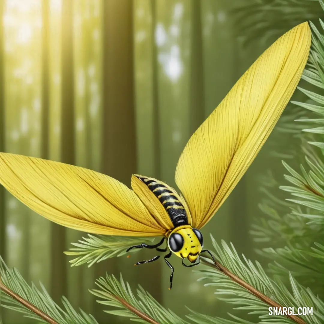
A yellow insect with striking black-striped wings perches delicately on a pine tree branch in a peaceful forest. The warm yellow color (#F5E97B) of the insect stands out beautifully against the green backdrop of the forest.
A bright yellow insect with black-striped wings rests on a pine branch, its vibrant color contrasting with the lush greenery of the forest, capturing a moment of nature’s beauty.

Enter Sandy Chanel, an engineer with a penchant for all things practical and a sense of humor that could light up a room - if not with Pantone 3935, then certainly with her witty remarks. Sandy and Iona had met at a local car show where Sandy had admired Iona’s vintage Porsche while Iona had admired Sandy’s uniquely patterned overalls.

When Iona sought Sandy’s help to crack the mystery of Pantone 3935, Sandy was intrigued. "So you want to make people look like a walking sunbeam?" Sandy asked with a grin. "I’m in! But first, let’s figure out how we can make yellow not just wearable, but irresistible."

The duo embarked on a series of whimsical experiments. Their first attempt was a set of overalls in Pantone 3935, hoping to create a fashion statement. The result was a pair of pants so bright that they practically glowed in the dark. "Looks like we’ve invented the new generation of glow-in-the-dark safety gear," Sandy joked, squinting as she adjusted her shades.

Next, they tried adding Pantone 3935 to accessories, hoping that a splash of yellow might be less overwhelming. They designed everything from belts to hats, but each piece was more striking than the last. "Well, at least you’ll never get lost in a crowd," Sandy quipped. "Just stand in the middle of the street and the cars will drive around you."

Finally, they had an epiphany. Instead of making entire outfits in Pantone 3935, why not use it as an accent color? They designed a collection featuring black and white patterns with vibrant yellow highlights. The effect was dazzling - fun without being blinding.
A car speeds past a massive green and yellow plane on a city street, surrounded by tall buildings and skyscrapers. The plane’s vibrant colors contrast against the urban skyline, creating a striking scene of motion and energy.
A car zooms past a vibrant green and yellow plane, with the energy of the city’s towering skyscrapers and fast-moving traffic creating a dynamic and colorful urban scene.

When the new line was ready for its debut, Iona and Sandy held a fashion show. The crowd was buzzing with curiosity, their anticipation punctuated by whispers about the "revolutionary yellow." As the models strutted down the runway, showcasing Iona’s designs, the audience’s skepticism turned to awe.

The standout piece was a simple black dress with Pantone 3935 accents - just enough to add a pop of fun without overwhelming. The crowd loved it. The bright yellow made the designs stand out, but the subtle accents ensured they were wearable and stylish.

Sandy couldn’t help but make a joke as the applause erupted. "Looks like Pantone 3935 is a hit! Who knew that making people look like a ray of sunshine would be the key to success?"

Iona laughed, relieved and thrilled by the reception. "You were right, Sandy. It’s not about making people shine like a neon sign - it’s about adding a splash of fun that complements the whole look."
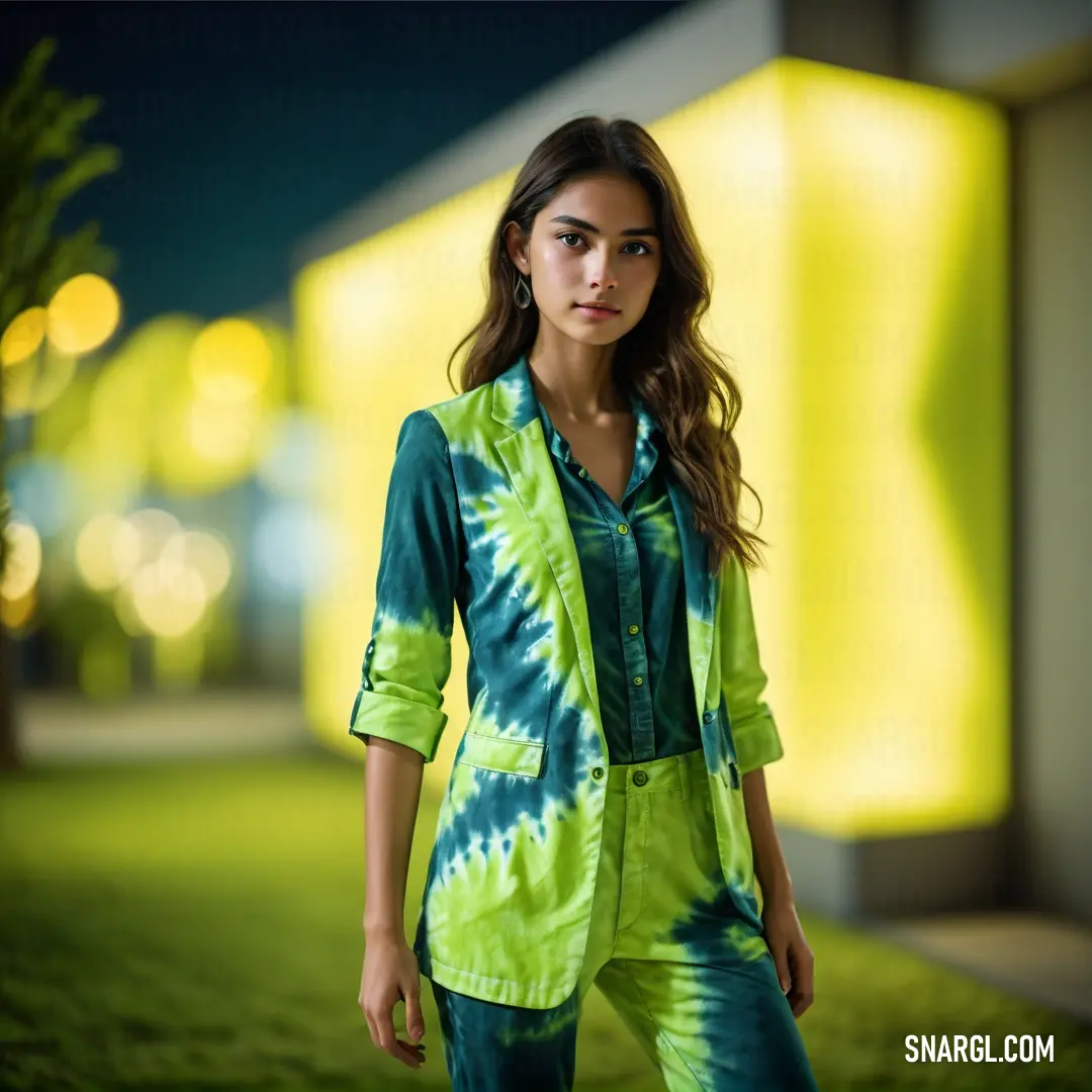
A woman in a tie-dye shirt and pants stands in a grassy area at night, with a building softly illuminated in the background. The colors of her outfit complement the tranquil, moonlit atmosphere of the scene.
In the quiet of the night, a woman’s colorful tie-dye outfit contrasts beautifully with the tranquil setting, where the soft glow of a distant building adds to the peaceful ambiance.

The fashion line became an instant sensation, and Iona’s designs were soon featured in magazines and boutiques worldwide. Pantone 3935 had found its place, not as the dominant color, but as the perfect accent that added a playful touch to everyday wear.

Sandy and Iona’s collaboration proved that with a bit of humor and creativity, even the brightest colors could be used in the most stylish ways. Pantone 3935 wasn’t just a color - it was a reminder that sometimes, the most unexpected ideas could lead to the most delightful outcomes.

In the end, Iona Moon and Sandy Chanel had shown the world that fashion didn’t have to be serious to be revolutionary. It just needed a bit of daring, a splash of yellow, and a sense of humor to make it truly unforgettable.
Author:
Continue browsing posts in category "PANTONE"
Take a look at this Music Video:
You may find these posts interesting:
PANTONE 207 Color
87
12
99
0
PANTONE 207 Color
PANTONE 338 Color
150
12
96
0
PANTONE 338 Color
PANTONE 481 Color
80
10
61
0
PANTONE 481 Color
PANTONE 2253 Color
106
11
67
0
PANTONE 2253 Color
PANTONE 7439 Color
56
10
71
0
PANTONE 7439 Color
PANTONE 7454 Color
80
11
67
0
PANTONE 7454 Color
PANTONE 7556 Color
73
11
78
0
PANTONE 7556 Color
PANTONE Cool Gray 9 Color
115
11
53
0
PANTONE Cool Gray 9 Color
Home
Terms of Service
Contact Us
Music Videos
Music

© 2023 Snargl.com