Home Colors PANTONE
PANTONE 301

PANTONE 301

Parameters:
HEX Triplet:
#005B95
RGB:
0, 91, 149
CMYK:
100, 53, 4, 19
HSL:
203°, 100%, 58%
Closest colors:
in RGB:
Sea blue
in PANTONE:
PANTONE 2945
in RAL Classic:
RAL 5017
in RAL Design:
RAL 230 40 40
in RAL Effect:
RAL 640-4
What color is PANTONE 301? The Essence of PANTONE 301
2024-09-21 Snargl 02:20

What color is PANTONE 301?

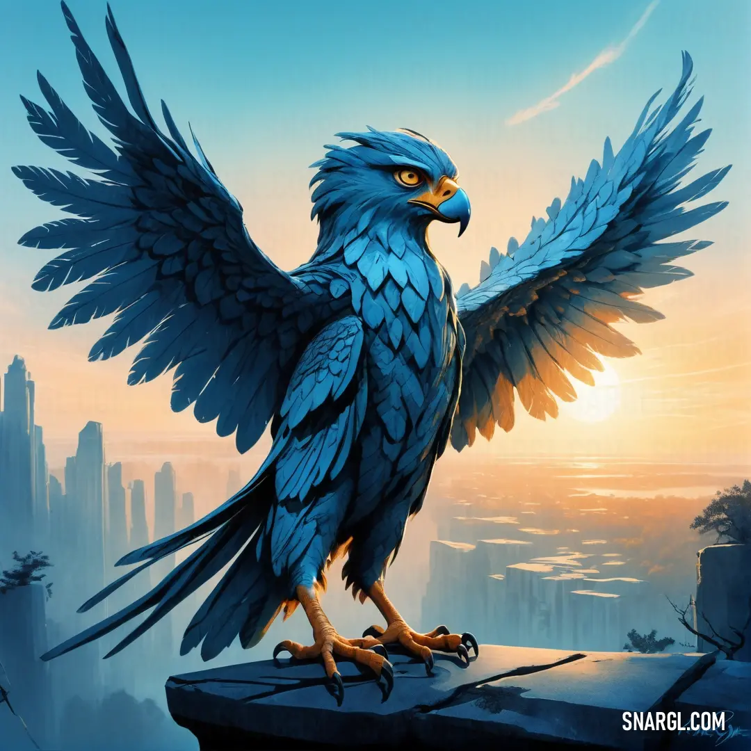
Bird with wings spread standing on a ledge with a city in the background and a sunset in the sky. Color #005B95.
Woman in a white jacket and blue shirt and a tree and grass area with a sunset in the background. Example of RGB 0,91,149 color.
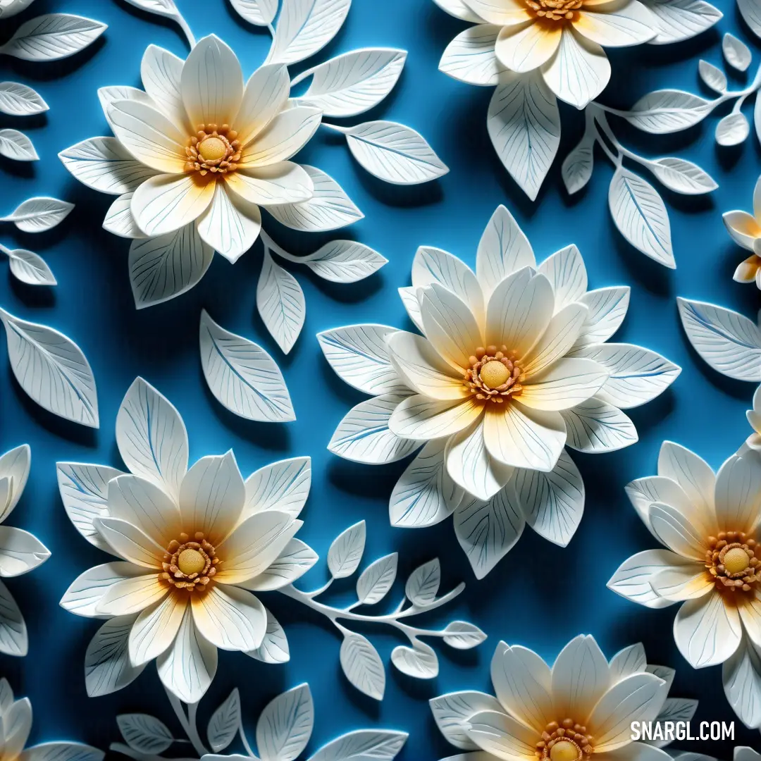
What color is PANTONE 301? Example - Bunch of white flowers on a blue background with leaves and petals on it's petals are white and yellow
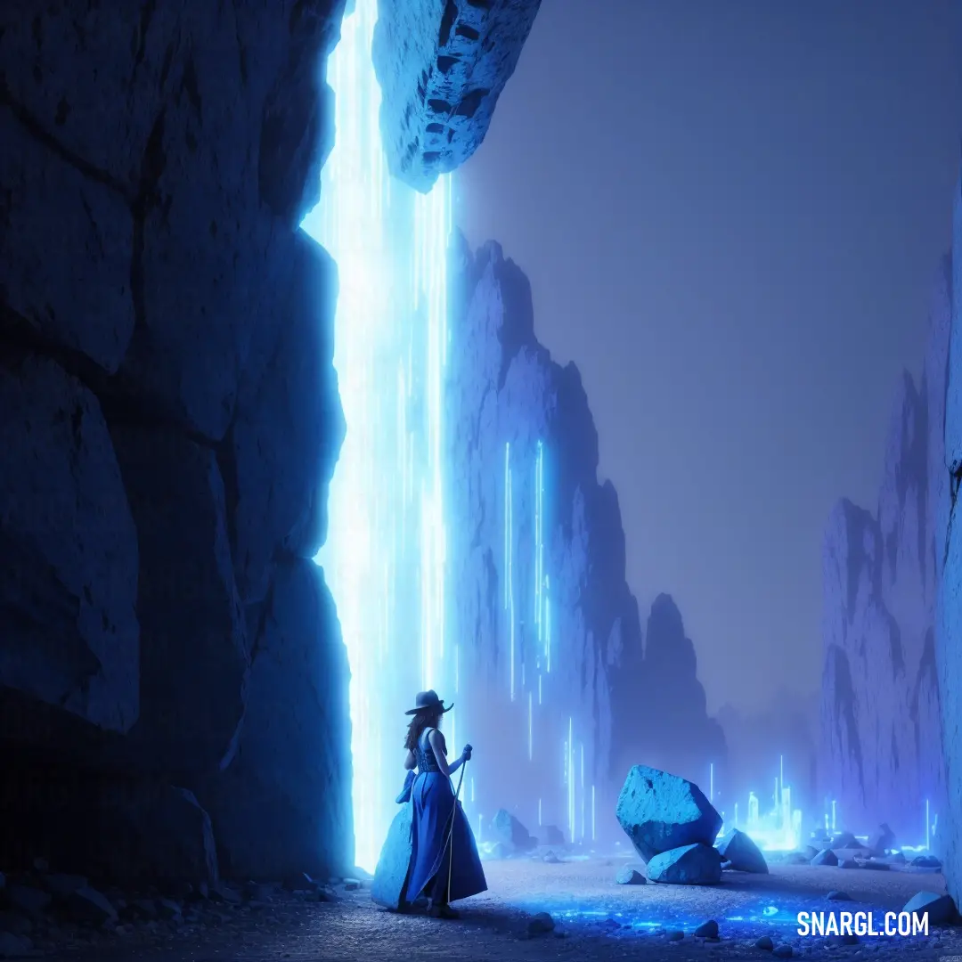
#005B95 color example: Woman in a blue dress standing in a cave with a light coming from her face and a rock wall
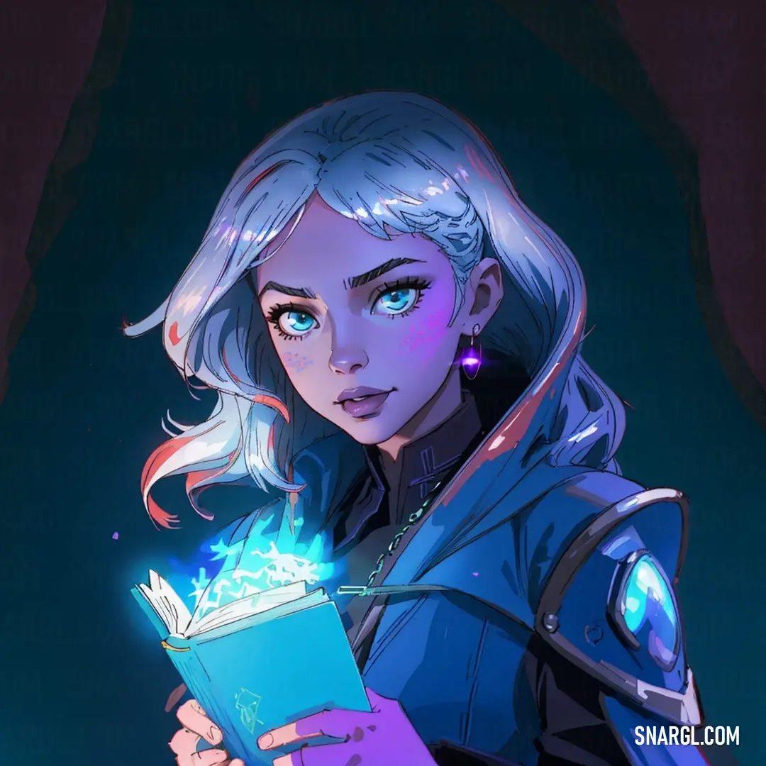
Woman holding a book with a glowing light on her face and a glowing light on her chest. Example of PANTONE 301 color.
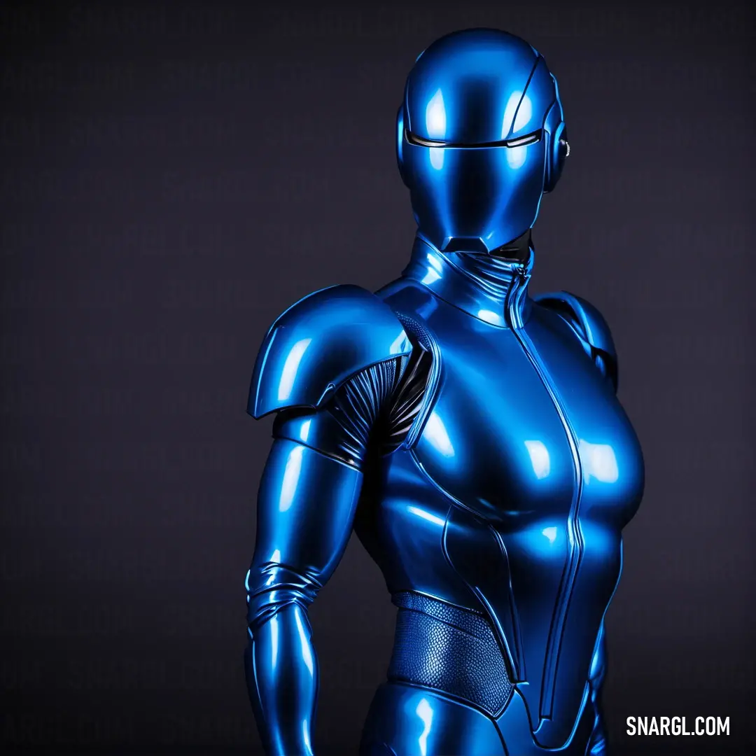
What color is PANTONE 301? Example - Blue robot is standing in a dark room with his hands on his hips and his back turned to the camera
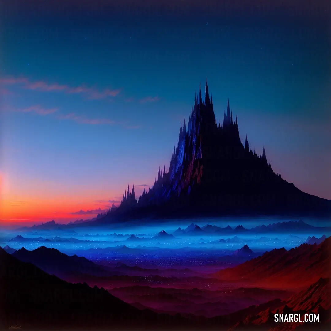
CMYK 100,53,4,19 example: Painting of a mountain with a sky background and clouds in the foreground
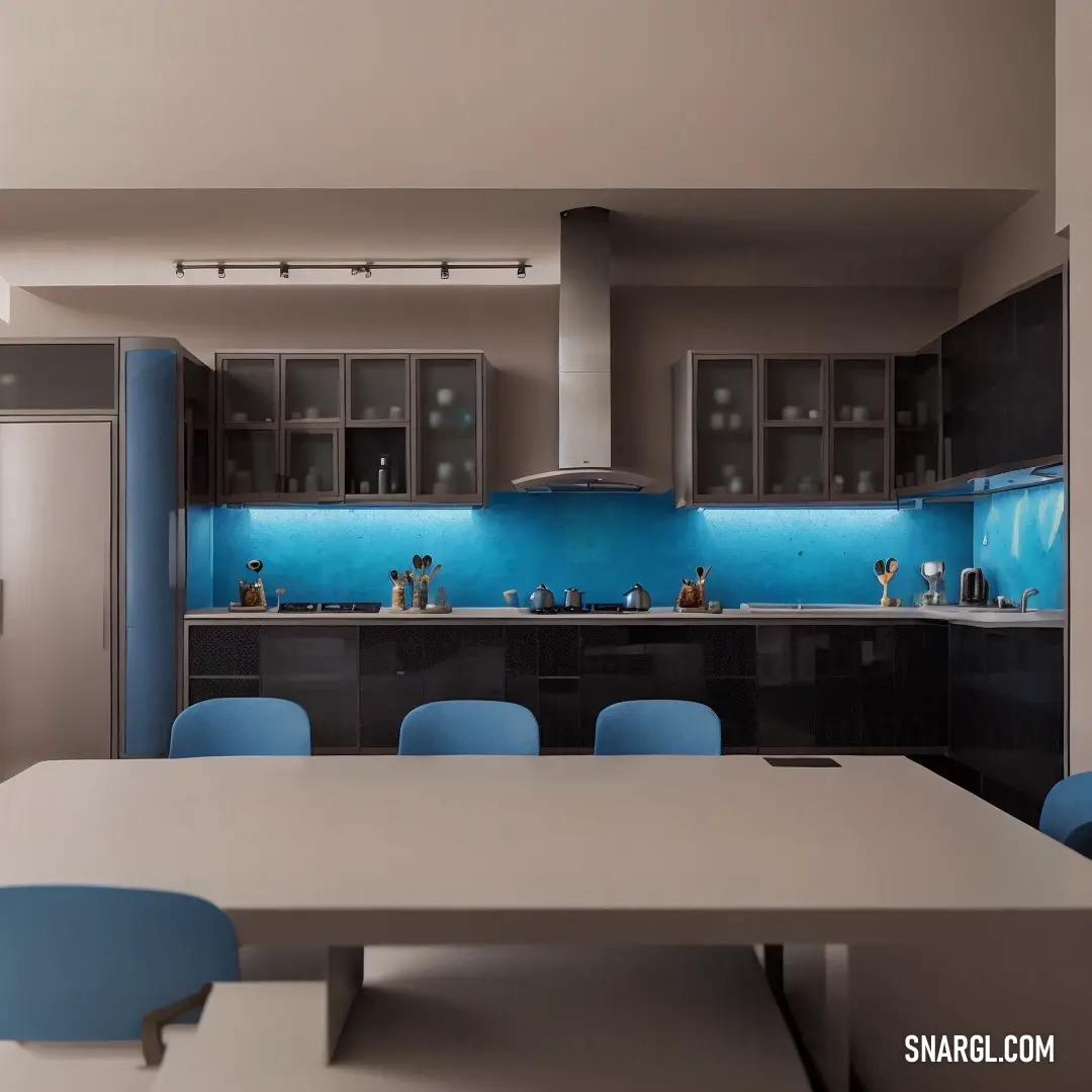
#005B95 color. Kitchen with a table and chairs and a blue light on the wall behind it and a refrigerator and oven
Man in a suit standing in the rain in front of a city street at night with cars parked on the street. Color CMYK 100,53,4,19.
PANTONE 301 is a medium dark shade of cyan-blue, with a hexadecimal color code of #005B95.

In the RGB color model, it is composed of 0% red, about 35.69% green, and about 58.43% blue.

In the HSL color space, this color has a hue of around 203 degrees, a saturation of 100%, and a lightness of around 58%.

PANTONE 301 is available in various Pantone products, such as formula guides, solid chips, and plastic standards.

It is often used as a corporate or brand color, as it conveys a sense of professionalism, reliability, and authority.

Some examples of companies or organizations that use PANTONE 301 as part of their logo or identity are: the United Nations, the European Union, the International Olympic Committee, IBM, Ford, and Pepsi.

PANTONE 301 is a versatile and powerful color that can be applied to various design projects, such as logos, posters, flyers, brochures, websites, packaging, clothing, and more.

It can help to create a strong visual impact, communicate a message, or evoke a mood or emotion.

This color is used to express confidence, trust, loyalty, stability, and sophistication.

Example of the palette with the PANTONE 301 color
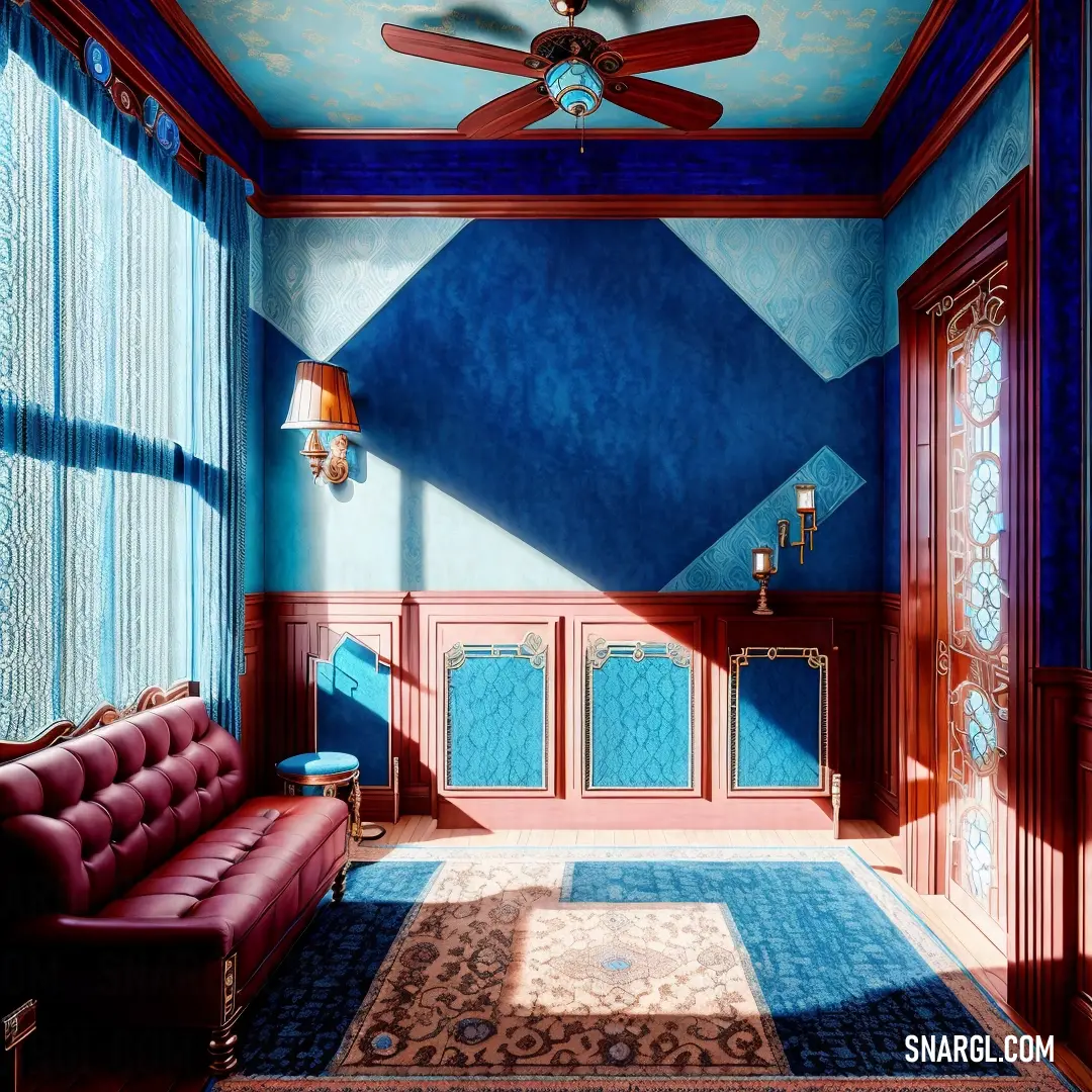
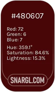
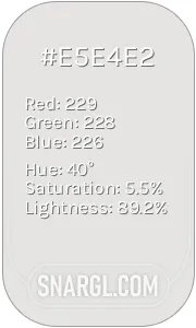
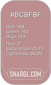
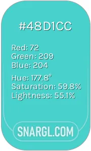
Picture with primary colors of Dark cerulean, Bulgarian rose, Platinum, Rosy Brown and Medium turquoise
Top 5 color shades of the illustration. Arranged in descending order of frequency of occurrence (first - more often, last - more rare).
See these colors in NCS, PANTONE, RAL palettes...
RAL Classic
RAL 5010
RAL 3007
RAL 9001
RAL 4009
RAL 6027
RAL Design
RAL 260 30 35
RAL 040 20 19
RAL 110 90 05
RAL 010 60 15
RAL 210 70 35
Author:
Funny stories about the 'PANTONE 301'

The Essence of PANTONE 301

In a quaint village nestled between rolling hills, there lived a Painter named Connor Krang and a Writer named Billy White. Their talents were known far and wide, though they pursued different crafts. Connor was famed for his vivid and emotional use of colors, while Billy spun tales that captured hearts and minds alike.

One day, the village's council approached them with a request. A new trademark was needed for their annual festival, one that would symbolize the spirit of the community. The council had chosen PANTONE 301, a deep, rich blue, for its representation. They sought Connor and Billy to bring this color to life in their design and story.

Connor, whose palette usually ranged from warm earth tones to bright, lively hues, was intrigued by the challenge. He pondered over PANTONE 301 and decided to experiment. He painted a vast canvas in the deep blue, layering and blending until the color seemed almost alive. He saw it as the night sky, vast and infinite, holding the mysteries of the universe. It felt like a promise of possibilities, a reminder of the boundless potential in every moment.

Billy, on the other hand, approached the task through words. He studied the blue, letting it inspire his thoughts. To him, PANTONE 301 was not just a color but a metaphor for depth and integrity. He imagined it as the ocean, a vast expanse where every wave held a story and every tide was a testament to strength and resilience.

As they worked, they often met to share their insights. Connor spoke of how the blue could evoke feelings of calm and trust, while Billy wove tales of deep oceans and boundless skies, emphasizing the trust and stability that the color represented.

One evening, under the soft glow of the setting sun, Connor and Billy decided to combine their efforts. Connor painted a mural that depicted a serene ocean under a twilight sky, using PANTONE 301 to give the scene a profound depth. Billy wrote a story to accompany the mural, describing a village where dreams took flight under the watchful gaze of the endless blue sky, and the ocean was a source of strength and unity for all its people.

The unveiling of their work was met with awe. The mural and story intertwined perfectly, capturing the essence of PANTONE 301. The deep blue represented not just a color, but a sense of unity and continuity. It symbolized the vast possibilities that lay before them, and the strength that came from their shared dreams and aspirations.

The trademark became a cherished emblem of the village festival, a reminder of the endless potential within every individual and the collective strength of the community. Connor and Billy had successfully brought the essence of PANTONE 301 to life, demonstrating that color and story together could create something truly profound.

Through their collaboration, they had not only crafted a trademark but also illustrated a timeless lesson: that every color and every story holds a depth of meaning waiting to be discovered and shared.
Author:

Continue browsing posts in category "PANTONE"
You may find these posts interesting:
PANTONE 100 Color
3
0
2
5
0
PANTONE 100 Color
PANTONE 2222 Color
4
1
2
11
0
PANTONE 2222 Color
PANTONE 2240 Color
11
1
4
26
0
PANTONE 2240 Color
PANTONE 7620 Color
2
0
1
8
0
PANTONE 7620 Color
PANTONE 2617 Color
2
0
2
5
0
PANTONE 2617 Color
PANTONE 194 Color
7
1
2
14
0
PANTONE 194 Color
PANTONE 566 Color
4
0
2
7
0
PANTONE 566 Color
PANTONE 2210 Color
5
0
2
5
0
PANTONE 2210 Color
Home
Terms of Service
Contact Us

© 2023 Snargl.com