Home Colors PANTONE
PANTONE 295

PANTONE 295


Parameters:
HEX Triplet:
#1F3A60
RGB:
31, 58, 96
CMYK:
100, 69, 8, 54
HSL:
215°, 68%, 38%
Closest colors:
in PANTONE:
PANTONE 648
in RAL Classic:
RAL 5001
in RAL Design:
RAL 250 20 25
in RAL Effect:
RAL 620-M
What color is PANTONE 295? What are the examples of PANTONE 295 color? What colors go well with the PANTONE 295 color? The Mysterious Birth of Pantone 295
2024-09-05 Snargl 03:20
# General # Fashion # Design

What color is PANTONE 295?

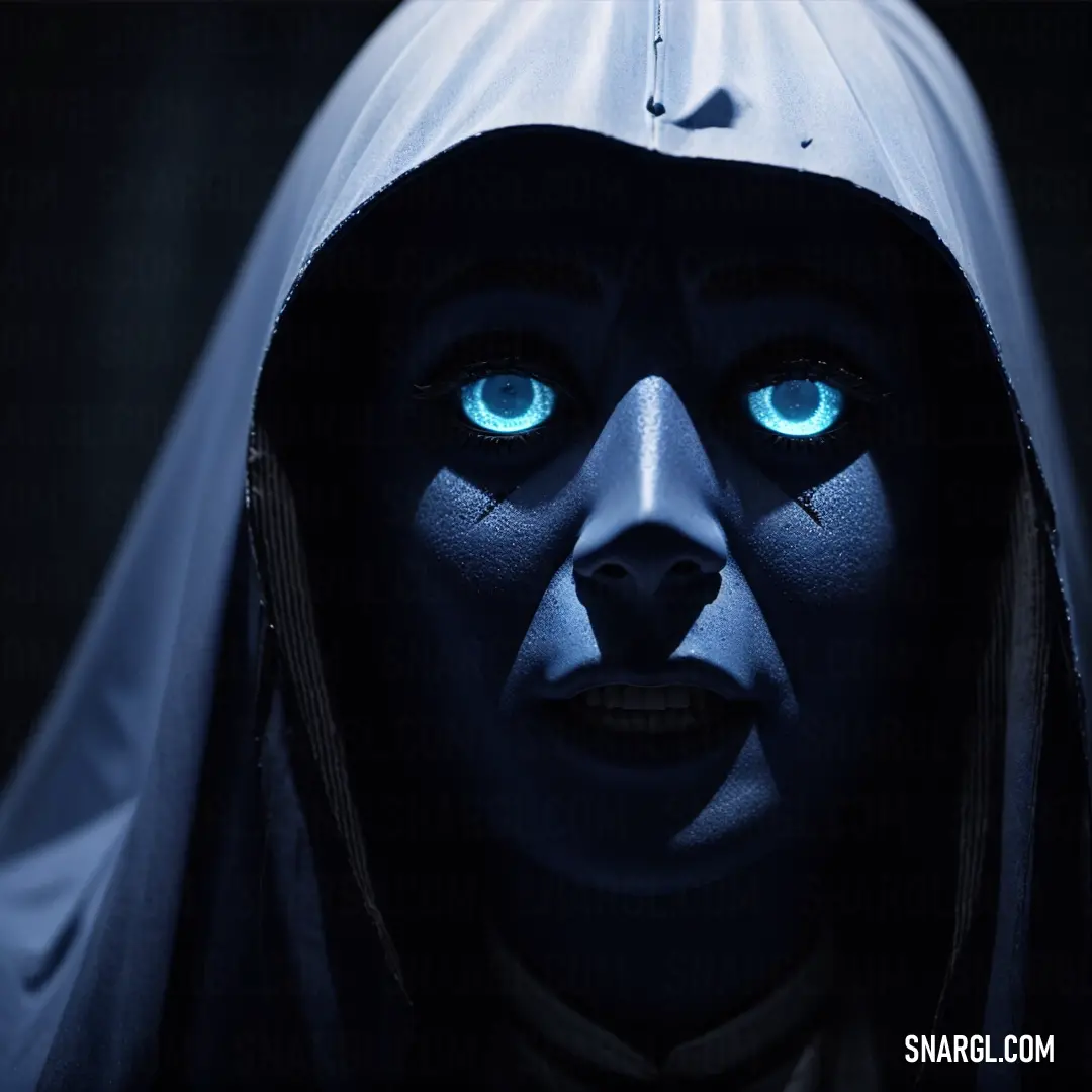
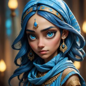
A mysterious woman with striking blue eyes and a hood, gazing directly at the camera with an intense, almost haunting expression. The cool dark hues surrounding her create an eerie atmosphere.
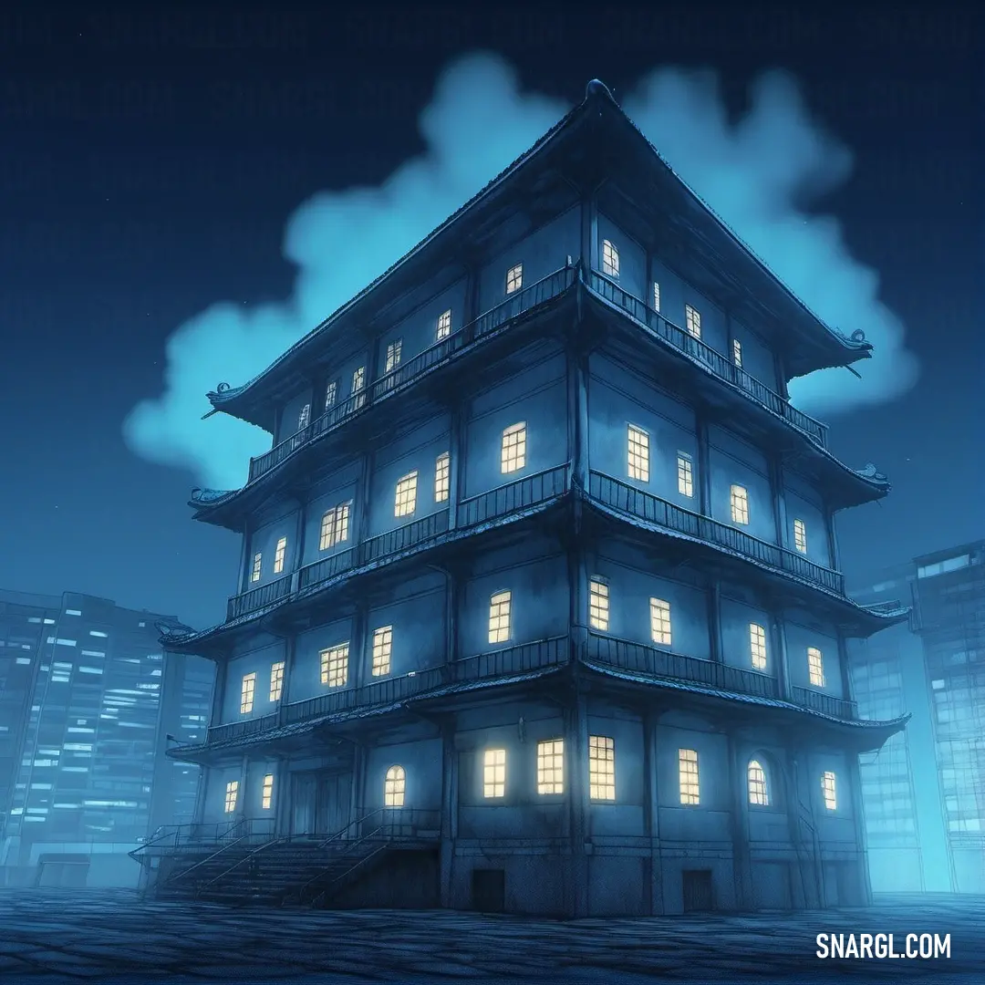
A towering modern building stands against a vast sky, its windows reflecting the soft light. The contrast between the sharp architecture and the serene backdrop evokes a sense of quiet strength.
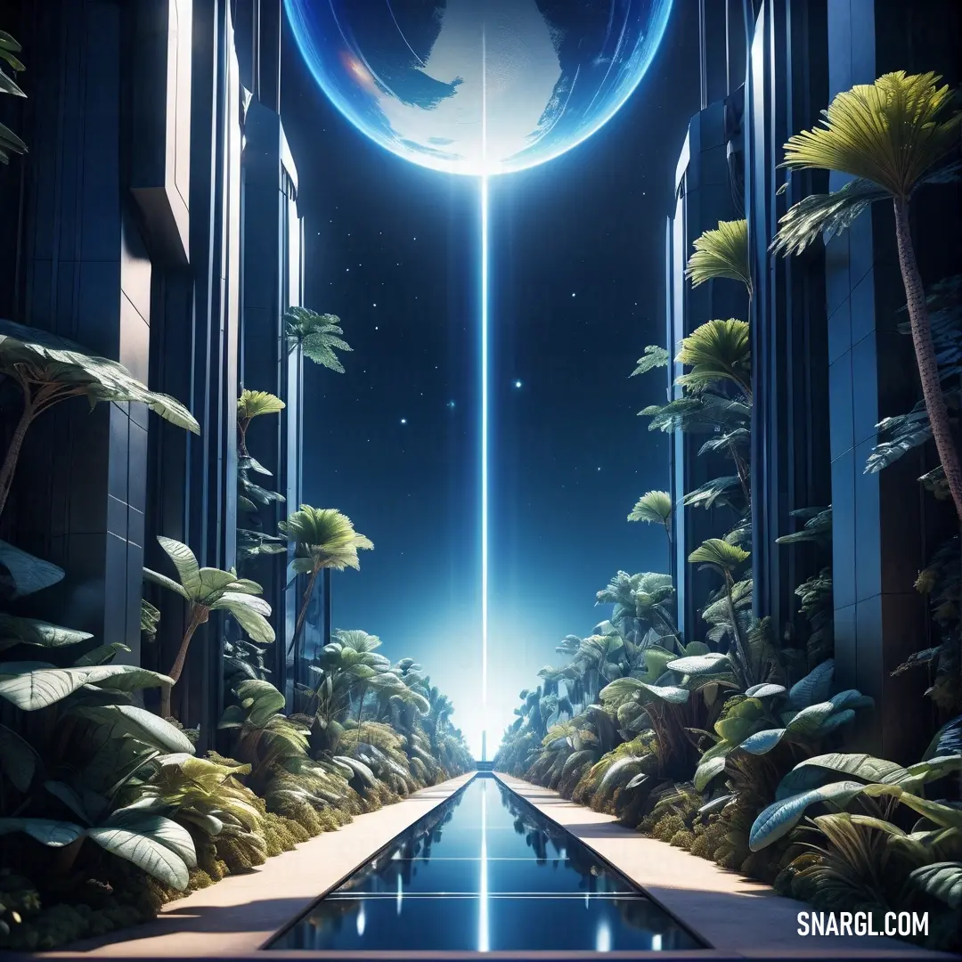
In a futuristic city, a giant glowing blue sphere floats above a walkway, surrounded by lush greenery. The bright, vibrant color contrasts beautifully with the urban landscape.
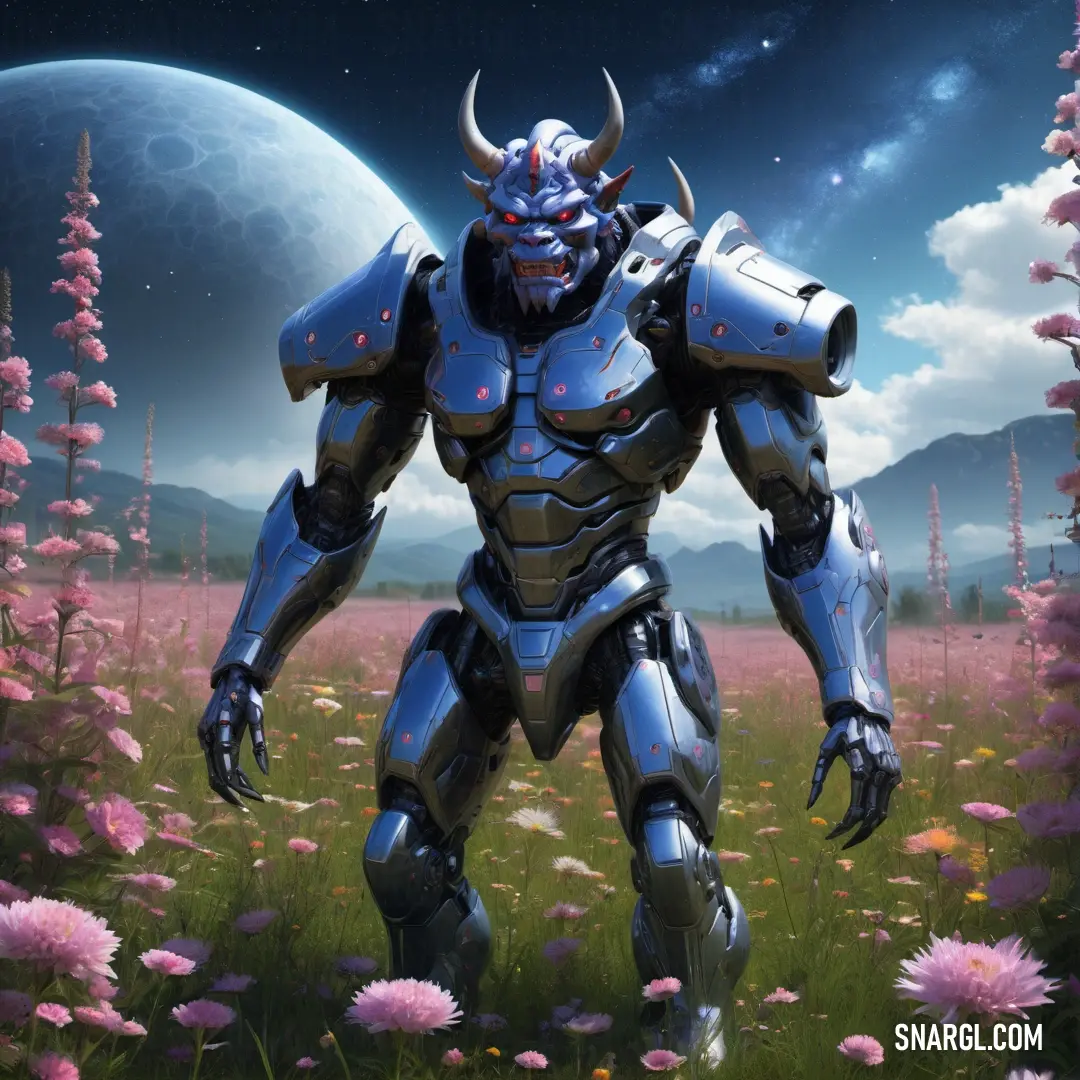
A giant robot with a massive head stands serenely in a flower-filled field, bathed in the soft light of a glowing moon. The peaceful scene contrasts with the imposing presence of the robot.
PANTONE 295 is a deep, rich shade of blue that is part of the PANTONE color system, widely used in the design and manufacturing industries for accurate color communication.

This particular color can be identified by its hexadecimal code #1F3A60.

In the RGB color model, which is used for screens, PANTONE 295 is composed of 31 (red), 58 (green), and 96 (blue).

When it comes to printing, the CMYK color model is used, and PANTONE 295 is represented by the values 100 (cyan), 69 (magenta), 8 (yellow), and 54 (black).

The color evokes the depth of the ocean at twilight or the vast expanse of the sky as night begins to fall.

It's a color that conveys reliability and strength, often chosen by brands and institutions to represent trust and authority.

Its dark tone makes it a popular choice for corporate identities, uniforms, and professional sports teams.

It's versatile enough to stand out on its own or to be used as a strong background that allows other colors to shine.

In design, PANTONE 295 can be paired with lighter shades for a classic look, or with vibrant colors for a more dynamic and contrasting effect.

It's a color that can be seen in various applications, from the print on a business card to the color of a car, showing its wide range of uses and the importance of having standardized colors like those provided by the PANTONE system.

This ensures consistency across different mediums and materials, which is crucial for brand identity and product manufacturing.

PANTONE 295 is not just a color; it's a language that designers and manufacturers speak to bring visions to life with precision and intent.

It's a testament to the power of color in our visual world and how it can influence perception and emotion.

Whether it's on a flag waving in the wind or the sleek surface of a new gadget, PANTONE 295 carries with it a sense of depth, professionalism, and the infinite possibilities that lie in the world of color.

Example of the palette with the PANTONE 295 color
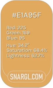
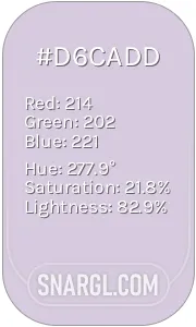
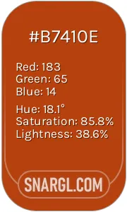
Picture with primary colors of Prussian blue, Earth yellow, Languid lavender, Rust and Dark electric blue
Top 5 color shades of the illustration. Arranged in descending order of frequency of occurrence (first - more often, last - more rare).
See these colors in NCS, PANTONE, RAL palettes...
Author:

What are the examples of PANTONE 295 color?

Man with a horned head and a large axe in a green environment with columns. Color #1F3A60.
Man in a winter scene with a sword and a cloak on his shoulders and a fur collar on his head. Color CMYK 100,69,8,54.
Man in a costume standing in a river with a snake in his hand. Color CMYK 100,69,8,54.
PANTONE 295 color example: Man in a full armor with a sword in his hand and other men in the background

Example of the palette with the PANTONE 295 color

Picture with primary colors of Dark jungle green, Smoky black, Gray, Davy grey and Dark lava
Top 5 color shades of the illustration. Arranged in descending order of frequency of occurrence (first - more often, last - more rare).
See these colors in NCS, PANTONE, RAL palettes...
Author:

What colors go well with the PANTONE 295 color?

Man in a green costume standing in a doorway with a sword in his hand. Color #1F3A60.
Man dressed in a green costume with horns and horns on his head. Color CMYK 100,69,8,54.
Man in a hooded cloak holding a sword in a dark room with light coming through the window and a light coming from behind him
Woman in a red dress holding a candle and a lantern in her hand in a dark room with a light. Example of #1F3A60 color.

Example of the palette with the PANTONE 295 color

Picture with primary colors of Black, Caput mortuum, Smoky black, Rifle green and Saddle brown
Top 5 color shades of the illustration. Arranged in descending order of frequency of occurrence (first - more often, last - more rare).
See these colors in NCS, PANTONE, RAL palettes...
Author:
Funny stories about the 'PANTONE 295'

The Mysterious Birth of Pantone 295

In a bustling city where creativity and chaos danced hand in hand, two unlikely heroes were about to embark on a color adventure that would baffle the design world. Virgil Chun, a car service worker with an unusual talent for mixing paint, and Mustafa Rodriguez, a factory worker with a penchant for mechanical mischief, were about to make history.

One day, Virgil, while repairing a stubborn engine, accidentally spilled a bucket of cobalt blue paint into an old engine part. Mustafa, who had just finished a shift at the paint factory and was testing a new batch of pigments, happened to drop by Virgil’s garage. The two had been friends since their high school days, when Mustafa had convinced Virgil to paint his old car a "mysterious shade of purple" that turned out to be more pink than purple.
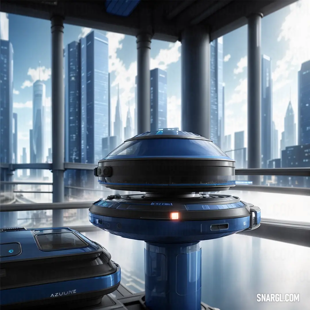
A futuristic cityscape is set against a deep blue and black backdrop, with two prominent objects in the foreground and background, their shapes mysterious and striking against the glowing city lights.

"What’s that smell?" Mustafa asked, his curiosity piqued.

Virgil shrugged, "It’s a new mix I’ve been experimenting with. Might be the next big thing."

Mustafa squinted at the bucket, intrigued by the rich, deep hue that had emerged from the mix. It was darker than navy but still rich and captivating. "We should call it something fancy," Mustafa suggested, eyes twinkling with excitement.

The two friends decided to test their new color on an old junker car that Virgil had lying around. As they painted, they couldn't help but marvel at how the color seemed to change under different lights - sometimes it looked like the midnight sky, other times like the deep ocean.

Hours passed, and their impromptu experiment turned into an obsession. They decided to take their color to the local design expo, where designers, artists, and color enthusiasts gathered to marvel at the latest trends. They named their creation "Pantone 295," after the number they plucked from a random catalog of paint samples as a joke.
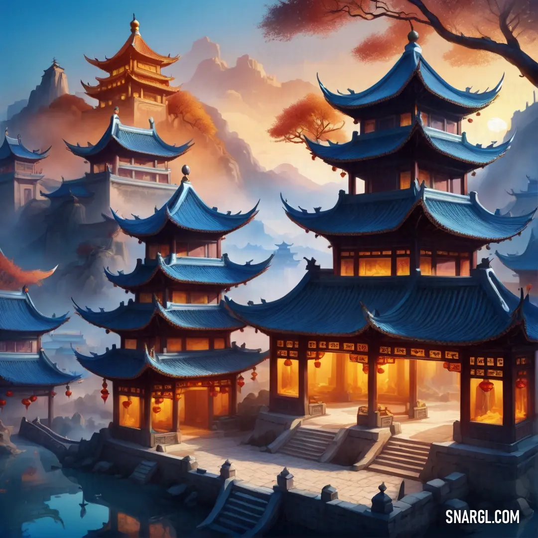
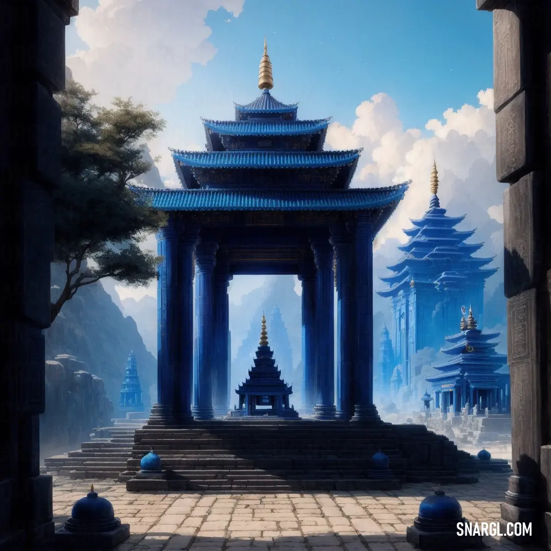
A serene painting of a blue pagoda nestled in a peaceful park, with the bright blue sky creating a calming backdrop. The gentle hues of the pagoda blend harmoniously with the surrounding nature.

At the expo, Virgil and Mustafa were an odd sight - dressed in paint-splattered overalls, their color-covered hands waving enthusiastically at anyone who would listen. Their booth was humble, but their color spoke volumes. It wasn’t long before the crowd began to notice the enchanting new hue.

One renowned designer, Diana Lark, stopped by their booth. She was known for her cutting-edge work and unyielding skepticism toward new trends. Diana peered at Pantone 295, then at Virgil and Mustafa. "Where did you come up with this?" she asked, a raised eyebrow betraying her disbelief.

Mustafa grinned. "Well, we mixed it up during a car repair, and it just... happened."

Diana chuckled. "You two are something else. I haven’t seen a color like this in years. It’s like a well-kept secret of the night sky."

By the end of the expo, Pantone 295 had captured the imagination of everyone who saw it. It became the talk of the town, and soon after, the design world adopted it with enthusiasm. The color’s story spread far and wide, becoming a symbol of serendipitous creativity.
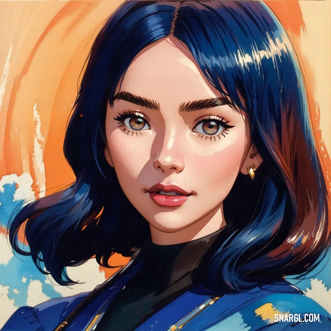
A woman with striking blue hair and a bold blue suit stands against a vibrant yellow backdrop. The colors create a dynamic contrast, drawing attention to her confident and stylish presence.

Virgil and Mustafa, now local legends, continued their respective jobs but always with a twinkle of mischief in their eyes. They knew that sometimes, the most extraordinary things come from the most unexpected places - like an old engine part and a chance meeting in a garage.

And so, Pantone 295 was born - not from a grand design lab, but from the sheer chance of a mechanic and a factory worker who simply wanted to make something beautiful.

Their adventure became a favorite anecdote among designers, reminding everyone that creativity often thrives where you least expect it.
Author:


# General # Fashion # Design
Continue browsing posts in category "PANTONE"
You may find these posts interesting:
PANTONE 7436 Color
61
2
50
0
PANTONE 7436 Color
PANTONE 522 Color
98
2
87
0
PANTONE 522 Color
PANTONE 5743 Color
127
2
65
0
PANTONE 5743 Color
PANTONE 533 Color
111
3
48
0
PANTONE 533 Color
PANTONE 2288 Color
75
2
99
0
PANTONE 2288 Color
PANTONE 449 Color
137
2
60
0
PANTONE 449 Color
PANTONE 2387 Color
56
2
75
0
PANTONE 2387 Color
PANTONE 2365 Color
72
2
71
0
PANTONE 2365 Color
Home
Terms of Service
Contact Us

© 2023 Snargl.com