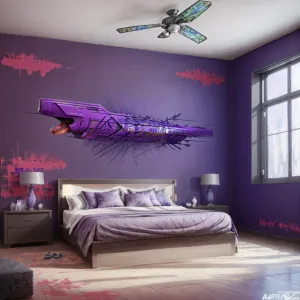
Home Colors PANTONE
PANTONE 270

PANTONE 270

Parameters:
HEX Triplet:
#B5B7D7
RGB:
181, 183, 215
CMYK:
29, 25, 0, 0
HSL:
236°, 16%, 84%
Closest colors:
in RGB:
Pastel blue
in PANTONE:
PANTONE 7444
in RAL Classic:
RAL 7038
in RAL Design:
RAL 230 80 10
in RAL Effect:
RAL 580-3
What color is PANTONE 270? The Enchanted Hue: Ravindra and Phoebe’s Pantone Adventure
2024-09-05 Snargl 02:10

What color is PANTONE 270?

Man with a purple shirt and a purple haircut smiling at the camera with a smile on his face. Example of PANTONE 270 color.
PANTONE 270 color. Woman with a necklace and a necklace on her neck and a necklace on her neck
PANTONE 270 has different variants depending on the type of material and printing process, such as coated, uncoated, or plastic.

The hexadecimal color code for PANTONE 270 is #B5B7D7, which means it is composed of 70.98% red, 71.76% green, and 84.31% blue in the RGB color model.

PANTONE 270 is available in various Pantone products, such as formula guides, solid chips, and color devices.

It is a cool and calming color that can evoke a sense of tranquility, creativity, and elegance.
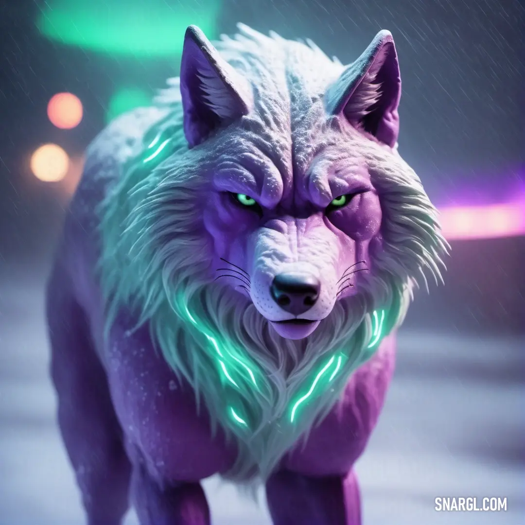
Example of the palette with the PANTONE 270 color

Picture with primary colors of Pang, Sky magenta, Platinum, Dark jungle green and Wild blue yonder
Top 5 color shades of the illustration. Arranged in descending order of frequency of occurrence (first - more often, last - more rare).
See these colors in NCS, PANTONE, RAL palettes...
Author:
Funny stories about the 'PANTONE 270'

The Enchanted Hue: Ravindra and Phoebe’s Pantone Adventure

In a bustling city known for its avant-garde art scene, Ravindra Yamamoto was an eager motion design student with a passion for color theory. He spent his days at the city's renowned design school and his nights experimenting in his tiny apartment, filled with swatches, screens, and stacks of sketchbooks.

One crisp autumn evening, Ravindra received a peculiar email from Phoebe Lantern, a celebrated writer and designer known for her groundbreaking work in visual storytelling. The email was brief but intriguing: "Dear Ravindra, I’d like to invite you to collaborate on a new motion design project using Pantone 270. It’s an uncharted path that I believe we can explore together. Meet me at the café on Maple Street. - Phoebe."
Purple and white object with a black background. Color RGB 181,183,215.

Ravindra’s excitement was palpable. He had read about Pantone 270, a soft lavender shade, but had never used it in his own designs. Eager to learn, he hurried to the café, a quaint place filled with the scent of freshly brewed coffee and the gentle hum of conversations.

Phoebe was already there, sipping her tea with a warm smile. "Ravindra, glad you could make it," she said, gesturing to the empty seat across from her. "Let’s dive right in."

As Phoebe explained her vision, Ravindra’s curiosity grew. She described a motion design project that would utilize Pantone 270 in a way that hadn’t been explored before: combining it with dynamic animations to evoke a sense of tranquility and innovation. "This color," Phoebe began, "has an ethereal quality, and our goal is to blend that with motion to create something truly immersive."

Phoebe and Ravindra brainstormed, sketching out ideas and discussing how Pantone 270 could be integrated into motion graphics. They imagined it as the backdrop of a calming, abstract landscape where shapes and lines would flow effortlessly, creating a serene, dreamlike experience. The challenge was to ensure that the color's subtlety did not get lost in the animation but instead enhanced the overall impact.
Kitchen with a stove, sink. Color PANTONE 270.

Over the next few weeks, Ravindra immersed himself in the project. He experimented with different techniques: blending Pantone 270 with gradient transitions, layering it with other shades for depth, and using it as a key element in fluid animations. He discovered that the color’s soothing properties were amplified when paired with slow, deliberate motion, and its versatility allowed for creative expression without overwhelming the viewer.

Phoebe, meanwhile, worked on integrating narrative elements into the animations. She wrote a series of poetic text overlays that would appear and dissolve, mirroring the gentle motion of Ravindra’s graphics. The text, in delicate white typography, floated over the Pantone 270 backdrop, creating a harmonious dance between color and words.

The day of the presentation arrived. Ravindra and Phoebe stood together, watching as their project was unveiled to an audience of design enthusiasts and industry professionals. The room fell silent as the motion design played out, with Pantone 270 flowing gracefully across the screen, interwoven with text that whispered its stories.

The audience was mesmerized. The color’s tranquil essence, combined with the fluid animations and poetic text, created an experience that was both calming and thought-provoking. The project received acclaim for its innovative use of Pantone 270, demonstrating how a seemingly simple color could transform into a powerful tool for storytelling.

As the applause echoed through the room, Phoebe turned to Ravindra with a proud smile. "You did it, Ravindra. We turned Pantone 270 into something truly magical."

Ravindra beamed, grateful for the opportunity and the guidance Phoebe had provided. "Thank you, Phoebe. This experience has shown me how a single color can shape an entire narrative."

The success of their collaboration marked the beginning of a new chapter in motion design, where Pantone 270 became a symbol of creativity and elegance. Ravindra and Phoebe continued to work together, pushing the boundaries of design and proving that with imagination and collaboration, even the softest hues could make a profound impact.
Author:

Continue browsing posts in category "PANTONE"
You may find these posts interesting:
PANTONE 2240 Color
11
1
4
26
0
PANTONE 2240 Color
PANTONE 566 Color
4
0
2
7
0
PANTONE 566 Color
PANTONE 7620 Color
2
0
1
8
0
PANTONE 7620 Color
PANTONE 305 Color
1
0
1
10
0
PANTONE 305 Color
PANTONE 140 Color
8
0
2
11
0
PANTONE 140 Color
PANTONE 105 Color
5
0
1
8
4
PANTONE 105 Color
PANTONE 575 Color
5
0
2
10
0
PANTONE 575 Color
PANTONE 7689 Color
1
0
2
9
0
PANTONE 7689 Color
Home
Terms of Service
Contact Us

© 2023 Snargl.com