Home Colors PANTONE
PANTONE 240

PANTONE 240

Parameters:
HEX Triplet:
#BF4994
RGB:
191, 73, 148
CMYK:
20, 89, 0, 0
HSL:
322°, 62%, 75%
Closest colors:
in RGB:
Mulberry
in RAL Classic:
RAL 4003
in RAL Design:
RAL 340 50 45
in RAL Effect:
RAL 510-5
What color is PANTONE 240? The Unlikely Genesis of Pantone 240
2024-09-03 Snargl 02:32

What color is PANTONE 240?

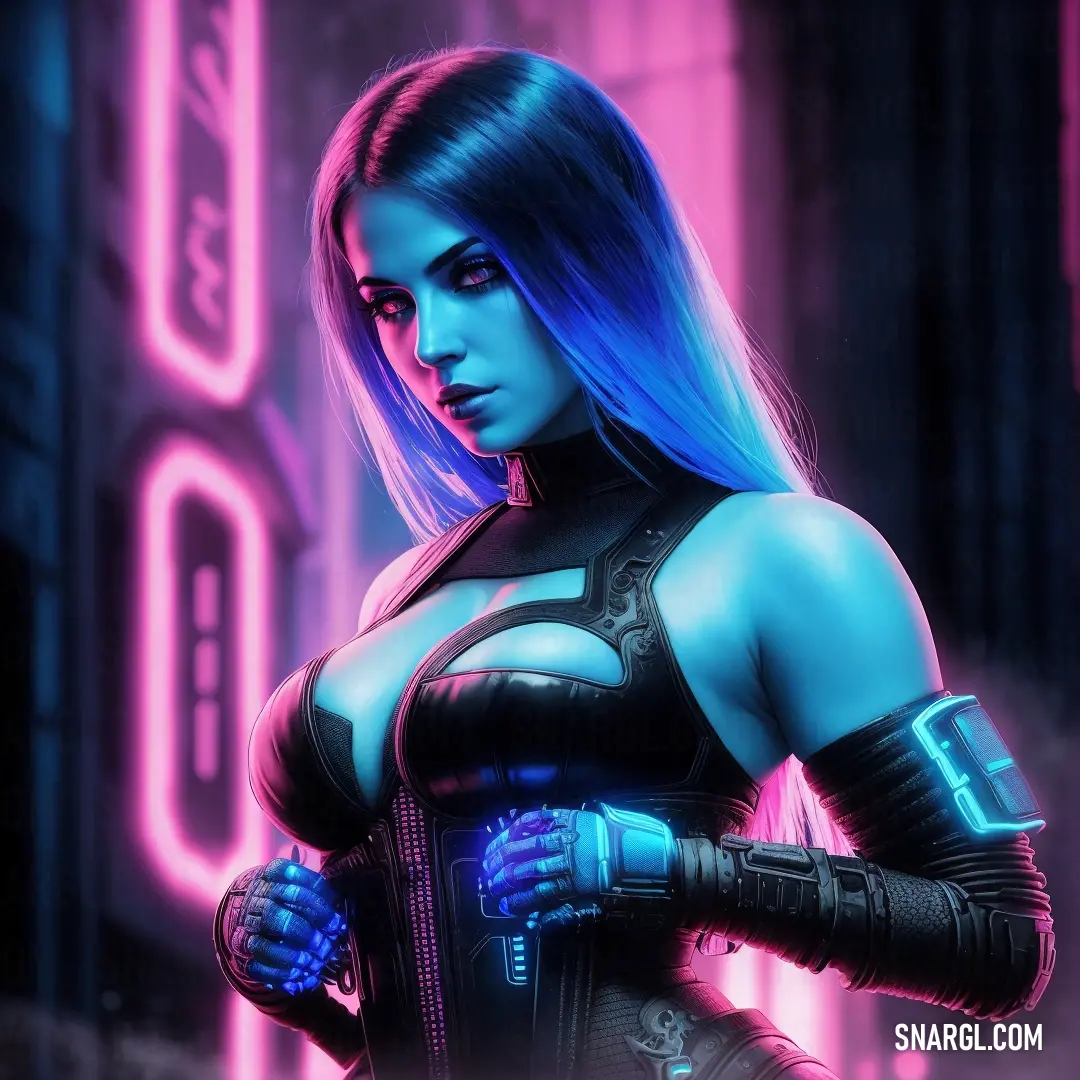
Woman in a futuristic suit with blue hair and gloves on her arm and a neon background
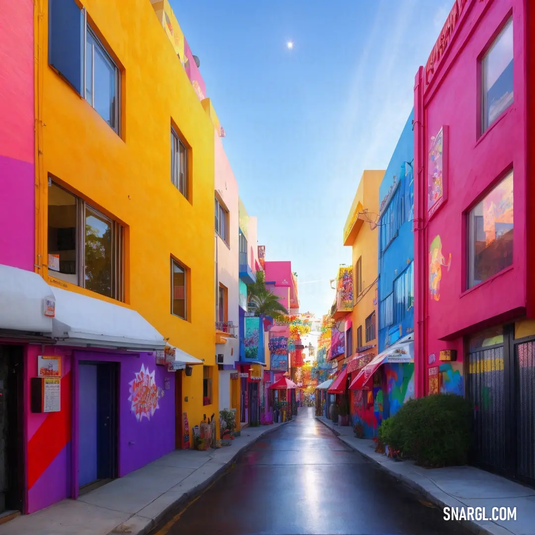
Street with a bunch of colorful buildings on both sides of it and a sky background with a few clouds
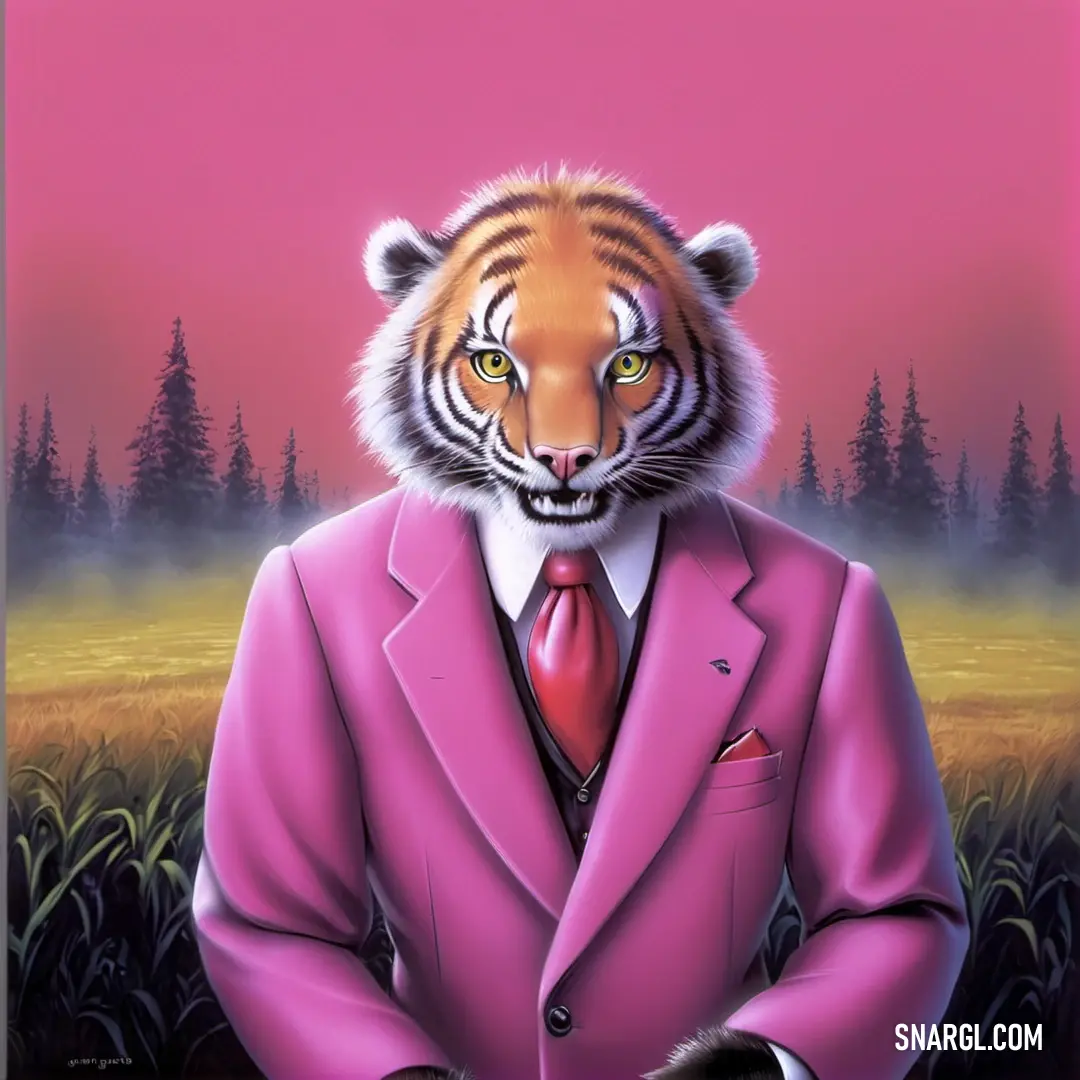
Painting of a tiger in a pink suit and tie with a pink sky in the background
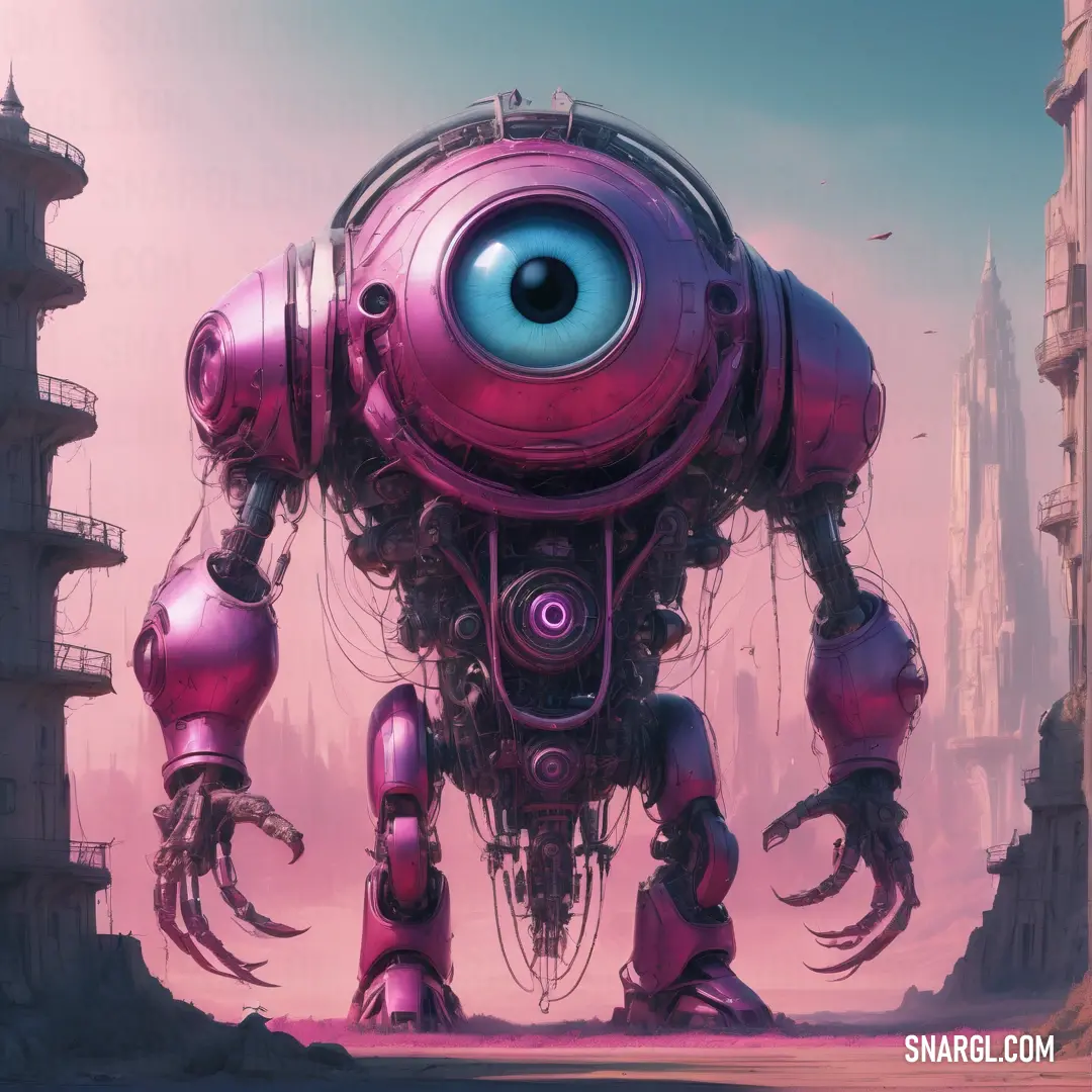
Robot with a large eye standing in a desert area with buildings in the background and a bird flying over it
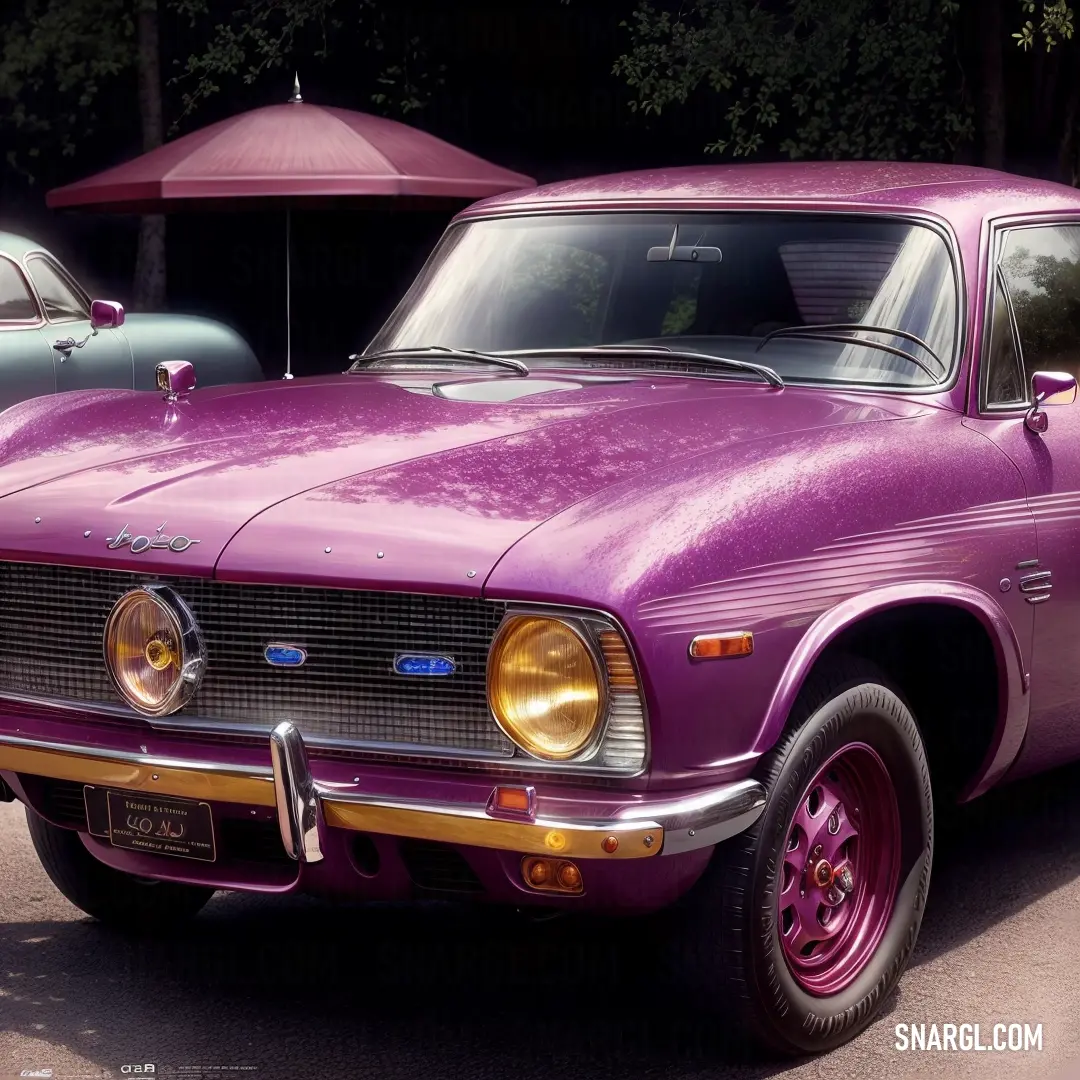
Purple car parked in a parking lot next to a red umbrella and a black car
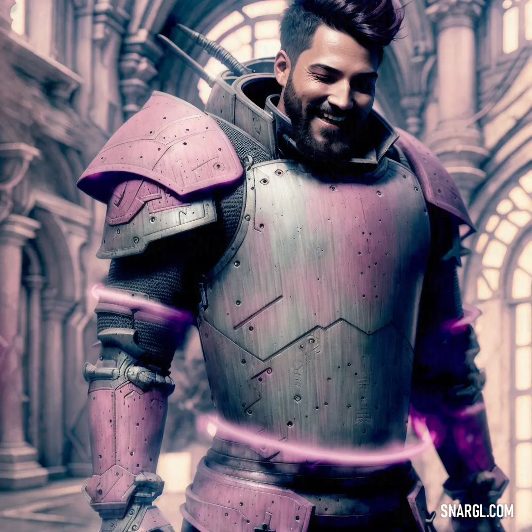
Man in a futuristic suit with a sword in his hand and a building in the background with arches
Woman with a black bra top and a neon background is shown in this digital painting style photo of a woman with a black bra top
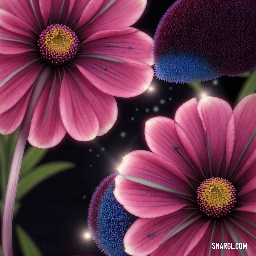
Close up of a pink flower with a blue center and green leaves on a black background with a star in the middle. Color CMYK 20,89,0,0.
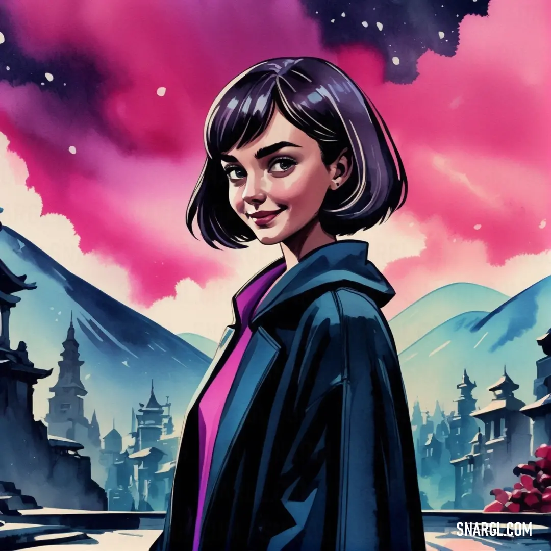
Woman in a black jacket standing in front of a pink sky with mountains and clouds behind her and a pink sky. Example of CMYK 20,89,0,0 color.
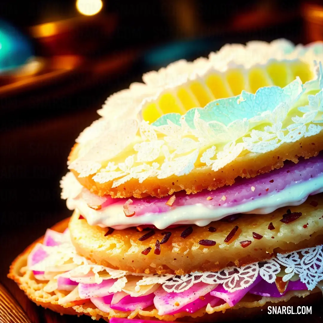
Stack of cookies with frosting and sprinkles on top of each other on a table. Color PANTONE 240.
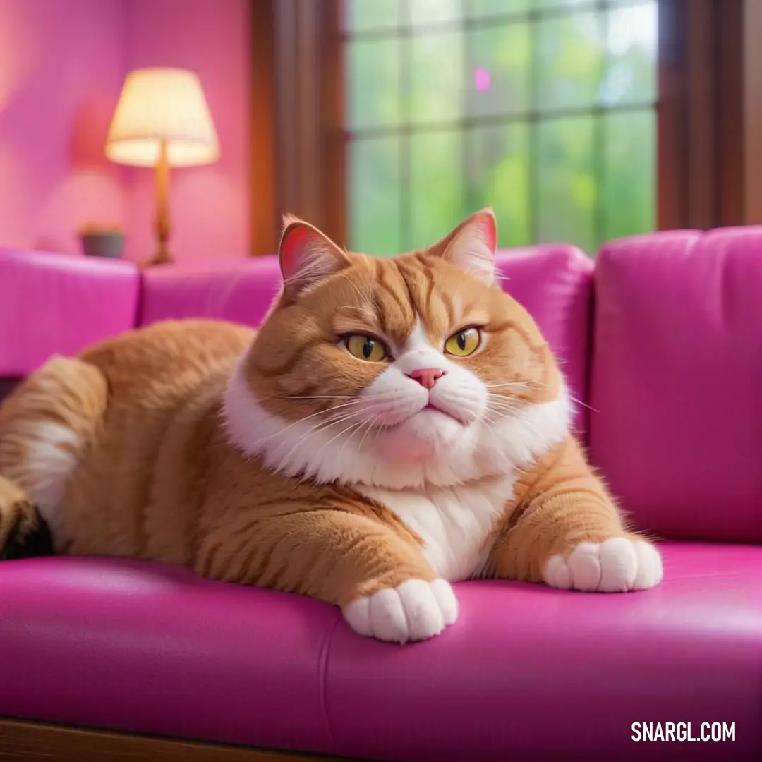
Cat laying on a pink couch in a living room with a window behind it and a lamp on the side. Color PANTONE 240.
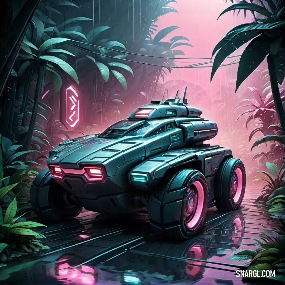
Futuristic vehicle is driving through a jungle with pink lights on it's headlights and a neon sign. Color RGB 191,73,148.
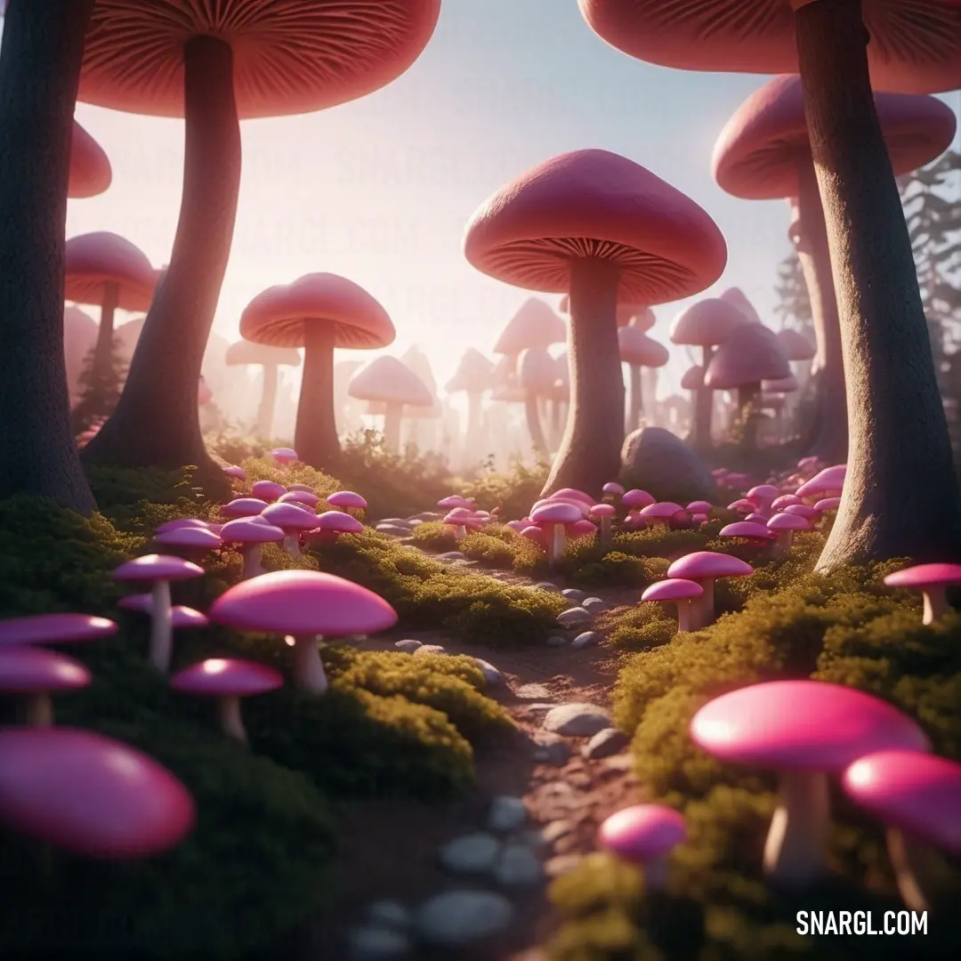
PANTONE 240 color. Group of mushrooms that are in the grass near trees and bushes
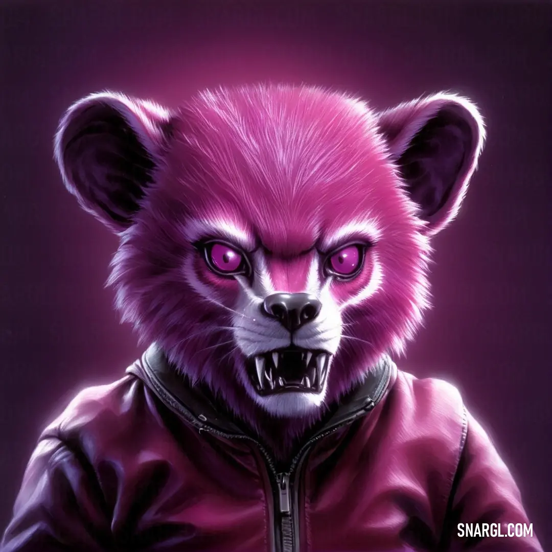
Pink colored bear with a leather jacket on it's chest and a purple background with a black zipper. Example of PANTONE 240 color.
PANTONE 240 is a shade of magenta, which is a color that combines red and blue.

In the RGB color model, which is a system that describes colors in terms of red, green, and blue light, it has 74.9% red, 28.63% green, and 58.04% blue.

In the HSL color space, which is a system that describes colors in terms of hue, saturation, and lightness, PANTONE 240 has a hue of 322° (degrees), 62% saturation, and 75% lightness.

PANTONE 240 is a vibrant and eye-catching color that can be used for various purposes, such as branding, packaging, fashion, or graphic design.

This color can convey different meanings and emotions depending on the context and the culture.

It can represent femininity, beauty, or romance.

PANTONE 240 can be used to create striking and memorable designs, products, or messages.

It is a color that can express femininity, creativity, or energy.

Example of the palette with the PANTONE 240 color
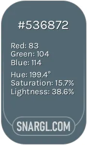
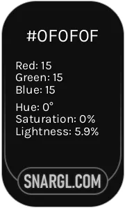
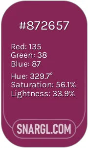
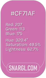
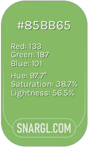
Picture with primary colors of Cadet, Onyx, Dark raspberry, Sky magenta and Dollar bill
Top 5 color shades of the illustration. Arranged in descending order of frequency of occurrence (first - more often, last - more rare).
See these colors in NCS, PANTONE, RAL palettes...

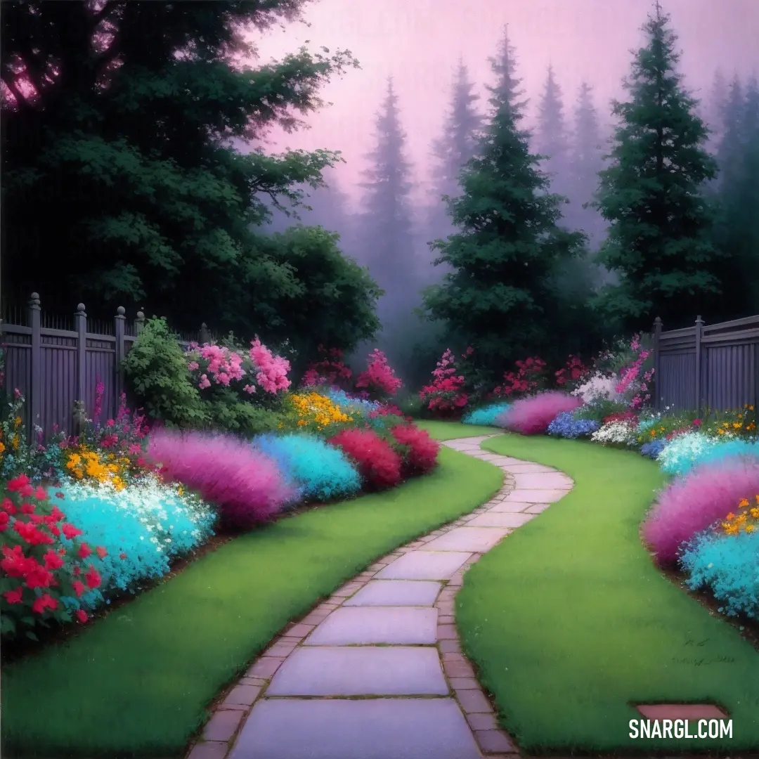
Example of the palette with the PANTONE 240 color
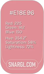
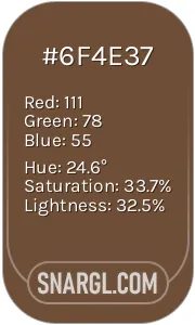
Picture with primary colors of Ruddy pink, Coffee, Dark jungle green, Blue Bell and UCLA Blue
Top 5 color shades of the illustration. Arranged in descending order of frequency of occurrence (first - more often, last - more rare).
See these colors in NCS, PANTONE, RAL palettes...
RAL Classic
RAL 3012
RAL 8024
RAL 8022
RAL 7040
RAL 5023
RAL Design
RAL 030 70 30
RAL 040 30 30
RAL 160 20 20
RAL 280 70 20
RAL 270 40 30
Author:
Funny stories about the 'PANTONE 240'

The Unlikely Genesis of Pantone 240

In a sleepy town famed for its mundane serenity, Karl Xiang was an unassuming car service worker with an unusual hobby: painting. His garage, normally filled with grease and oil, had an entire wall dedicated to his experimental color splashes. Meanwhile, Igor Honey, a novelist with a penchant for bizarre plots, spent his days spinning stories in a quaint café on Main Street.

One particularly dull Tuesday, Karl’s routine was disrupted by a perplexing phone call from Igor. The writer had been struck by an inspiration for a new novel - a plot so vibrant it needed a new color to come to life. The problem was, Igor had absolutely no idea what this color would look like. He had only one clue: it had to be as unpredictable and unforgettable as his narrative twists.

Karl, intrigued and slightly amused, agreed to help. He suggested they meet at his garage. Igor arrived in the middle of a rather unremarkable day, his face lit up with unrestrained enthusiasm. The garage was a cacophony of paint pots, brushes, and half-finished canvases. Karl was in the middle of mixing an odd concoction of colors when Igor burst in, brandishing a worn-out manuscript.

As they discussed the plot - which revolved around a sentient toaster’s quest for existential meaning - Karl's attention drifted to the paint. He absentmindedly stirred the mixture and, quite by accident, dropped in an entire jar of neon pink glitter. The resulting hue was mesmerizing: a shade of pink so vibrant it practically hummed.

Igor's eyes widened as he saw the paint. "That’s it! That’s the color I’ve been looking for!"

Karl, feeling a sudden rush of pride, decided to name the color "Pantone 240." It was as ridiculous as it was revolutionary. Igor immediately used this color in his book's cover design, and it became the highlight of the novel’s marketing campaign. The book, aptly titled "The Hues of the Toaster’s Quest," became a bestseller.

Pantone 240, the color, quickly gained notoriety. It wasn’t just a shade; it was a phenomenon. Artists, designers, and even fashionistas were enchanted by its unpredictable nature. The color was so vivid it seemed to change shades depending on the viewer's mood.

Soon, Karl and Igor found themselves at the heart of a global sensation. The local town, once known for its tranquility, was now a hotspot for color enthusiasts. Karl’s garage turned into a vibrant studio, and Igor’s café became a pilgrimage site for fans seeking to catch a glimpse of the illustrious Pantone 240.

Their fame was bizarre but delightful. Karl continued to mix and experiment, always ready to stumble upon the next outrageous color. Igor, meanwhile, churned out stories even wilder than the last, inspired by his serendipitous encounter with the most vibrant shade of pink ever imagined.

And so, Pantone 240 was born not from a grand design or a meticulous scientific process, but from an accidental splash of paint and an impromptu brainstorm. It stood as a reminder that sometimes, the most remarkable things emerge from the most unexpected places - like a dusty garage in a sleepy town and a writer’s whimsical imagination.
Author:

Continue browsing posts in category "PANTONE"
You may find these posts interesting:
PANTONE 2062 Color
2
1
2
14
0
PANTONE 2062 Color
PANTONE 107 Color
4
0
2
11
1
PANTONE 107 Color
PANTONE 210 Color
5
0
2
9
0
PANTONE 210 Color
PANTONE 2210 Color
5
0
2
5
0
PANTONE 2210 Color
PANTONE 4635 Color
4
0
1
5
0
PANTONE 4635 Color
PANTONE 103 Color
3
0
2
13
2
PANTONE 103 Color
PANTONE 2013 Color
4
0
3
7
0
PANTONE 2013 Color
PANTONE 7620 Color
2
0
1
8
0
PANTONE 7620 Color
Home
Terms of Service
Contact Us

© 2023 Snargl.com