Home Colors PANTONE
PANTONE 237

PANTONE 237

Parameters:
HEX Triplet:
#DA93BD
RGB:
218, 147, 189
CMYK:
6, 53, 0, 0
HSL:
325°, 33%, 85%
Closest colors:
in PANTONE:
PANTONE 673
in RAL Classic:
RAL 3015
in RAL Design:
RAL 340 70 25
in RAL Effect:
RAL 510-3
What color is PANTONE 237? The Pantone Paradox
2024-09-03 Snargl 02:32

What color is PANTONE 237?

Kitten with blue eyes on a purple chair with a purple background
Painting of a skeleton and flamingos with pink paint on it's face and body
Woman with pink hair and a choker on her neck
Woman in a pink dress with a pink fairy wings on her chest
Pink deer in a forest with rocks and trees in the background
Painting of a fountain with a lot of water in it and a lot of pink and blue colors. Color #DA93BD.
Bedroom with a bed and a chandelier. Color RGB 218,147,189.
Dog wearing a pink coat with planets in the background
Digital painting of a woman with headphones on her ears and a futuristic suit on her face. Color PANTONE 237.
Field of flowers with buildings in the background in the daytime light. Color RGB 218,147,189.
PANTONE 237 is a medium light shade of magenta-pink, with a hexadecimal color code of #DA93BD.

In the RGB color model, it is composed of 85.49% red, 57.65% green and 74.12% blue.

In the HSL color space, it has a hue of 325° (degrees), 33% saturation and 85% lightness.

PANTONE 237 is a vibrant and feminine color that can be used to create contrast, emphasis, or mood in various design projects.

It can also be paired with other colors to create harmonious or dynamic color schemes.

Example of the palette with the PANTONE 237 color

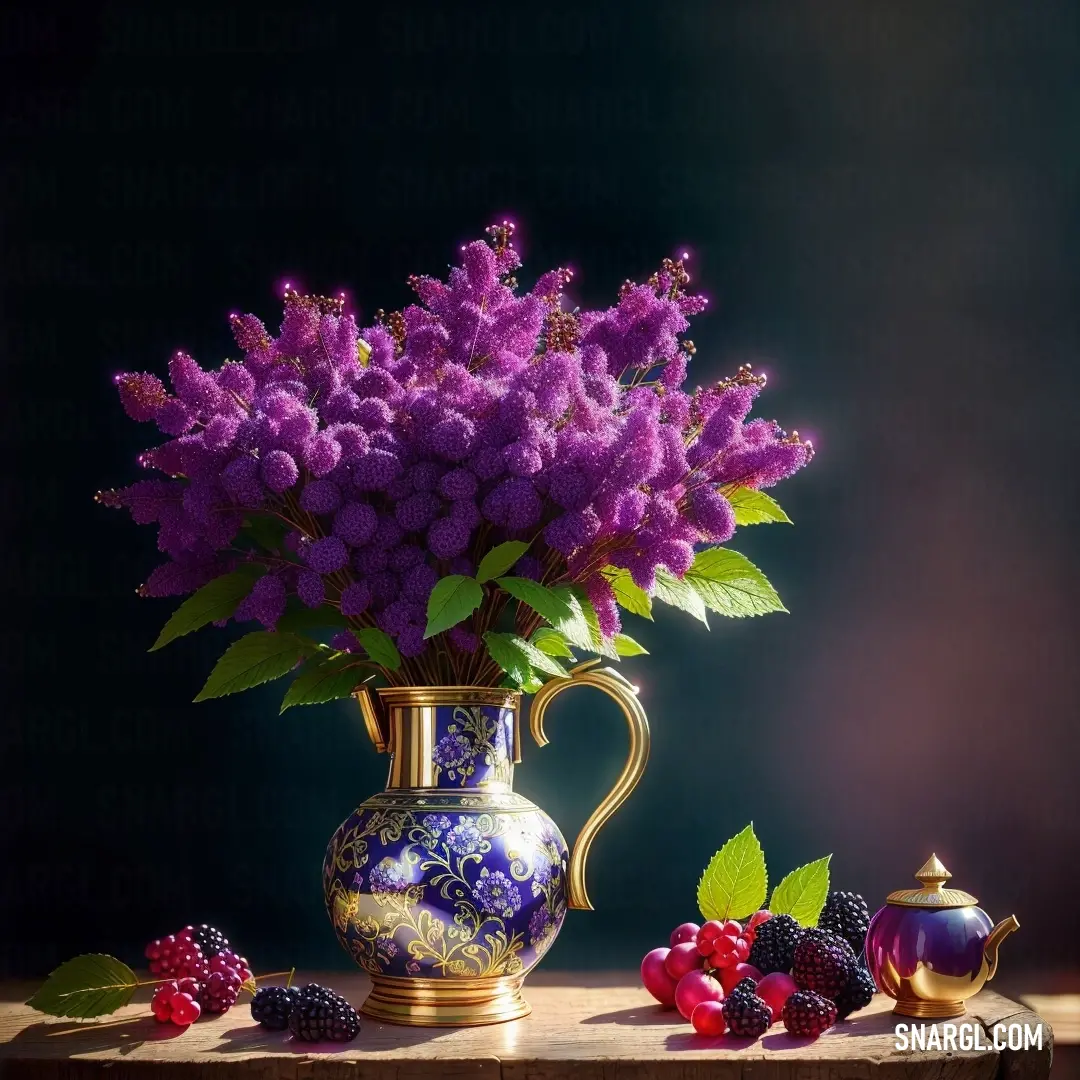
Picture with primary colors of Dark byzantium, Dark jungle green, Lavender rose, Gray-Tea Green and Apple Green
Top 5 color shades of the illustration. Arranged in descending order of frequency of occurrence (first - more often, last - more rare).
See these colors in NCS, PANTONE, RAL palettes...

Example of the palette with the PANTONE 237 color

Picture with primary colors of Pale chestnut, Viridian, Cadet grey, Mulberry and Glitter
Top 5 color shades of the illustration. Arranged in descending order of frequency of occurrence (first - more often, last - more rare).
See these colors in NCS, PANTONE, RAL palettes...
RAL Classic
RAL 3015
RAL 6000
RAL 7001
RAL 4003
RAL 9003
RAL Design
RAL 010 70 20
RAL 160 50 25
RAL 180 70 10
RAL 350 50 45
RAL 250 92 05

Example of the palette with the PANTONE 237 color

Picture with primary colors of Pale mauve, Dark sienna, Rose ebony, Isabelline and Beaver
Top 5 color shades of the illustration. Arranged in descending order of frequency of occurrence (first - more often, last - more rare).
See these colors in NCS, PANTONE, RAL palettes...
RAL Classic
RAL 7032
RAL 3007
RAL 8007
RAL 9010
RAL 7034
RAL Design
RAL 040 70 10
RAL 080 20 10
RAL 030 30 20
RAL 010 92 05
RAL 030 50 20
RAL Effect
RAL 340-1
RAL 790-5
RAL 340-4
RAL 150-2
RAL 780-5
Author:
Funny stories about the 'PANTONE 237'

The Pantone Paradox

Long time ago, in the world of high fashion, where every detail is meticulously curated, one color had the power to spark a revolution. Pantone 237, a striking blend of electric pink and vibrant purple, was more than just a hue; it was a sensation waiting to be unleashed.

Virgil Powell, a reclusive painter known for his experimental work, had always been fascinated by the intersection of art and fashion. His studio was a riot of colors, but Pantone 237 had eluded him. It was the shade of a dream, a ghost color that hovered just out of reach. Rumors of its mythical quality had reached his ears through whispered conversations and hushed admiration.
Painting of a mountain range with a sunset in the background and a tree in the foreground

Meanwhile, Hubert Clank, a top model with an ethereal presence, was the epitome of fashion's new age. His career was at its zenith, yet he felt a growing discontent. Despite the glamour, he sought something more profound - an experience that transcended the superficial glitter of his world.

The two worlds collided when Virgil received a cryptic invitation to a private fashion gala hosted by Hubert. The invite was adorned with a single Pantone 237 swatch, promising an unveiling that would transcend conventional fashion. Intrigued, Virgil accepted, hoping to finally grasp the essence of this elusive color.

At the gala, the air was electric, charged with anticipation. The venue was an opulent mansion bathed in dim, atmospheric lighting. The centerpiece of the evening was a series of fashion pieces, each one meticulously crafted and adorned with Pantone 237. Hubert, draped in a flowing gown of the same shade, was the embodiment of the color's essence.
Cake with pink frosting and blue frosting on a plate on a table with a fork and a knife

As Hubert took to the runway, the room fell silent. The gown seemed to glow, pulsating with an otherworldly energy. The color was not merely a visual delight but a transformative force. It was as if Pantone 237 had the power to evoke emotions and memories, casting a spell over anyone who beheld it.

Virgil, captivated, watched with wide eyes. He saw in Pantone 237 not just a color but a reflection of the human soul - its depth, its passion, and its vulnerability. The gown's interplay with the light created shifting patterns, almost like living art. It was in this moment that Virgil realized the true nature of Pantone 237: it was a bridge between reality and fantasy, a catalyst for change.

As Hubert completed his walk, the room erupted into applause, but Virgil remained transfixed. After the show, he sought out Hubert, their paths converging backstage. The two shared a moment of mutual understanding. Hubert, too, had felt something extraordinary during the evening, sensing that Pantone 237 had unlocked a new dimension of his existence.
Woman with pink hair and horns on her head and a green dress on her body and a green and gold necklace

In their conversation, they discovered a shared vision - one where Pantone 237 would not just be a fleeting trend but a symbol of transformation and transcendence in fashion. Together, they envisioned a project that would push the boundaries of creativity, making Pantone 237 the epitome of artistic expression.

As the night drew to a close, Virgil and Hubert left the gala not just as collaborators but as visionaries. They understood that Pantone 237 was more than a color; it was a living, breathing entity that connected their dreams and aspirations. It was the essence of their creativity, poised to redefine the world of fashion and art.

In the end, Pantone 237 was not just a color on a swatch but a profound experience - one that would leave an indelible mark on the canvas of history.
Author:

Continue browsing posts in category "PANTONE"
You may find these posts interesting:

PANTONE 140 Color
8
0
2
11
0
PANTONE 140 Color
PANTONE 194 Color
7
1
2
14
0
PANTONE 194 Color
PANTONE 100 Color
3
0
2
5
0
PANTONE 100 Color
PANTONE 2617 Color
2
0
2
5
0
PANTONE 2617 Color
PANTONE 634 Color
2
0
1
9
0
PANTONE 634 Color
PANTONE 107 Color
4
0
2
11
1
PANTONE 107 Color
PANTONE 7718 Color
1
0
2
7
0
PANTONE 7718 Color
PANTONE 101 Color
2
0
2
7
1
PANTONE 101 Color
Home
Terms of Service
Contact Us

© 2023 Snargl.com