Home Colors PANTONE
PANTONE 2320

PANTONE 2320

Parameters:
HEX Triplet:
#724B25
RGB:
114, 75, 37
CMYK:
25, 69, 97, 54
HSL:
30°, 68%, 45%
Closest colors:
in RGB:
Field drab
in PANTONE:
PANTONE 7568
in RAL Classic:
RAL 8008
in RAL Design:
RAL 050 30 36
in RAL Effect:
RAL 320-6
What color is PANTONE 2320? The Great PANTONE 2320 Conundrum
2024-09-04 Snargl 02:10

What color is PANTONE 2320?

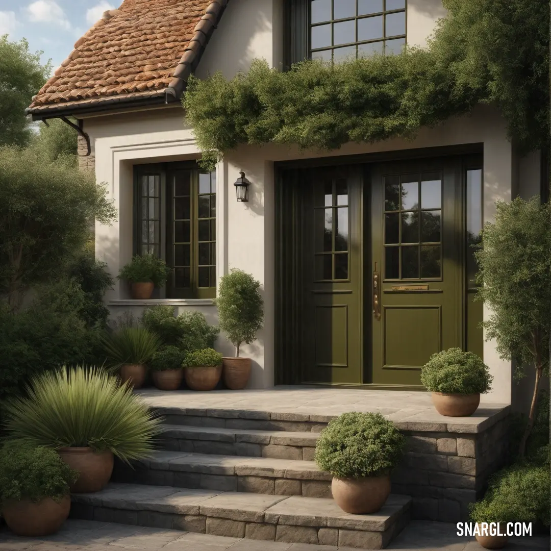
House with a green door and a green planter on the steps next to it. Example of RGB 114,75,37 color.
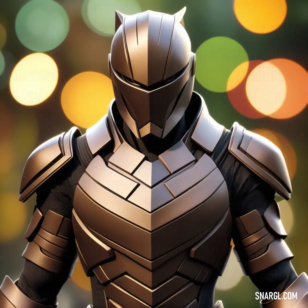
PANTONE 2320 color example: Close up of a person in a suit of armor with a blurry background
PANTONE 2320 is a color that can be described as a medium dark shade of orange.

In the RGB color model, it is composed of 44.71% red, 29.41% green, and 14.51% blue, which translates to a hexadecimal color code of #724B25.

This color exudes a sense of warmth and earthiness, reminiscent of autumn leaves or the rich hues found in spices like cinnamon and paprika.

The color's composition in CMYK, commonly used in printing, is approximately 25% cyan, 69% magenta, 97% yellow, and 54% black, indicating a color that is strong in yellow and black tones, giving it a deep, saturated appearance.

In the HSL color space, which is relevant for web design, PANTONE 2320 has a hue of 30° (degrees), which places it within the orange spectrum on the color wheel.

This particular shade of orange is versatile and can be used in various design contexts.

It can bring warmth to graphic designs, add a touch of sophistication to interior spaces, and even serve as an accent color in fashion and product design.

Its vibrancy can evoke feelings of creativity and excitement, while its depth provides a grounding effect.

In terms of color psychology, orange is often associated with enthusiasm, encouragement, and stimulation.

This color can inspire action and is thought to promote a sense of general wellness and emotional energy.

PANTONE 2320, with its particular blend of red and yellow, can be seen as a color that combines the energy of red with the happiness of yellow, making it a dynamic yet balanced choice for projects that aim to stand out and captivate an audience.

Example of the palette with the PANTONE 2320 color
Picture with primary colors of Gainsboro, Black, Cafe noir, Dark spring green and Verdigris
Top 5 color shades of the illustration. Arranged in descending order of frequency of occurrence (first - more often, last - more rare).
See these colors in NCS, PANTONE, RAL palettes...
Author:
Funny stories about the 'PANTONE 2320'

The Great PANTONE 2320 Conundrum

In a far away place, in the bustling city of Chromaville, a place where every hue had its day, there existed a small but vibrant design studio called "Spectrum Savvy." This was where Alexander Gold, a shop assistant with a penchant for precision and panache, and Donna Jacobs, a delivery worker known for her speed and impeccable taste in music, crossed paths.

One sunny afternoon, as Alexander meticulously organized the color swatches, a peculiar new shade arrived. It was a vibrant, almost shocking pink with a touch of sophistication that defied ordinary description. The label read "PANTONE 2320."
Painting of a tree with a blue trunk and branches on it's trunk. Color #724B25.

Alexander was intrigued. "What a marvelous hue!" he exclaimed. "This could be the breakthrough color of the season!"

Meanwhile, Donna, who had just dropped off a crate of neon green fabric, was making her way out. She stopped in her tracks, her eyes widening at the sight of the new color. "Whoa, what’s that?"

"It’s PANTONE 2320," Alexander said, proudly showing her the swatch. "It’s supposed to be the next big thing in design. I’ve never seen anything like it."

Donna raised an eyebrow. "Big thing, huh? Looks like it belongs in a sci-fi movie where aliens throw fabulous parties."

Alexander laughed. "You’re not wrong. It does have a bit of that ‘extra-terrestrial chic’ about it. But we need to make sure it’s seen everywhere. It could redefine the season."

And so, the mission began. Alexander and Donna embarked on a quest to get PANTONE 2320 into every conceivable corner of Chromaville. Their first stop was a trendy boutique that specialized in avant-garde clothing.

Alexander, armed with the swatch, made his pitch. "This is the new PANTONE 2320. It’s vibrant, revolutionary, and bound to turn heads."

The boutique owner, Ms. Violet, adjusted her neon green glasses and took a long look at the swatch. "Hmm, interesting. It might just be what my customers didn’t know they were missing!"
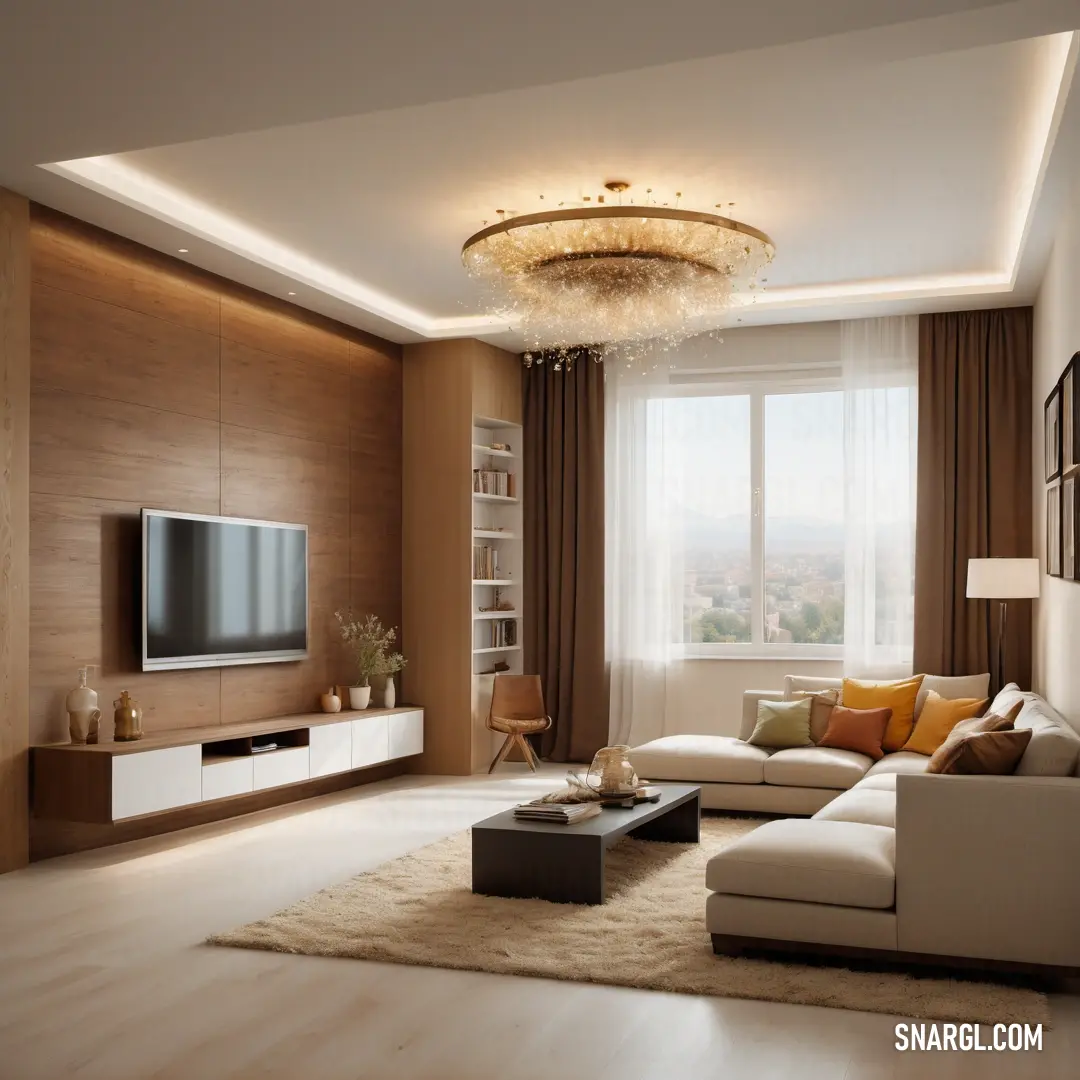
Living room with a large window and a tv on a stand in it's center wall. Example of CMYK 25,69,97,54 color.

Donna, ever the astute observer, chimed in. "Plus, think of how amazing it would look under those disco lights you have. It’ll be like a color explosion!"

Ms. Violet’s eyes sparkled with excitement. "Alright, I’m in! Let’s make it happen."

Next, they visited a hip café known for its artistic decor. The barista, Max, was skeptical. "PANTONE 2320? Sounds like a high-tech gadget."

Alexander replied, "It’s high-tech in a way! It’s a game-changer for aesthetics."

Donna added, "Imagine this color on your new menu boards or as a highlight on your café walls. It’ll attract a whole new crowd - those who love bold, daring styles."

Max, intrigued by the prospect of a trendy makeover, agreed. "You’ve got me convinced. Let’s give it a shot."

Word spread quickly, and soon, PANTONE 2320 was making waves. It adorned everything from chic boutiques to trendy cafés, from office walls to the latest fashion lines. Alexander and Donna’s efforts paid off, and PANTONE 2320 became the talk of the town.

One day, as they looked at the city’s new, vibrant look, Alexander turned to Donna. "You know, we might have just started a color revolution."

Donna grinned. "And to think, it all started with a shade that looks like it’s straight out of an alien fashion show."

Alexander chuckled. "True. But sometimes, it takes a bit of the extraordinary to make the everyday extraordinary."

And so, PANTONE 2320 continued to dazzle Chromaville, proving that with a bit of vision and a splash of boldness, even a color could change the world.
Author:

Continue browsing posts in category "PANTONE"
You may find these posts interesting:
PANTONE 2062 Color
2
1
2
14
0
PANTONE 2062 Color
PANTONE 5255 Color
1
0
2
5
0
PANTONE 5255 Color
PANTONE 2603 Color
1
0
1
13
0
PANTONE 2603 Color
PANTONE 7620 Color
2
0
1
8
0
PANTONE 7620 Color
PANTONE 189 Color
10
0
2
12
0
PANTONE 189 Color
PANTONE 107 Color
4
0
2
11
1
PANTONE 107 Color
PANTONE 634 Color
2
0
1
9
0
PANTONE 634 Color
PANTONE 101 Color
2
0
2
7
1
PANTONE 101 Color
Home
Terms of Service
Contact Us

© 2023 Snargl.com