Home Colors PANTONE
PANTONE 228

PANTONE 228

Parameters:
HEX Triplet:
#8F2054
RGB:
143, 32, 84
CMYK:
16, 100, 14, 42
HSL:
332°, 78%, 56%
Closest colors:
in PANTONE:
PANTONE 235
in RAL Classic:
RAL 4002
in RAL Design:
RAL 010 30 44
in RAL Effect:
RAL 530-4
What color is PANTONE 228? The Chromatic Revelation
2024-09-03 Snargl 02:28

What color is PANTONE 228?

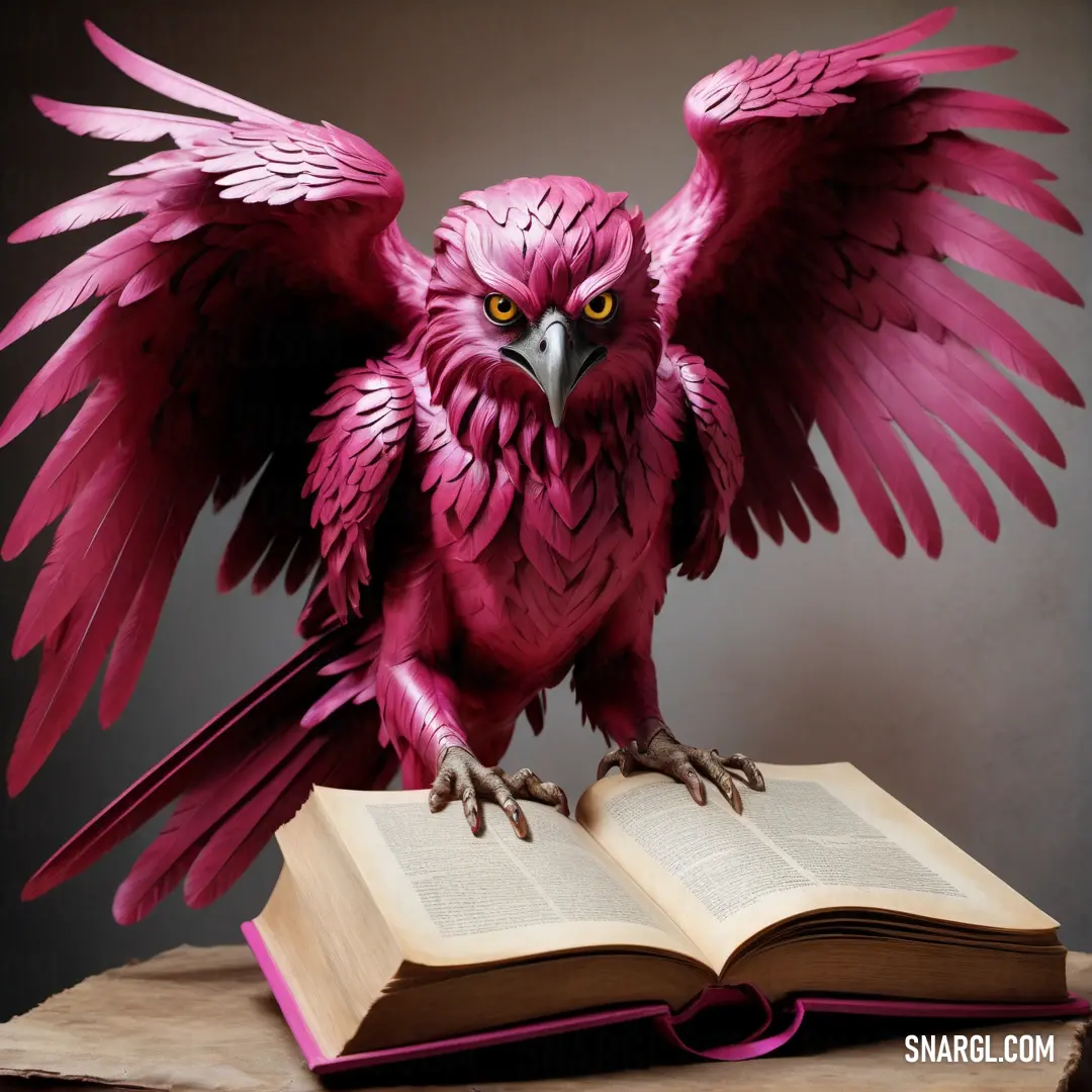
Pink bird with wings spread on an open book with its wings spread out and spread out. Example of RGB 143,32,84 color.
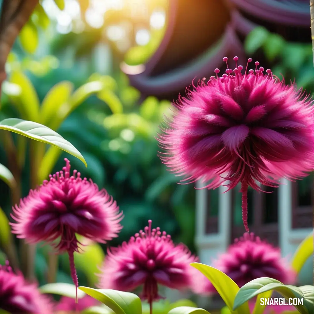
Bunch of pink flowers in a garden with green leaves and a building in the background. Color RGB 143,32,84.
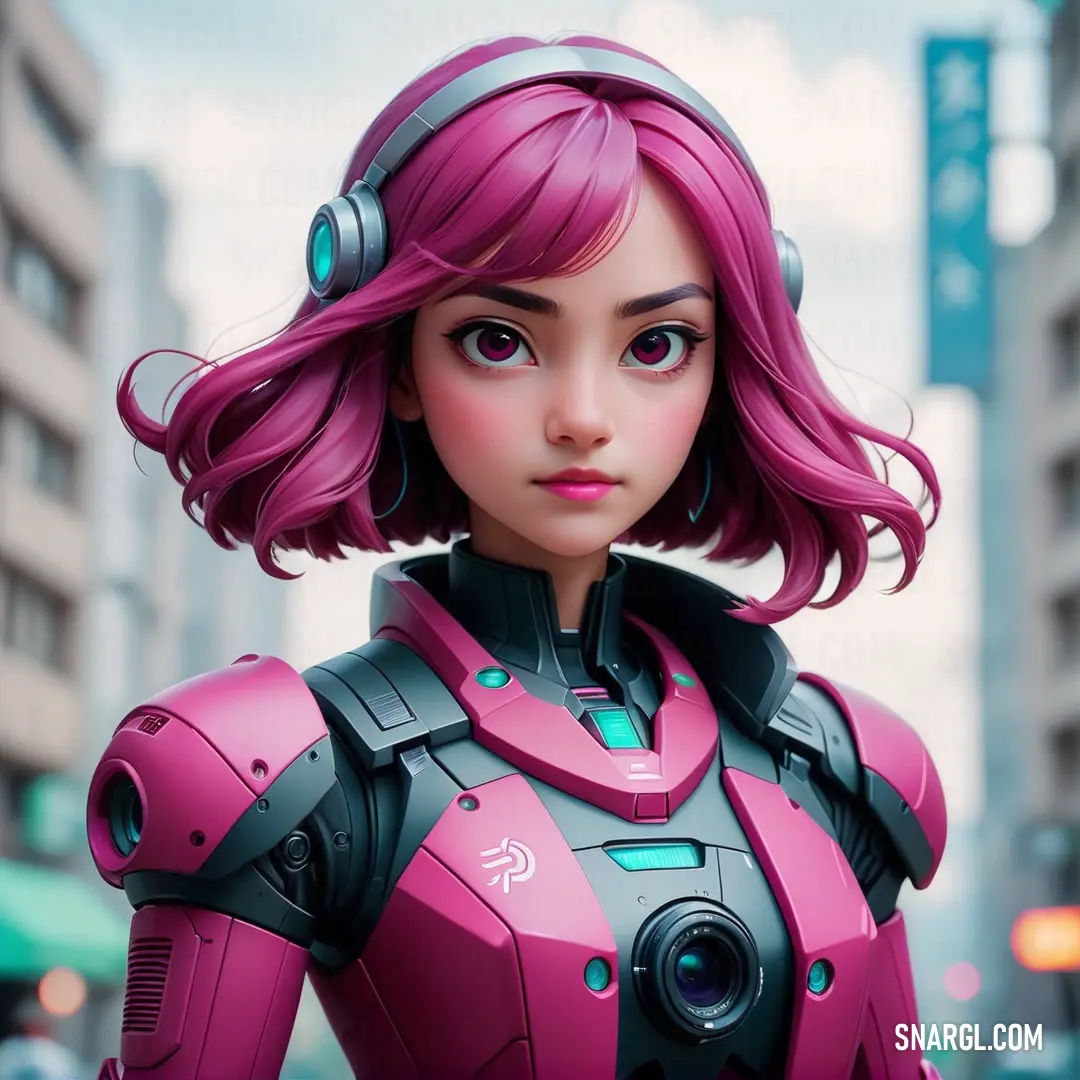
Cartoon character with pink hair and headphones on a city street with buildings in the background. Color CMYK 16,100,14,42.
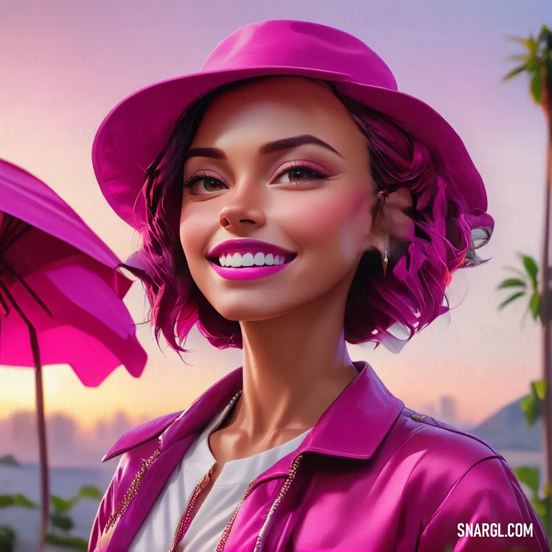
Woman with a pink hat and a pink umbrella in the background. Color #8F2054.
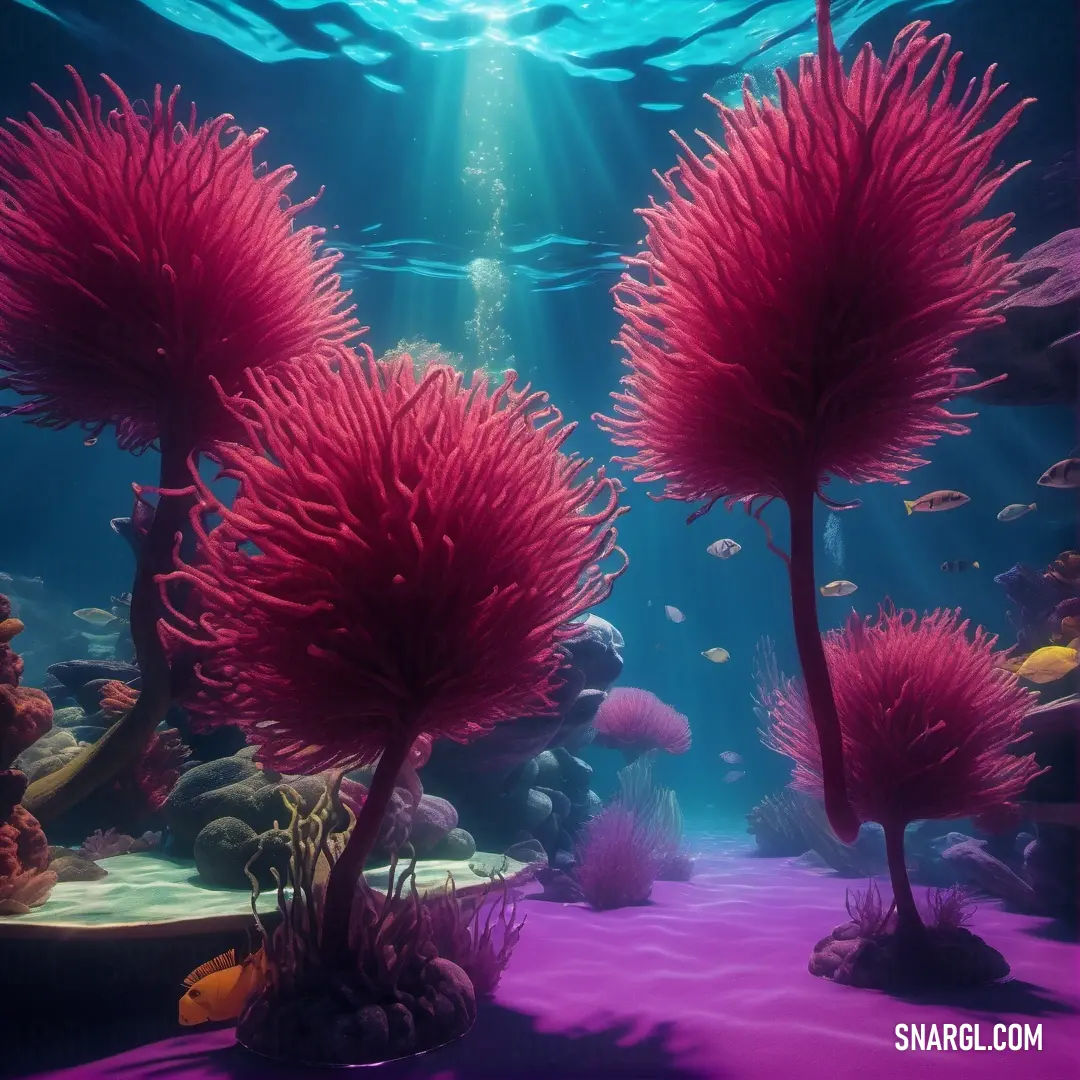
Underwater scene with corals and seaweed in the water and sunlight shining through the water's bubbles. Example of #8F2054 color.
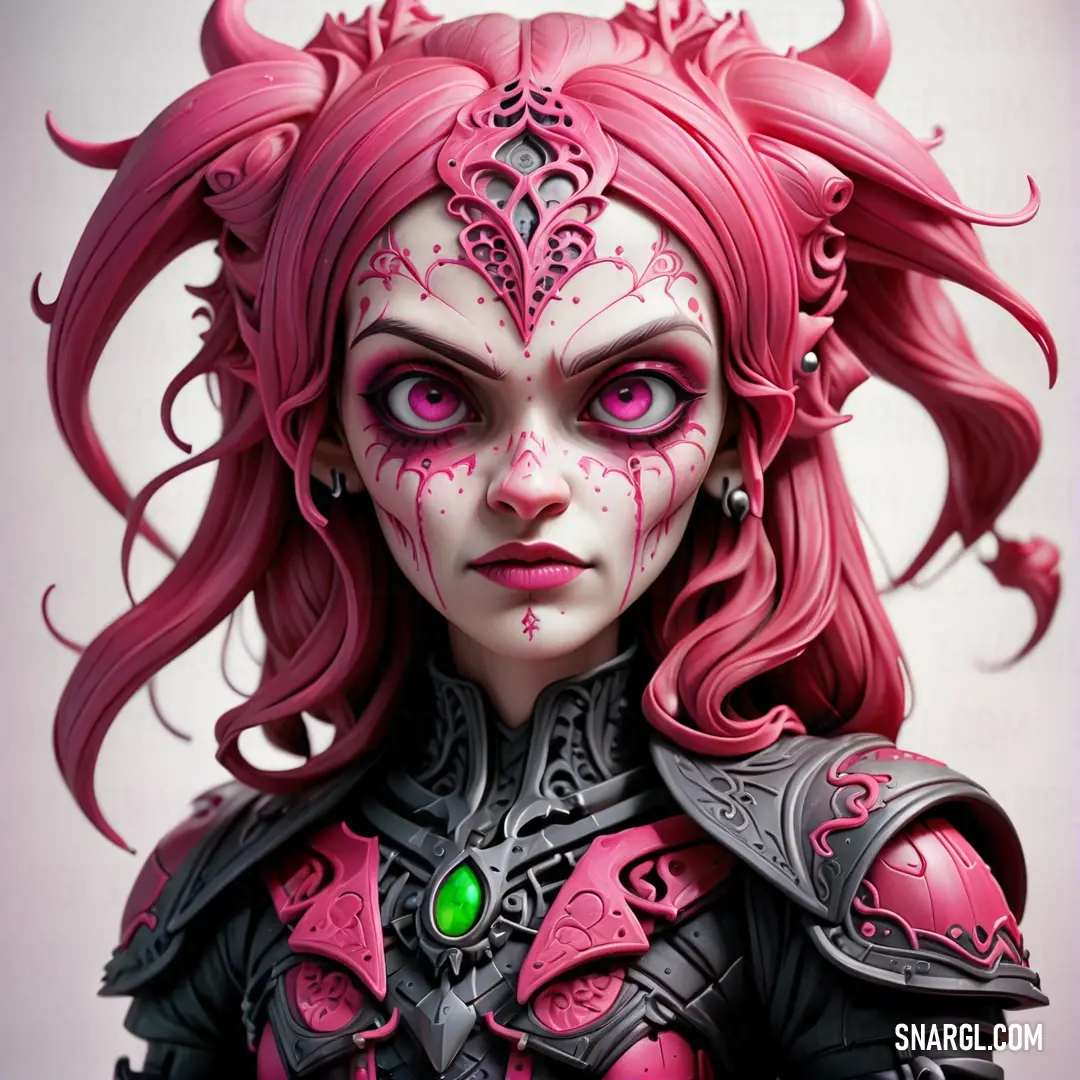
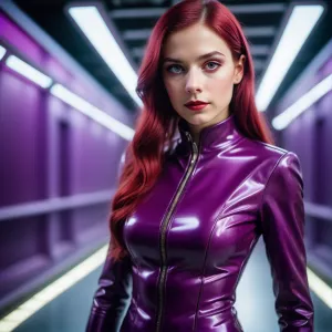
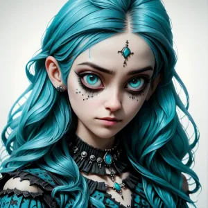
PANTONE 228 color. Woman with pink hair and makeup is wearing a costume with horns and a green eye patch on her face
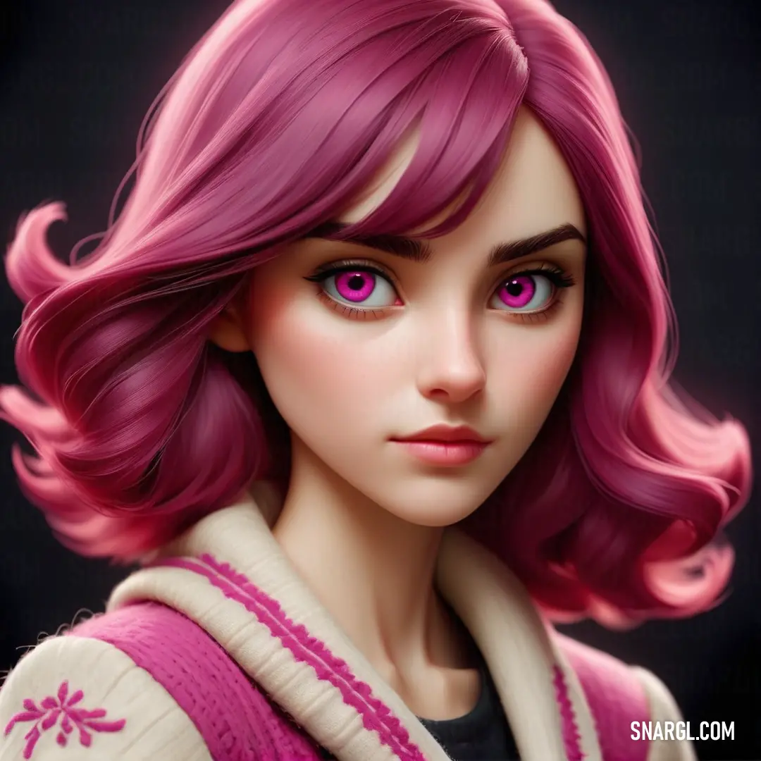
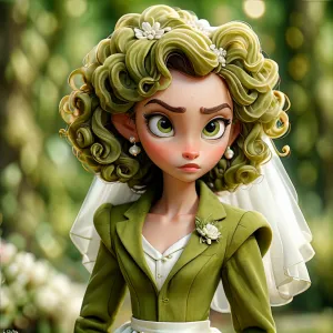
Close up of a doll with pink hair and pink eyes and a sweater on her shoulders and a scarf around her neck. Example of CMYK 16,100,14,42 color.
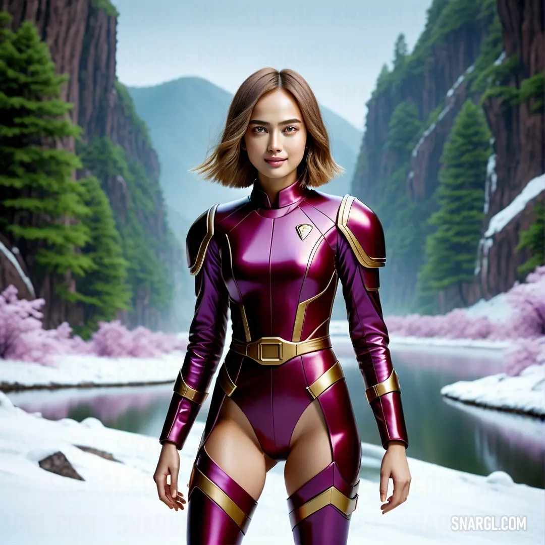
Woman in a purple suit standing in the snow with mountains in the background. Color CMYK 16,100,14,42.
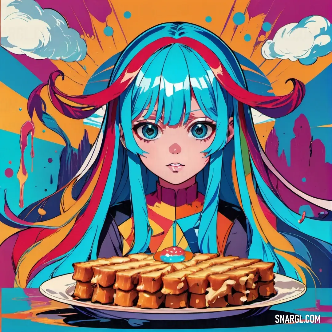
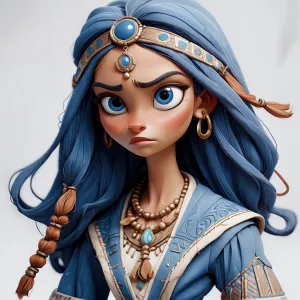
Girl with blue hair is holding a plate of food and looking at a cake with a candle on it. Example of RGB 143,32,84 color.
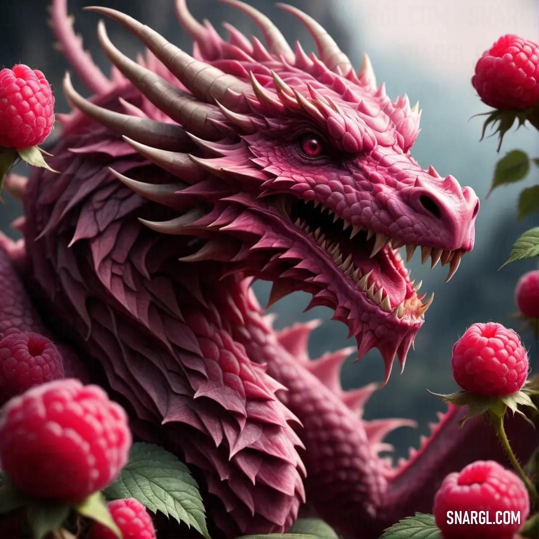
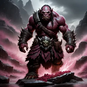
Pink dragon with long horns and large horns on it's head surrounded by raspberries and leaves. Color PANTONE 228.
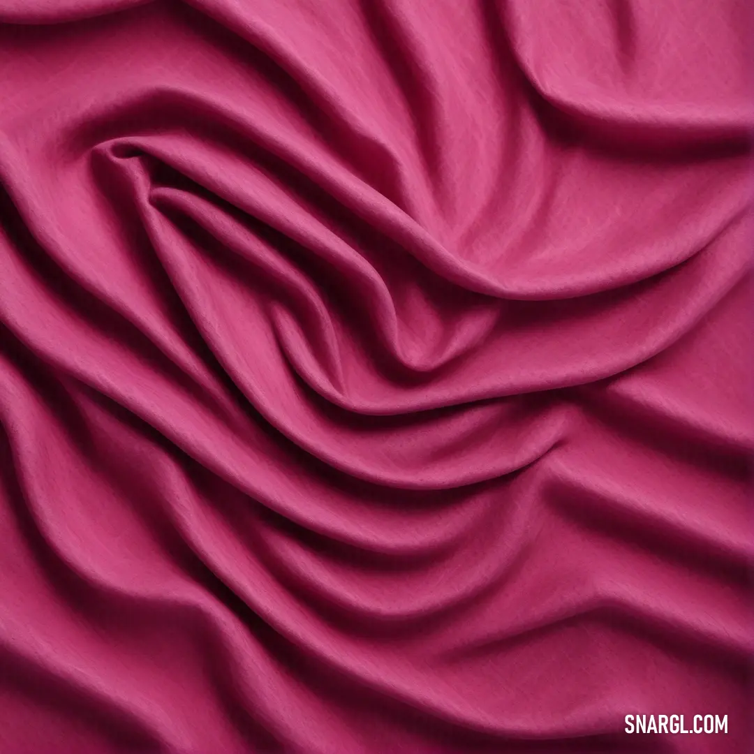
PANTONE 228 color example: Pink fabric with a very large amount of folds on it's surface, with a purple background
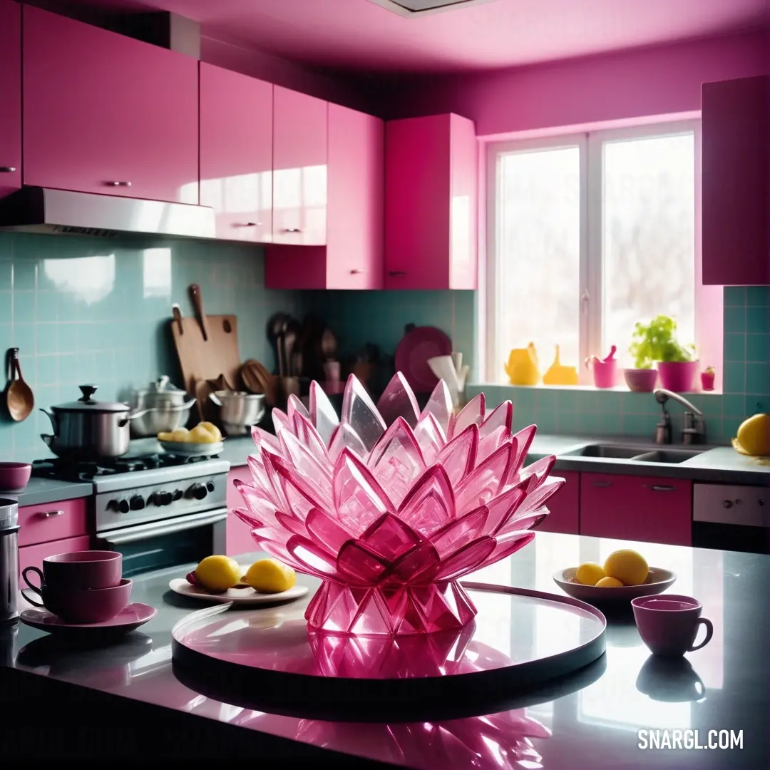
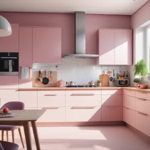
Pink glass flower on a kitchen counter top with a bowl of fruit on the counter top and a plate of lemons on the counter
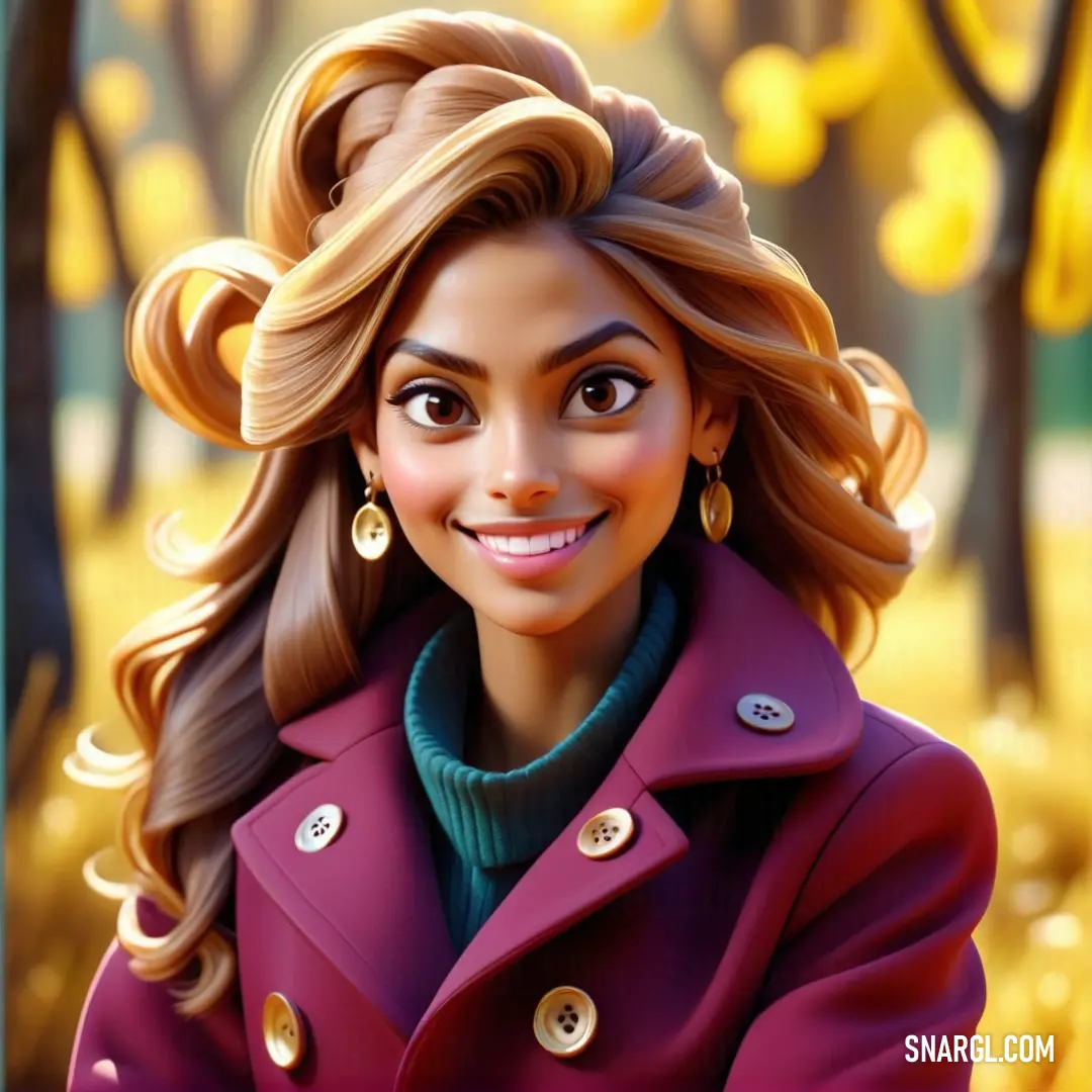
Cartoon of a woman in a purple coat smiling at the camera with a yellow background. Color RGB 143,32,84.
PANTONE 228 is a medium dark shade of magenta-pink with a hexadecimal color code of #8F2054.

In the RGB color model, it is composed of 56.08% red, 12.55% green, and 32.94% blue.

In the HSL color space, this color has a hue of 332°, a saturation of 78%, and a lightness of 56%.

In the CMYK color model, which is commonly used for printing, it is composed of 16% cyan, 100% magenta, 14% yellow, and 42% black.

PANTONE 228 is a vibrant and eye-catching color that can be used to create contrast, emphasis, or drama in a design.

This color can also evoke feelings of passion, romance, or creativity.

It inspires creativity, passion, and excitement.

PANTONE 228 is used for various purposes and occasions, such as logos, posters, flyers, invitations, packaging, clothing, accessories, and more.

This color is able to give any design a magenta pink magic.

Example of the palette with the PANTONE 228 color
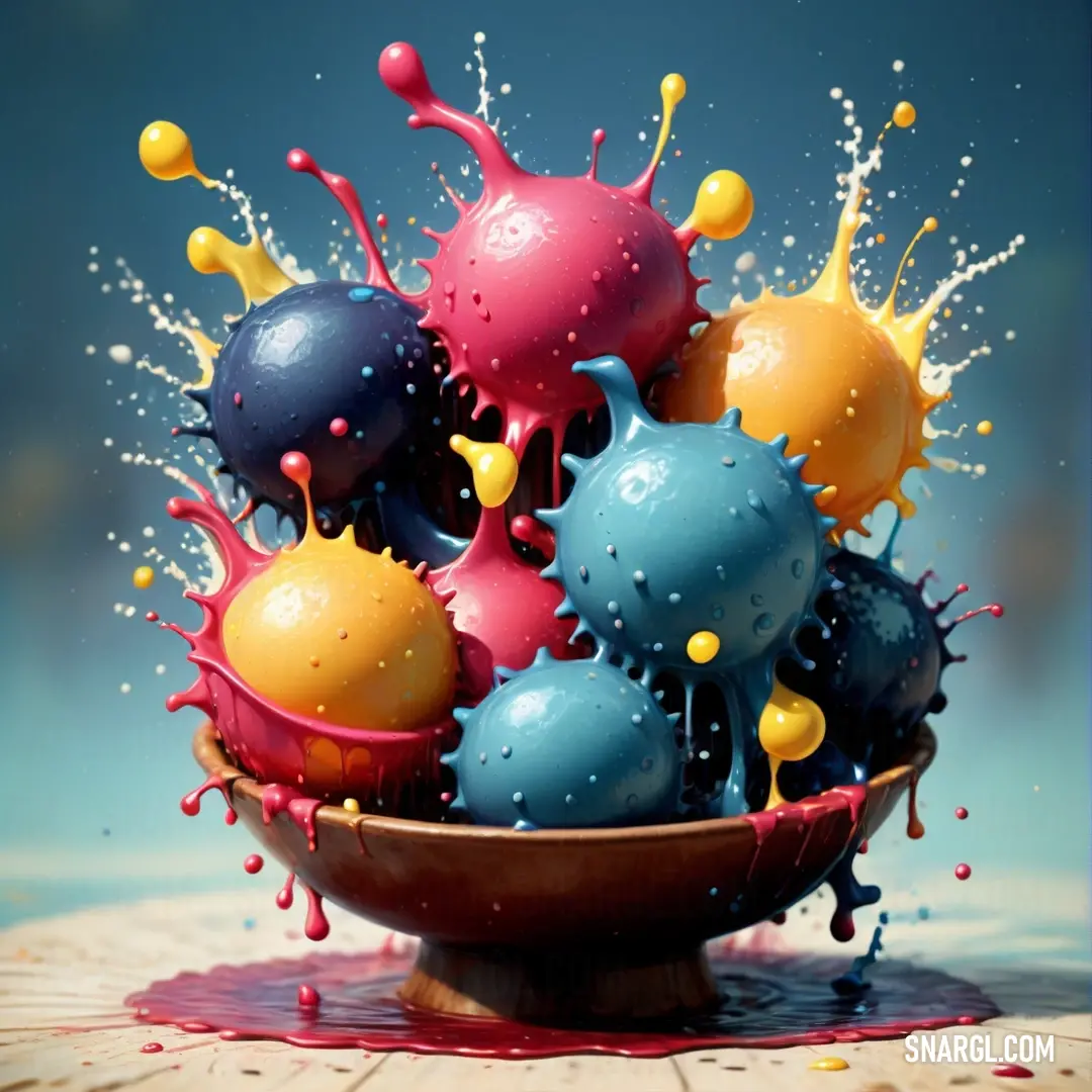
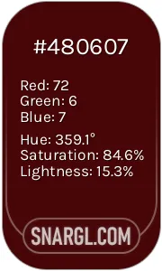
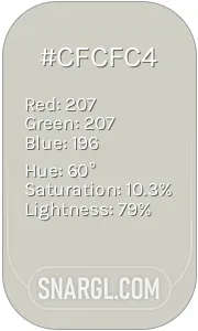
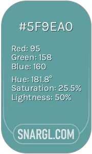
Picture with primary colors of Bulgarian rose, Pastel gray, Cadet blue, Pastel orange and Deep carmine
Top 5 color shades of the illustration. Arranged in descending order of frequency of occurrence (first - more often, last - more rare).
See these colors in NCS, PANTONE, RAL palettes...
RAL Classic
RAL 3007
RAL 9018
RAL 5024
RAL 1017
RAL 3031
RAL Design
RAL 040 20 19
RAL 080 80 05
RAL 190 60 20
RAL 070 80 60
RAL 030 40 60
Author:
Funny stories about the 'PANTONE 228'

The Chromatic Revelation

Far-far away, in the heart of a bustling city stood a quaint, artisanal paint store named "Palette & Vision," where hues and shades from every corner of the spectrum mingled in harmonious chaos. It was here that Pier Westwood, an attentive and imaginative shop assistant, spent his days helping clients transform their spaces with color. On a rainy Tuesday afternoon, a curious figure entered the store - Professor Hubert Black, a renowned cognitive scientist known for his pioneering work on color perception.

"Welcome to Palette & Vision!" Pier greeted, his enthusiasm as bright as the store's vibrant displays.

Professor Black nodded with a scholarly air. "I’m here to explore the essence of PANTONE 228. I believe it holds a unique cognitive significance."

Pier’s eyes lit up. "PANTONE 228? That’s an intriguing choice. It’s a rich, bold shade of purple - a color associated with creativity and luxury. What’s your interest?"

The professor’s gaze became thoughtful. "Color has profound effects on cognition and emotion. PANTONE 228, specifically, is known to evoke feelings of confidence and introspection. I wish to understand how its presence influences room design."

With a nod, Pier led the professor to a cozy corner of the store, where swatches of PANTONE 228 were displayed. The color, a deep, regal purple, seemed to absorb the ambient light, casting a velvety shadow.

"Let’s start with the basics," Pier began. "PANTONE 228 can be described as a deep, sophisticated purple. It’s often used to create a sense of opulence or to stimulate creative thinking."

Professor Black studied the swatches closely. "Indeed. But it’s not just about the visual impact. The essence of this color can subtly influence the cognitive and emotional responses of individuals within a room."

Pier looked intrigued. "How so?"

The professor continued. "Colors like PANTONE 228 have the power to alter mood and perception. Purple is often linked to the activation of the brain's creative centers. In room design, its application can enhance focus and encourage imaginative thinking."

Pier’s face brightened with realization. "So, if someone were to use PANTONE 228 in a study or creative space, it might help them think more freely and innovatively?"

"Precisely," Professor Black affirmed. "It’s also worth noting that PANTONE 228 can create a sense of grandeur and calm. When used in moderation, it can turn a room into a sanctuary of inspiration. However, too much of it might overwhelm."

Pier nodded, absorbing the insight. "And how does this affect the practical aspects of room design?"

Professor Black smiled. "The key is balance. Integrating PANTONE 228 with complementary colors - like soft neutrals or muted tones - can enhance its effects without overwhelming the senses. This creates a dynamic environment that stimulates creativity while maintaining harmony."

As they continued discussing, Pier and Professor Black experimented with different room mock-ups using PANTONE 228. They observed how the color interacted with various lighting conditions and materials, noting how it transformed the ambiance of each space.

By the end of the day, Pier had a newfound appreciation for the subtleties of color psychology. Professor Black’s visit had illuminated the profound impact that a single shade could have on cognition and emotion.

As the professor prepared to leave, Pier thanked him. "This has been eye-opening. I never realized how deeply a color could influence our thinking and feeling."

Professor Black smiled warmly. "Remember, Pier, colors are not merely visual experiences; they are cognitive and emotional catalysts. PANTONE 228 is just one example of how the essence of color can shape our perception and creativity."

With that, Professor Black departed, leaving Pier with a deeper understanding of the profound relationship between color and cognition. The store, once just a place of pigment and hue, now brimmed with a new purpose: to inspire and transform through the thoughtful application of color.

And so, in the vibrant realm of Palette & Vision, Pier Westwood continued to guide his clients, armed with the remarkable knowledge of how colors like PANTONE 228 could reshape their worlds in unexpected and wondrous ways.
Author:

Continue browsing posts in category "PANTONE"
You may find these posts interesting:
PANTONE 4635 Color
4
0
1
5
0
PANTONE 4635 Color
PANTONE 189 Color
10
0
2
12
0
PANTONE 189 Color
PANTONE 2166 Color
2
0
2
6
0
PANTONE 2166 Color
PANTONE 105 Color
5
0
1
8
4
PANTONE 105 Color
PANTONE 101 Color
2
0
2
7
1
PANTONE 101 Color
PANTONE 108 Color
2
0
2
25
1
PANTONE 108 Color
PANTONE 107 Color
4
0
2
11
1
PANTONE 107 Color
PANTONE 103 Color
3
0
2
13
2
PANTONE 103 Color
Home
Terms of Service
Contact Us

© 2023 Snargl.com