Home Colors PANTONE
PANTONE 2121

PANTONE 2121

Parameters:
HEX Triplet:
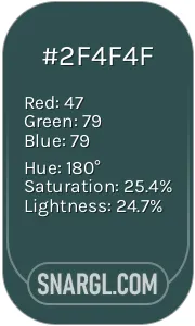
#8CADD6
RGB:
140, 173, 214
CMYK:
51, 21, 0, 0
HSL:
213°, 35%, 84%
Closest colors:
in PANTONE:
PANTONE 7453
in RAL Classic:
RAL 6034
in RAL Design:
RAL 250 70 25
in RAL Effect:
RAL 610-4
What color is PANTONE 2121? The Awakening of Pantone 2121
2024-10-01 Snargl 01:12

What color is PANTONE 2121?

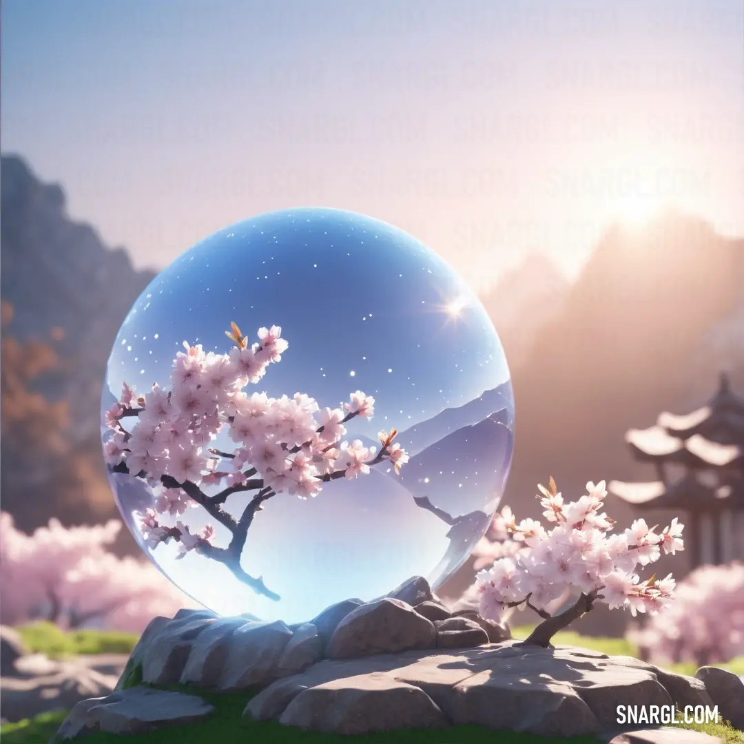
Glass ball with a tree inside of it on a rock in a field with pink flowers and a mountain in the background. Color #8CADD6.
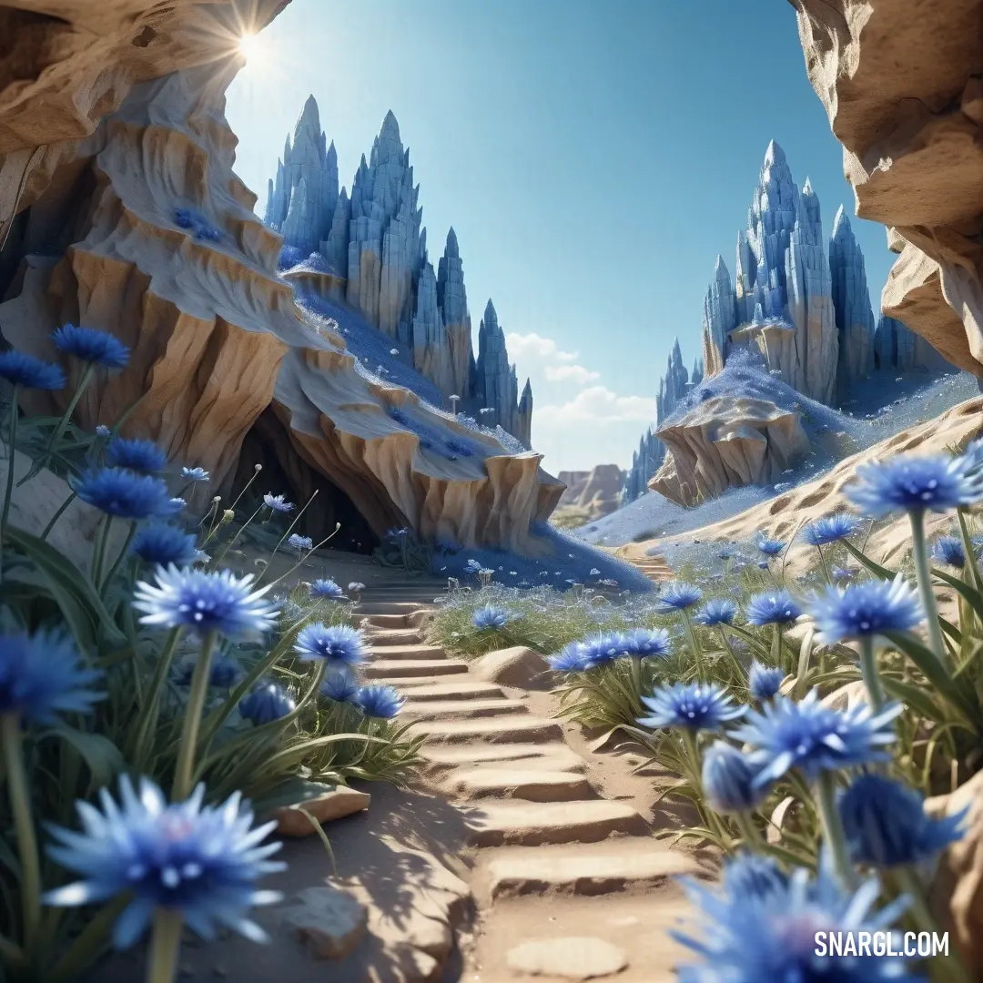
3d rendering of a path leading to a cave with blue flowers in the foreground. Example of CMYK 51,21,0,0 color.
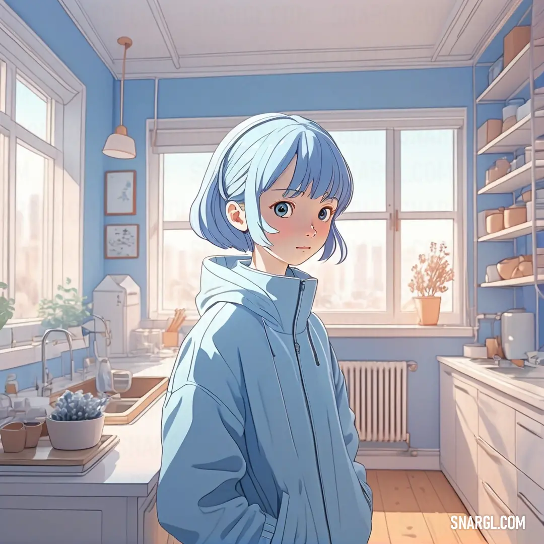
PANTONE 2121 color. Woman with blue hair standing in a kitchen next to a window and a sink with a window behind her
Two large blue water heaters next to each other in a room with a window and a chair. Example of PANTONE 2121 color.
PANTONE 2121 is a medium light shade of cyan-blue, with a hexadecimal color code of #8CADD6.

In the RGB color model, it is composed of 54.9% red, 67.84% green, and 83.92% blue.

In the HSL color space, this color has a hue of 213°, a saturation of 35%, and a lightness of 84%.

In the CMYK color model, it is composed of 51% cyan, 21% magenta, 0% yellow, and 0% black.

PANTONE 2121 is available in various Pantone products, such as formula guides, solid chips, plastic chips, and color palettes.

It can be used for different purposes, such as graphic design, printing, packaging, fashion, home, and interiors.

PANTONE 2121 is a beautiful and versatile color that can create different moods and effects depending on how it is used and combined.

This color evokes feelings of calmness, freshness, elegance, or creativity.

It can also represent water, sky, ice, or technology.

Example of the palette with the PANTONE 2121 color
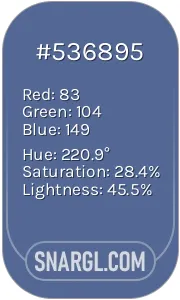
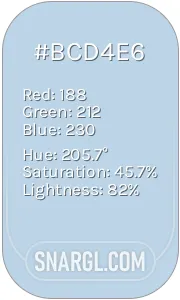
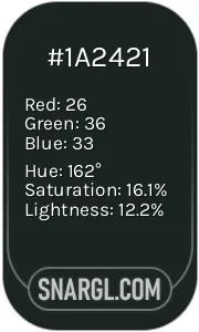
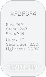
Picture with primary colors of UCLA Blue, Beau blue, Dark jungle green, Anti-flash White and Dark slate gray
Top 5 color shades of the illustration. Arranged in descending order of frequency of occurrence (first - more often, last - more rare).
See these colors in NCS, PANTONE, RAL palettes...
RAL Classic
RAL 5023
RAL 9018
RAL 8022
RAL 9016
RAL 6028
RAL Design
RAL 270 40 30
RAL 250 80 15
RAL 160 20 20
RAL 340 92 05
RAL 180 30 15
Author:
Funny stories about the 'PANTONE 2121'

The Awakening of Pantone 2121

In a tranquil village nestled between rolling hills and serene lakes, lived a renowned artist named Virgil Ming. Known for his vivid paintings and innovative techniques, Virgil's work had touched many, but he felt something was missing. His colors were beautiful, yet none seemed to truly embody the depth he sought.

One autumn morning, Virgil received a letter from a friend in the city, introducing him to Professor Kate Buffalo, a color theorist who had been researching a mysterious and rare shade. The letter hinted at a breakthrough that could revolutionize the world of color. Intrigued, Virgil journeyed to the city to meet this enigmatic professor.
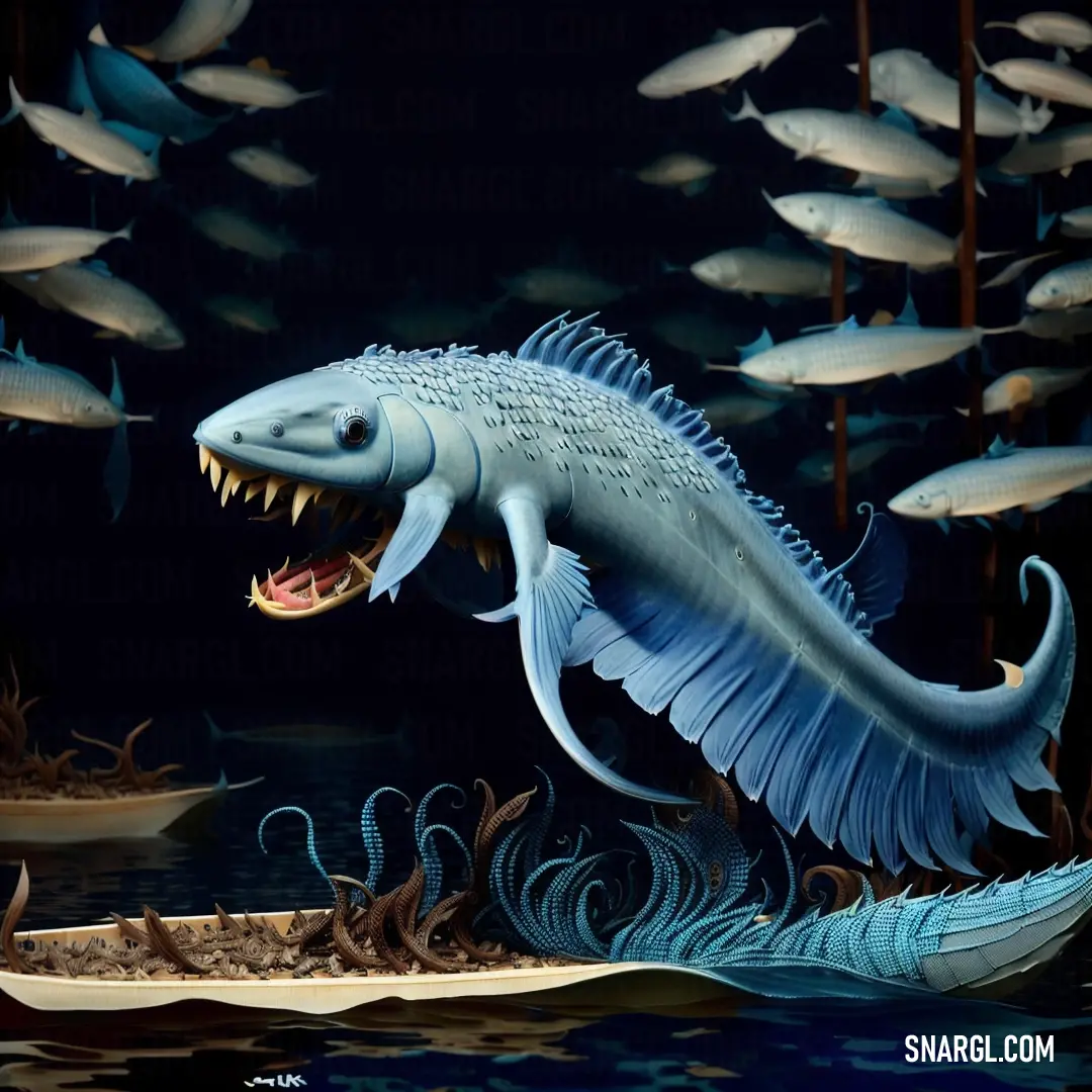
Large fish with its mouth open and teeth wide open in a body of water with many fish around it. Example of RGB 140,173,214 color.

Professor Kate Buffalo was a woman of extraordinary intellect and gentle grace. Her office was filled with an array of color samples, pigments, and ancient manuscripts. When Virgil arrived, she greeted him warmly and led him to her laboratory, where she had been working on a new color - Pantone 2121.

"It's said to be a color of extraordinary depth," Professor Buffalo explained, her eyes gleaming with excitement. "It has the warmth of the sunset, the depth of the ocean, and the subtlety of twilight. I've been searching for the perfect combination of pigments to create it."

Virgil was captivated. He had seen countless shades, but none had ever struck him like this. Together, they worked for days, mixing pigments and adjusting formulas. Virgil's artistic intuition and Kate's scientific precision complemented each other perfectly. As the days turned into weeks, they discovered that Pantone 2121 was not merely a color but a reflection of something deeper - a harmonious blend of elements that conveyed both warmth and mystery.

When the color was finally perfected, Virgil and Kate decided to unveil it to the world. They organized an exhibition where Virgil showcased his new paintings, each piece dominated by the mesmerizing Pantone 2121. The response was overwhelming. People were enchanted by the color's ability to evoke a sense of calm and wonder, making them feel both connected and introspective.

The success of Pantone 2121 brought Virgil and Kate to the forefront of the art and design world. Yet, what truly mattered to them was the way their collaboration had breathed new life into their work and how Pantone 2121 had allowed others to experience profound emotions through art.

As time passed, Pantone 2121 became a symbol of creativity and unity, celebrated not just for its aesthetic qualities but for the story of its creation - a testament to the power of collaboration between art and science. Virgil Ming and Professor Kate Buffalo continued to work together, exploring new possibilities, but they always cherished their journey with Pantone 2121 as a reminder of the beauty that can emerge when passion and knowledge intertwine.

In the quiet moments of reflection, Virgil often thought about how a single shade had changed his perspective and, in doing so, had illuminated the true essence of creativity. And so, Pantone 2121 remained a beacon of inspiration, a reminder that sometimes, the most profound discoveries come from the simplest of beginnings.
Author:

Continue browsing posts in category "PANTONE"
You may find these posts interesting:
PANTONE 100 Color
3
0
2
5
0
PANTONE 100 Color
PANTONE 189 Color
10
0
2
12
0
PANTONE 189 Color
PANTONE 2200 Color
3
2
2
6
0
PANTONE 2200 Color
PANTONE 2166 Color
2
0
2
6
0
PANTONE 2166 Color
PANTONE 210 Color
5
0
2
9
0
PANTONE 210 Color
PANTONE 108 Color
2
0
2
25
1
PANTONE 108 Color
PANTONE 634 Color
1
0
1
9
0
PANTONE 634 Color
PANTONE 4635 Color
4
0
1
5
0
PANTONE 4635 Color
Home
Terms of Service
Contact Us

© 2023 Snargl.com