Home Colors PANTONE
PANTONE 2052

PANTONE 2052

Parameters:
HEX Triplet:
#C7A1B2
RGB:
199, 161, 178
CMYK:
18, 39, 11, 0
HSL:
333°, 19%, 78%
Closest colors:
in RGB:
Pale mauve
in PANTONE:
PANTONE 7633
in RAL Classic:
RAL 3015
in RAL Design:
RAL 350 70 15
in RAL Effect:
RAL 340-1
What color is PANTONE 2052? The Color of Tomorrow
2024-09-21 Snargl 02:10

What color is PANTONE 2052?

View of a city from a window in a building structure with a sky background. Example of CMYK 18,39,11,0 color.
Woman in a purple dress on a purple chair with her legs crossed and her legs crossed. Color RGB 199,161,178.
PANTONE 2052 has the following color values:
  • Hexadecimal: #C7A1B2

  • RGB: 199, 161, 178

  • CMYK: 18, 39, 11, 0

  • HSL: 333, 19, 78

It is a medium light shade of magenta-pink.

In the RGB color model, it is composed of 78.04% red, 63.14% green and 69.8% blue.

PANTONE 2052 is a warm and soft color that can evoke feelings of romance, femininity, and elegance.

This color is used to create contrast with darker or cooler colors, or to create harmony with lighter or warmer colors.

Example of the palette with the PANTONE 2052 color

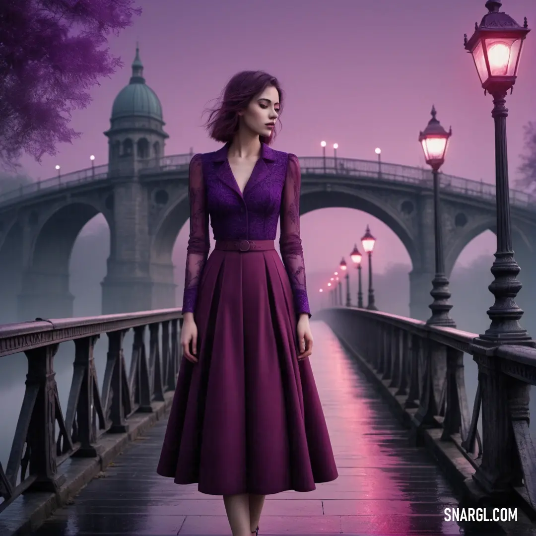
Picture with primary colors of Canonical aubergine, Pastel purple, Old mauve, Smoky black and Bazaar
Top 5 color shades of the illustration. Arranged in descending order of frequency of occurrence (first - more often, last - more rare).
See these colors in NCS, PANTONE, RAL palettes...
Author:
Funny stories about the 'PANTONE 2052'

The Color of Tomorrow

Long time ago, in the vibrant heart of a bustling metropolis, two seemingly unrelated lives were about to intersect in a way neither could have foreseen. Cassandra Gold, a promising design student at the prestigious Crestwood Institute, was renowned for her creativity and innovative approach to color theory. Phoebe McLeod, a dedicated cleaner at the same institute, was known for her meticulous attention to detail and a love for uncovering hidden beauty in everyday things.

One autumn afternoon, Cassandra was poring over her latest project - a new line of eco-friendly packaging. She was on the cusp of a breakthrough but felt something was missing. The new color palette she had been working with seemed uninspired. Desperate for a spark, she turned to her professor's latest research on cutting-edge colors. Among the intriguing options was PANTONE 2052, a striking shade of teal with an almost mystical quality.
Kitchen with pink cabinets and a marble counter top and a sink with a faucet and a window. Color #C7A1B2.

Intrigued, Cassandra decided to experiment with the color, hoping it might provide the inspiration she desperately needed. She applied it to her designs, but the results were underwhelming. The color, though beautiful, seemed to lack the dynamism she envisioned. Frustrated, she took a break and wandered through the quiet, dimly lit halls of the institute.

Phoebe was in the midst of her evening shift, quietly cleaning the corridors with practiced ease. She was scrubbing a particularly stubborn stain on the wall when she noticed a series of color swatches scattered on the floor near Cassandra's studio. One swatch caught her eye - PANTONE 2052. As Phoebe looked at it, she felt a curious sense of connection to the color, almost as if it spoke to her.
Digital painting of a woman with pink hair and a blue jacket on her shoulders and a blue background. Color PANTONE 2052.

That night, while cleaning, Phoebe found herself inspired by the color's unique allure. She began experimenting with different cleaning solutions and techniques to see how the color might interact with various surfaces. To her surprise, the color took on new dimensions when combined with the gleaming reflections of polished floors and walls. It seemed to breathe life into the environment, creating an ambiance that was both calming and invigorating.

The next morning, Cassandra returned to her studio to find Phoebe cleaning nearby. She noticed the distinct way the color seemed to come alive around Phoebe's work. Curious, Cassandra struck up a conversation with her. Phoebe shared her observations about how PANTONE 2052 transformed the spaces she cleaned, creating a subtle, enchanting effect.

Intrigued by Phoebe's insights, Cassandra invited her to collaborate on a new approach to using the color. Together, they developed a groundbreaking design concept that integrated PANTONE 2052 into a range of interactive and immersive experiences. Their idea was to use the color in ways that would change depending on the environment and interaction, creating a dynamic visual experience.

Their project gained attention and acclaim, transforming the way designers and brands approached color. It wasn't just about aesthetic appeal anymore; it was about creating an emotional and sensory experience. PANTONE 2052 became synonymous with innovation and emotional resonance.

Cassandra and Phoebe's unexpected partnership proved that creativity and insight could come from the most unlikely sources. Their story became a testament to the power of collaboration and the magic of finding inspiration in the everyday. And so, in the city's vibrant landscape, PANTONE 2052 wasn't just a color; it was a bridge between the ordinary and the extraordinary, forever changing the way people perceived the world around them.
Author:

Continue browsing posts in category "PANTONE"
You may find these posts interesting:

PANTONE 2240 Color
11
1
4
26
0
PANTONE 2240 Color
PANTONE 7718 Color
2
0
2
7
0
PANTONE 7718 Color
PANTONE 2617 Color
2
0
2
5
0
PANTONE 2617 Color
PANTONE 107 Color
4
0
2
11
1
PANTONE 107 Color
PANTONE 103 Color
3
0
2
13
2
PANTONE 103 Color
PANTONE 210 Color
5
0
2
9
0
PANTONE 210 Color
PANTONE 634 Color
2
0
1
9
0
PANTONE 634 Color
PANTONE 2200 Color
3
2
2
6
0
PANTONE 2200 Color
Home
Terms of Service
Contact Us

© 2023 Snargl.com