Home Colors PANTONE
PANTONE 196

PANTONE 196

Parameters:
HEX Triplet:
#EFCAD0
RGB:
239, 202, 208
CMYK:
0, 23, 6, 0
HSL:
350°, 15%, 94%
Closest colors:
in RGB:
Almond
in PANTONE:
PANTONE 706
in RAL Classic:
RAL 1013
in RAL Design:
RAL 350 80 20
in RAL Effect:
RAL 450-1
What color is PANTONE 196? The Crimson Revelation
2024-09-03 Snargl 02:20

What color is PANTONE 196?

Woman with long hair and a rose in her hair is in the water with rocks
Woman in a dress standing in a field of flowers with a tree in the background and a pink sky
City street with a lot of flowers and buildings in the background with a sunset in the sky over the street
Woman in a pink outfit walking down a street with a pink bag in her hand and a pink shirt with a yellow smiley face on it
Woman with a mask and a hairdow on her head and a purple background
Woman with long hair wearing a white top and denim shorts with a pink tie around her waist and a gold necklace
Pink cake with white frosting on a plate with a fork and knife on the side of the plate
PANTONE 196 is a very light shade of pink-red, with the following color values:
  • RGB: 239, 202, 208

  • HEX: #EFCAD0

  • CMYK: 0, 23, 6, 0

  • HSL: 350°, 15%, 94%

This color can be used in various Pantone products, such as formula guides, solid chips, and plastic chips.

It is a soft and delicate color that can evoke feelings of romance, tenderness, and femininity.

PANTONE 196 can also be paired with other colors to create different moods and effects.

For example, it can contrast well with dark blues or greens, or harmonize with light yellows or purples.

Example of the palette with the PANTONE 196 color

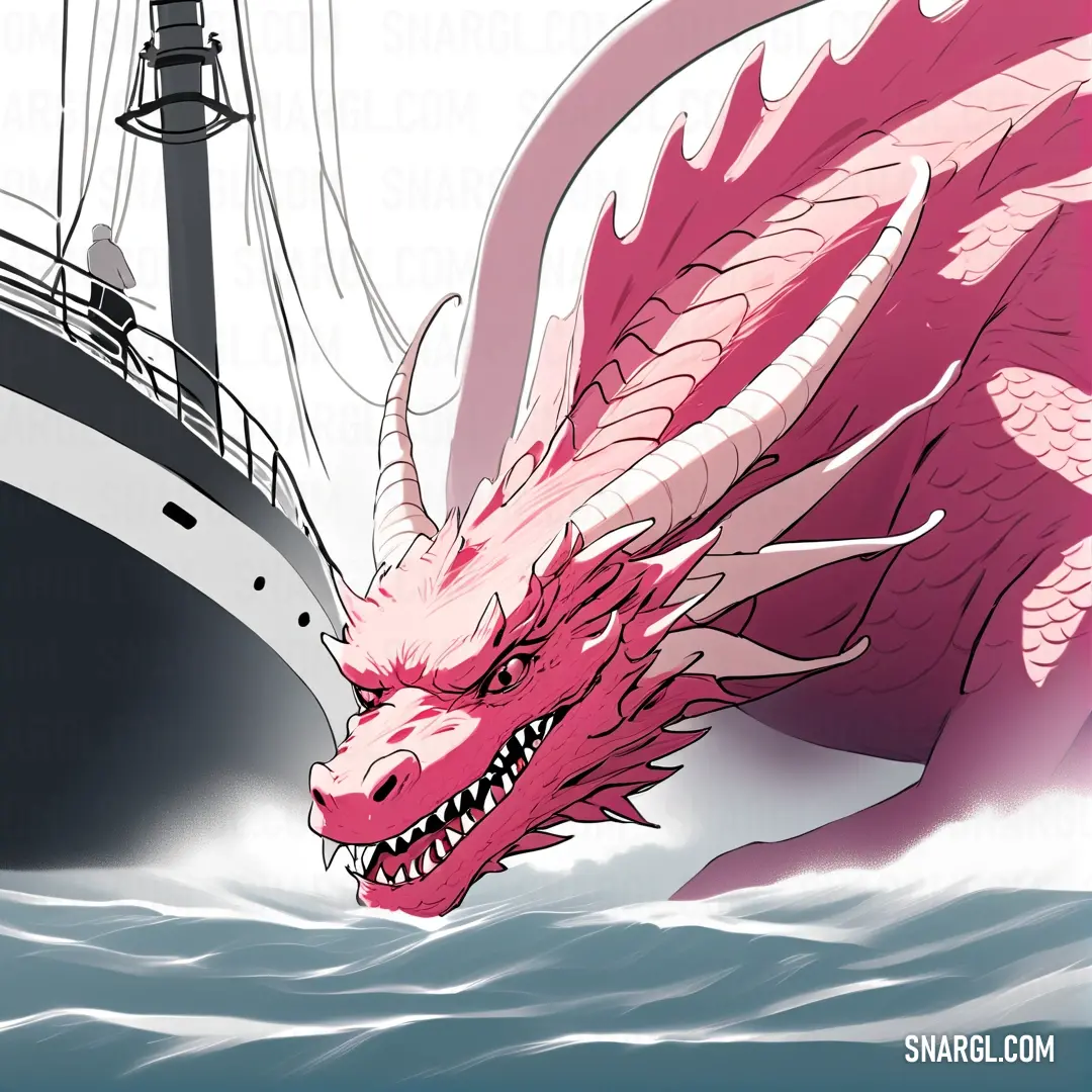
Picture with primary colors of Piggy pink, Turkish rose, Wenge, Lavender gray and Cerise
Top 5 color shades of the illustration. Arranged in descending order of frequency of occurrence (first - more often, last - more rare).
See these colors in NCS, PANTONE, RAL palettes...
RAL Classic
RAL 9001
RAL 3014
RAL 7013
RAL 7035
RAL 3018
RAL Design
RAL 010 90 10
RAL 030 60 20
RAL 070 40 10
RAL 300 80 05
RAL 020 50 58

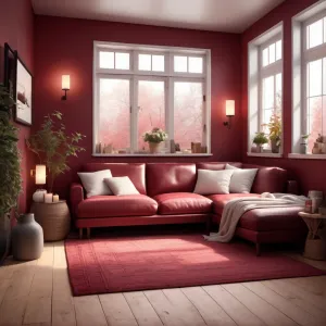
Example of the palette with the PANTONE 196 color

Picture with primary colors of Bole, Lavender gray, Cafe noir, Antique brass and Smoky black
Top 5 color shades of the illustration. Arranged in descending order of frequency of occurrence (first - more often, last - more rare).
See these colors in NCS, PANTONE, RAL palettes...
RAL Classic
RAL 8002
RAL 7035
RAL 8016
RAL 3012
RAL 9005
RAL Design
RAL 030 30 30
RAL 300 80 05
RAL 050 20 16
RAL 040 60 30
RAL 170 20 20
Author:
Funny stories about the 'PANTONE 196'

The Crimson Revelation

Long time ago, far away, in the quaint village of Marigold, nestled between emerald hills and sapphire skies, lived a humble farmer named Shivansh Moon. His days were filled with tending to crops and caring for his small farm, but his true passion lay in creating vibrant, colorful murals on the walls of his home. His favorite color was a striking hue of crimson he lovingly called "Moon Red."

One fateful day, Professor Mustafa Stewart, a renowned expert in color theory and design, visited Marigold to escape his hectic life in the city. The professor was intrigued by the charming murals he had heard about and decided to visit Shivansh’s farm. As he arrived, he was greeted by the sight of a simple farmhouse adorned with breathtaking crimson patterns that seemed to shimmer with a life of their own.
Bunch of pink flowers with white petals

Professor Stewart was captivated. "What is this color you use?" he asked with genuine curiosity.

Shivansh, with a modest smile, replied, "It’s what I call Moon Red. It’s just a color I love."

The professor’s eyes twinkled with excitement. "Actually, you may be onto something much more revolutionary than you realize."

Professor Stewart was fascinated by Shivansh's choice of color and suggested they experiment with it in the world of modern design. He explained that "Moon Red" was remarkably close to a specific shade in the PANTONE color matching system known as PANTONE 196. This particular shade was known for its rich, vibrant tone and was often used in high-end fashion and branding but seldom explored in room design.

Over the following weeks, Professor Stewart and Shivansh embarked on an ambitious project. They redesigned a traditional farmhouse into a showcase of color innovation using PANTONE 196. The professor introduced modern design principles and sophisticated techniques, while Shivansh’s artistic touch ensured that the essence of Moon Red was preserved and celebrated.

They painted walls, designed furnishings, and even crafted bespoke textiles, all in varying shades of PANTONE 196. The crimson hue breathed new life into the space, transforming it from a quaint farmhouse into a stunningly vibrant sanctuary. The color created an atmosphere of warmth and passion, something profoundly comforting yet strikingly fresh.

When the renovation was complete, the transformed farmhouse was unveiled to the villagers. The reaction was nothing short of astonishment. The vibrant crimson walls, paired with the elegant furnishings, created a sense of wonder and beauty that was both timeless and modern. People from nearby towns flocked to see the miraculous transformation, and soon the farmhouse became a celebrated example of how color could transcend traditional boundaries.

Shivansh Moon and Professor Mustafa Stewart’s collaboration sparked a revolution in room design. Their work demonstrated that color was not merely a background element but a powerful force capable of reshaping spaces and experiences. PANTONE 196 became a symbol of creativity and innovation, showing the world that even the simplest hues could create extraordinary impact.

The story of Shivansh and Mustafa’s collaboration spread far and wide, inspiring countless designers to explore the profound effects of color in their work. And though their farmhouse was no longer just a home but a beacon of design brilliance, Shivansh and Mustafa remained humble, knowing that their greatest achievement was not just in creating something beautiful, but in bringing a touch of magic to the everyday.
Author:

Continue browsing posts in category "PANTONE"
You may find these posts interesting:
PANTONE 645 Color
5
0
2
7
0
PANTONE 645 Color
PANTONE 634 Color
1
0
1
9
0
PANTONE 634 Color
PANTONE 108 Color
2
0
2
25
1
PANTONE 108 Color
PANTONE 2013 Color
4
0
3
7
0
PANTONE 2013 Color
PANTONE 400 Color
2
0
2
9
0
PANTONE 400 Color
PANTONE 105 Color
5
0
1
8
4
PANTONE 105 Color
PANTONE 4635 Color
4
0
1
5
0
PANTONE 4635 Color
PANTONE 100 Color
3
0
2
5
0
PANTONE 100 Color
Home
Terms of Service
Contact Us

© 2023 Snargl.com