Home Colors PANTONE
PANTONE 185

PANTONE 185

Parameters:
HEX Triplet:
#D93740
RGB:
217, 55, 64
CMYK:
0, 93, 79, 0
HSL:
357°, 75%, 85%
Closest colors:
in RGB:
Jasper
in PANTONE:
PANTONE 711
in RAL Classic:
RAL 3028
in RAL Design:
RAL 040 50 70
in RAL Effect:
RAL 440-1
What color is PANTONE 185? The Pantone Predicament
2024-09-03 Snargl 02:34

What color is PANTONE 185?

Woman in a bikini with a red face paint on her face and a train track in the background
Glass of liquid and a pitcher of liquid with a lemon slice on the rim of the glass and a glass of liquid
Red truck with a light on top of it in the desert with rocks in the background
Red motorcycle engine with steam coming out of it's exhaust system and a black background with a white dot
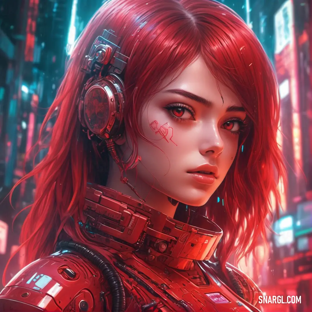
Woman with red hair and a red jacket on is looking at the camera with a serious look on her face
Woman in a red suit with wings and a red outfit on a rock in a forest with mushrooms
Woman in a kimono is standing by a window with a flower in her hair
Woman with green leaves on her head and a red face with green leaves on her head
Red cloth with a silver frame on it and a black background with a silver frame on it and a red cloth
Woman with red hair and a black jacket is looking at the camera with a serious look on her face
Woman with red hair and blue eyes is standing in front of a tree with orange flowers
Woman with red hair standing next to a red truck with a red fire engine on it's side
Stack of layered pizza on a plate with a red sauce on top of it and smoke coming out of the top
Woman in a red bra and a man in a suit behind her wearing a suit and tie
Red hat on top of a body of water next to a forest filled with trees and clouds
PANTONE 185 is a color code that belongs to the PANTONE Matching System (PMS), which is a proprietary color space used in printing, design, and fashion.
PANTONE 185 is a shade of pink-red that has a hex value of #E4002B.
In the RGB color model, it is composed of 89.41% red, 0% green, and 16.86% blue.
In the CMYK color model, it is composed of 0% cyan, 100% magenta, 81.18% yellow, and 10.59% black.
PANTONE 185 is also known as PANTONE 185 C or PANTONE 185 Coated.
It is a vibrant and eye-catching color that can be used for logos, posters, packaging, and more.

Example of the palette with the PANTONE 185 color

Picture with primary colors of Caput mortuum, Medium carmine, Fuzzy Wuzzy, Coral pink and Medium taupe
Top 5 color shades of the illustration. Arranged in descending order of frequency of occurrence (first - more often, last - more rare).
See these colors in NCS, PANTONE, RAL palettes...
RAL Classic
RAL 3005
RAL 3031
RAL 3022
RAL 3012
RAL 7013
RAL Design
RAL 020 20 29
RAL 040 40 60
RAL 040 60 40
RAL 040 70 50
RAL 030 30 20

Example of the palette with the PANTONE 185 color

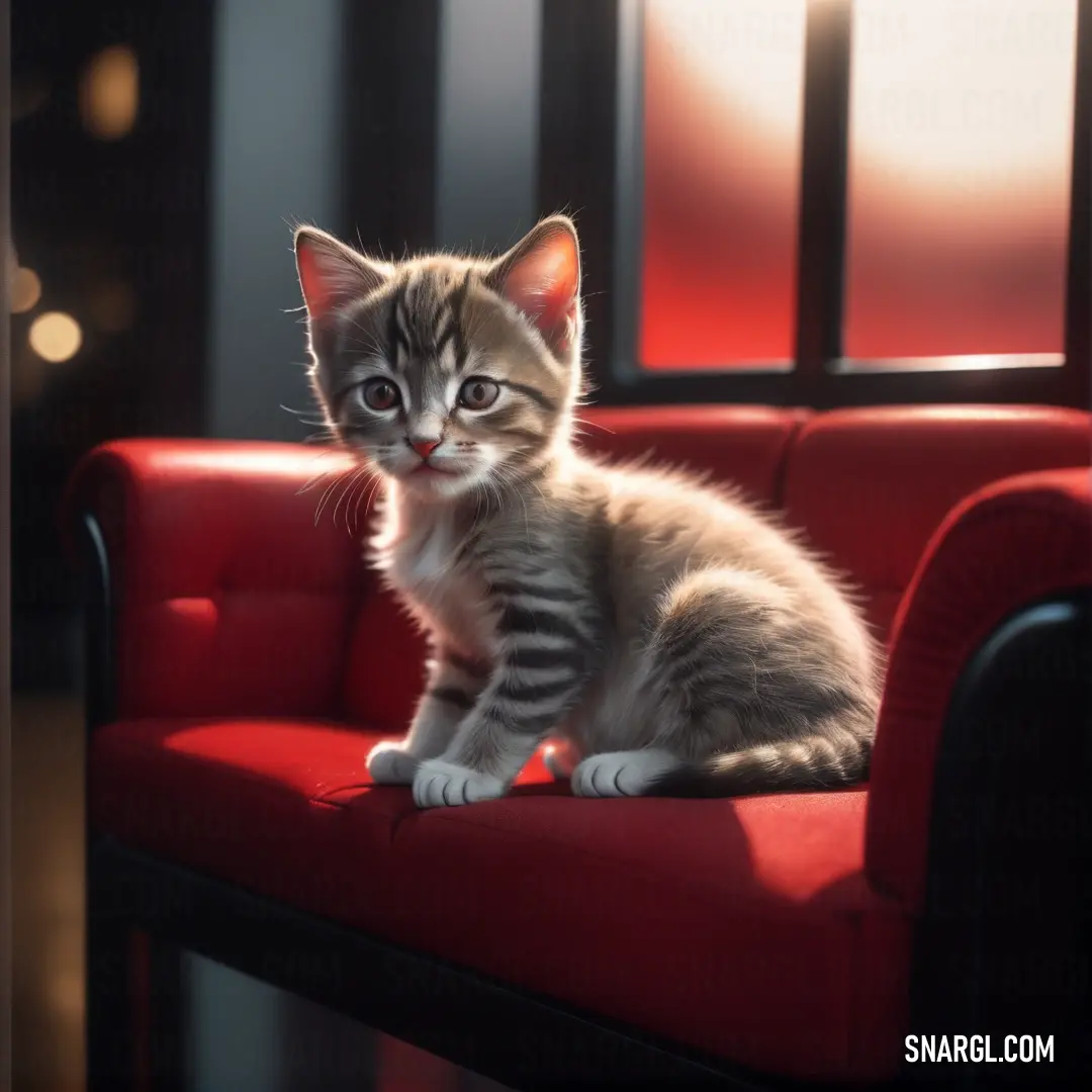
Picture with primary colors of Zinnwaldite, Pale brown, Persian red, Dark gray and Purple taupe
Top 5 color shades of the illustration. Arranged in descending order of frequency of occurrence (first - more often, last - more rare).
See these colors in NCS, PANTONE, RAL palettes...
RAL Classic
RAL 8022
RAL 1036
RAL 2002
RAL 9006
RAL 7024
RAL Design
RAL 000 15 00
RAL 050 50 20
RAL 030 40 60
RAL 140 70 05
RAL 340 30 05
Author:
Funny stories about the 'PANTONE 185'

The Pantone Predicament

In a bustling design studio nestled in the heart of the city, Connor Powell, a painter with a penchant for perfectionism, stared at a swatch of Pantone 185. His eyes narrowed as if the color were a mischievous imp plotting something outrageous.

"Behold," he declared dramatically, "the perfect shade of red!" He gestured grandly at the vibrant hue. "This is the color of passion, the color of power, the color of... well, really aggressive ketchup."

Igor Gonzalez, a factory worker from the adjacent paint production plant, looked up from his clipboard. Igor had a reputation for his unflappable calm and deadpan delivery. "I was told to check in on the new Pantone batch. Anything I should know?"

Connor adjusted his beret and struck a pose. "Igor, my friend, Pantone 185 is not just a color; it's an experience! We’re about to revolutionize the world of design with this shade. It’s going to be everywhere: on billboards, in fashion, and, quite possibly, in every kitchen as a condiment."

Igor raised an eyebrow. "Is this really the right shade? The factory's been having issues with color accuracy lately."

Connor waved his hands dismissively. "Issues? Nonsense! Pantone 185 is flawless. Look at it - so red, it practically demands attention."

As the two chatted, Igor’s phone buzzed. "I’ve got a message," he said, pulling it out. "The factory’s sent over a sample batch for you to review."

Connor’s eyes widened as he took the sample pot. He unscrewed the lid, expecting a burst of perfect red. Instead, he was greeted by a shade so startlingly bright it looked like it had been dipped in neon lights.

"This... is not Pantone 185," Connor said, his voice trembling slightly. "This is... a rebellious neon menace!"

Igor peered into the pot. "Hmm, looks like the factory’s calibration must’ve gone haywire."

Connor sighed dramatically. "So close, yet so far. If this shade gets out, the world might think we’re launching a line of high-visibility construction gear instead of avant-garde fashion!"

Determined to fix the situation, Connor and Igor devised a plan. They spent hours in the factory, tinkering with the machines, recalibrating the mixers, and applying an almost scientific precision to their task. Igor’s calm demeanor balanced Connor’s artistic fervor, resulting in a surprisingly effective partnership.

After several tense hours, the moment of truth arrived. Connor and Igor tested the new batch. As the perfect Pantone 185 color appeared in the sample pot, Connor grinned triumphantly. "Behold, the true red of passion and power!"

Igor smirked. "I suppose now it’s safe to say this color won’t be mistaken for a traffic signal."

The two heroes celebrated their success with a toast of coffee mugs - Igor’s plain, Connor’s artistically adorned with splatters of various colors. As they clinked mugs, Connor exclaimed, "To Pantone 185 - may it never be confused with high-visibility paint again!"

Igor chuckled. "And to our teamwork - proving that even the most stubborn color can be tamed."

As the sun set over the city, Connor and Igor knew they had achieved something remarkable. Pantone 185 was ready to make its grand debut, no longer an unpredictable neon anomaly but a bold, classic red poised to make its mark on the world.

And so, the tale of the Pantone Predicament became a legend in the design world, a humorous reminder that even in the most precise fields, a touch of collaboration and a dash of humor could turn a potential disaster into a brilliant success.
Author:

Continue browsing posts in category "PANTONE"
You may find these posts interesting:
PANTONE 2617 Color
2
0
2
5
0
PANTONE 2617 Color
PANTONE 566 Color
4
0
2
7
0
PANTONE 566 Color
PANTONE 103 Color
3
0
2
13
2
PANTONE 103 Color
PANTONE 2240 Color
11
1
4
26
0
PANTONE 2240 Color
PANTONE 2210 Color
5
0
2
5
0
PANTONE 2210 Color
PANTONE 634 Color
1
0
1
9
0
PANTONE 634 Color
PANTONE 194 Color
7
1
2
14
0
PANTONE 194 Color
PANTONE 107 Color
4
0
2
11
1
PANTONE 107 Color
Home
Terms of Service
Contact Us

© 2023 Snargl.com