Home Colors PANTONE
PANTONE 154

PANTONE 154

Parameters:
HEX Triplet:
#9D6120
RGB:
157, 97, 32
CMYK:
8, 66, 100, 41
HSL:
31°, 80%, 62%
Closest colors:
in RGB:
Golden brown
in PANTONE:
PANTONE 464
in RAL Classic:
RAL 8001
in RAL Design:
RAL 060 50 60
in RAL Effect:
RAL 360-5
What color is PANTONE 154? The Color of Dreams
2024-09-21 Snargl 02:16

What color is PANTONE 154?

Robot standing in front of a castle in the desert with a clock tower in the background
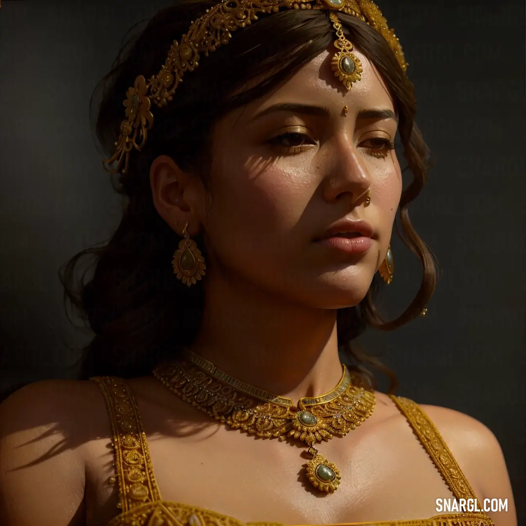
Woman wearing a gold necklace and earrings with a black background and a black backdrop
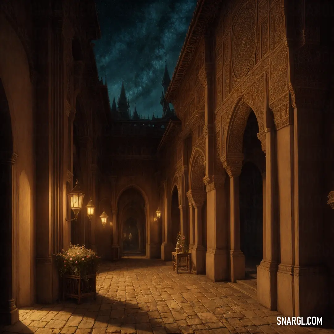
Dimly lit hallway with a vase of flowers on the floor and a clock on the wall in the background
Cartoon character with a big smile on his face
Woman with a futuristic suit and a cell phone in her hand
Man with dreadlocks standing in the street with a blue jacket on and a necklace on his neck
Raccoon dressed in a suit and tie with a jacket on it's chest
PANTONE 154 is a medium dark shade of brown with a warm, orange undertone.

It is composed of 61.57% red, 38.04% green, and 12.55% blue in the RGB color model.

PANTONE 154 is a versatile color that can be used for various purposes and occasions.

It can create a warm and cozy atmosphere when paired with other earthy tones, such as beige, tan, or olive.

It can also add a touch of elegance and sophistication when combined with metallic shades, such as gold, silver, or bronze.

PANTONE 154 can be applied to different types of products and materials, such as clothing, accessories, furniture, packaging, or logos.

For example, PANTONE 154 can be seen in the logo of Hermès, a French luxury fashion house that is known for its high-quality leather goods, scarves, and perfumes.

PANTONE 154 is a color that can inspire creativity and innovation.

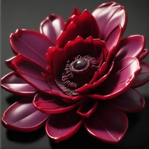
Example of the palette with the PANTONE 154 color

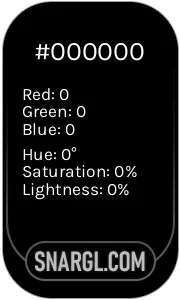
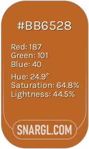
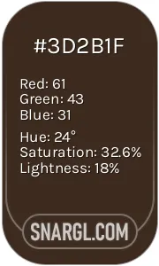
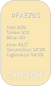
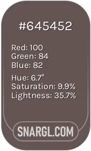
Picture with primary colors of Black, Ruddy brown, Bistre, Banana Mania and Wenge
Top 5 color shades of the illustration. Arranged in descending order of frequency of occurrence (first - more often, last - more rare).
See these colors in NCS, PANTONE, RAL palettes...
RAL Classic
RAL 9005
RAL 2001
RAL 3007
RAL 1015
RAL 7013
RAL Design
RAL 170 20 25
RAL 060 50 60
RAL 080 20 10
RAL 075 90 20
RAL 070 40 10
Author:
Funny stories about the 'PANTONE 154'

The Color of Dreams

Manolo Storm was a visionary entrepreneur known for transforming ordinary products into extraordinary experiences. His latest venture, however, seemed improbable even for him. He had stumbled upon a color called PANTONE 154, a bright, unassuming hue known only to a few as "Sunlit Meadow." Most dismissed it as just another shade in the vast spectrum of colors. Manolo, however, saw something more - a chance to revolutionize industrial design.

He shared his audacious idea with Kate McLeod, a writer with a keen eye for detail and a flair for capturing the essence of innovation. Their meeting took place in a cozy, sunlit café, with Manolo enthusiastically outlining his vision.

"This color," Manolo began, holding up a small swatch of PANTONE 154, "is more than just a tint. It's a canvas for change. I want to use it to redesign everyday products, turning mundane items into sources of joy and inspiration."

Kate was intrigued. "But how will you make this color stand out in a market saturated with endless shades?"

Manolo's eyes sparkled with determination. "By making it an emblem of positivity and transformation. Imagine a world where PANTONE 154 isn't just a color but a symbol of progress and hope."

Their first project was a line of industrial tools - a sector not known for its aesthetic appeal. The tools were designed with sleek lines and ergonomic shapes, all highlighted by PANTONE 154. The color was used sparingly but strategically, making each tool feel both familiar and exciting. The results were astonishing. What had been utilitarian objects now seemed vibrant and engaging, each tool inviting users to experience their work with renewed enthusiasm.

The real shock came when they applied PANTONE 154 to public spaces. Manolo and Kate redesigned a dreary industrial park with the color, painting benches, walkways, and even the factory walls. The once bleak environment transformed into a lively, uplifting space. Workers reported feeling more motivated, and productivity soared.

News of the transformation spread quickly. Industry leaders were astonished by the profound impact of a simple color. Manolo and Kate's success was not just in the design but in the emotional resonance of their work. They demonstrated that color could influence mood, inspire creativity, and even enhance job satisfaction.

As the color of Sunlit Meadow gained popularity, it became a symbol of innovative thinking and positive change in industrial design. People everywhere began to recognize PANTONE 154 not merely as a color but as a beacon of possibility and joy.

Kate's articles celebrated the revolution, and Manolo's business thrived, fueled by the surprising yet profound effects of a single shade. Together, they had proven that sometimes, the smallest elements could have the most significant impact, showing the world that even the most unassuming colors could ignite the brightest ideas.

And so, the legacy of PANTONE 154 lived on, not just as a color but as a testament to the transformative power of creativity and collaboration.
Author:

Continue browsing posts in category "PANTONE"
You may find these posts interesting:
PANTONE 575 Color
5
0
2
10
0
PANTONE 575 Color
PANTONE 108 Color
2
0
2
25
1
PANTONE 108 Color
PANTONE 102 Color
4
0
2
7
2
PANTONE 102 Color
PANTONE 2200 Color
3
2
2
6
0
PANTONE 2200 Color
PANTONE 2062 Color
2
1
2
14
0
PANTONE 2062 Color
PANTONE 2603 Color
1
0
1
13
0
PANTONE 2603 Color
PANTONE 210 Color
5
0
2
9
0
PANTONE 210 Color
PANTONE 2240 Color
11
1
4
26
0
PANTONE 2240 Color
Home
Terms of Service
Contact Us

© 2023 Snargl.com