Home Arts Colors PANTONE
PANTONE 125

PANTONE 125

Parameters:
HEX Triplet:
#BB9121
RGB:
187, 145, 33
CMYK:
6, 32, 100, 24
HSL:
44°, 82%, 73%
Closest colors:
in PANTONE:
PANTONE 7556
in RAL Classic:
RAL 1027
in RAL Design:
RAL 075 60 60
in RAL Effect:
RAL 320-M
Articles:
What color is PANTONE 125? What are the examples of PANTONE 125 color? What colors go well with the PANTONE 125 color? What color is PMS 125? The Golden Glitch: The Birth of PANTONE 125
2025-03-13 Snargl 13:54
# General # Fashion # Design

What color is PANTONE 125?

A stunning yellow motorcycle parked elegantly within a stylish room, adorned with wall lights casting a warm glow, highlighting its sleek curves and inviting presence against a sophisticated backdrop.
A striking yellow and black motorcycle stands parked next to a bright yellow crate, showcasing a vibrant contrast against the urban backdrop. It exudes a sense of adventure and freedom, inviting onlookers to imagine a thrilling ride ahead.
A close-up of an inviting yellow fabric, luxuriously soft to the touch, inviting viewers to appreciate its texture and warmth, vividly colored with a subtle sheen that enhances its rich appearance.
A massive dragon with piercing yellow eyes looms in the sky, its powerful wings outstretched and its body covered in thick scales. The creature exudes an aura of ancient power and mystery.
A man with bright yellow hair and a matching headband stands confidently in front of a towering mountain, the vivid colors contrasting with the rugged natural landscape around him.
A futuristic robot with a glowing face and body stands in the depths of a dark cave, its bright lights cutting through the shadows and illuminating the rocky walls.
A tree with vibrant yellow leaves stands in a park at night, surrounded by colorful lights that create a magical and festive atmosphere.
A close-up of a bright yellow wall, framed with thick ropes on both sides, creating a strong visual contrast between smooth color and textured material.
A bowl of hearty vegetable soup filled with colorful carrots, greens, and other fresh ingredients, placed on a wooden tabletop beside a spoon ready to dig in.
A woman wears an ornate golden headpiece adorned with jewels, adding an air of regal elegance to her appearance, highlighted against a soft backdrop.
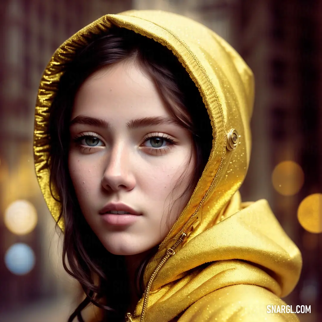
A woman in a bright yellow jacket stands on a street, posing for a picture with city lights glowing softly in the blurred background.
Dressed in a striking yellow jacket, she stands confidently against the blurred glow of city lights, her presence adding vibrancy to the night scene.
PANTONE 125 is a shade of yellow with a hint of brown, resembling the color of mustard or gold.

The color values for PANTONE 125 are as follows:
  • RGB: 187, 145, 33

  • CMYK: 6, 32, 100, 24

  • HEX: #BB9121

  • HSL: 44, 82, 73

PANTONE 125 can be used for various purposes, such as graphic design, fashion, home decor, and product packaging.

It is a warm and vibrant color that can evoke feelings of energy, optimism, and creativity.

This can also be associated with nature, autumn, and harvest.

PANTONE 125 can be paired with other colors to create different effects, such as contrast, harmony, or balance.

It is a versatile and expressive color that can be used for various applications and occasions.

This color can capture attention, inspire creativity, and celebrate life.

Example of the palette with the PANTONE 125 color

Picture with primary colors of Bronze, Medium carmine, Chamoisee, Coffee and Yellow Orange
Top 5 color shades of the illustration.
See these colors in NCS, PANTONE, RAL palettes...
Author:

What are the examples of PANTONE 125 color?

Three yellow bags with handles rest on a table, one of which stands out with its bright yellow color. The composition is simple yet striking, with the color providing a lively touch to the scene.
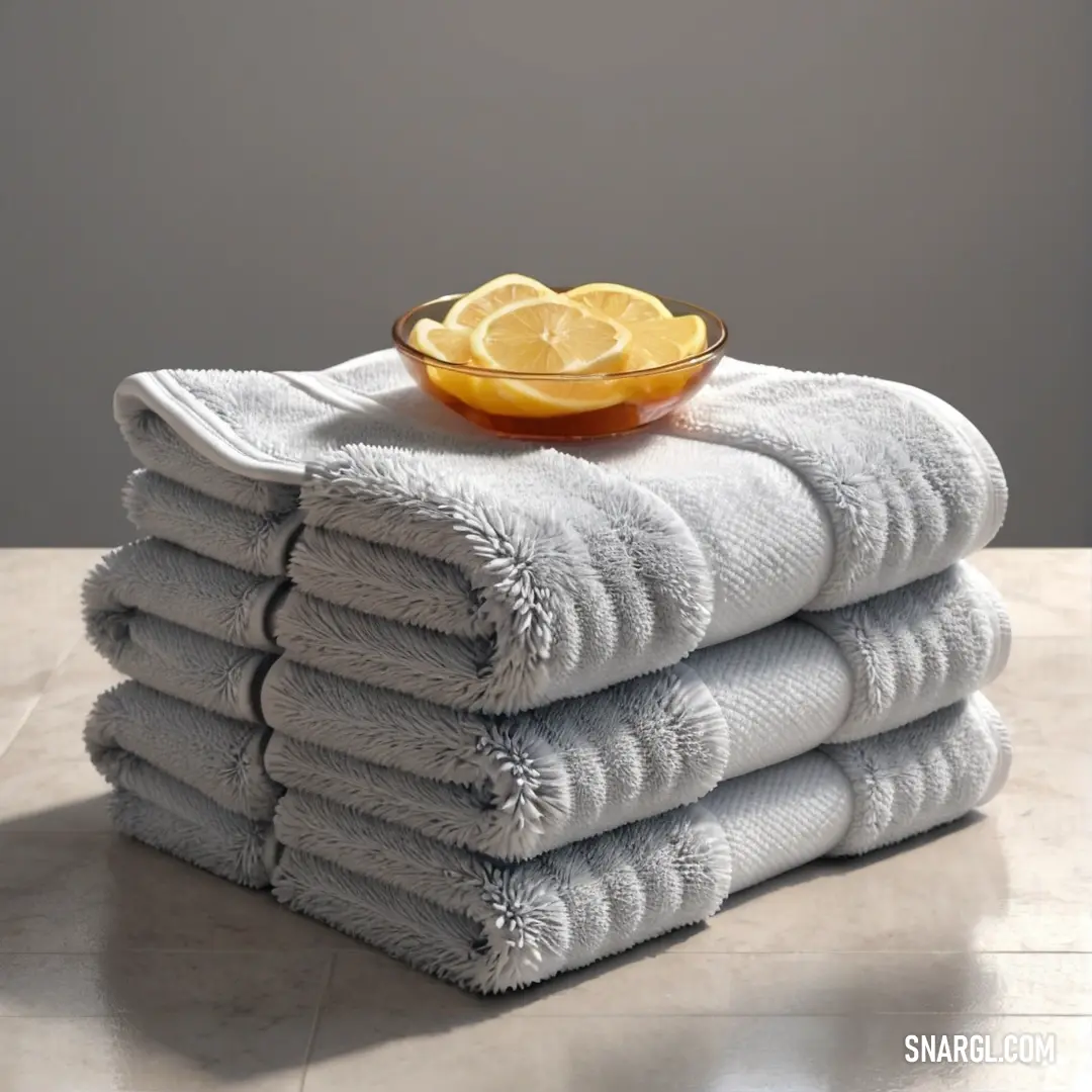
A stack of yellow towels neatly arranged on a wooden table next to a bottle of water and a cup. The warm, golden hue of the towels complements the refreshing simplicity of the setup.
A stack of folded towels sits on a wooden table next to a lit candle and a potted plant. The color of the towels and the warm, natural elements evoke a sense of calm and tranquility.
A row of yellow and gray metal pipes neatly arranged on a warehouse shelf. The pipes, surrounded by other industrial materials, form an intriguing and orderly display of engineering and storage.
A glass of water with a splash of liquid captured mid-air, set against a vibrant blue background. The gentle ripple and transparency of the water stand out, creating an intriguing contrast with the blue hue.
In a serene snowy forest, a depicted troll with a glowing torch illuminates the wintry scene, with snow-dusted trees surrounding him, creating a mesmerizing contrast of warmth and cold in an icy wonderland.
A fantasy character adorned in elaborate horns and a flowing cloak stands regally amidst a mythical landscape, surrounded by hints of magical energy that enhance the intrigue and allure of this enchanting scene.
A close-up of a yellow pipe fitting on a clean white background. The smooth, shiny surface of the fitting contrasts with the simplicity of the white backdrop, highlighting its design and functionality.
In a lush forest, a striking green creature with flowing white hair and a rugged brown outfit blends seamlessly with its surroundings, embodying the raw beauty and magic found within nature's embrace.
In a tranquil forest at sunset, a little mouse clutches a tiny stick while leaning against an impressive tree, surrounded by vibrant foliage that glows softly in the golden light, evoking a moment of peaceful adventure.
PANTONE 125 is a vibrant golden yellow hue, symbolizing warmth and optimism. It finds its application across various industries, particularly in branding and design. For example, its rich tone can be seen in logos of sports teams, most notably the Golden State Warriors, which embrace this energetic color to represent their spirit and drive. Additionally, PANTONE 125 is popular in marketing materials for food brands, as it evokes feelings of hunger and satisfaction. Its versatility allows it to blend seamlessly in both modern and traditional designs, making it a favorite among designers.

Example of the palette with the PANTONE 125 color

Picture with primary colors of Taupe gray, Wenge, Silver, Pale yellow and Persian plum
Top 5 color shades of the illustration.
See these colors in NCS, PANTONE, RAL palettes...

Example of the palette with the PANTONE 125 color

Picture with primary colors of Grullo, Zinnwaldite, Teal green, Field drab and Banana Mania
Top 5 color shades of the illustration.
See these colors in NCS, PANTONE, RAL palettes...
Author:

What colors go well with the PANTONE 125 color?

A wise-looking man with a full, flowing beard dons a vibrant red robe, holding an ancient book that whispers stories of the past. His thoughtful expression and the distinct tones of #BB9121 in the image invite reflection and admiration for the knowledge h
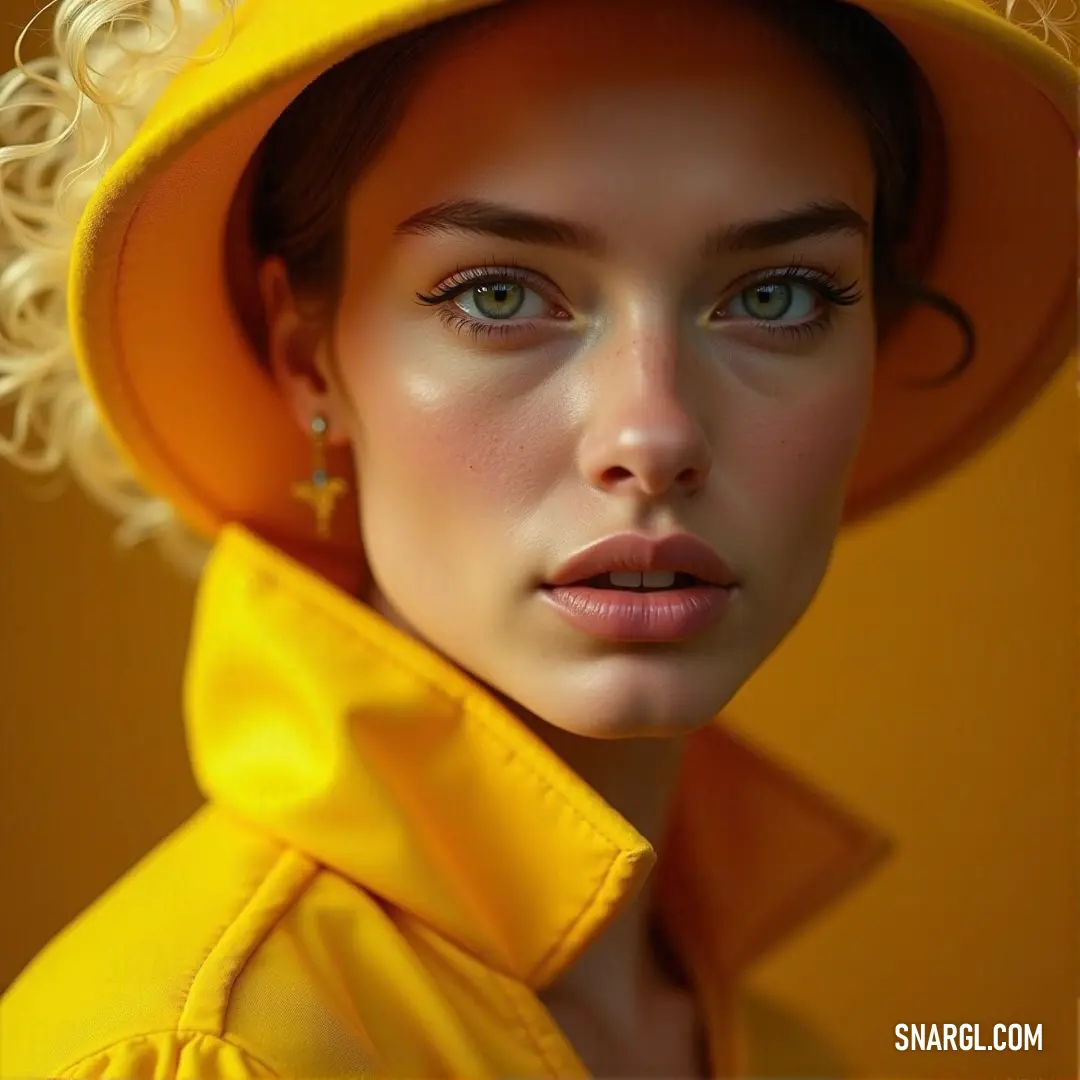
A confident woman stands out in a striking yellow suit against a vivid yellow backdrop, exuding elegance and boldness. The warm tones, with RGB 187,145,33, create a harmonious and eye-catching effect.
A radiant woman in a flowing yellow dress gazes into the camera, illuminated by soft light that enhances her natural beauty. Behind her, a cozy lamp adds warmth to the scene.
An artistic arrangement of coiled copper and black wire, resting beautifully on a sleek black surface. This image presents a stunning example of PANTONE 125 color that embodies both complexity and elegance, creating a visual feast for the eyes.
An elegant acoustic guitar rests in its case atop a polished tabletop, exuding warmth and craftsmanship, ready to create beautiful melodies in an inviting and cozy setting.
A cheerful yellow bathtub invites relaxation in a sunlit bathroom, framed by a bright window that lets in soft light, creating a serene ambiance perfect for unwinding.
This bathroom scene showcases a charming bathtub bathed in soft light, with a lush plant nestled in the corner, harmonizing comfort and style amidst a serene setting.
A stylish yellow and white speaker rests on a sleek black surface, juxtaposed against a subtle gray background, showcasing its modern aesthetic and hinting at the quality sound it brings to any space.
A vibrant bush adorned with clusters of yellow flowers stands proudly in the foreground, contrasting beautifully against a subtle gray backdrop, which adds depth and serenity to the scene.
A lovely bathtub features prominently in a softly lit bathroom, with a green plant thriving in the corner, creating a refreshing oasis of calm and natural beauty against the backdrop of a window.
PANTONE 125 is a warm, golden hue that embodies sophistication and energy. It pairs beautifully with deep, rich colors like navy blue and charcoal gray, enhancing its vibrancy. Earthy tones, such as olive green and burnt sienna, create a natural palette that feels grounded. For a more lively combination, PANTONE 125 works well with vibrant shades like turquoise or coral, infusing a playful contrast. When used with neutral shades like beige or cream, it adds a touch of elegance. This versatile color is perfect for both modern and classic designs.

Example of the palette with the PANTONE 125 color

Picture with primary colors of Dark sienna, Raw umber, Tan, Citrine and Deep coffee
Top 5 color shades of the illustration.
See these colors in NCS, PANTONE, RAL palettes...

Example of the palette with the PANTONE 125 color

Picture with primary colors of Persian orange, Raw Sienna, Bronze, University of California Gold and Copper
Top 5 color shades of the illustration.
See these colors in NCS, PANTONE, RAL palettes...
Author:

What color is PMS 125?

An ambient light fixture gracefully hanging from the ceiling, casting a warm glow in a cozy room adorned with rustic wooden walls and a charming wooden bench nestled in the corner, inviting relaxation.
A delightful arrangement of a glass of red wine accompanied by a book, alongside a bottle of wine and an inviting orange slice, encapsulating the essence of relaxation and indulgence in a cozy setting.
An intricate arrangement of glossy black and vibrant multi-colored stones elegantly displayed on a polished table, with a dreamy blurred background enhancing the visual intrigue of this natural composition.
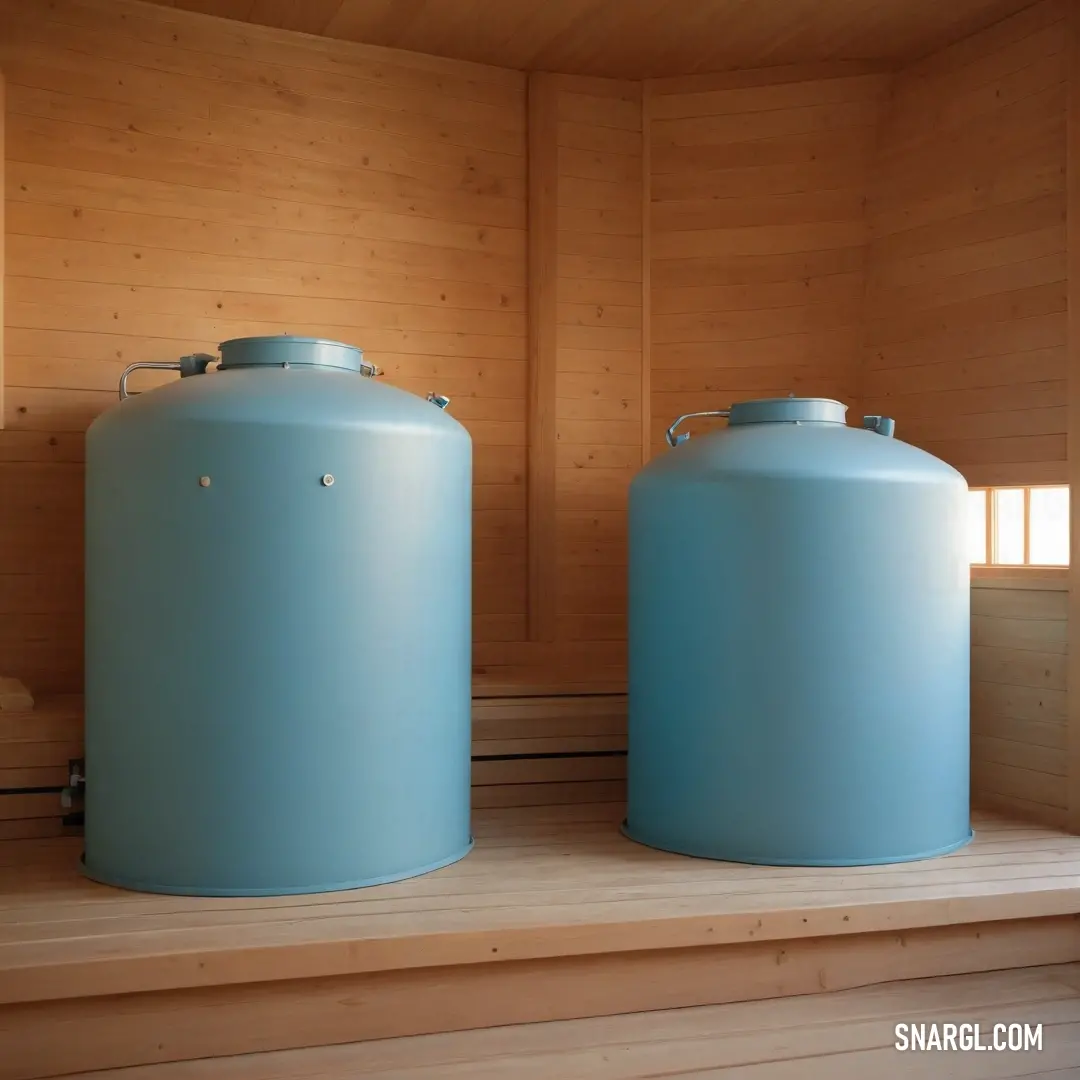
Two substantial barrels resting majestically on a sturdy wooden shelf in a tranquil sauna setting, radiating warmth and inviting ambiance that enhances the spa-like experience.
A close-up view of a beautifully textured wood grain surface featuring a distinctive hole at its center, complemented by a rich brown spot, highlighting the natural imperfections and character of the wood.
A rustic wooden wall adorned with a captivating pattern of brown and yellow, framed by a sleek black border, presenting a striking combination of colors that evoke warmth and texture in interior design.
A charming street light illuminates a scene with a building in the background, showcasing the warm glow from its light against the backdrop of urban architecture, creating a cozy and inviting evening atmosphere.
A striking close-up of a yellow and gray cable elegantly set against a dark background, creating a bold contrast that emphasizes the details of the cable's texture and interwoven colors.
A close-up view of a phone cable connected to a device amidst a sprawling field of golden wheat under a bright background, embodying the interplay of technology and nature in a sunny setting.
A rich brown cork textured background showcases its unique surface detail, perfect for creating a warm and inviting atmosphere in any design project or creative work. The color exudes a rustic charm, ideal for a variety of applications.
PMS 125 is a vibrant shade of yellow, specifically classified within the Pantone Matching System, which is a standardized color reproduction system widely used in various industries. Known for its warm, golden hue, PMS 125 exudes brightness and positivity, often associated with energy and optimism. This color is commonly utilized in branding, particularly for companies aiming to convey feelings of warmth and cheerfulness. It pairs well with darker shades like navy or charcoal, enhancing its visual appeal. In design, PMS 125 is an excellent choice for creating eye-catching promotional materials that evoke enthusiasm and creativity.

Example of the palette with the PANTONE 125 color

Picture with primary colors of Cadet grey, Pastel brown, Caput mortuum, Black and Dark slate gray
Top 5 color shades of the illustration.
See these colors in NCS, PANTONE, RAL palettes...

Example of the palette with the PANTONE 125 color

Picture with primary colors of Caput mortuum, Platinum, Saddle brown, Dark goldenrod and Pale gold
Top 5 color shades of the illustration.
See these colors in NCS, PANTONE, RAL palettes...
Author:
Funny stories about the 'PANTONE 125'

The Golden Glitch: The Birth of PANTONE 125

Long time ago, in the small town of Hueville, where everything from the buildings to the people seemed to be painted in fifty shades of beige, lived Karl Steel, a car service worker with a knack for fixing anything with wheels. Across town, at the ColorWorks Factory, Billy Abloh spent his days mixing pigments and creating the vibrant hues that brought life to everything outside of Hueville.

Karl was known for his love of precision. Every car that left his garage was polished to perfection, each scratch repaired with meticulous attention to detail. Billy, on the other hand, was a bit of a daydreamer. He often found himself wondering what it would be like to create a color so unique that it would make everyone stop and stare.
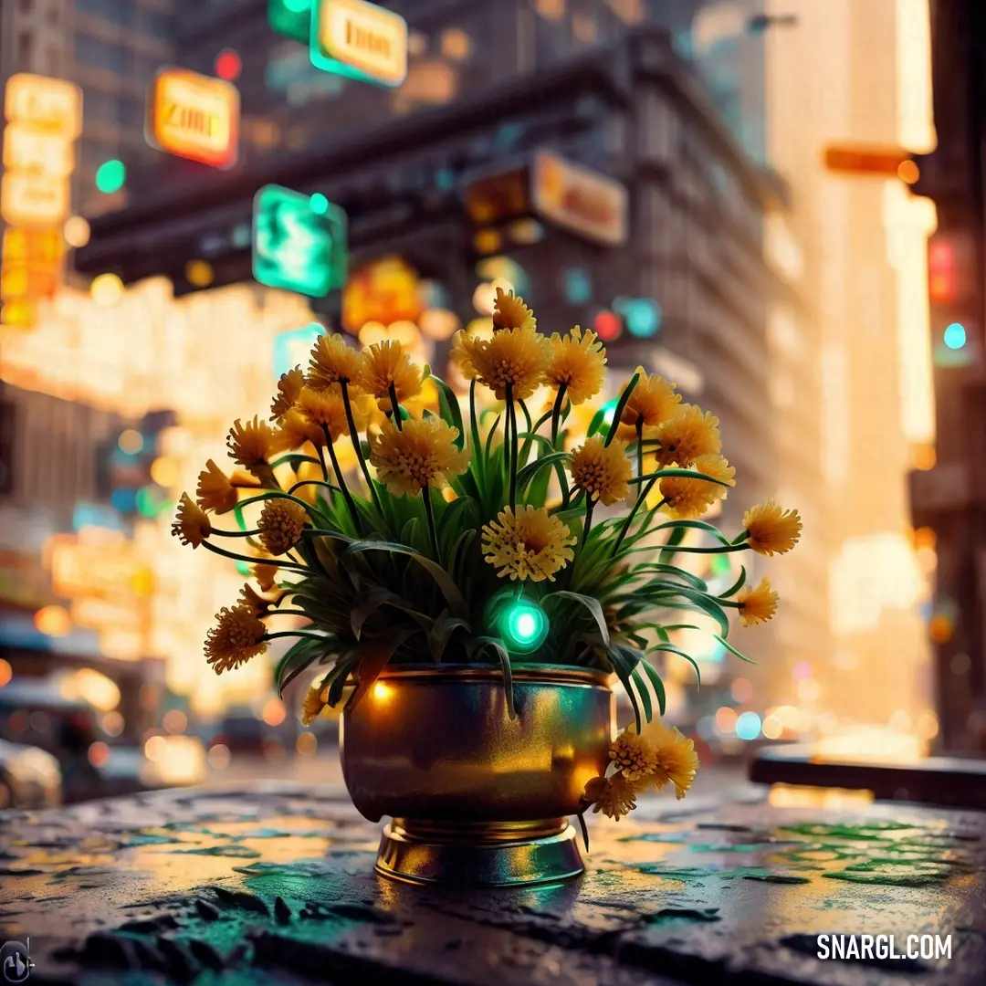
A vase filled with bright yellow flowers rests on a table on a bustling city street at night. Traffic lights and neon signs illuminate the scene, creating a contrast between nature and urban life.
Amidst the neon-lit hustle of the city at night, a vase of yellow flowers provides a peaceful contrast to the busy streets and flashing lights around it.

One dreary Monday morning, as Karl was working on a particularly stubborn dent in a golden-yellow sports car, he noticed something strange. The usual shiny yellow paint he applied seemed off, almost muddy. He shook the can, checked the label, and tried again. But no matter how much he sprayed, the color just didn’t match the vibrant yellow he was used to. Frustrated, he gave up for the day and decided to visit his friend Billy at the ColorWorks Factory.

"Hey, Billy! Got a minute?" Karl called out as he walked into the factory, still wearing his grease-stained overalls.

"Sure thing, Karl. What's up?" Billy replied, wiping his hands on his equally stained apron.

Karl explained the problem with the yellow paint, and Billy, ever curious, offered to take a look. The two men headed back to Karl’s garage, where Billy inspected the can of paint. He popped open the lid, dipped his finger in, and studied the color.

"That's odd," Billy muttered. "This should be a perfect match, but something’s definitely off."

Karl nodded. "Exactly! It’s like someone took the sunshine out of it."

Billy decided to take a sample back to the factory for analysis. He spent the entire night in the lab, mixing and testing, trying to figure out what had gone wrong. As dawn broke, Billy realized something incredible: the "mistake" was actually the result of a tiny glitch in the mixing machine that had created a completely new color.
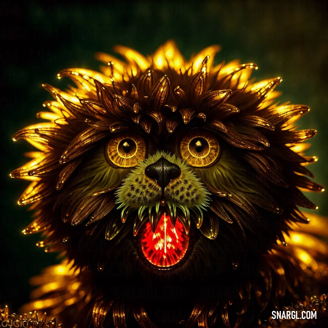
A majestic lion stands proudly, its golden mane flowing as it surveys its surroundings. The intensity in its eyes suggests strength and wisdom, embodying the spirit of the wild.
A proud lion commands the scene, its regal presence and piercing gaze reminding us of the untamed power and beauty of the animal kingdom.

Instead of a bright yellow, the glitch had produced a warm, rich, golden-brown hue that shimmered like honey in the sunlight. Billy stared at the color, mesmerized. It was beautiful, unlike anything he had ever seen before.

Excited, Billy rushed back to Karl’s garage with a fresh can of the new color. "Karl, you won't believe this! I think we just created something amazing!"

Karl eyed the can suspiciously but trusted his friend. He grabbed his spray gun and carefully applied the paint to the car’s dented panel. As the color spread across the metal, both men stood in awe. The golden-brown shade was not only stunning but also gave the car a sleek, luxurious finish.

"Wow," Karl whispered. "This is... actually pretty cool."

Billy grinned. "We need to name this color! It deserves its own spot in the PANTONE catalog."

After some brainstorming, they decided to name it "PANTONE 125," a nod to the golden ratio that Billy often rambled about during their coffee breaks. Karl was more than happy to have his name associated with a color, even if it was a glitch-turned-masterpiece.

A woman in a choker and leather attire stands confidently, her outfit adding a bold and edgy flair. The intensity of her gaze complements her strong and stylish look.
With a fierce gaze and a bold leather outfit, this woman embraces her unique style, radiating confidence and a touch of mystery.

Word of the new color spread quickly, and soon everyone wanted their cars painted in PANTONE 125. The ColorWorks Factory received orders from all over the world, and Karl's garage became the go-to place for a golden-brown makeover.

And so, what started as a minor mishap in a small town garage became a global sensation. PANTONE 125 was born out of a perfect blend of precision and a little bit of luck, proving that sometimes the most beautiful things come from the most unexpected places.

As for Karl and Billy, they continued to work together, each appreciating the other's unique talents. And whenever someone asked them how PANTONE 125 came to be, they’d share a knowing smile and say, "It was a golden glitch, my friend. A golden glitch.".

Author:
Continue browsing posts in category "PANTONE"
Take a look at this Music Video:
Cyberpunk
Lyrics for the 'Cyberpunk'
You may find these posts interesting:
PANTONE 2124 Color
63
10
73
0
PANTONE 2124 Color
PANTONE 177 Color
75
13
92
0
PANTONE 177 Color
PANTONE 4655 Color
57
12
68
0
PANTONE 4655 Color
PANTONE 2047 Color
69
10
75
0
PANTONE 2047 Color
PANTONE 7742 Color
84
10
67
0
PANTONE 7742 Color
PANTONE 2252 Color
40
13
95
0
PANTONE 2252 Color
PANTONE 2073 Color
118
10
67
0
PANTONE 2073 Color
PANTONE 528 Color
77
10
67
0
PANTONE 528 Color
Home
Terms of Service
Contact Us

© 2023 Snargl.com