Home Arts Colors PANTONE
PANTONE 103

PANTONE 103

Parameters:
HEX Triplet:
#D0BC00
RGB:
208, 188, 0
CMYK:
5, 5, 100, 16
HSL:
54°, 100%, 82%
Closest colors:
in PANTONE:
PANTONE 612
in RAL Classic:
RAL 1004
in RAL Design:
RAL 080 70 80
in RAL Effect:
RAL 270-4
Best Pictures:
Articles:
What color is PANTONE 103? What are the examples of PANTONE 103 color? What colors go well with the PANTONE 103 color? What color is PMS 103? The Golden Palette
2025-03-13 Snargl 12:46 3135 33
# General # Fashion # Design

What color is PANTONE 103?

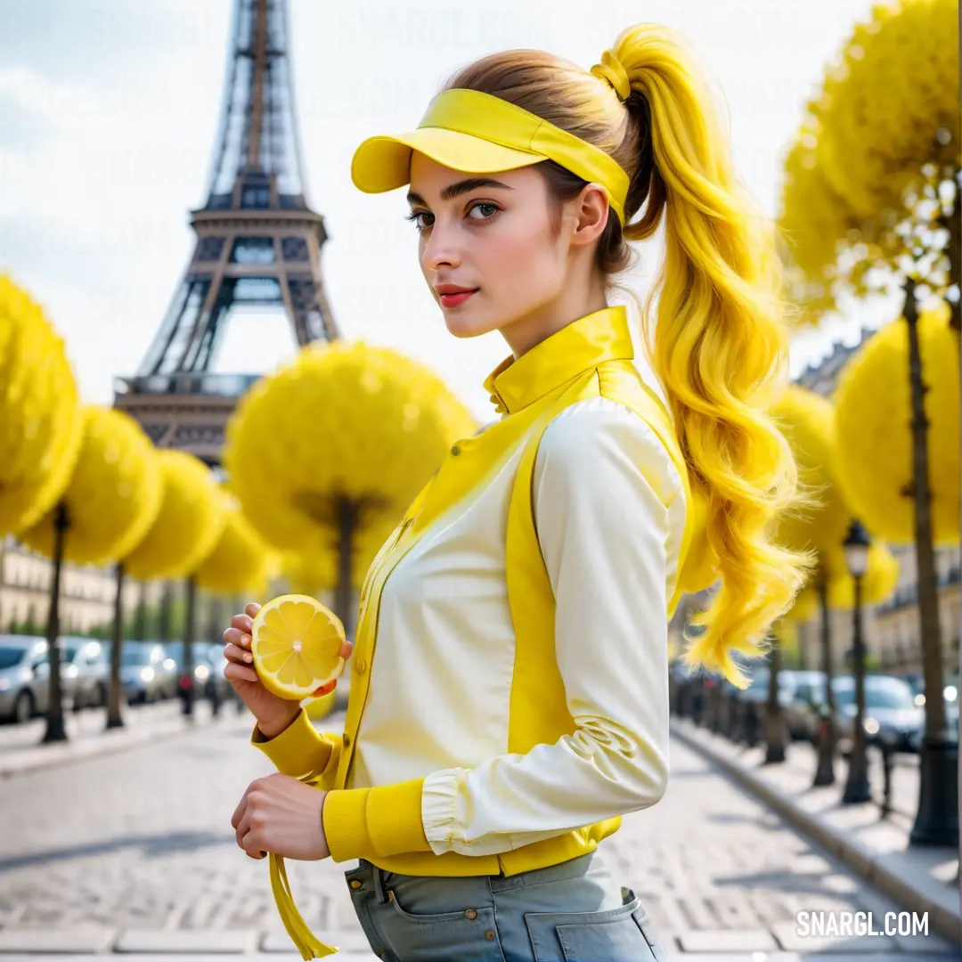
A woman wearing a vibrant green and yellow jacket with a yellow shirt beneath, standing confidently, exuding energy and style.
A woman in a striking yellow coat stands in front of a backdrop of blooming daffodils, her arms crossed as she gazes thoughtfully with a slight tilt of her head.
A black cat with striking green eyes sits in front of a dark backdrop, its gaze intense and captivating, exuding an aura of mystery and elegance.
A dramatic lightning storm illuminates a traditional Japanese village, with vibrant yellow flowers and trees in the foreground, set against a dark, stormy sky. The bolt of lightning strikes through the ominous clouds, creating a stunning contrast of natur
A futuristic space station with a massive central circular hub, surrounded by various modules and structures, floating against the backdrop of deep space. Its design suggests advanced technology and distant exploration.
A striking yellow sports car parked in a dimly lit parking garage, its headlights glowing brightly. The car features a bold black stripe running down the front, making it stand out in the subdued lighting.
A striking mural of a woman's face painted on the side of a yellow building, with bright green hair and eyes, wearing a black jacket. The mural's vivid colors bring life to the otherwise plain structure.
A woman in a bright yellow jacket and helmet stands ready for action, with a camera mounted on her head and one held in her hand. The yellow jacket and helmet complement her determined expression.
PANTONE 103 is a medium dark shade of yellow with a metallic finish.

It is composed of 81.57% red, 73.73% green and 0% blue in the RGB color model, and has a hue of 54°, saturation of 100% and lightness of 82% in the HSL color space.

Its HEX value is #D0BC00, and its CMYK values are 5, 5, 100, 16.

PANTONE 103 can be used for various purposes, such as printing, painting, or digital design.

Example of the palette with the PANTONE 103 color

Picture with primary colors of Timberwolf, Citrine, Bole, Khaki and Golden brown
47 %
34 %
8 %
5 %
2 %

Click to see these colors in NCS, PANTONE, RAL palettes...

Example of the palette with the PANTONE 103 color

Picture with primary colors of Onyx, Purple Heart, Banana Mania, Medium turquoise and Kelly green
65 %
14 %
8 %
5 %
4 %

Click to see these colors in NCS, PANTONE, RAL palettes...
Author:

What are the examples of PANTONE 103 color?

A whimsical cartoon character stands confidently, armed with a stick and a sword, surrounded by the enchanting embrace of a vibrant forest and a towering castle visible in the distance. This adventurous spirit hints at a tale awaiting to be told.
Amidst a mystical forest, a whimsical cartoon character holds a magical staff, illuminated by a radiant light behind it. The vibrant colors and glowing aura create a sense of enchantment, suggesting hidden wonders in the depths of the woods.
A powerful woman stands tall, adorned with magnificent yellow dragon wings and wielding a sword, embodying strength and grace. The surrounding environment hints at an epic tale, where she reigns as a formidable warrior in a fantastical world.
In an adventurous scene, a wolf clad in a striking yellow outfit confidently holds a sword and shield, standing ready for battle. Its fierce gaze captures the spirit of courage and nobility, set against a backdrop that hints at an epic journey ahead.
PANTONE 103 is a vibrant shade of yellow, often associated with warmth and optimism. Commonly recognized for its use in branding, it can be found in various logos and marketing materials. For instance, the famous fast-food chain McDonald's utilizes a shade very close to PANTONE 103 in its branding to evoke appetite and joy. Sports teams, like the University of Iowa, also employ this bold yellow to enhance team spirit. Additionally, in design and fashion, PANTONE 103 offers a striking contrast when paired with deep blues or greens, making it a versatile choice for creative projects.

Example of the palette with the PANTONE 103 color

Picture with primary colors of Rifle green, Raw umber, Pale goldenrod, Smoky black and Camouflage green
46 %
25 %
22 %
2 %
2 %

Click to see these colors in NCS, PANTONE, RAL palettes...
Author:

What colors go well with the PANTONE 103 color?

A serene woman in a flowing yellow dress stands gracefully at the water's edge, holding a paddle as the sun sets behind her, creating a picturesque scene framed by shimmering reflections and the silhouette of trees.
A mesmerizing scene of a woman dressed in a vibrant yellow outfit, standing in a sunlit room, exuding a mystical charm with bright light radiating from her eyes against an inviting yellow background.
A strikingly handsome man stands before a radiant yellow light, his hair playfully blown by the wind, sporting a look of confidence while showcasing the vibrant hue of his surroundings in captivating color #D0BC00.
A captivating image of a woman with vibrant dreadlocks, illuminated by the warm glow of a yellow light in a uniquely styled room, showcasing the cheerful hues of PANTONE 103.
PANTONE 103, a rich and vibrant shade of yellow, is often associated with positivity and clarity. To create visually appealing combinations, consider pairing it with complementary colors. Darker hues like navy blue or deep gray offer a striking contrast, allowing PANTONE 103 to shine. Additionally, soft pastels like mint green or lavender can add a playful touch while maintaining balance. For a bold statement, use vibrant purples or burnt oranges, creating a dynamic palette. These combinations not only enhance aesthetic appeal but also evoke strong emotional responses, making them ideal for branding and design.

Example of the palette with the PANTONE 103 color

Picture with primary colors of Gamboge, Caput mortuum, Raw umber, Golden yellow and Sepia
63 %
16 %
8 %
5 %
5 %

Click to see these colors in NCS, PANTONE, RAL palettes...
Author:

What color is PMS 103?

A cozy model house glowing warmly against a starry night sky, framed by a distant city skyline, capturing the comforting charm of home amid the hustle and bustle of urban life.
A vibrant jar filled with orange and white paint, artistically positioned on a tabletop, ready to inspire creativity and artistic pursuits in a lively workspace.
A striking yellow and black device standing confidently on a sleek table against a neutral gray backdrop, merging modern design with functional elegance in a minimalist setting.
A dynamic yellow and black device resting on a warm wooden table, set against a rich brown background, exuding contemporary flair and inviting interaction through its engaging design.
PMS 103 is a distinctive shade of yellow that is recognized for its vibrant and striking appearance in various design contexts. It is part of the Pantone Matching System, used predominantly in printing and design to ensure color consistency. PMS 103 can be described as a rich golden yellow, often associated with energy and positivity. A notable characteristic of this hue is its dark undertone, giving it a warm quality that stands out beautifully on both light and dark backgrounds. Companies often use PMS 103 to evoke feelings of optimism, making it a popular choice in branding, especially among food and beverage brands. Its versatility allows it to be paired effectively with contrasting hues, further enhancing visual appeal.

Example of the palette with the PANTONE 103 color

Picture with primary colors of Meat brown, Canonical aubergine, Dark byzantium, Old Gold and Seal brown
58 %
14 %
11 %
8 %
5 %

Click to see these colors in NCS, PANTONE, RAL palettes...
Author:
Funny stories about the 'PANTONE 103'

The Golden Palette

Far away, in the quaint town of Bramblewood, nestled between rolling hills and serene lakes, lived two remarkable souls: Karl Arrow, a renowned artist with an affinity for vibrant colors, and Scarlett Jacobs, an insightful writer whose words could paint the most evocative scenes.

Karl had recently completed a stunning series of abstract paintings, but his latest project was different. He wanted to create something that would capture the essence of the sun itself - a hue so bright and cheerful that it would make anyone who saw it smile. After weeks of experimenting with various shades, he finally found it: PANTONE 103, a brilliant, sunny yellow that seemed to radiate warmth and joy.
Indulge in the sweet simplicity of four deliciously decorated cupcakes, perfectly set on a plate, ready to enjoy with a fork and knife.

Excited by his discovery, Karl decided to test his new color in a real-world setting. He approached Scarlett, who had been working on a novel about light and color in human emotions, with an intriguing proposal. "Scarlett," he said one evening, "I’ve got this new shade, PANTONE 103. I believe it could transform a room in a way that’s both magical and uplifting. Would you be interested in collaborating to design a space where this color can truly shine?"

Scarlett, intrigued by the idea, agreed. They chose an old library in town, a space that had been neglected for years. The library had character but lacked vibrancy. They envisioned it as a sanctuary where readers could feel invigorated and inspired.

Karl and Scarlett began their work by painting the library's walls with PANTONE 103. The yellow hue was more than just a color; it was a vibrant declaration of optimism. As the walls transformed, the library began to shimmer with a new energy. Karl, with his keen artistic eye, meticulously worked on the color gradients to ensure that PANTONE 103 would reflect light in the most captivating way.
A tranquil mountain scene with tall trees in the foreground, their green tops brushing against the blue sky, while the jagged peaks rise in the distance, bathed in sunlight.
A peaceful mountain landscape unfolds, with towering trees in the foreground and majestic peaks rising under the vast blue sky, offering a sense of serenity and grandeur.

Scarlett, inspired by the transformation, wrote a series of poetic inscriptions and thoughtful quotes about light and happiness, which she had printed on translucent panels and placed strategically around the room. These inscriptions seemed to glow with the same brilliance as the walls, creating a harmonious interplay between text and color.

When the project was complete, the library was unveiled to the public. Visitors were initially taken aback by the strikingly vivid walls, but as they stepped inside, something extraordinary happened. The room, bathed in the golden glow of PANTONE 103, felt like a warm embrace. The vibrant yellow infused the space with a sense of optimism and joy, transforming it into a haven of inspiration.

Scarlett's inscriptions provided gentle reminders of hope and reflection, complementing the cheerful atmosphere. People who had once felt the weight of their everyday struggles found solace in the library’s newfound brilliance. Children laughed and played, while adults lost themselves in books with renewed vigor.
With a genuine smile and a relaxed demeanor, this man exudes warmth and friendliness, a moment captured against the vibrant backdrop of nature’s green hues.

The collaboration between Karl and Scarlett became the talk of Bramblewood. Their project was celebrated not only for its aesthetic appeal but for the profound impact it had on the community. The library had been revitalized into a place of light and happiness, all thanks to the unusual yet enchanting use of PANTONE 103.

As time passed, Karl and Scarlett continued to explore new creative ventures together, but the library remained a cherished testament to their unique partnership. They often reminisced about how a single color had brought a place back to life and had woven their skills together in a masterpiece of design and narrative.

In the end, their story was a testament to the power of creativity and collaboration. PANTONE 103 had proven that even the simplest of elements, when used with vision and care, could brighten the world in the most extraordinary ways.
Author:
Continue browsing posts in category "PANTONE"
Take a look at this Music Video:
You may find these posts interesting:

PANTONE 113 Color
84
11
87
3
PANTONE 113 Color
PANTONE 145 Color
86
12
98
0
PANTONE 145 Color
PANTONE 234 Color
58
13
110
0
PANTONE 234 Color
PANTONE 372 Color
96
12
52
0
PANTONE 372 Color
PANTONE 418 Color
146
12
69
0
PANTONE 418 Color
PANTONE 5205 Color
96
10
58
0
PANTONE 5205 Color
PANTONE 7509 Color
76
14
82
0
PANTONE 7509 Color
PANTONE Cool Gray 5 Color
143
11
60
0
PANTONE Cool Gray 5 Color
Home
Terms of Service
Contact Us
Music Videos
Music

© 2023 Snargl.com