2025-03-25 Snargl 25:36
How the Platinum color can be used in the interior design?
Platinum, a sophisticated and elegant hue, is a versatile choice in interior design. Its subtle shimmer and neutral tone make it an excellent base for various styles and color schemes. Here are some ways to incorporate platinum into your interior design:
Neutral Base
Platinum serves as a perfect neutral base, allowing other colors to stand out. It can be used on walls, floors, or large furniture pieces like sofas and beds. Accent Color
Using platinum as an accent color can add a touch of luxury and sophistication to any room. Consider platinum-colored cushions, throws, or rugs to complement a darker color scheme. Metallic Finishes
Platinum's metallic sheen makes it an excellent choice for fixtures and fittings. Think about incorporating platinum-colored light fixtures, cabinet handles, or even picture frames. Combination with Bold Colors
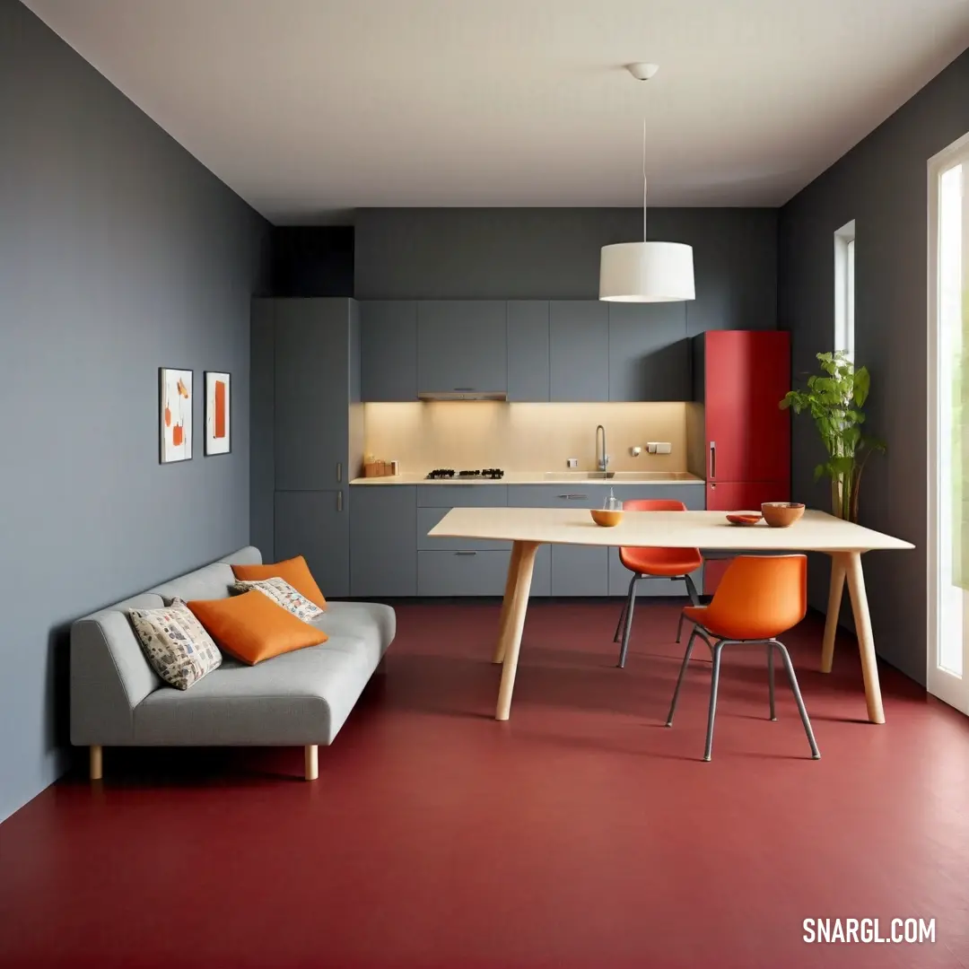
Platinum pairs beautifully with bold colors like dark red, rich navy, and deep emerald green. This combination creates a dramatic and stylish look. For instance, a platinum-colored sofa against a navy blue wall can make a striking statement. Textures and Patterns
Incorporating different textures and patterns in platinum can add depth and interest to a room. Consider using platinum-colored fabrics like velvet or silk for cushions and curtains. Patterns such as houndstooth or Moroccan designs in platinum can create a classic and timeless look. Modern Minimalism
For a modern minimalist look, platinum can be used in combination with white and black. This trio creates a sleek and contemporary aesthetic. Platinum-colored furniture with clean lines and minimalistic decor can make a space feel open and airy. Luxurious Touches
Platinum is often associated with luxury and exclusivity. Incorporating platinum-colored elements like a statement chandelier, a plush rug, or even platinum-colored wallpaper can add a touch of elegance and sophistication to any room. Natural Light Enhancement
Platinum's reflective quality can enhance natural light in a room. Using platinum-colored paint or wallpaper can help bounce light around, making a space feel brighter and more open. Complementary Colors
Platinum works well with a variety of complementary colors. Pairing it with soft pastels like blush pink or mint green can create a fresh and inviting look. Alternatively, combining platinum with deeper shades like charcoal gray or navy blue can add a sense of depth and sophistication. Versatility in Different Rooms
Platinum is versatile enough to be used in different rooms throughout the house. In the living room, it can create a calm and elegant atmosphere. In the bedroom, platinum-colored bedding and curtains can add a touch of luxury. In the kitchen, platinum-colored appliances and fixtures can give a modern and sleek look. Conclusion
Incorporating platinum into your interior design can transform your space into a sophisticated and elegant haven. Whether used as a neutral base, an accent color, or in combination with bold hues, platinum offers endless possibilities for creating a stylish and inviting home. Its versatility and timeless appeal make it a valuable addition to any interior design palette.Example of the palette with the Platinum color
Top 5 color shades of the illustration.
See these colors in NCS, PANTONE, RAL palettes...
NCS (Natural Color System) How can a car of Platinum color look?
A platinum-colored car exudes sophistication and luxury, reminiscent of precious metals like silver, but with a unique luster. This shade offers a blend of warmth and coolness, often reflecting light beautifully, which emphasizes the car's sleek lines and contours. Car manufacturers often use metallic and pearlescent finishes to enhance the platinum effect, giving it depth. Platinum cars are often seen as symbols of status, appealing to those who appreciate elegance and subtlety. Notably, research shows that lighter colors retain less heat, promoting a cooler interior in sunny weather.
What home furniture can be colored Platinum?
When considering home furniture that can be colored platinum, several sophisticated options come to mind. Leather sofas and armchairs take on a luxurious sheen, enhancing contemporary spaces. Metal fixtures like tables or shelves benefit greatly from a platinum finish, offering durability and style. Upholstered beds in platinum hues create a chic focal point in bedrooms, while dining chairs can add an elegant touch to any dining set. Additionally, decorative items like vases and lamps in platinum colors can elevate the aesthetic of a room, making it luminous and stylish.
How to decorate the garden in the Platinum color?

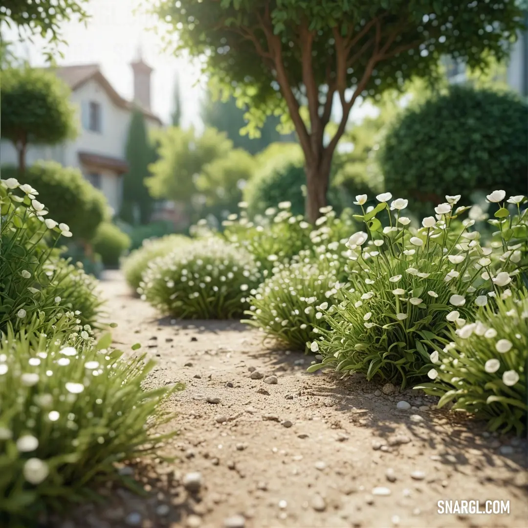
Embark on a peaceful journey along this enchanting path where lush greenery and blooming florals elevate the beauty of every step, encouraging quiet reflection amid nature's embrace.

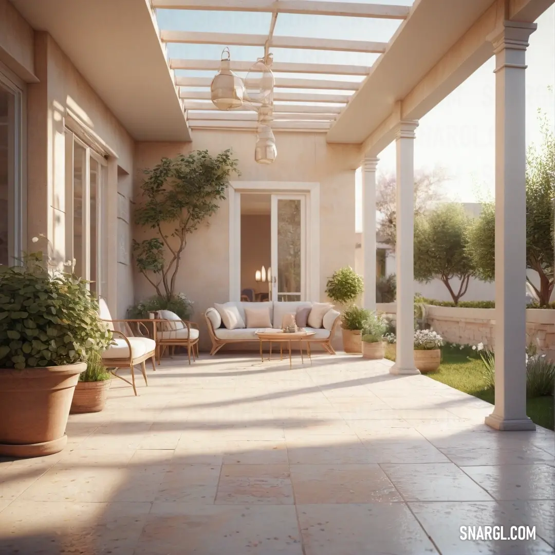
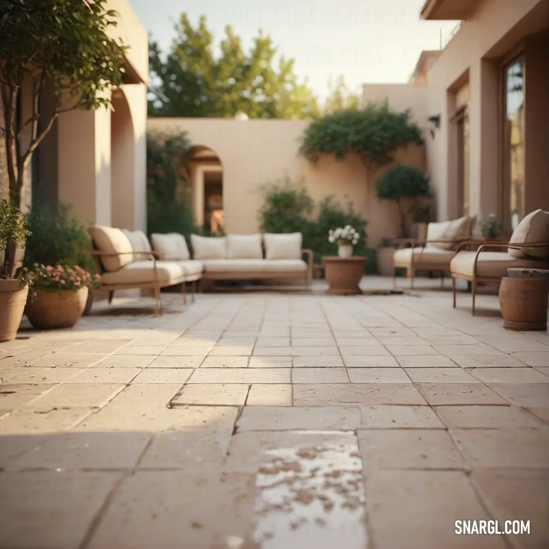
This stylish patio offers the perfect setting for relaxation, with its inviting furniture and a soft, calming color palette that creates a peaceful outdoor retreat.

The soft glow of #E5E4E2 highlights this peaceful, flower-lined pathway, making it the perfect place for quiet reflection and enjoying nature's beauty.

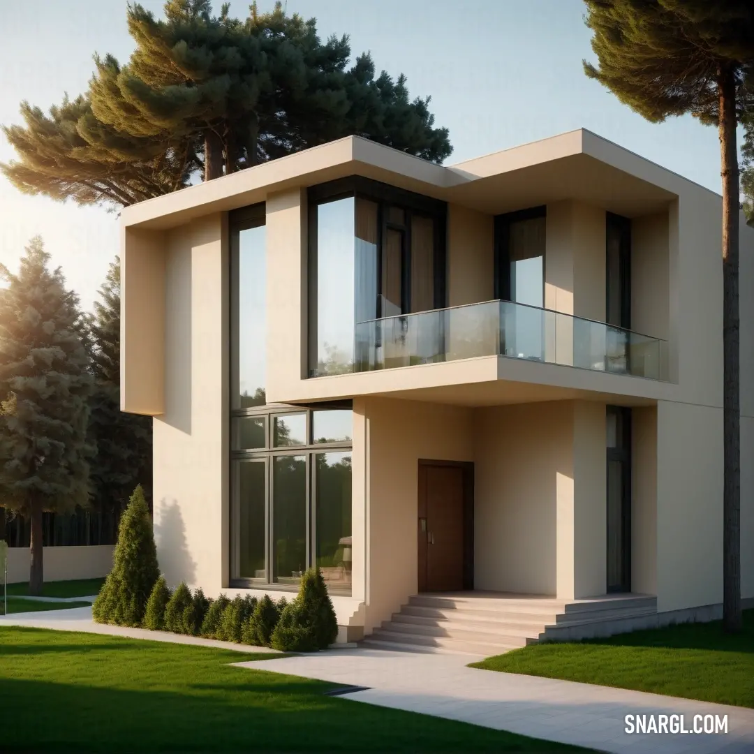
The modern design of this home, paired with the calming #E5E4E2 color, creates an elegant space perfect for both relaxation and style.

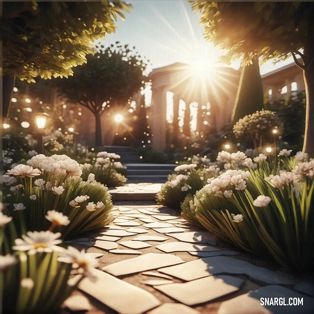
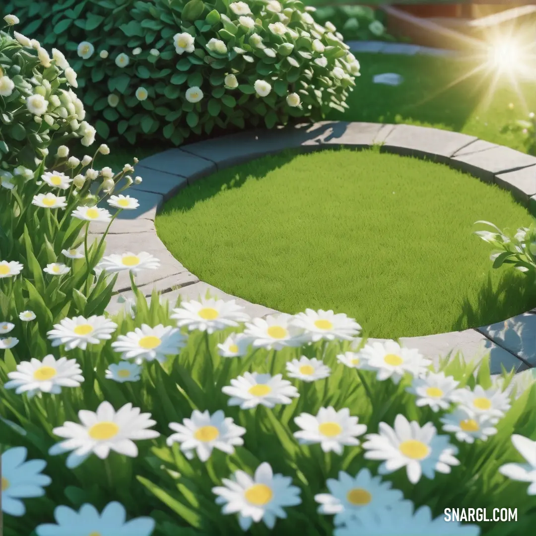
This garden's elegant circle of flowers and grass, coupled with the cool platinum color, creates a tranquil space for peaceful contemplation and enjoyment of nature.
Decorating a garden in platinum color can create a stunning and serene oasis. Platinum, with its soft sheen and elegance, complements greenery beautifully. Start by using platinum-themed accessories like pots, garden furniture, or sculptures. Incorporate plants with silvery leaves, such asDusty Miller or Lamb's Ear, to enhance the metallic theme. Consider white flowers like Moonflower or Pearly Everlasting for contrast. Accentuate pathways with platinum-hued stones or gravel. Finally, strategic lighting with silver fixtures can enhance the magical atmosphere during evenings, transforming your garden into a shimmering retreat.
Example of the palette with the Platinum color
Top 5 color shades of the illustration.
See these colors in NCS, PANTONE, RAL palettes...
NCS (Natural Color System) Example of the palette with the Platinum color
Top 5 color shades of the illustration.
See these colors in NCS, PANTONE, RAL palettes...
NCS (Natural Color System) What garden plants can be of the Platinum color?
While true platinum-colored plants are rare, some garden varieties exude a metallic sheen. Notably, the 'Platinum Blonde' Japanese sedge features silvery foliage that gleams in sunlight. Another option is the 'Silver Ghost' Astilbe, which showcases striking white blooms and frosty foliage. Additionally, certain types of ornamental grasses, like 'Blue Fescue,' have a silvery-blue hue that adds a platinum touch to any garden. For a unique twist, the 'Platinum Star' Brunnera offers silver leaves adorned with delicate blue flowers, making it a standout choice. These plants not only provide stunning visuals but also thrive in various garden settings, enhancing your landscape with an elegant touch.
More about "Platinum"
Discover the elegance of platinum clothing and how to incorporate this luxurious color into your wardrobe for a sophisticated look. Learn tips on styling and the best materials to enhance your fashion statement.
Read:
Platinum Clothing: A Guide to Elegance and StyleDiscover the enchanting world of platinum accessories in this article, where we explore how these exquisite pieces can transform any outfit and elevate your lifestyle. Whether it's jewelry or home decor, platinum exudes timeless elegance that never goes out of style.
Read:
Platinum Accessories: Elevate Your Style with Timeless EleganceContinue browsing posts in category "Colors"
More palettes with the color Platinum:
Take a look at this Music Video:
You may find these posts interesting:

