Pear

Parameters:
HEX Triplet:
#d1e231
RGB:
209, 226, 49
CMYK:
8, 0, 78, 11
HSL:
65.8°, 75.3%, 53.9%
Closest colors:
in RGB:
Dandelion
in PANTONE:
PANTONE 395
in RAL Classic:
RAL 1018
in RAL Design:
RAL 095 80 70
in RAL Effect:
RAL 260-4
What color is Pear? What are the examples of Pear color in life? What strange or uncommon things can be of the Pear color? The Pear-fect Palette: A Tale of Colorful Discovery
2024-08-24 Snargl 08:04
# General # Fashion # Imagination # Design

What color is Pear?

Woman in a costume standing next to a woman in a dress with flowers on her head
Man in a costume is posing for a picture with a yellow background
Green vase on top of a table next to a window sill with a city in the background
Painting of a flower in a field with a castle in the background and butterflies flying around it in the sky
Two pears on a table with a black background and a shadow of one of them on the table
Glass vase with a leaf inside of it on a table next to a candle holder and a vase
Woman with a braid standing in front of flowers and a sky background with bubbles in the background and a sun shining through the clouds
Painting of a woman with green hair and yellow makeup and a green wig with yellow and red paint
Cat figurine on a red box next to a painting of a cat with a green and yellow coat
Painting of a pagoda in a courtyard with columns and arches
Woman with a necklace and a black jacket on a street corner with a yellow car in the background
Green and white stuffed animal sitting on top of a table next to a black background
Pear is a color that resembles the skin of some varieties of pear fruits, such as Anjou or Bartlett pears.

It is a pale yellowish-green hue that can be considered a desaturated version of chartreuse.

The HEX code for pear is #D1E231, which means it has 81.96% red, 88.63% green, and 19.22% blue in RGB color space.

In CMYK color space, it has 8% cyan, 0% magenta, 78% yellow, and 11% black.

Pear is a bright and lively color that can evoke a sense of freshness, vitality, and happiness.

It can also represent something or someone that is sweet, juicy, and satisfying, like the fruit.

Pear can be used as an accent color to create contrast and interest in a design, or as a background color to create a warm and inviting atmosphere.

It can also be combined with other colors to create different color schemes, such as complementary, analogous, split-complementary, triadic, or tetradic.

Some examples of colors that go well with pear are purple, blue, orange, brown, or gray.

It is a color that has been used in various contexts and fields, such as art, fashion, food, and nature.

For example, pear is the name of a light green glaze used in ceramics, especially in Chinese porcelain.

Pear is a popular color for clothing and accessories, as it can flatter many skin tones and hair colors.

It is also a common color for fruits and vegetables, such as pears, limes, kiwis, celery, or lettuce.

This is a color that can be found in nature, such as in leaves, grass, moss, or flowers.

Pear is a color that has many shades and tints, depending on the amount of white or black added to it.

Some examples of shades and tints of pear are pear sorbet, medium winter pear, winter pear, or pear green.

These variations can create different moods and effects, such as lighter, softer, darker, or cooler.

Pear is a versatile and expressive color that can be used for many purposes and occasions.

Example of the palette with the Pear color

Picture with primary colors of University of California Gold, Pear, Smoky black, Sepia and Rufous
Top 5 color shades of the illustration. Arranged in descending order of frequency of occurrence (first - more often, last - more rare).
See these colors in NCS, PANTONE, RAL palettes...
Author:

What are the examples of Pear color in life?

Close up of a green leaf with water droplets on it's petals and a black background
Plate of green apples on a table cloth with a green background behind it
Woman with green hair and yellow flowers on her head and green eyes and green hair
Bowl of green soup with a spoon and spoon on a plate with a spoon in it
Painting of a garden with flowers and a path leading to a house with a butterfly flying overhead in the sky
Close up of a green plant with lots of leaves on it's side and a black background
Yellow sports car parked on the side of the road next to a white wall and trees in the background
Woman in a yellow dress is walking down a hall way with a yellow dress on her chest
Snail is on a leafy green plant in the woods
Painting of a cow in a field of grass with mountains in the background and trees in the foreground
White and green floral wallpaper with a green border on it's side and a white background
Pear color is a light yellow-green hue that resembles the skin of some varieties of pears.

It is often associated with freshness, springtime, and nature.

Some examples of pear color in life are:
  • Leaves of certain plants, such as mint, basil, and parsley.

  • Walls or furniture of a minimalist or Scandinavian-style interior design.

  • Clothing or accessories of someone who wants to create a soft and soothing impression.

  • The packaging or logo of a brand that wants to convey eco-friendliness or healthiness.

  • The background or accent color of a painting or illustration that wants to evoke a calm and serene mood.

Example of the palette with the Pear color

Picture with primary colors of Pear, Zinnwaldite, Sap green, Golden brown and Pastel yellow
Top 5 color shades of the illustration. Arranged in descending order of frequency of occurrence (first - more often, last - more rare).
See these colors in NCS, PANTONE, RAL palettes...
Author:

What strange or uncommon things can be of the Pear color?

Pear color example: Stylized image of a demon with horns and horns on his head
Pear color. Green alien with a skull and a head with a light above it
Painting of a woman surrounded by aliens and aliens in green colors with a staircase leading to the entrance. Example of Pear color.

Example of the palette with the Pear color

Picture with primary colors of Smoky black, Sepia, Pear, Ash grey and Outer Space
Top 5 color shades of the illustration. Arranged in descending order of frequency of occurrence (first - more often, last - more rare).
See these colors in NCS, PANTONE, RAL palettes...
Author:
Funny stories about the 'Pear'

The Pear-fect Palette: A Tale of Colorful Discovery

Long time ago, far away, in the bustling city of Chromaville, where every building was a canvas and every street a gallery, lived two extraordinary individuals: Ralph Ming, a painter with a flair for the unconventional, and Professor Igor Lantern, a renowned expert in the psychology of colors. Their paths crossed in the most unexpected way, leading to a comical and cool adventure that would change the world of interior design forever.

Ralph Ming was known for his eccentric style. His studio was a chaotic symphony of colors, with splashes of paint on every surface. He believed that every color had a story to tell, and he was determined to uncover them all. One day, while experimenting with a new shade, Ralph stumbled upon a peculiar color he had never seen before. It was a vibrant, juicy hue that reminded him of a ripe pear. Intrigued, he decided to name it "Pear" and set out to explore its potential.
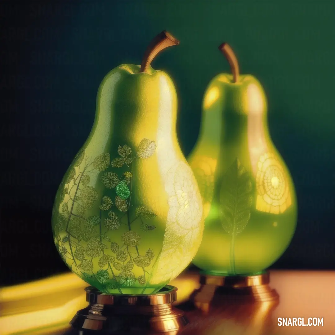
Green glass vase with a leaf design on it and two pears on a table with bananas in the background

Meanwhile, Professor Igor Lantern was busy in his lab at the Chromaville University, conducting experiments on how colors affect human emotions and behavior. Igor was a serious man with a penchant for bow ties and a love for order. His research was meticulous, and he had little patience for anything that disrupted his routine. However, his curiosity was piqued when he received a letter from Ralph Ming, inviting him to collaborate on a project involving the mysterious "Pear" color.

Despite his initial reluctance, Igor agreed to meet Ralph. Their first encounter was nothing short of comical. Ralph's studio was a stark contrast to Igor's orderly lab. Paint cans were scattered everywhere, and the walls were covered in abstract murals. Igor, with his neatly pressed suit and clipboard, looked completely out of place. But Ralph's enthusiasm was infectious, and soon Igor found himself intrigued by the potential of the "Pear" color.

Together, they embarked on a journey to study the effects of the "Pear" color in interior design. Their experiments ranged from the scientific to the downright absurd. They painted entire rooms in "Pear" and observed how people reacted. They even hosted a "Pear Party," where guests were encouraged to wear pear-themed outfits and share their feelings about the color.
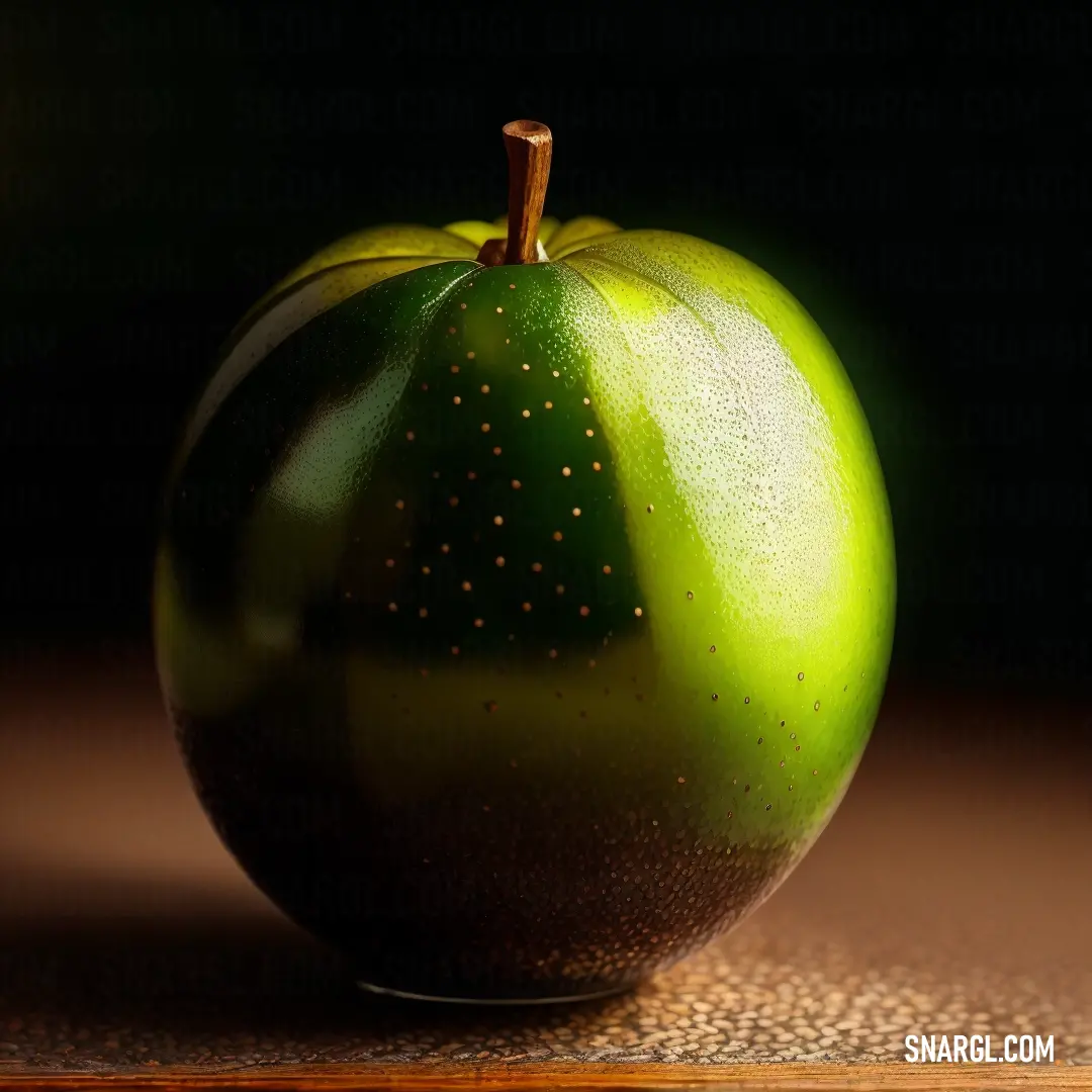
Green apple with a brown spot on it's surface and a black background behind it

As they delved deeper into their research, Ralph and Igor discovered that the "Pear" color had a unique ability to evoke a sense of freshness and vitality. It made people feel more energetic and optimistic. They also found that it had a calming effect, reducing stress and promoting relaxation. The results were astonishing, and soon the "Pear" color became the talk of the town.

Their collaboration was not without its challenges. Ralph's spontaneous approach often clashed with Igor's methodical nature. There were moments of frustration and hilarity, like the time Ralph accidentally spilled a bucket of "Pear" paint on Igor's prized bow tie collection. But through it all, they developed a deep respect for each other's talents and a genuine friendship.
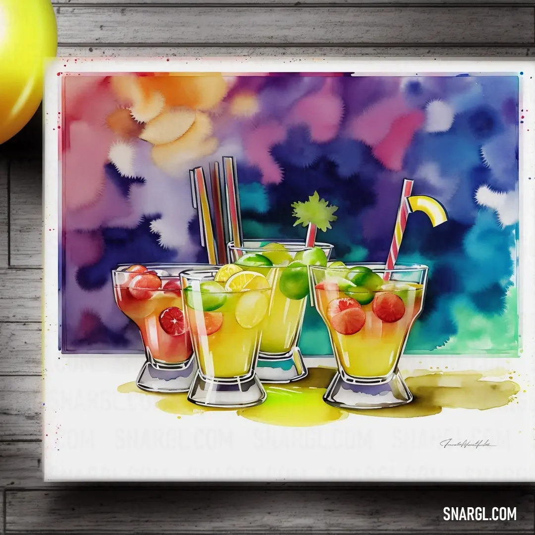
Painting of three glasses of fruit juice with a flag on top of them and a balloon in the background. Color RGB 209,226,49.

In the end, their research culminated in a groundbreaking presentation at the International Conference on Interior Design. Ralph and Igor stood side by side, sharing their findings with an audience of designers, architects, and color enthusiasts from around the world. The "Pear" color was hailed as a revolutionary discovery, and Ralph and Igor became overnight celebrities.

Their story didn't end there. Inspired by their success, Ralph and Igor continued to explore the world of colors, uncovering new shades and their effects on human emotions. They even co-authored a book titled "The Pear-fect Palette," which became a bestseller and a must-read for anyone interested in interior design.

And so, in the vibrant city of Chromaville, the painter and the professor proved that sometimes, the most unexpected collaborations can lead to the most extraordinary discoveries. Their tale of colorful adventure and friendship became a legend, inspiring future generations to embrace the magic of colors and the power of creativity.
Author:

# General # Fashion # Imagination # Design
Continue browsing posts in category "Colors"
More palettes with the color Pear:
You may find these posts interesting:
Umber Color
11
3
2
34
0
Umber Color
Medium Violet Red Color
2
0
2
57
0
Medium Violet Red Color
Beaver Color
10
0
3
23
0
Beaver Color
Gainsboro Color
9
2
3
39
3
Gainsboro Color
Upsdell Red Color
3
1
5
67
0
Upsdell Red Color
Bistre Color
4
1
8
79
0
Bistre Color
Rosso Corsa Color
1
0
3
46
0
Rosso Corsa Color
Dark Orange Color
2
0
3
56
4
Dark Orange Color
Home
Terms of Service
Contact Us

© 2023 Snargl.com