Payne grey
What color is Payne grey? What are the examples of Payne grey color in everyday life? What looks best in Payne grey? What strange or uncommon things can be of the Payne grey color? What color is similar to Payne's GREY? What color is closest to Paynes gray? The Enigmatic Shade: Payne's Grey
What color is Payne grey?


It is named after William Payne, a British artist who first used it in the late 18th century.
Payne grey can be made by mixing different pigments, such as blue, black, ochre, and crimson.
It can appear almost blue when diluted, and can be used as an alternative to black for shading and creating depth.
Payne grey can also be found in oil and acrylic paints, and is a popular choice for painting skies, shadows, and landscapes.
This color has a history of being used by famous artists, such as J.M.W.Turner, John Constable, and James McNeill Whistler, who used it to create atmospheric effects and subtle contrasts.
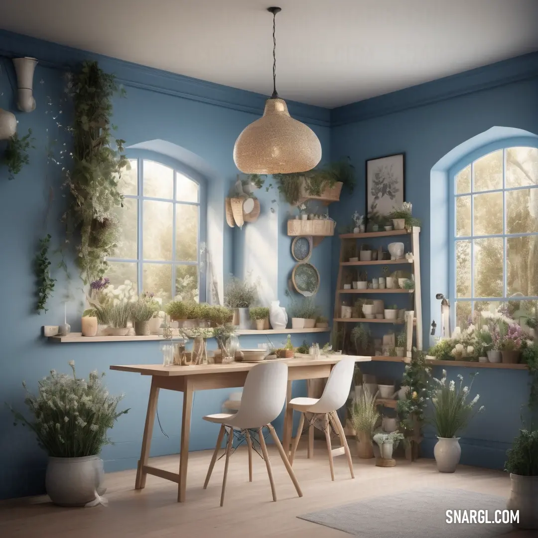
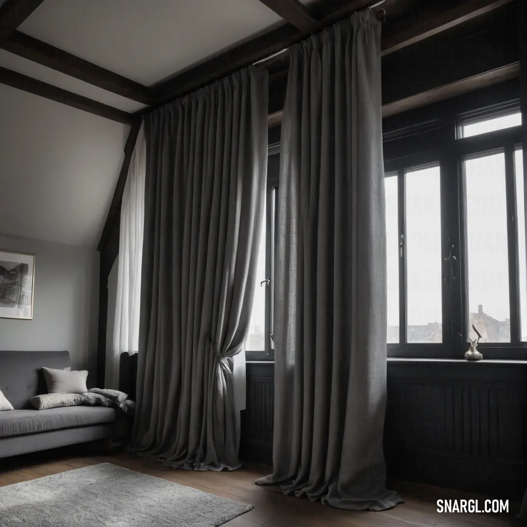
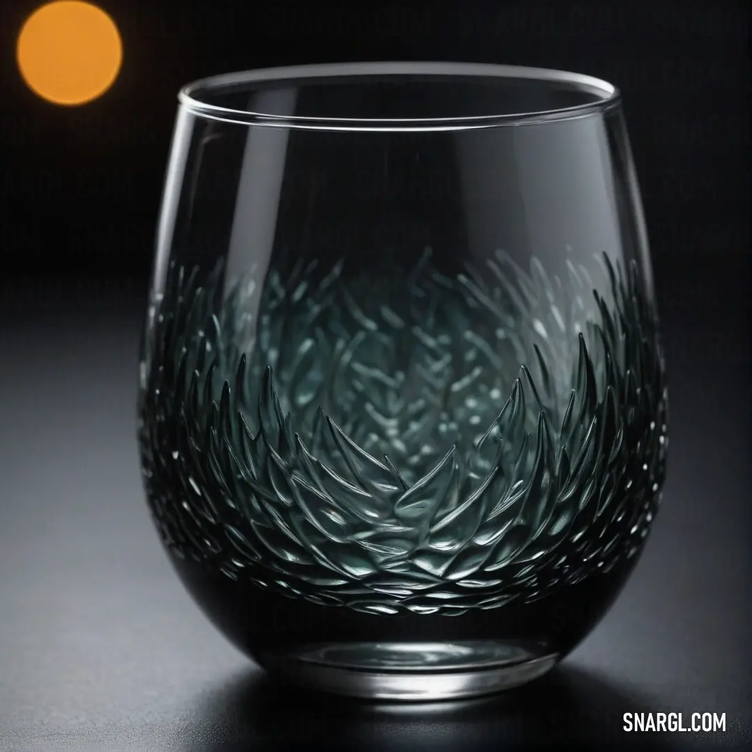
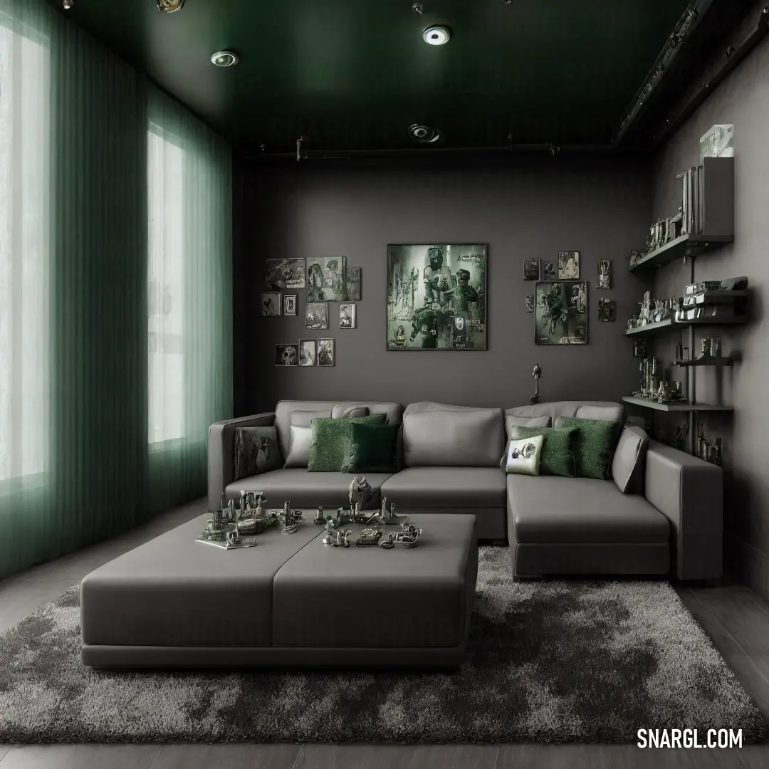
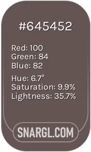
Example of the palette with the Payne grey color
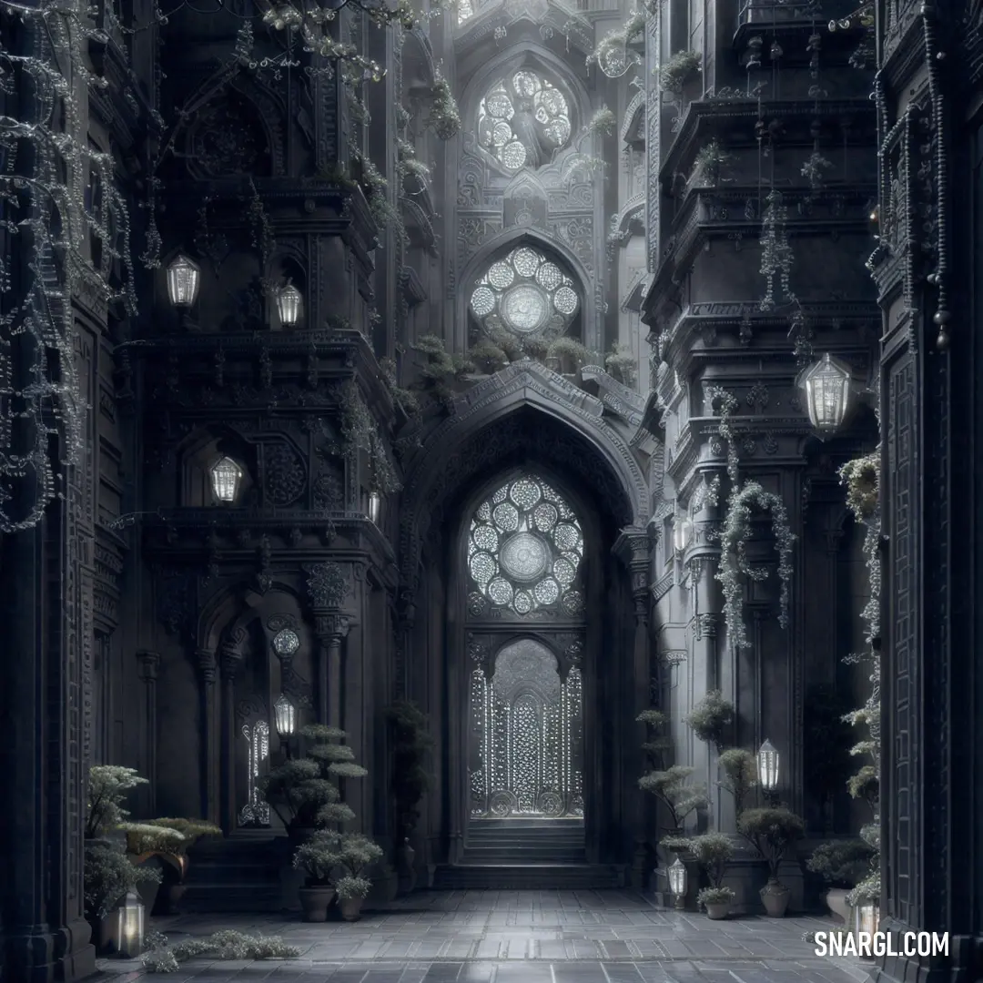
See these colors in NCS, PANTONE, RAL palettes...
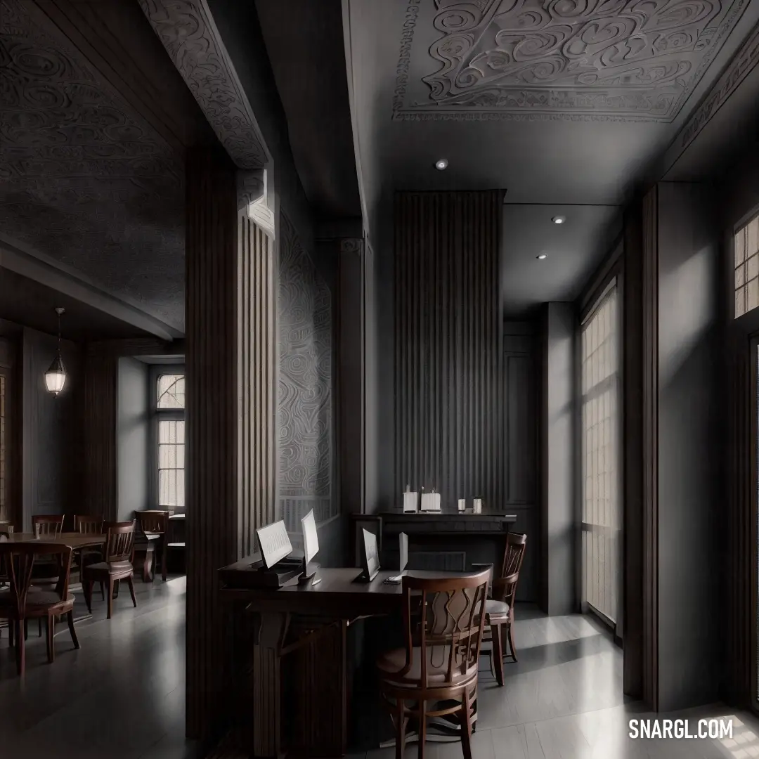
Example of the palette with the Payne grey color

See these colors in NCS, PANTONE, RAL palettes...
Example of the palette with the Payne grey color

See these colors in NCS, PANTONE, RAL palettes...
Example of the palette with the Payne grey color

See these colors in NCS, PANTONE, RAL palettes...
What are the examples of Payne grey color in everyday life?
Some examples are:
The sky on a cloudy or stormy day, especially before or after rain.
Payne grey can create a dramatic contrast with the bright white clouds or the flashes of lightning.The feathers of some birds, such as crows, ravens, magpies, or pigeons.
Payne grey can give them a sleek and elegant appearance, or a mysterious and ominous aura.The fur or skin of some animals, such as wolves, dolphins, whales, or elephants.
Payne grey can help them blend in with their surroundings, or stand out with their distinctive shapes and features.The water of some lakes, rivers, or oceans, especially when reflecting the sky or the shadows of the land.
Payne grey can create a sense of depth and movement, or a calm and serene atmosphere.The clothing or accessories of some people, such as suits, coats, hats, or scarves.
Payne grey can be a versatile and stylish colour, suitable for formal or casual occasions, or for expressing one's personality or mood.
Example of the palette with the Payne grey color

See these colors in NCS, PANTONE, RAL palettes...
Example of the palette with the Payne grey color

See these colors in NCS, PANTONE, RAL palettes...
What looks best in Payne grey?
It can be used to create shadows, contrast, and depth in various styles and mediums.
Here are some examples of what looks best in Payne grey:
Landscapes: Payne grey can be used to paint the sky, mountains, water, and rocks in a realistic or impressionistic way.
It can also be used to create a moody and atmospheric scene, especially in winter or night settings.
Payne grey can complement other colours such as yellow, green, and purple in landscapes.Portraits: Payne grey can be used to paint the hair, eyes, and clothing of a person in a portrait.
It can also be used to create shadows and highlights on the face and body, giving a sense of volume and realism.
Payne grey can contrast well with warm colours such as red, orange, and pink in portraits.Abstract: Payne grey can be used to create abstract shapes, patterns, and textures in a painting.
It can also be used to create a sense of movement, rhythm, and balance in a composition.
Payne grey can harmonize with other colours such as blue, white, and black in abstract paintings.
It can also be used in other forms of art and design, such as photography, graphic design, and fashion.
Payne grey is a colour that can suit any style and mood.
Example of the palette with the Payne grey color

See these colors in NCS, PANTONE, RAL palettes...
What strange or uncommon things can be of the Payne grey color?


Example of the palette with the Payne grey color

See these colors in NCS, PANTONE, RAL palettes...
Example of the palette with the Payne grey color

See these colors in NCS, PANTONE, RAL palettes...
What color is similar to Payne's GREY?
Example of the palette with the Payne grey color

See these colors in NCS, PANTONE, RAL palettes...
Example of the palette with the Payne grey color
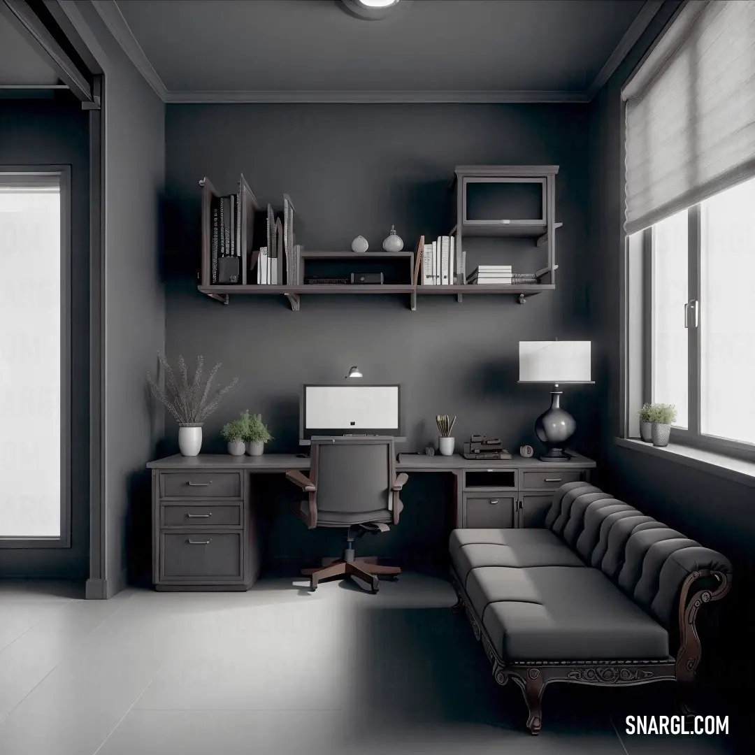
See these colors in NCS, PANTONE, RAL palettes...
What color is closest to Paynes gray?
Example of the palette with the Payne grey color

See these colors in NCS, PANTONE, RAL palettes...
Example of the palette with the Payne grey color

See these colors in NCS, PANTONE, RAL palettes...
The Enigmatic Shade: Payne's Grey
Dr. Shivansh Ford was a man of science and precision. His office, nestled in the heart of the city, was a sanctuary of color swatches, light boxes, and endless books on color theory. He had dedicated his life to understanding the psychological and emotional impacts of colors. Yet, one color eluded him: Payne's Grey. It was neither black nor blue, but a hauntingly beautiful blend that seemed to shift with the light.

Jessica McLeod, on the other hand, was a whirlwind of energy. By day, she navigated the city's labyrinthine streets, delivering packages with a smile. By night, she transformed her small apartment into an art studio, experimenting with colors and forms. Her fascination with Payne's Grey began when she stumbled upon an old tube of paint in a second-hand shop. The color captivated her, and she began incorporating it into her digital animations, noticing how it added depth and emotion to her work.
Their paths crossed one rainy afternoon when Jessica delivered a package to Dr. Ford's office. Intrigued by the array of colors and the meticulous notes scattered across his desk, she couldn't help but ask, "What are you working on?"
Dr. Ford looked up, surprised by her interest. "I'm studying Payne's Grey. It's a color that defies easy classification, and I believe it holds untapped potential in motion design."
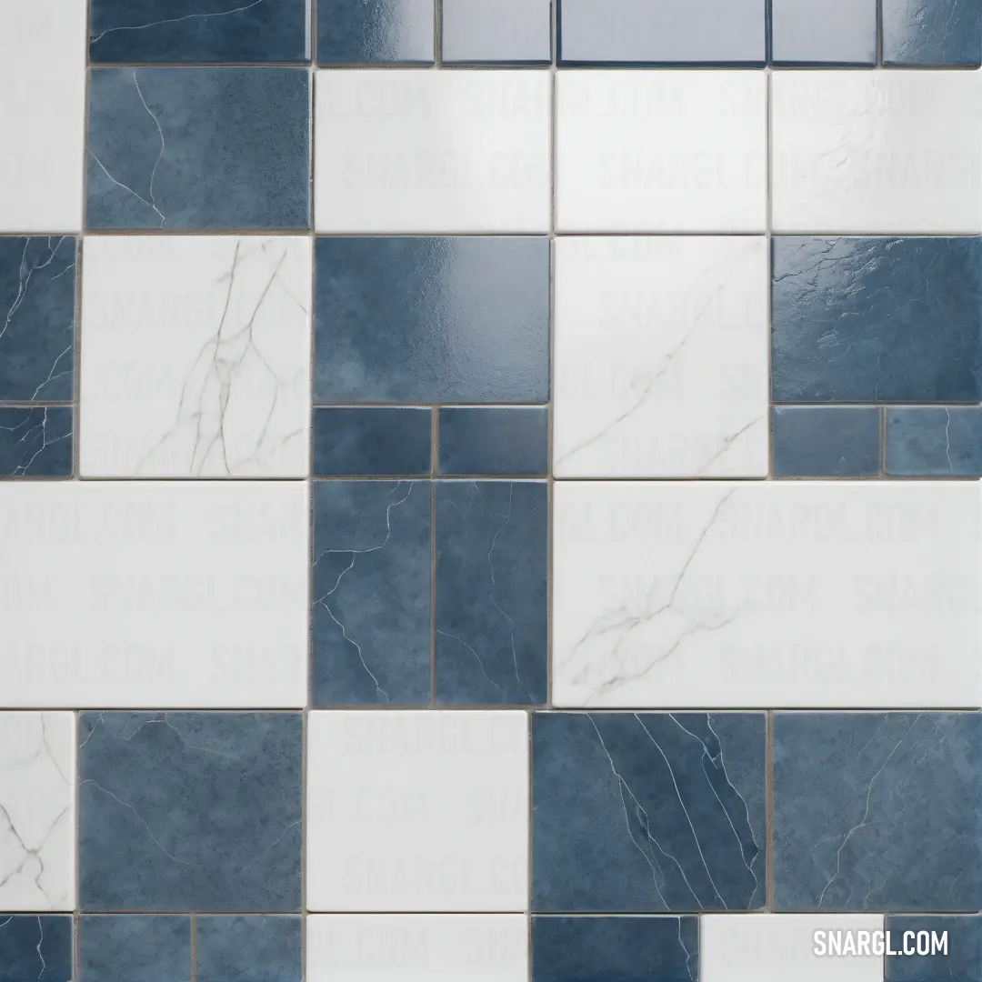
Jessica's eyes lit up. "I've been using Payne's Grey in my animations! It adds a certain moodiness and depth that I can't achieve with other colors."
Intrigued by her practical experience, Dr. Ford invited Jessica to collaborate with him. Together, they embarked on a series of experiments to understand the full potential of Payne's Grey in motion design. They discovered that the color's unique properties allowed it to evoke a wide range of emotions, from melancholy to tranquility, depending on its application and the surrounding colors.
Jessica's animations, infused with the enigmatic shade, began to gain attention. She created a short film that showcased the versatility of Payne's Grey, using it to transition between scenes, highlight key moments, and create a cohesive visual narrative. The film was a hit, earning accolades from critics and audiences alike.

Dr. Ford, inspired by their success, published a paper detailing their findings. He explained how Payne's Grey could be used to create a sense of depth and movement, making it an invaluable tool for motion designers. The paper sparked a wave of interest in the design community, with artists and designers eager to explore the possibilities of this mysterious color.
As their collaboration continued, Dr. Ford and Jessica realized that their journey was about more than just a color. It was about the power of curiosity, the importance of collaboration, and the magic that happens when science and art come together. They became close friends, united by their shared passion and the knowledge that they had unlocked a new dimension in the world of motion design.
And so, in the heart of Amsterdam, amidst the canals and cobblestone streets, the legacy of Payne's Grey lived on, a testament to the endless possibilities that await those who dare to explore the unknown.
Read: Understanding Payne's Grey: The Versatile Color in Art and Design
Read: Understanding Payne Grey: A Dive into Its Origins, Characteristics, and Usage
Read: Exploring Payne Grey: Definition, Characteristics, and Inspiring Examples
Read: Exploring the Aesthetic Depths of Payne Grey Design: A Modern Approach to Color in Interior Spaces
Read: Payne Grey Interior: The Chic and Timeless Choice for Modern Spaces
Read: Payne Grey Clothing: The Ultimate Trend in Modern Fashion
Read: Payne Grey Fashion: Embracing Elegance and Versatility in Your Wardrobe
Read: Payne Grey For Men: A Comprehensive Guide to Embracing This Sophisticated Color
Read: Payne Grey for Women: A Timeless Color Choice for Every Wardrobe
Read: Exploring Payne Grey: The Color of Tranquility in Nature
Read: Exploring the Beauty of Payne Grey in Art: A Comprehensive Guide
Read: Exploring Payne Grey Paint: A Comprehensive Guide to Its Beauty and Versatility
Read: Payne Grey in Cars: A Stunning Shade for Automotive Design
Read: Payne Grey Superhero: A Unique Take on Color and Character
Read: Payne Grey Plants: A Comprehensive Guide to Choosing and Caring for This Stunning Color Palette in Your Garden
Read: Payne Grey Furniture: The Perfect Blend of Elegance and Versatility
Read: Exploring the Beauty of Payne Grey in Your Garden: A Comprehensive Guide
Read: Exploring Battleship Grey: The Versatility of Grey in Design
Read: Grey In Design: Exploring the Versatility of Ash Grey
Read: Exploring the Essence of Cadet Grey: Grey in Design

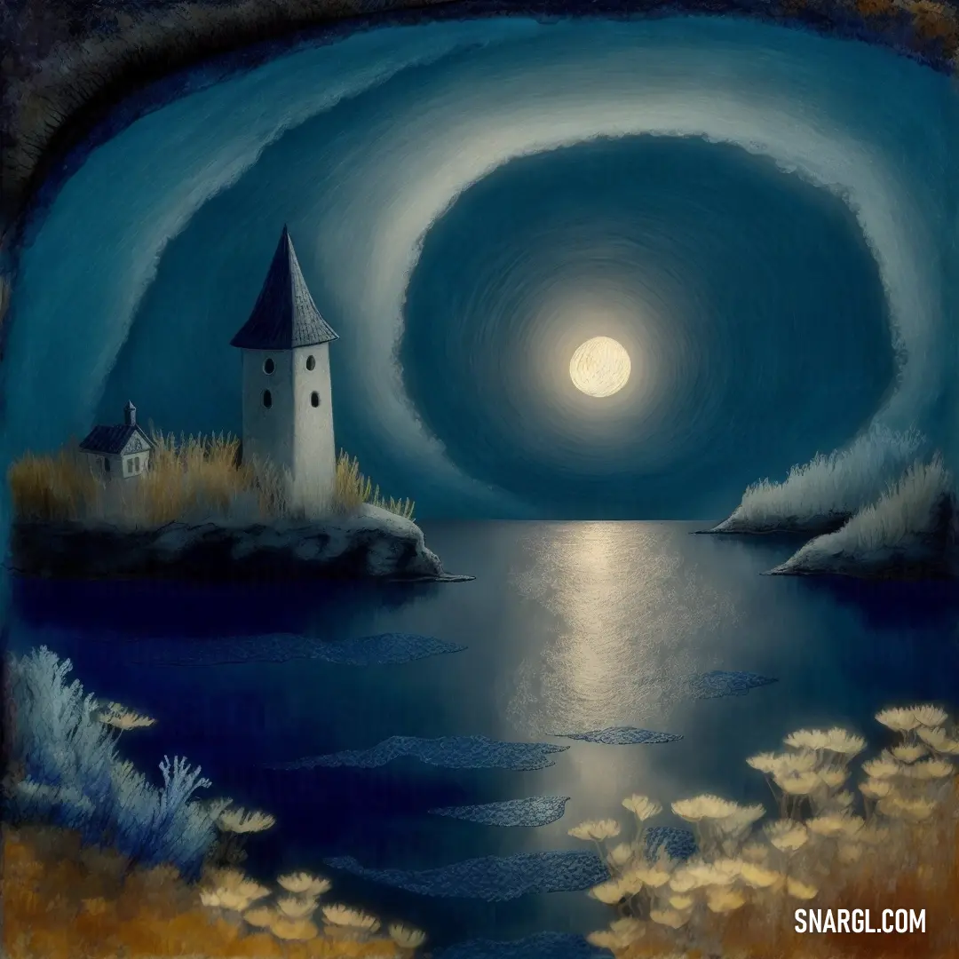








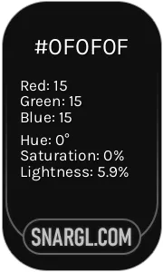 Onyx
Onyx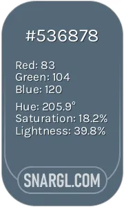 Payne grey
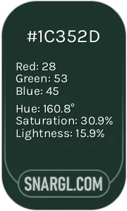 Medium jungle green
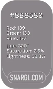 Taupe gray
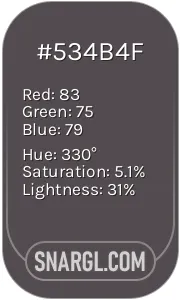 Liver
Liver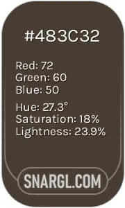 Dark lava
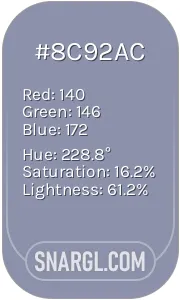 Cool grey
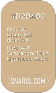 Tan
Tan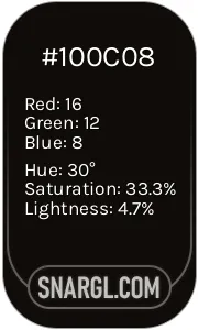 Smoky black
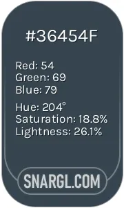 Charcoal
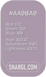 Rose quartz
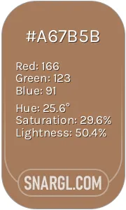 Cafe au lait
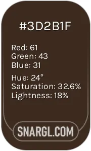 Bistre
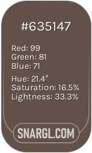 Umber
Umber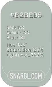 Ash grey




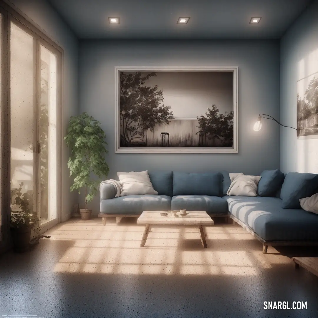



 Davy grey
 Anti-flash White
 Dark jungle green
 Purple taupe






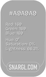 Dark gray
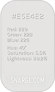 Platinum









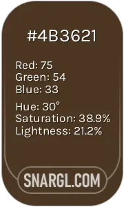 Cafe noir
 Vegas gold
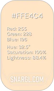 Bisque
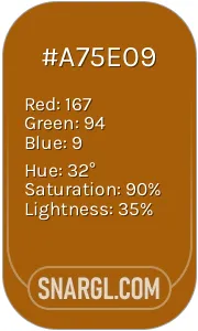 Raw umber
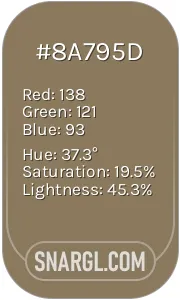 Shadow
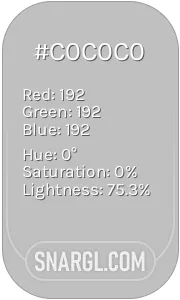 Silver








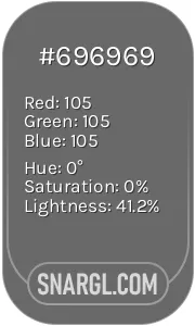 Dim gray
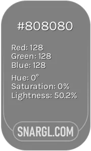 Gray
Gray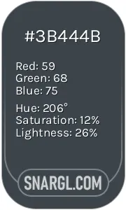 Arsenic
 Black
Black





 Wenge
Wenge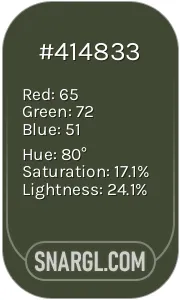 Rifle green
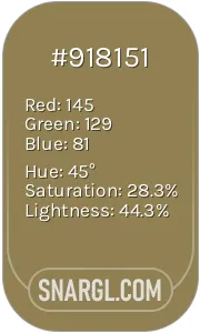 Dark tan
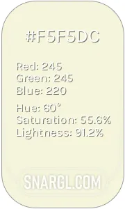 Beige
Beige
