Harvard crimson # Design
How the Harvard crimson color can be used in the interior design? How can a car of Harvard crimson color look? What home furniture can be colored Harvard crimson? How to decorate the garden in the Harvard crimson color? What garden plants can be of the Harvard crimson color?
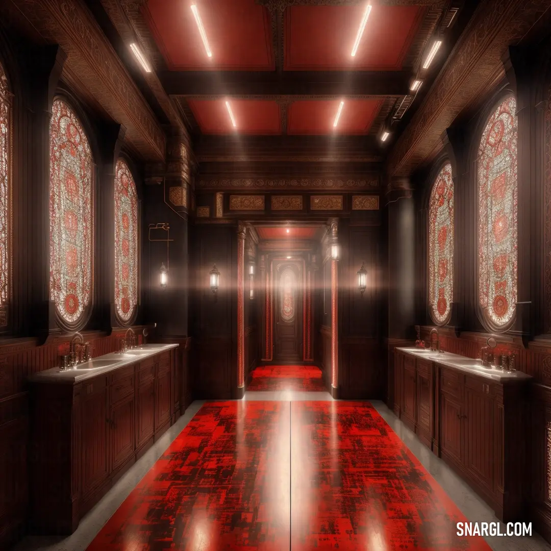
How the Harvard crimson color can be used in the interior design?
Crimson can also evoke associations with royalty, nobility, religion, and passion.
Here are some tips on how to use Harvard crimson color in interior design:
To showcase elegance and sophistication, try pairing crimson with gentle, neutral shades such as champagne, white, and serenity blue.
These colors can create a soothing contrast and balance the intensity of crimson.For an earthy palette, try adding crimson to autumnal colors such as gold, brown, and chili pepper.
These colors can create a warm and cozy atmosphere and complement the richness of crimson.If you want to create a bold and dramatic statement, you can use crimson as an accent color against a dark background, such as black, navy, or charcoal.
This can create a striking and eye-catching effect and highlight the crimson elements in your design.You can also use crimson to add some personality and flair to your design by incorporating it in patterns, textures, and accessories.
For example, you can use crimson pillows, rugs, curtains, or artwork to add some interest and variety to your space.Crimson can also be used to create a focal point in your design, such as a crimson sofa, chair, or wall.
This can draw attention to a specific area and create a sense of drama and excitement.
Example of the palette with the Harvard crimson color

See these colors in NCS, PANTONE, RAL palettes...
How can a car of Harvard crimson color look?
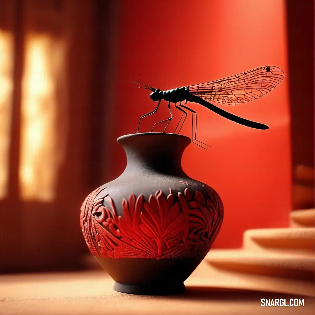
What home furniture can be colored Harvard crimson?
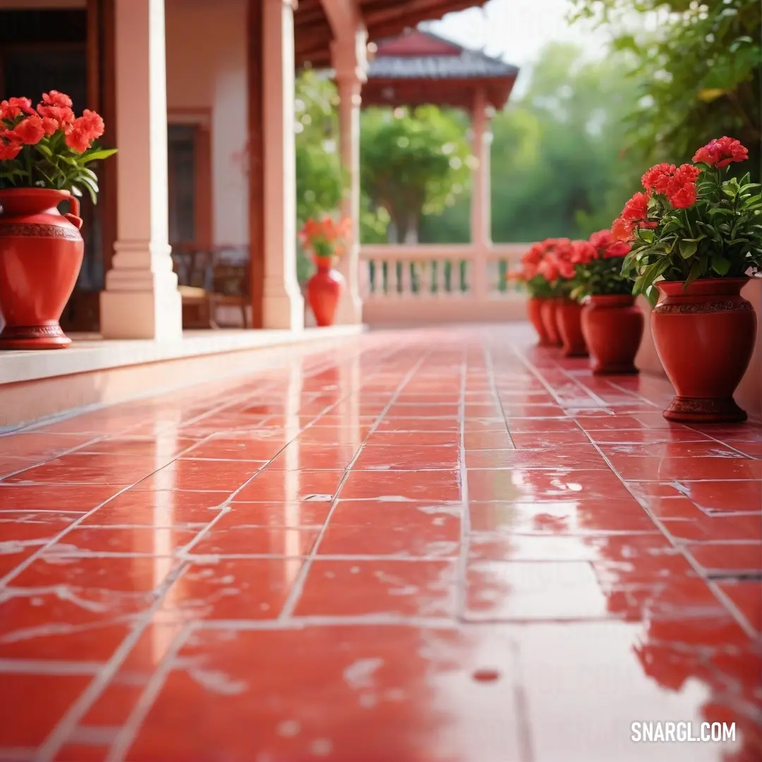
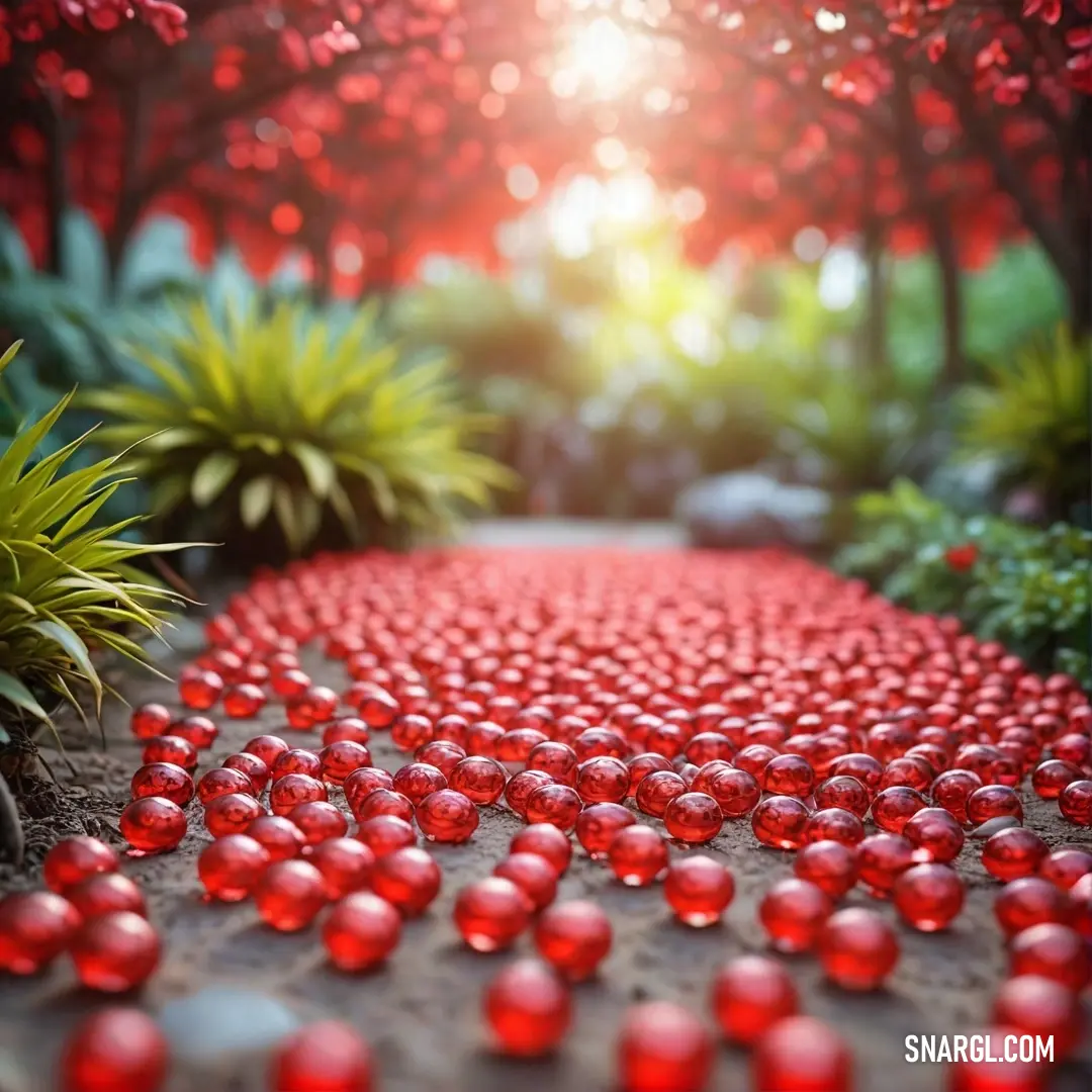
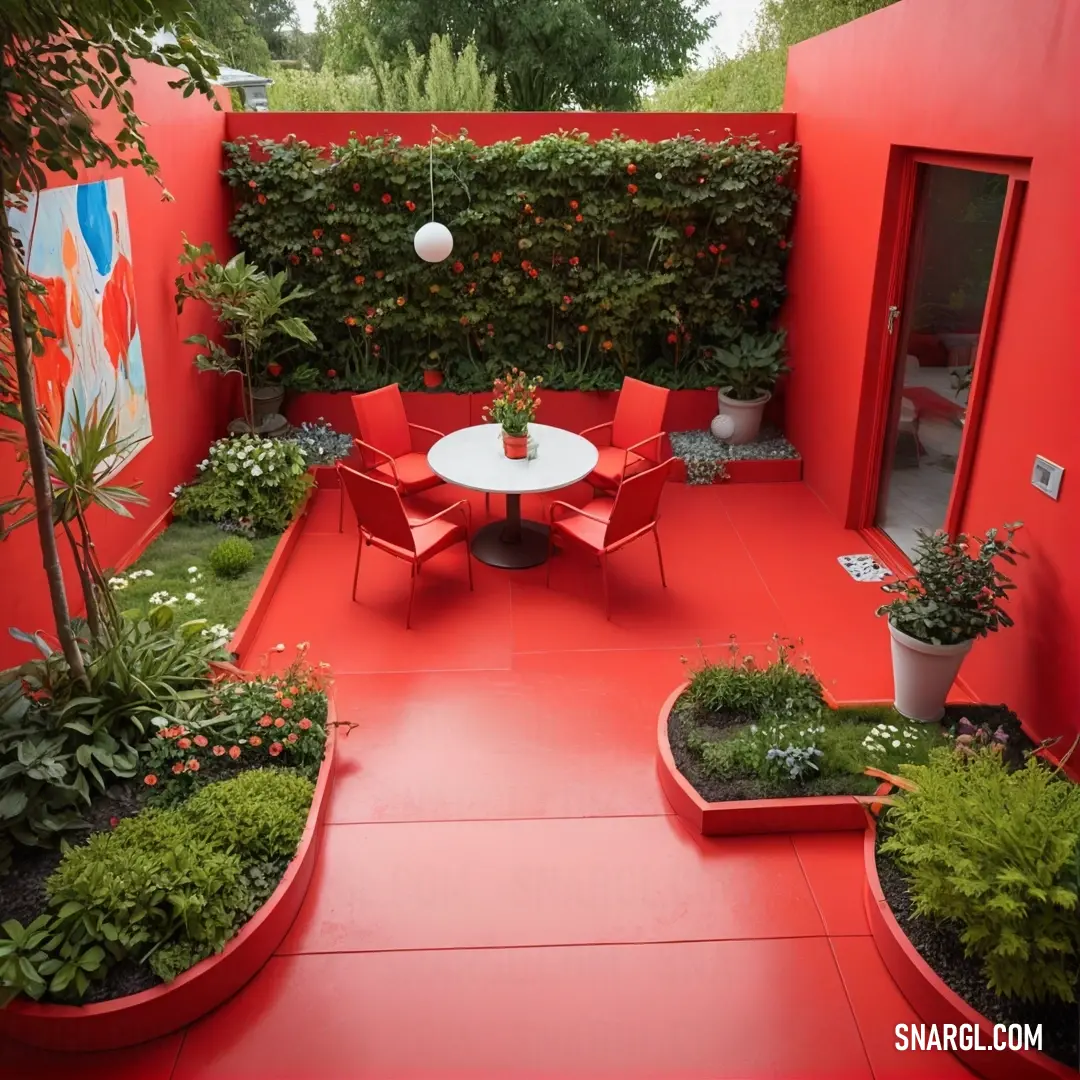
How to decorate the garden in the Harvard crimson color?
Example of the palette with the Harvard crimson color
See these colors in NCS, PANTONE, RAL palettes...
What garden plants can be of the Harvard crimson color?
Read: The Allure of Alizarin Crimson: Exploring the Depths of Crimson Color
Read: Crimson Color: Meaning, Symbolism, and Applications in Design
Read: The Allure of Crimson Red: A Guide to Understanding and Using This Captivating Color
Read: Exploring the Essence of Crimson Glory: The Allure of Crimson Color
Read: The Allure of Electric Crimson: A Deep Dive into the Crimson Color
Read: Exploring the Richness of Harvard Crimson: A Deep Dive into One of the Most Iconic Shades of Red
Read: Harvard Colors: The Significance and History of Harvard Crimson
Read: Exploring the Rich History and Significance of KU Crimson
Read: Crimson Color: The Allure of Light Crimson in Design and Nature
Read: Exploring Utah Crimson: The Color's Significance and Applications
Read: Crimson Color: An In-Depth Exploration of NCS S 2005-Y20R and Its Significance in Design
Read: Exploring the Vibrant Essence of NCS S 0570-Y30R: The Crimson Color
Read: Exploring NCS S 4050-Y30R: The Allure of Crimson Color
Read: Exploring the Allure of NCS S 4550-Y30R: The Essence of Crimson Color
Read: Exploring the Richness of Crimson Color: NCS S 1515-Y40R
Read: Exploring the Richness of NCS S 4030-Y40R: The Crimson Color
Read: Crimson Color: An Exploration of NCS S 2060-Y50R
Read: Crimson Color: Exploring NCS S 3050-Y50R and Its Significance in Design
Read: Crimson Color - Exploring the Richness of NCS S 4550-Y50R
Read: The Vibrant Elegance of Crimson Color in NCS S 7010-Y50R

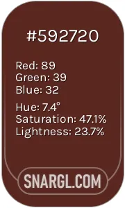 Caput mortuum
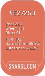 Terra cotta
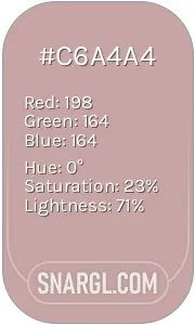 Pale mauve
 Harvard crimson
 Sunglow

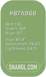 Asparagus
 Baby pink
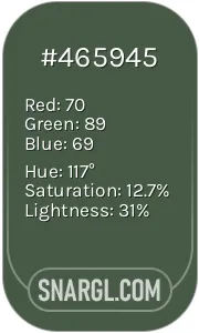 Gray-asparagus


