Chartreuse # Design
How the Chartreuse color can be used in the interior?
It is named after a French herbal liqueur that comes in two types: chartreuse yellow and chartreuse green.
Chartreuse can be used in interior design in various ways, depending on the desired effect and the complementary colors.
Here are some ideas:
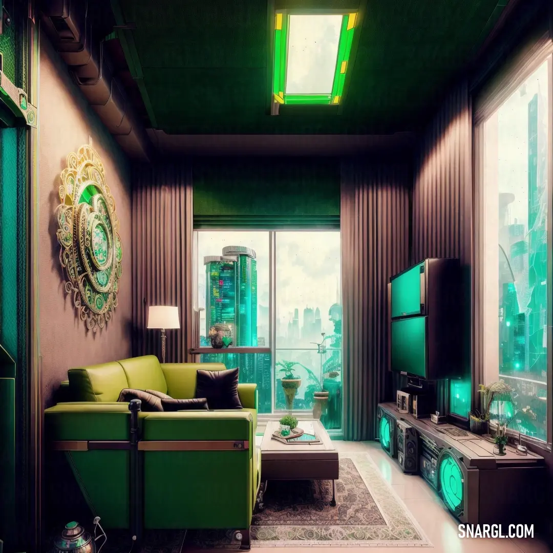
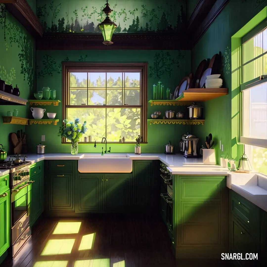
You can use chartreuse as a main color for the walls, curtains or upholstery, especially if you want to create a zippy and cheerful atmosphere.
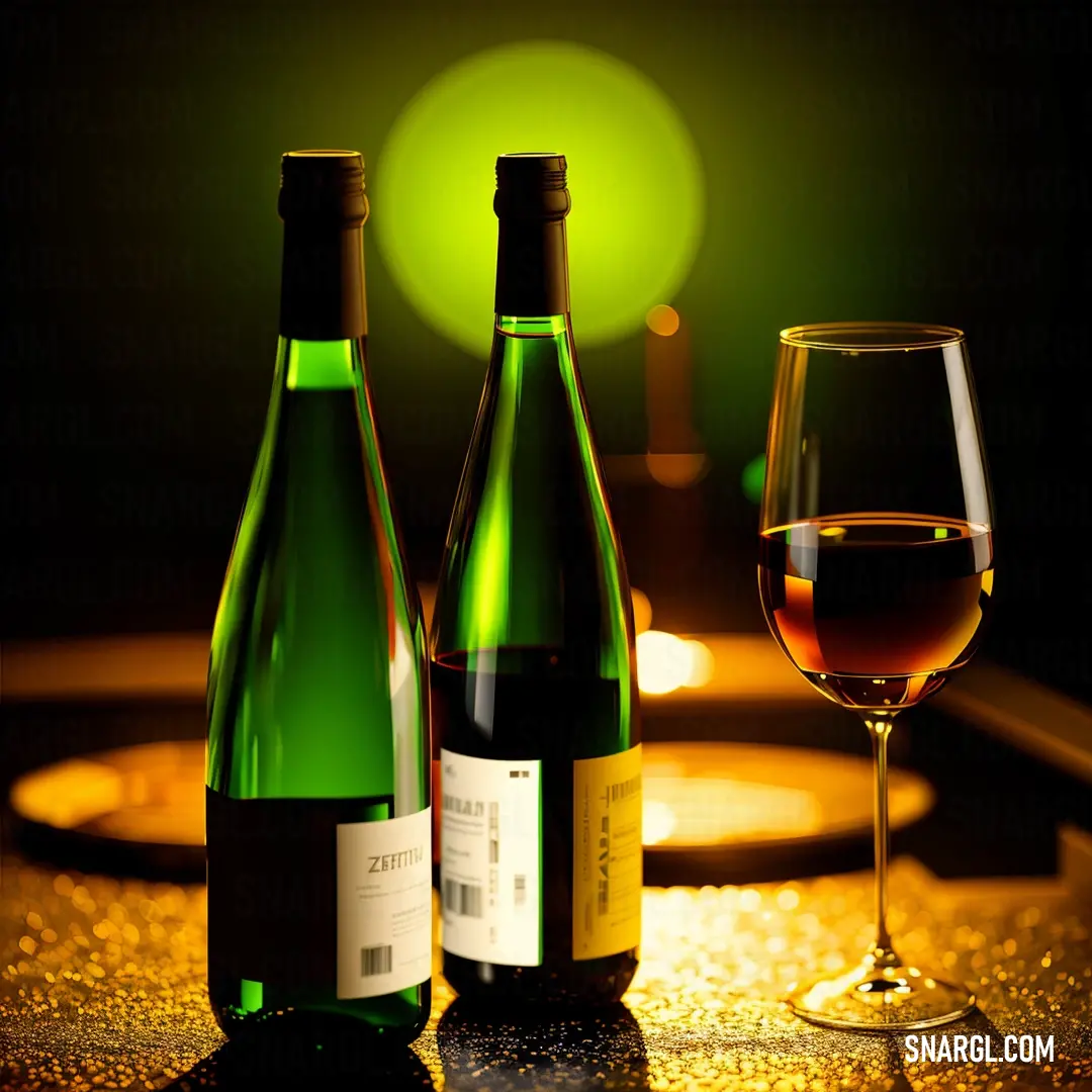
Chartreuse works well with natural light and can also create a dramatic and romantic mood in lower light or candlelight.
You can use chartreuse as an accent color for accessories, soft furnishings or furniture, especially if you want to add some energy and contrast to a neutral or dark background.
Chartreuse can pop against white, black, gray or navy and can also harmonize with other bright colors like pink, purple or turquoise.
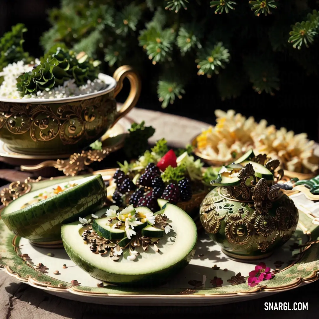
You can use chartreuse as a natural color that reflects the new growth in the garden.
Chartreuse can pair well with any floral color, such as lilac, delphinium blue, rose or sunflower yellow.
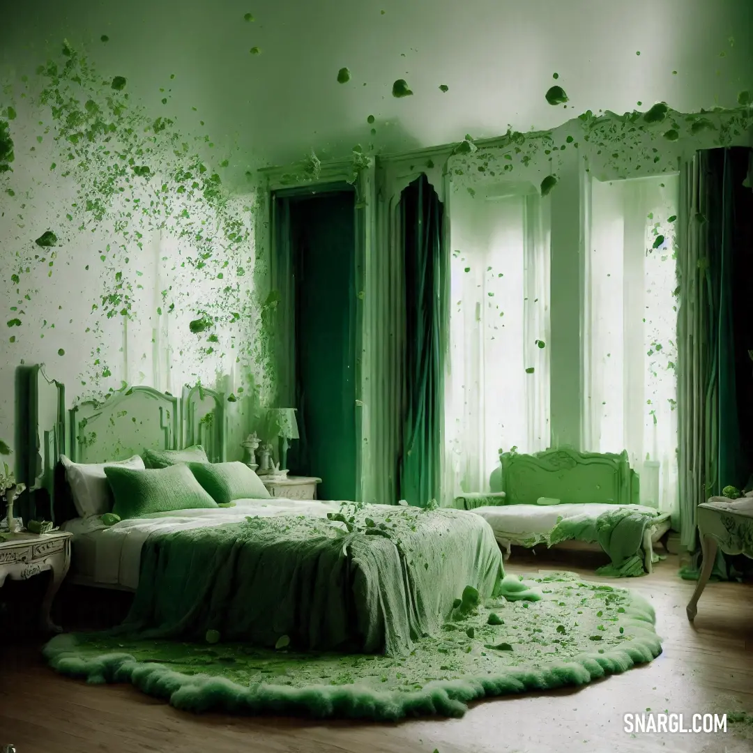
You can also use chartreuse to bring some greenery indoors with plants, flowers or botanical prints.
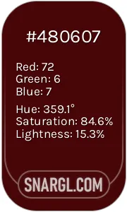
Example of the palette with the Chartreuse color
See these colors in NCS, PANTONE, RAL palettes...


 Bulgarian rose
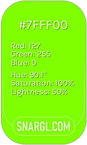 Chartreuse
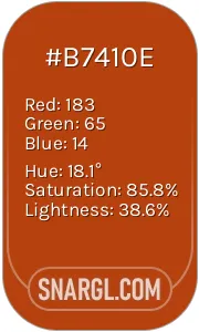 Rust
Rust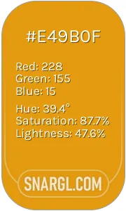 Gamboge
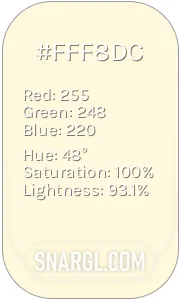 Cornsilk