Home Colors
Bittersweet

Bittersweet # Design

Parameters:
HEX Triplet:
#fe6f5e
RGB:
254, 111, 94
CMYK:
0, 56, 63, 0
HSL:
6.4°, 98.8%, 68.2%
Closest colors:
in RGB:
Pastel red
in PANTONE:
PANTONE 2030
in RAL Classic:
RAL 3022
in RAL Design:
RAL 040 60 60
in RAL Effect:
RAL 410-2
How the Bittersweet color can be used in the interior? How to decorate the garden in the Bittersweet color?
2023-05-17 Snargl 10 minutes 38 seconds
# General # Fashion # Imagination # Design

How the Bittersweet color can be used in the interior?

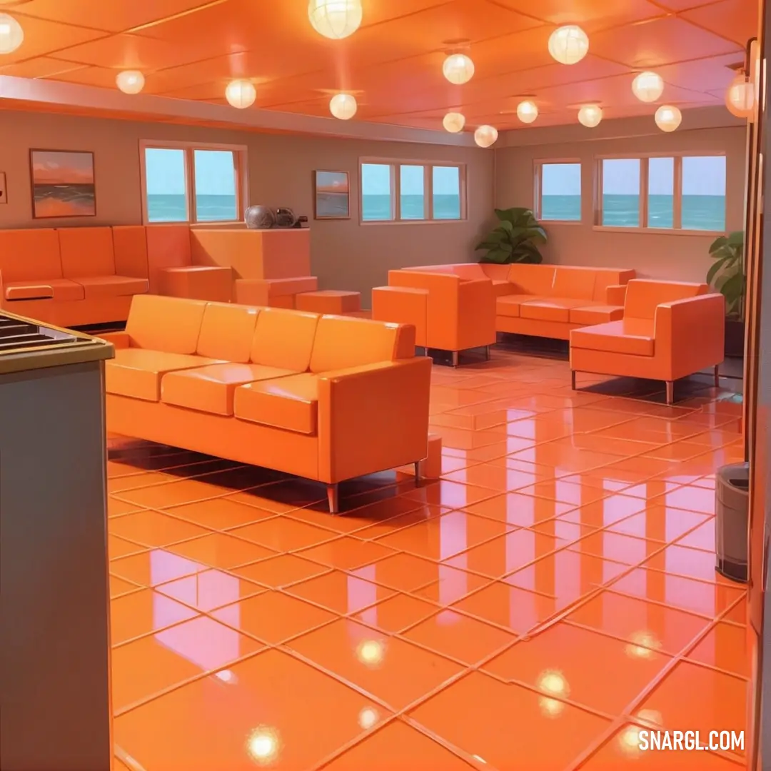
Room with orange couches and a large window with a view of the ocean in the distance and a bar in the foreground
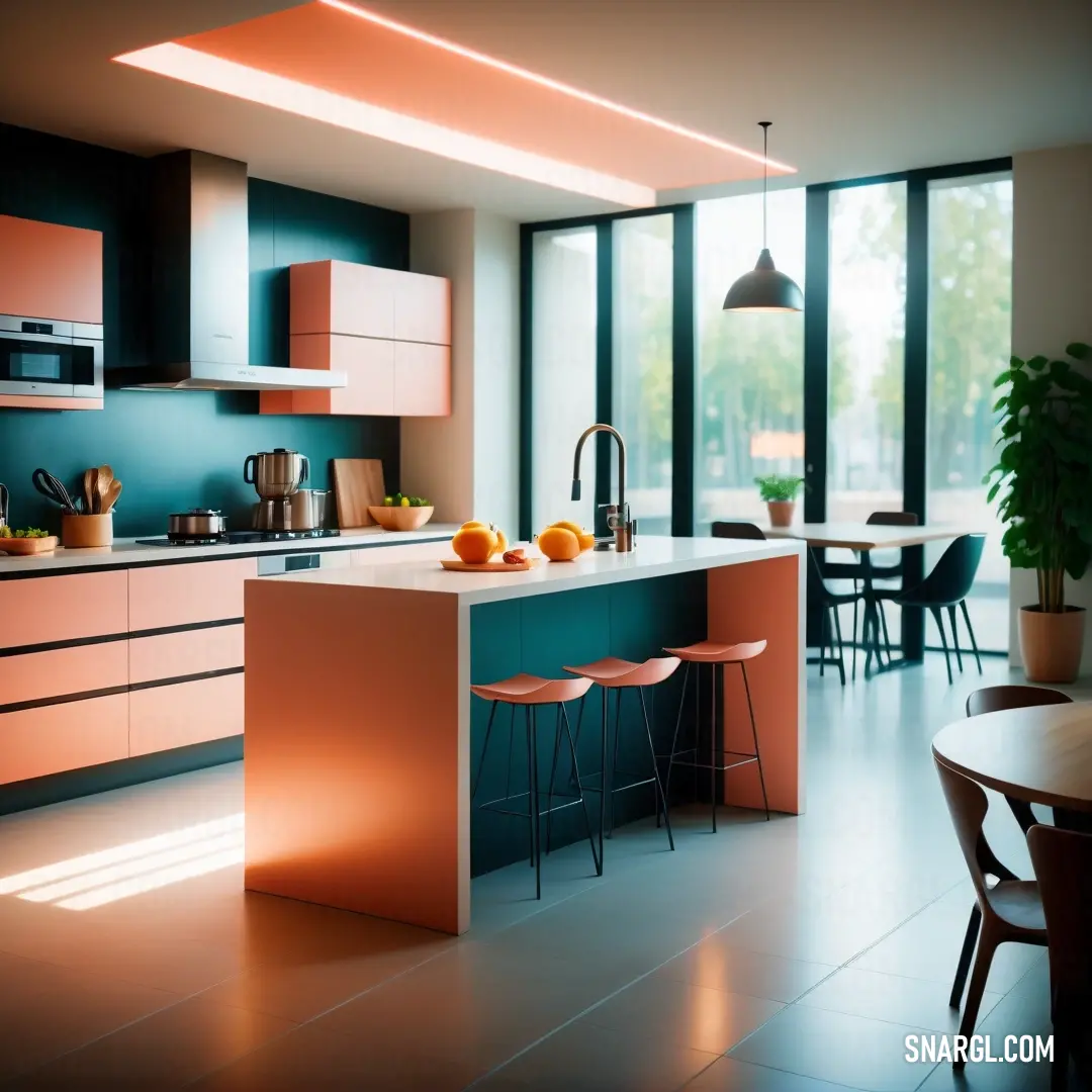
Kitchen with a table and chairs and a counter with oranges on it and a potted plant. Color RGB 254,111,94.
Bedroom with a bed and a painting on the wall above it and a painting on the wall above it. Example of #FE6F5E color.
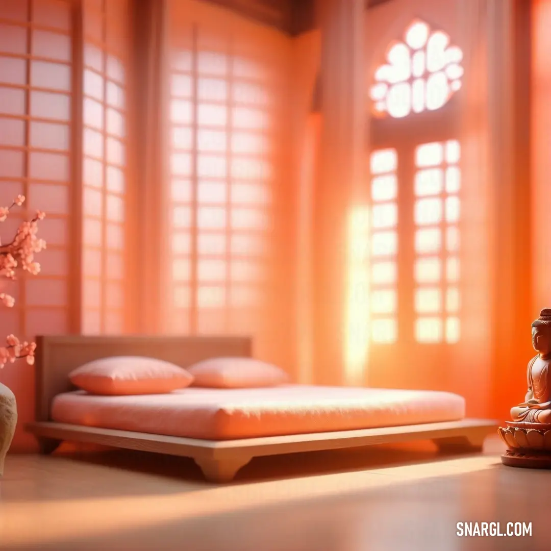
Bed in a bedroom next to a window with a buddha statue on top of it next to a vase with flowers. Example of Bittersweet color.
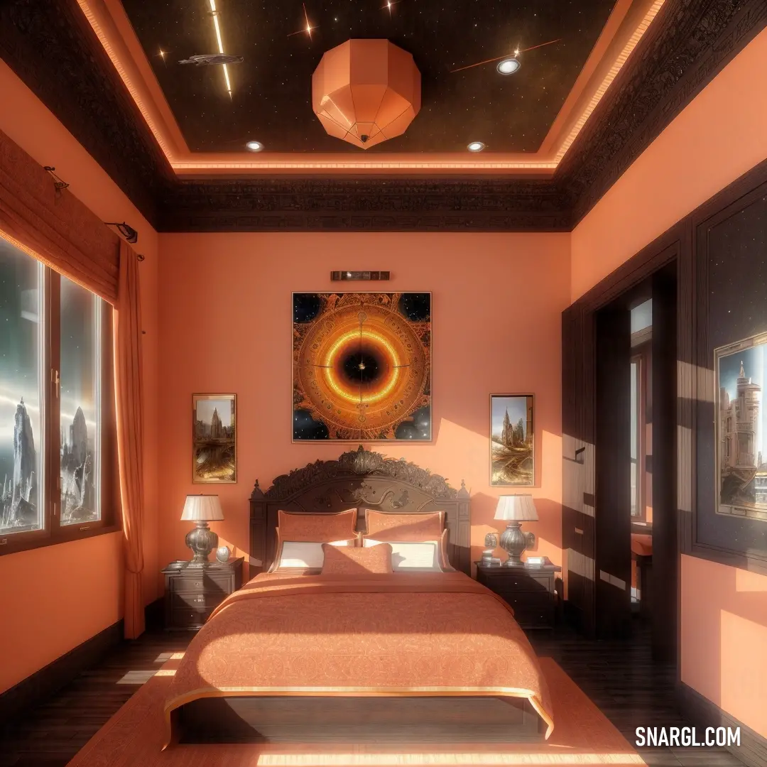
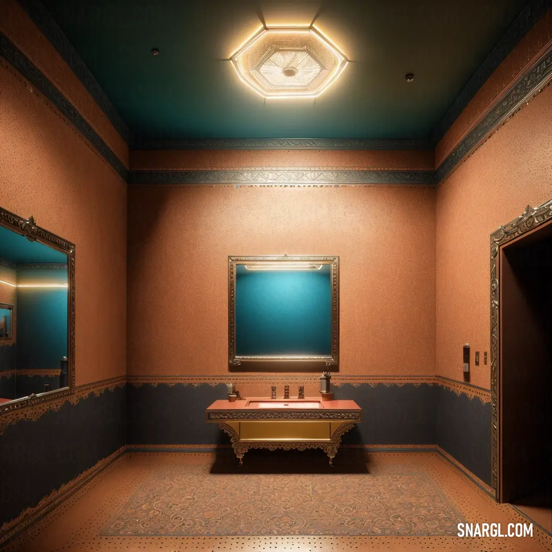
Futuristic orange room with a lot of lights and mirrors on the walls and flooring and a large mirror. Color Bittersweet.
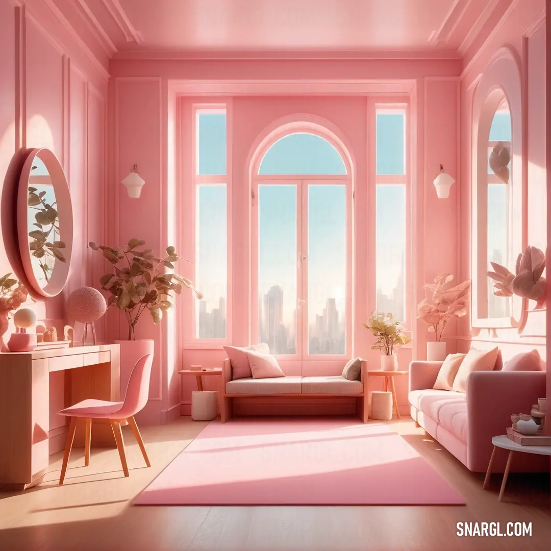
Bittersweet color example: Pink room with a pink rug and a pink couch and chair
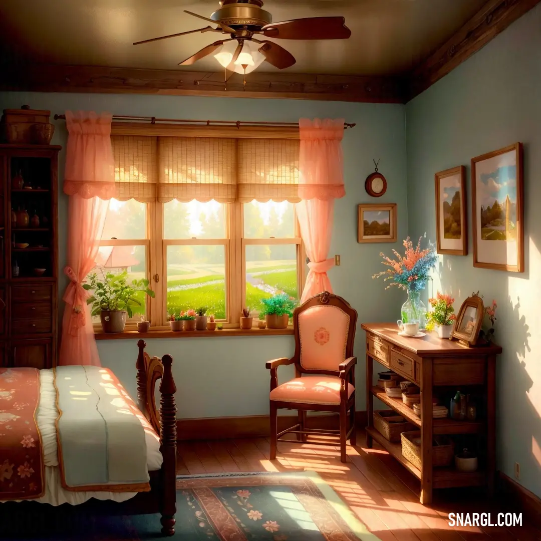
Bedroom with a bed and desk. Example of Bittersweet color.
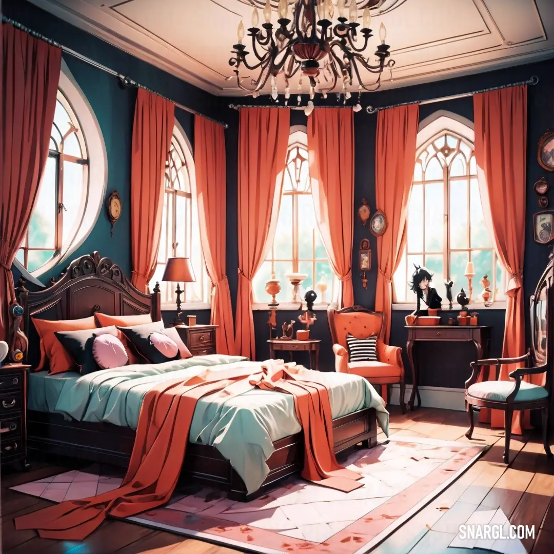
Bedroom with a bed and a chandelier. Example of CMYK 0,56,63,0 color.
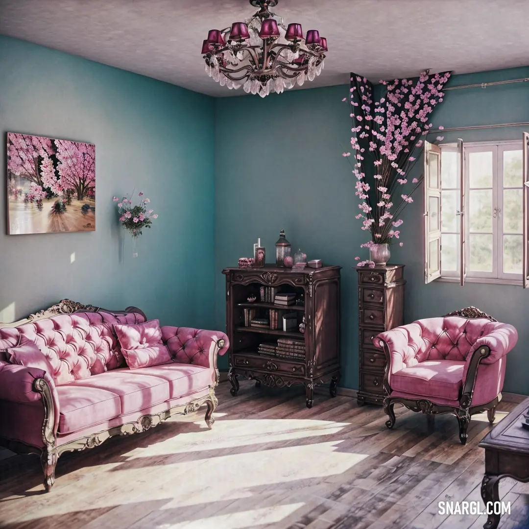
Living room with a couch, chair, and a table in it with a chandelier hanging from the ceiling
Room with a chandelier and a large window with a view of the outside of the room
Room with a desk
Kitchen with a blue refrigerator and a pink and green refrigerator freezer next to a window with a potted plant
Living room with a couch and a tv on a stand in it's center wall
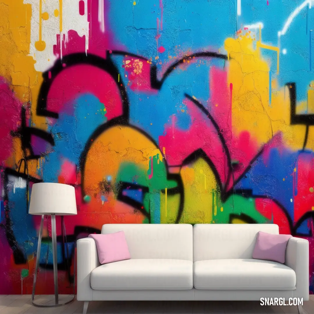
Couch in front of a colorful wall with graffiti on it's walls and a lamp next to it
Living room with a couch
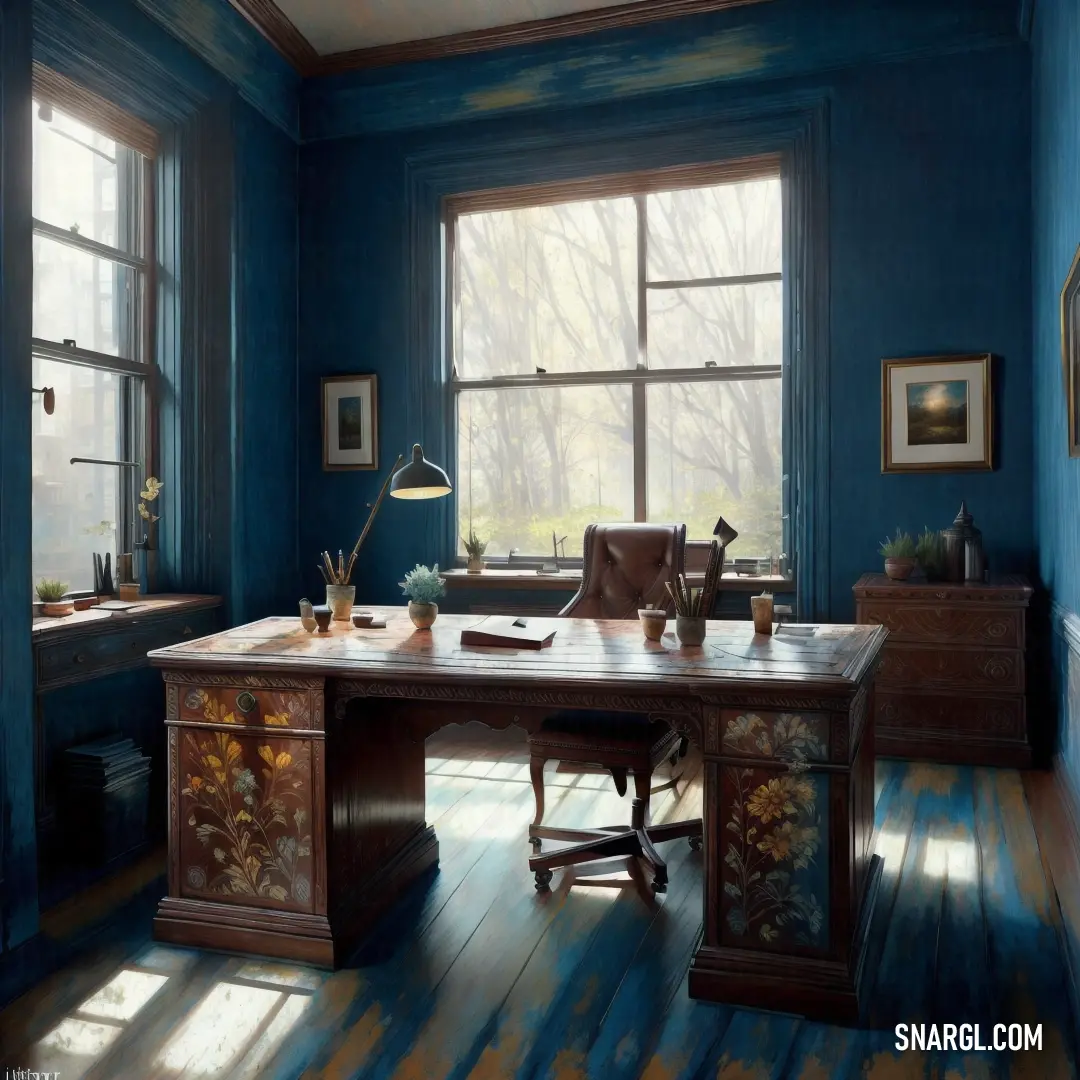
Painting of a desk in a blue room with a window and a chair in front of it with a lamp on it
Bittersweet is a subdued, soft orange color, named for berries of the bittersweet plant, also known as woody nightshade.

It is a versatile and gentle hue that can liven up interior spaces without being too overwhelming.

Here are some ways to use bittersweet color in the interior:
  • Bittersweet can create a warm and cozy atmosphere in the living room or bedroom.
    You can paint a wall or the ceiling with this color, or use it for curtains, cushions, blankets, or rugs.
    Bittersweet can also be used for furniture, such as sofas, chairs, or cabinets, to add some color and contrast to the room.

  • Bittersweet can complement various shades of blue, from sky blue to navy, turquoise to teal.
    This combination can create a fresh and vibrant look, especially in the kitchen or dining room.
    You can use bittersweet for tableware, napkins, placemats, or vases, or paint some cabinets or shelves with this color.
    Blue and bittersweet can also work well in the bathroom, for towels, shower curtains, or tiles.

  • Bittersweet can pair well with soft peach and darker oranges, creating a harmonious and soothing palette.
    This can be suitable for the nursery, the home office, or the sunroom.
    You can use bittersweet for wallpaper, lamps, pillows, or artwork, or mix and match different shades of orange for a gradient effect.

  • Bittersweet can look good with metallics, such as gold, brass, bronze, or champagne.
    This can add some elegance and glamour to the interior, especially in the hallway, the bedroom, or the living room.
    You can use bittersweet for frames, mirrors, lamps, or accessories, or contrast it with metallic accents, such as knobs, handles, or legs.

  • Bittersweet can be a great choice for seasonal or festive decorations, as it can evoke the feeling of autumn, harvest, or Halloween.
    You can use bittersweet for pumpkins, leaves, flowers, or candles, or incorporate it into wreaths, garlands, or centerpieces.
    Bittersweet is a popular decorative color because it can suit different styles, moods, and preferences.
    You can experiment with different amounts, shades, and combinations of bittersweet to find the one that works best for you and your interior.

Example of the palette with the Bittersweet color
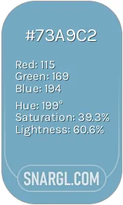
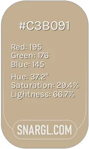
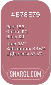
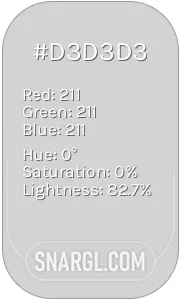
Picture with primary colors of Almond, Bittersweet, Fawn, Ghost white and Pale mauve
Top 5 color shades of the illustration. Arranged in descending order of frequency of occurrence (first - more often, last - more rare).
See these colors in NCS, PANTONE, RAL palettes...
NCS (Natural Color System)
NCS S 1505-Y50R
NCS S 1060-Y80R
NCS S 2030-Y30R
NCS S 0505-R80B
NCS S 2010-R10B
RAL Classic
RAL 1013
RAL 3022
RAL 1034
RAL 9016
RAL 7032
RAL Design
RAL 080 90 10
RAL 040 60 60
RAL 050 70 40
RAL 360 92 05
RAL 040 70 10
RAL Effect
RAL 120-5
RAL 410-2
RAL 310-3
RAL 120-2
RAL 340-1

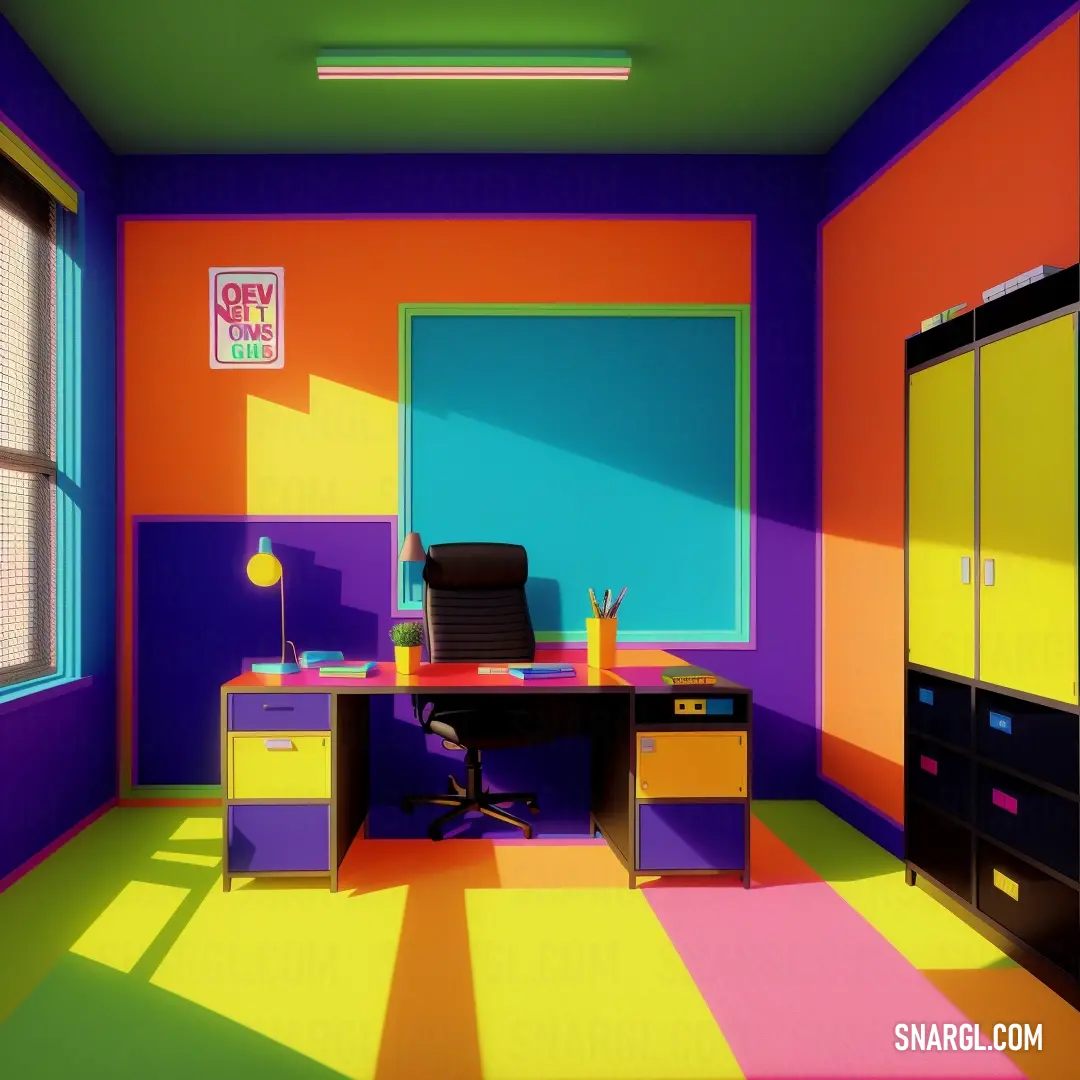
Example of the palette with the Bittersweet color
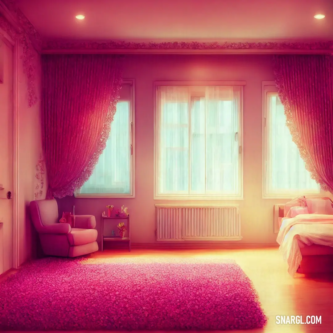
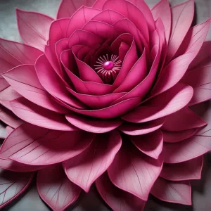
Picture with primary colors of Zinnwaldite, Bittersweet, Golden brown, Burlywood and Moonstone blue
Top 5 color shades of the illustration. Arranged in descending order of frequency of occurrence (first - more often, last - more rare).
See these colors in NCS, PANTONE, RAL palettes...
NCS (Natural Color System)
NCS S 8010-Y30R
NCS S 1060-Y80R
NCS S 4040-Y10R
NCS S 2020-Y30R
NCS S 1550-R80B
RAL Classic
RAL 8022
RAL 3022
RAL 8001
RAL 1001
RAL 6034
RAL Design
RAL 000 15 00
RAL 040 60 60
RAL 075 50 58
RAL 050 70 30
RAL 200 70 25
RAL Effect
RAL 790-5
RAL 410-2
RAL 360-5
RAL 310-3
RAL 680-1

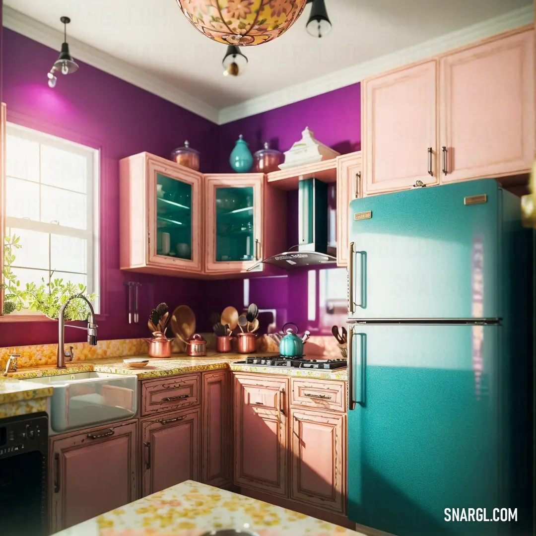
Example of the palette with the Bittersweet color
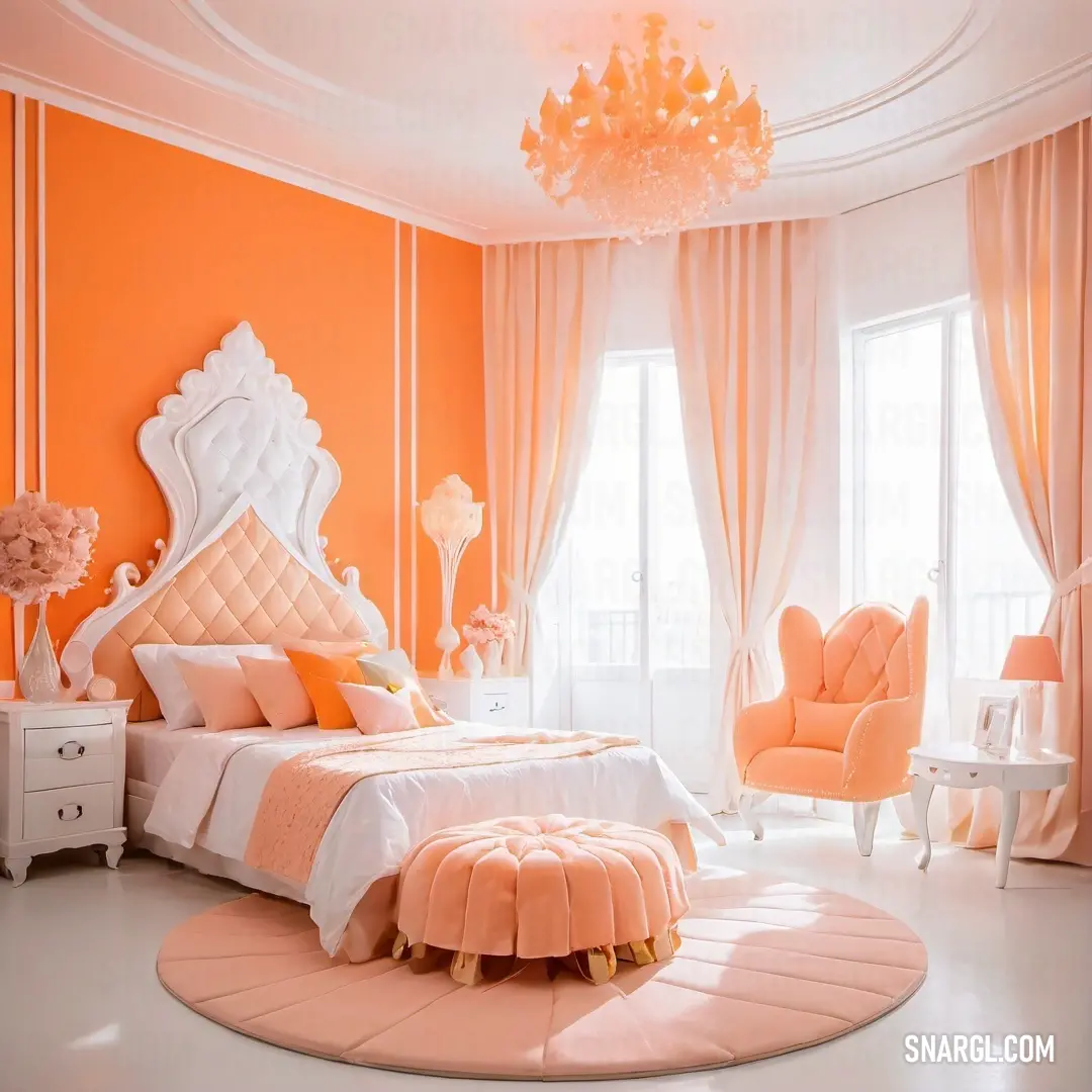
Picture with primary colors of Khaki, Rose gold, Light gray, Peach-yellow and Bright maroon
Top 5 color shades of the illustration. Arranged in descending order of frequency of occurrence (first - more often, last - more rare).
See these colors in NCS, PANTONE, RAL palettes...
RAL Classic
RAL 1000
RAL 3012
RAL 7047
RAL 1015
RAL 3027
RAL Design
RAL 060 70 20
RAL 360 50 35
RAL 000 85 00
RAL 085 90 30
RAL 010 40 53
RAL Effect
RAL 140-M
RAL 330-1
RAL 870-1
RAL 140-1
RAL 440-3
Author:

How to decorate the garden in the Bittersweet color?

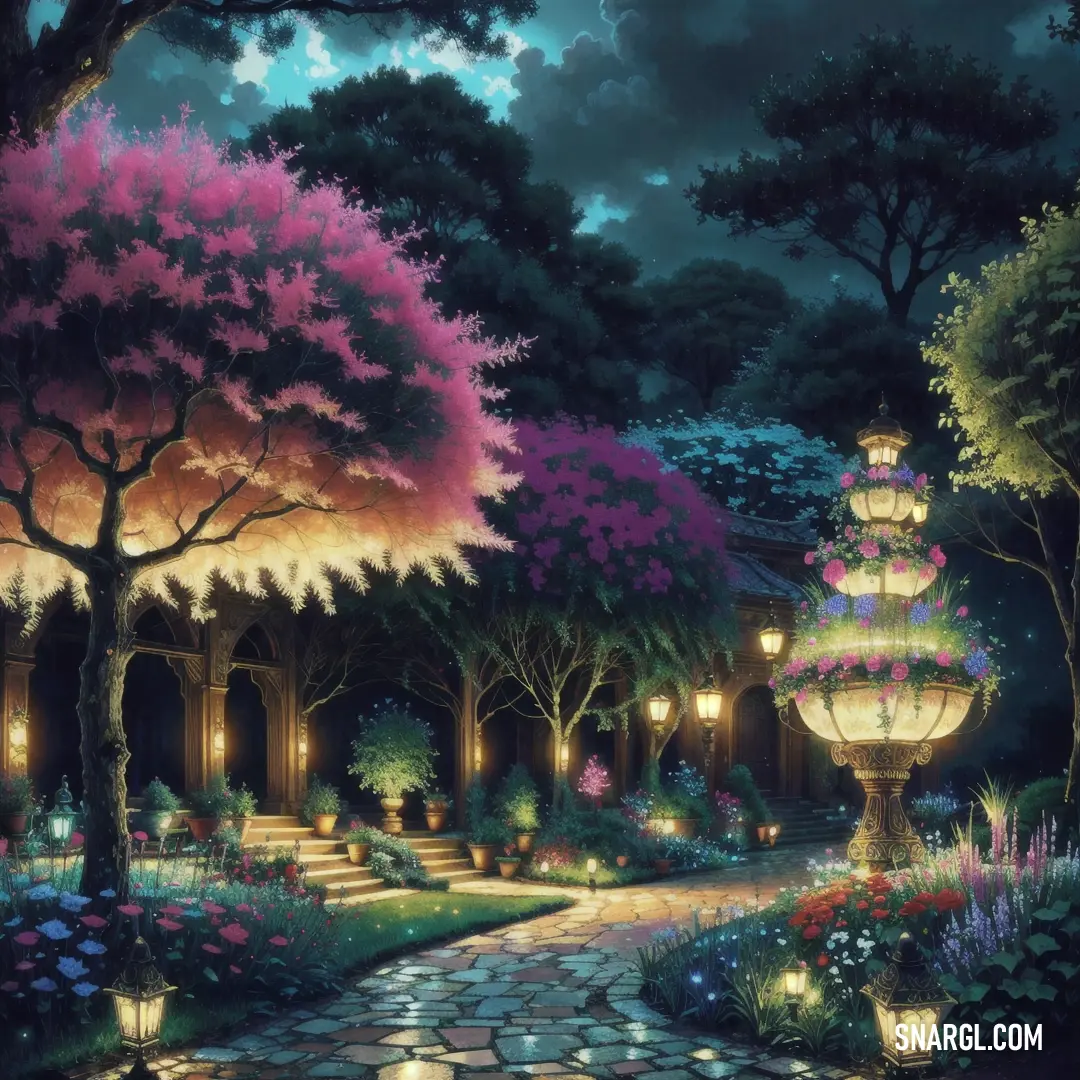
Painting of a garden with a pathway and lanterns lit up at night with a full moon in the sky
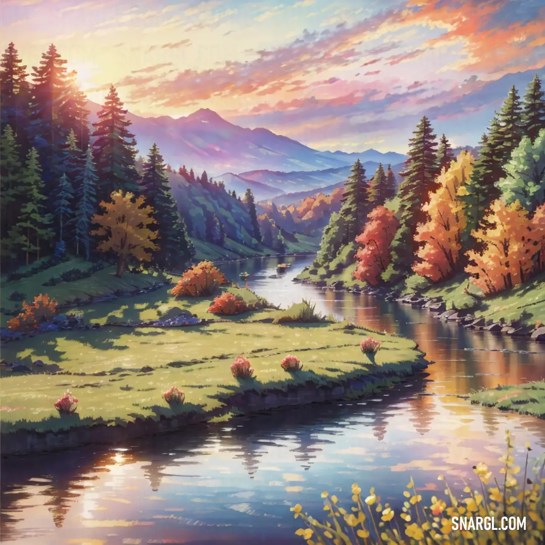
Painting of a beautiful landscape with a river and mountains in the background with flowers and trees in the foreground
House with a lot of windows and a driveway with a puddle in front of it and a sunset in the background
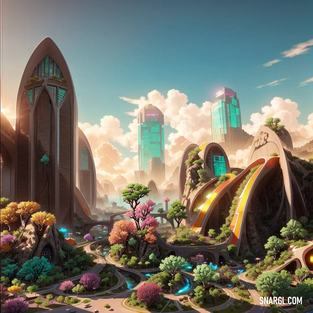
Futuristic city with a slide in the middle of it and a lot of trees and bushes around it
Bittersweet is a soft orange color, named for the berries of the bittersweet plant, also known as woody nightshade.

It is a warm and cozy color that can add some charm and character to your garden.

Here are some ideas on how to decorate your garden in the bittersweet color:
  • Plant some flowers that have bittersweet-colored petals, such as marigolds, zinnias, dahlias, or cosmos.
    You can also mix them with other colors, such as purple, yellow, or white, to create a vibrant contrast.

  • Paint some garden furniture, such as chairs, tables, or benches, in the bittersweet color.
    Add some cushions or throws in the same or complementary colors to make them more comfortable and inviting.

  • Use some bittersweet-colored pots, planters, or containers to display your plants or herbs.
    You can also paint some terracotta pots in the bittersweet color to give them a new look.

  • Hang some bittersweet-colored lanterns, fairy lights, or candles to create a cozy and romantic atmosphere in your garden.
    Use some bittersweet-colored ribbons, flags, or banners to add some festive flair.

  • Create some bittersweet-colored art or sculptures to decorate your garden.
    You can use some natural materials, such as wood, stone, or metal, or some recycled items, such as bottles, cans, or tires, to make some unique and creative pieces.

Example of the palette with the Bittersweet color

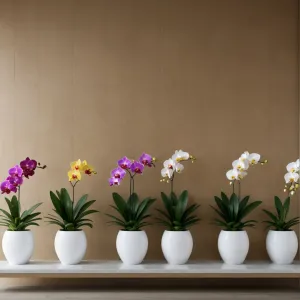
Picture with primary colors of Bittersweet, Onyx, Banana Mania, Sinopia and Dark lava
Top 5 color shades of the illustration. Arranged in descending order of frequency of occurrence (first - more often, last - more rare).
See these colors in NCS, PANTONE, RAL palettes...
RAL Classic
RAL 3022
RAL 9005
RAL 1015
RAL 2002
RAL 8014
RAL Design
RAL 040 60 60
RAL 170 20 20
RAL 075 90 20
RAL 050 50 70
RAL 050 20 10

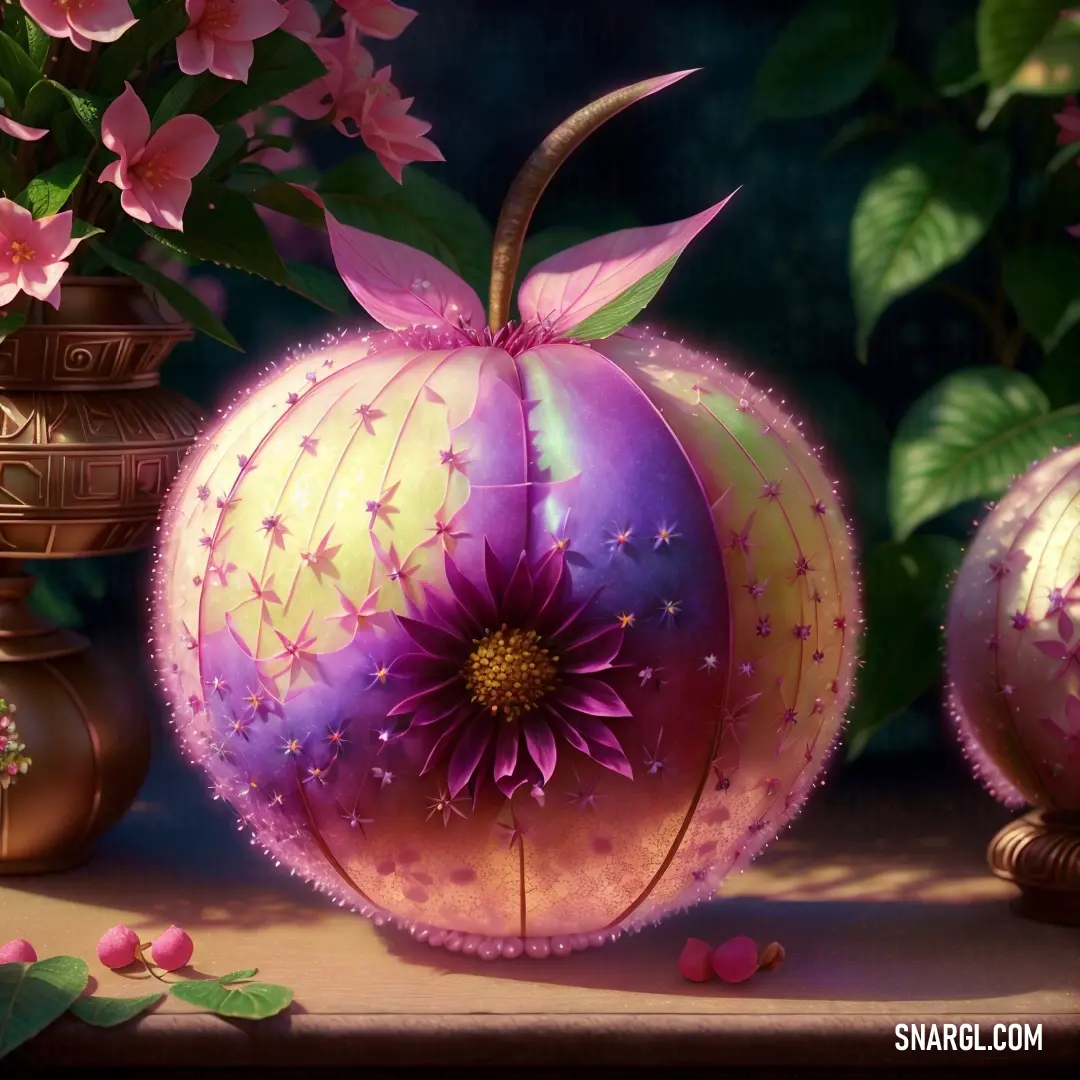
Example of the palette with the Bittersweet color
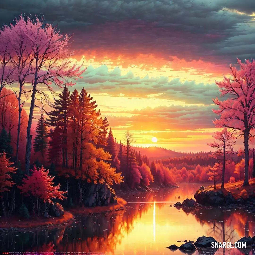
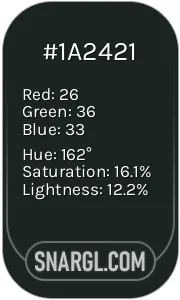
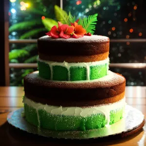
Picture with primary colors of Dark jungle green, Bittersweet, Byzantium, Light Thulian pink and Deep lilac
Top 5 color shades of the illustration. Arranged in descending order of frequency of occurrence (first - more often, last - more rare).
See these colors in NCS, PANTONE, RAL palettes...
NCS (Natural Color System)
NCS S 8005-B80G
NCS S 1060-Y80R
NCS S 4040-R30B
NCS S 1040-R20B
NCS S 3040-R50B
RAL Classic
RAL 8022
RAL 3022
RAL 4006
RAL 3015
RAL 4005
RAL Design
RAL 160 20 20
RAL 040 60 60
RAL 330 30 40
RAL 350 70 30
RAL 310 50 40
Author:

Continue browsing posts in category "Colors"
NEXT POST
Black
2
0
8
109
0
Black
More palettes with the color Bittersweet:
You may find these posts interesting:
Urobilin
4
0
2
46
0
Urobilin
Asparagus
4
1
7
88
0
Asparagus
Medium purple
1
0
4
53
0
Medium purple
Ghost white
2
1
3
22
1
Ghost white
Rose taupe
1
0
1
15
0
Rose taupe
Heliotrope
1
0
4
36
0
Heliotrope
Unmellow Yellow
1
0
5
51
0
Unmellow Yellow
Medium aquamarine
1
0
2
48
0
Medium aquamarine
Home
Terms of Service
Contact Us

© 2023 Snargl.com