Bittersweet
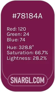
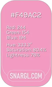
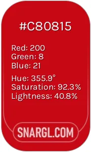
Closest colors:
in RAL Design:
RAL 040 60 60 2024-08-23 Snargl 11:50
What color is Bittersweet?
Bittersweet is a color name that refers to a soft red hue with a hint of orange.
The color is named after the berries of the bittersweet plant, also known as woody nightshade, which have a similar appearance.
Bittersweet is not a pure color, but a mixture of red, green and blue light.
The hexadecimal code for bittersweet is #FE6F5E, which means it has 99.61% red, 43.53% green and 36.86% blue in the RGB color model.
In the CMYK color model, which is used for printing, bittersweet has 0% cyan, 56% magenta, 63% yellow and 0% black.
Bittersweet has a hue angle of 6.4 degrees, a saturation of 98.8% and a lightness of 68.2% in the HSL color model.
It is a warm color that can create a cozy and inviting atmosphere.
This color can also evoke feelings of passion, excitement and energy.
However, too much bittersweet can be overwhelming and aggressive, so it should be balanced with cooler or neutral colors.
This color can symbolize love, romance, joy, optimism, enthusiasm, creativity, courage, adventure, autumn, Halloween, Thanksgiving and more.
It can also represent the contrast between happiness and sadness, or the balance between sweet and bitter.
Bittersweet is a color that can capture the complexity and richness of life.
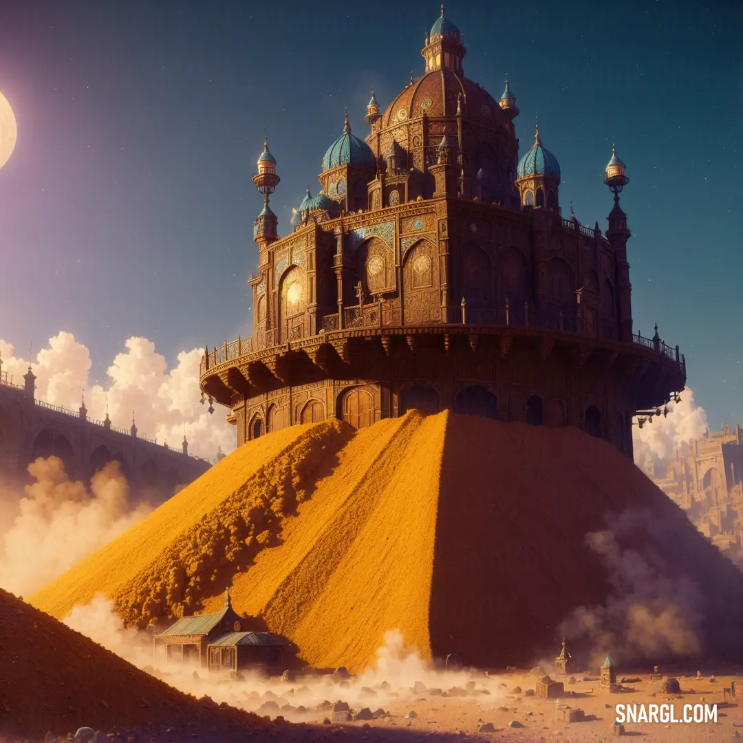
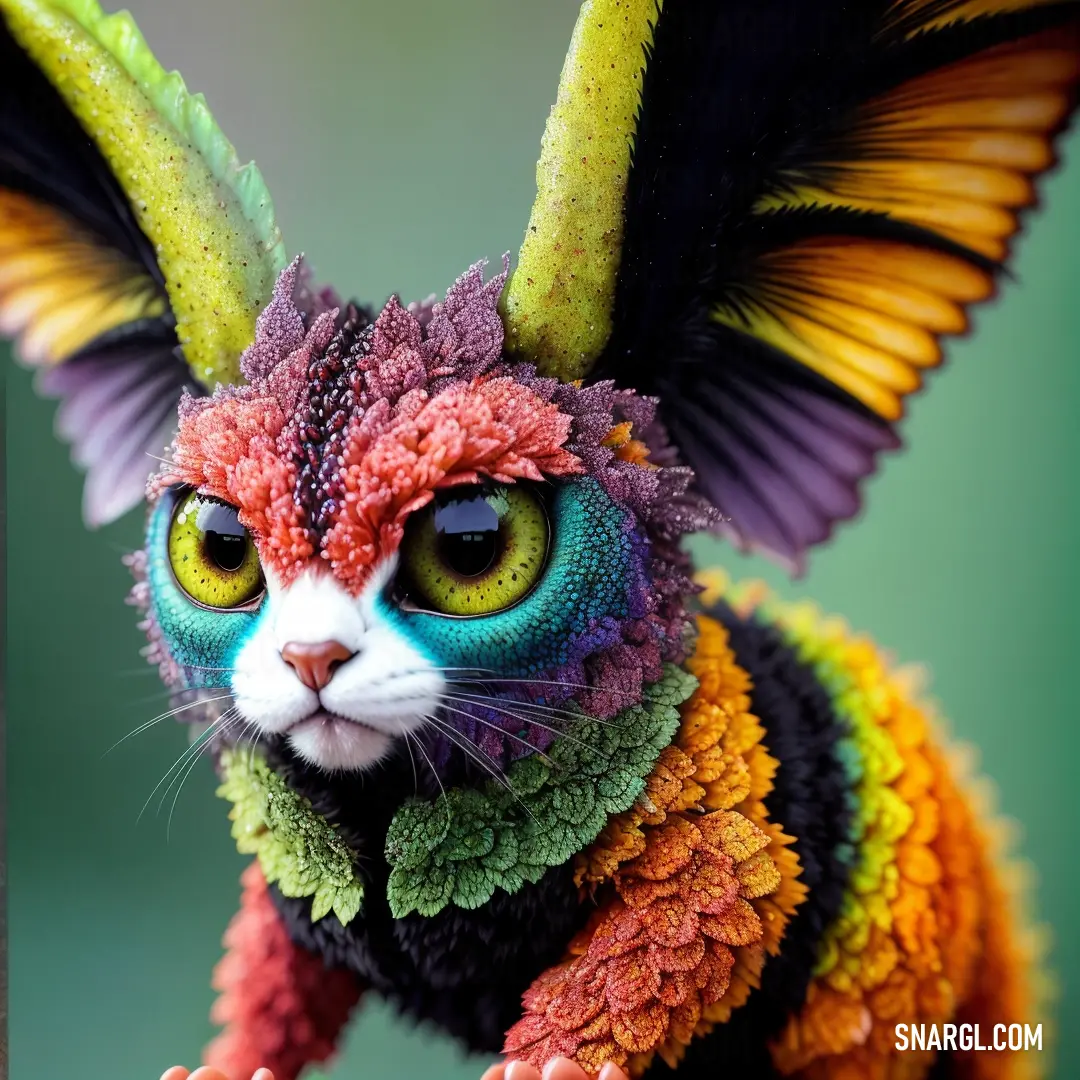
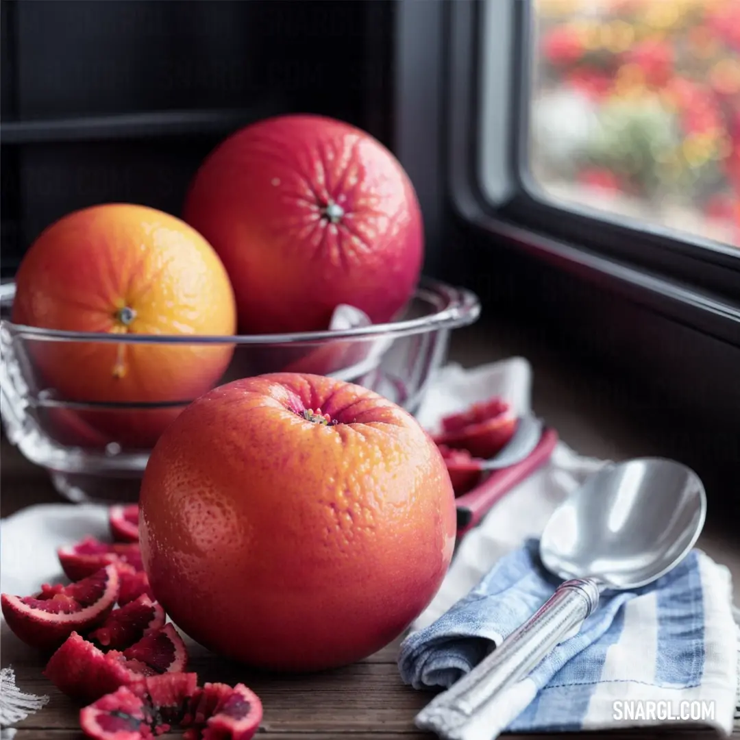
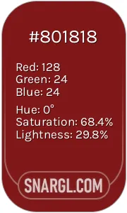
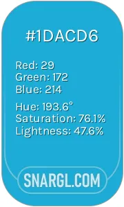
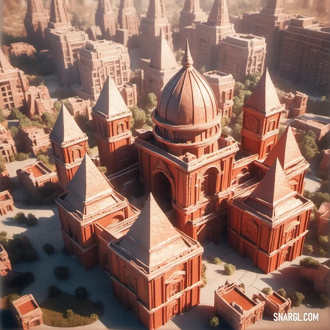
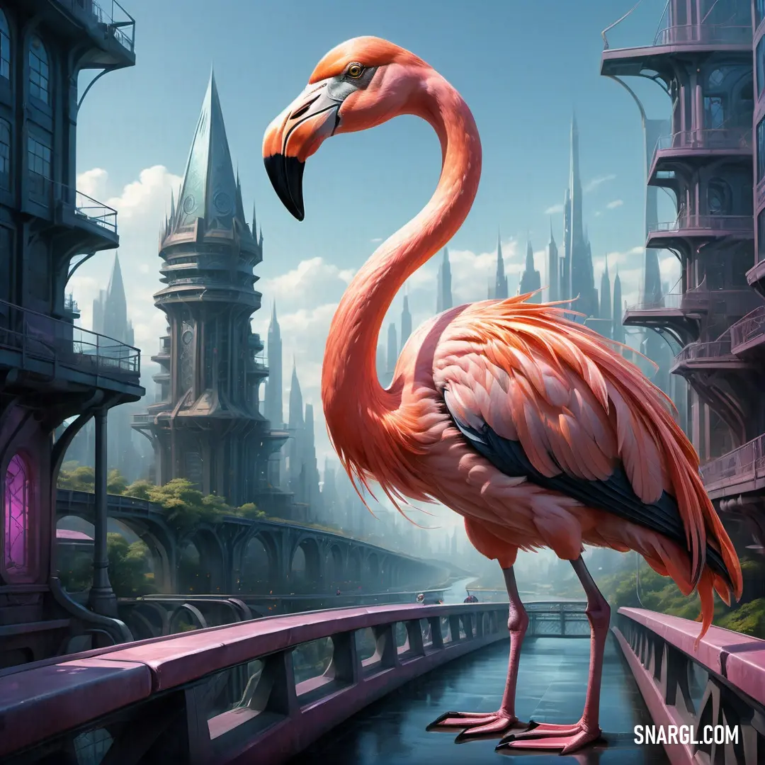
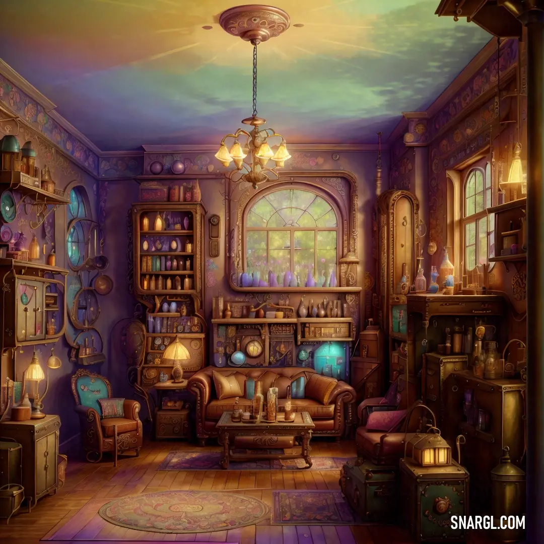
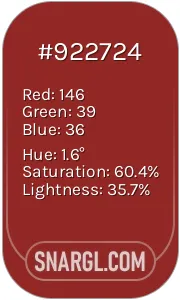
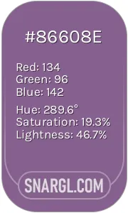
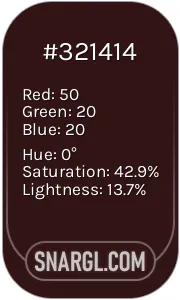
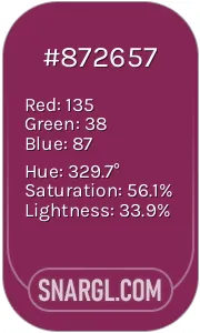
Example of the palette with the Bittersweet color

Top 5 color shades of the illustration. Arranged in descending order of frequency of occurrence (first - more often, last - more rare).
See these colors in NCS, PANTONE, RAL palettes...
NCS (Natural Color System)
Author:
Douglas.
Snargl Content MakerWhat are the examples of Bittersweet color in life?
Bittersweet is the color of a sunset
That paints the sky with beauty and regret
Bittersweet is the color of a rose
That blooms with love and thorns that hurt
Bittersweet is the color of a smile
That hides the pain and sorrow inside
Bittersweet is the color of a tear
That falls with joy and sadness mixed
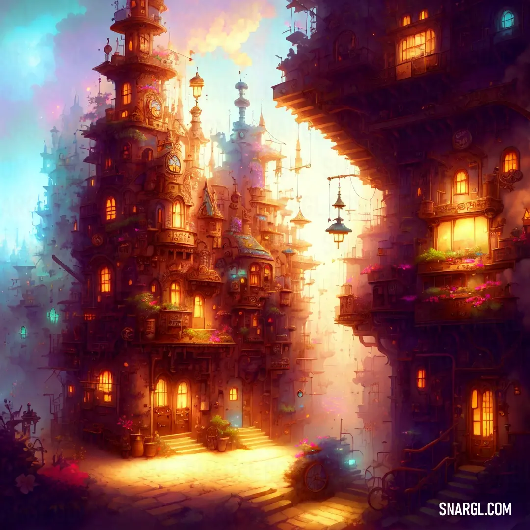
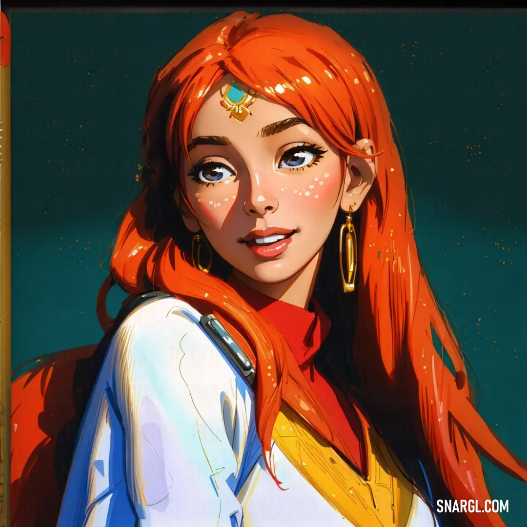
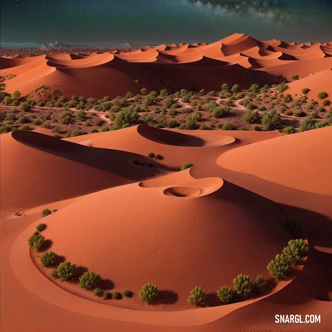
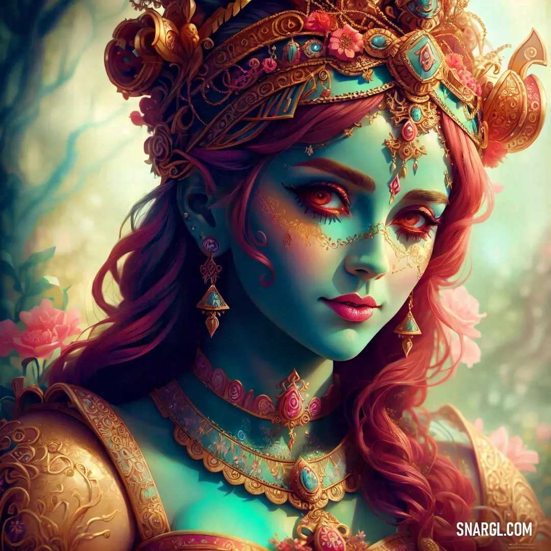
Example of the palette with the Bittersweet color
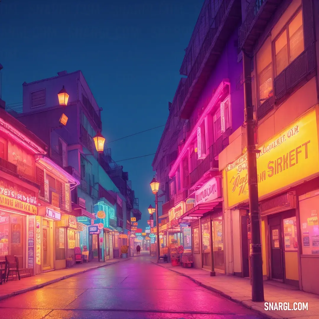
Top 5 color shades of the illustration. Arranged in descending order of frequency of occurrence (first - more often, last - more rare).
See these colors in NCS, PANTONE, RAL palettes...
NCS (Natural Color System)
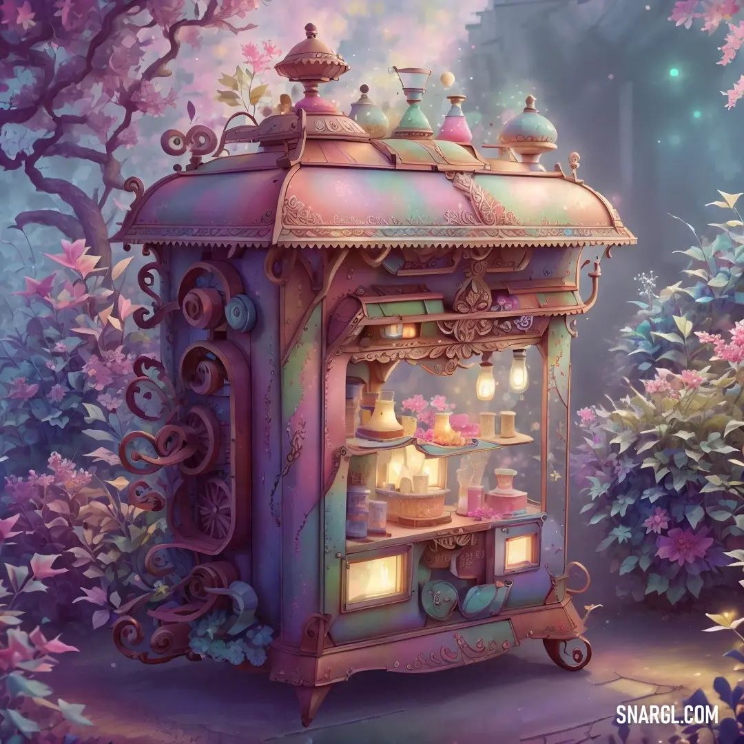
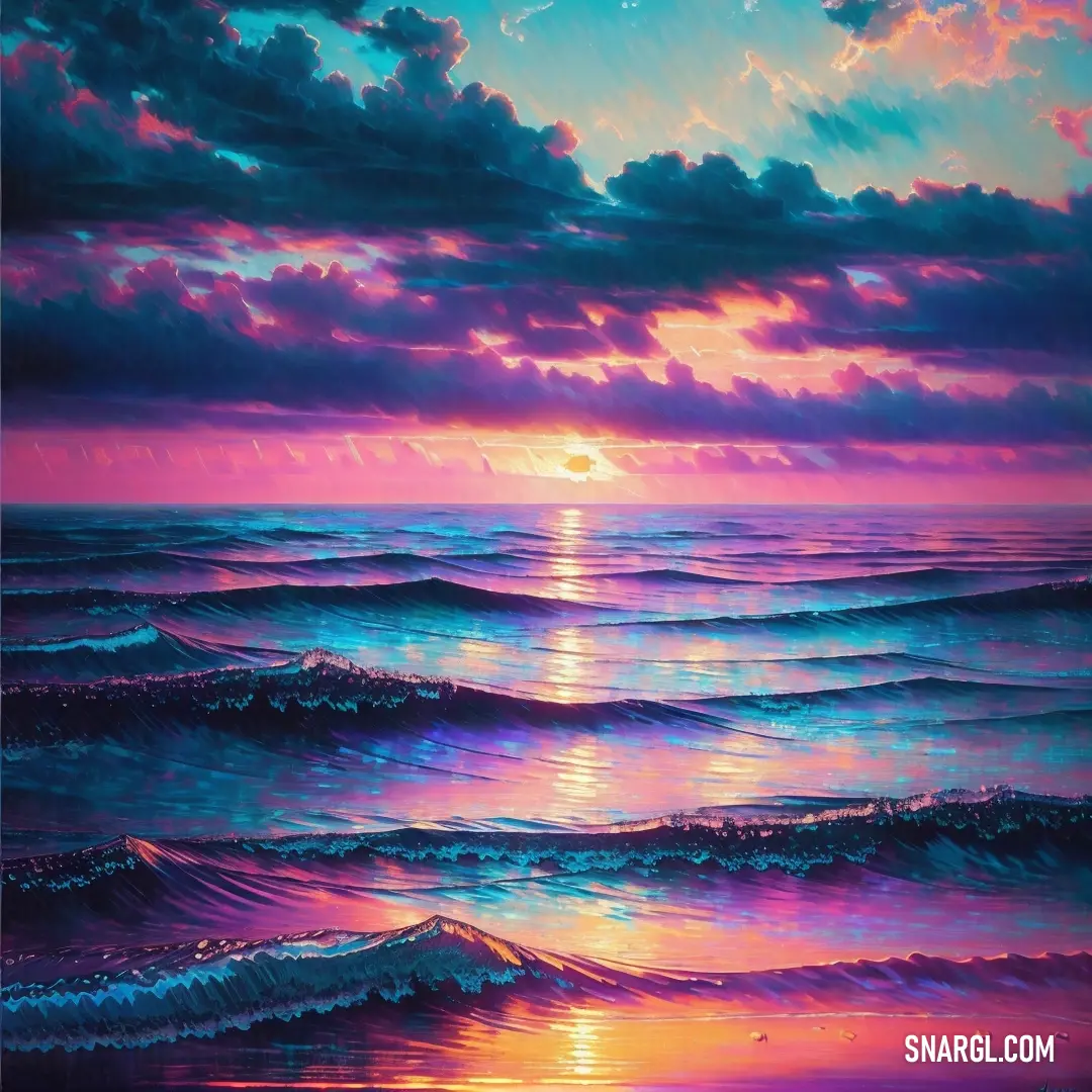
Example of the palette with the Bittersweet color

Top 5 color shades of the illustration. Arranged in descending order of frequency of occurrence (first - more often, last - more rare).
See these colors in NCS, PANTONE, RAL palettes...
NCS (Natural Color System)
Author:
Natasha.
AI Artist, Snargl Content MakerWhat looks best in Bittersweet?
Bittersweet can be a versatile color for different purposes and occasions.
This color can create a cozy and inviting atmosphere in interior design, especially when paired with neutrals or earthy tones.
It can also be used as an accent color to add some warmth and energy to a space.
Bittersweet can also be a flattering color for clothing and accessories, as it can complement many skin tones and hair colors.
It can be worn as a solid color or mixed with other colors to create different effects.
For example, bittersweet can look elegant and sophisticated with black, navy, or gray; cheerful and playful with yellow, green, or turquoise; or romantic and feminine with pink, purple, or coral.
Bittersweet can also be a great color for creative projects, such as painting, drawing, or crafting.
This color can be used to create realistic or abstract images of nature, such as flowers, fruits, or sunsets.
It can also be used to express emotions, such as passion, joy, or nostalgia.
Bittersweet is a color that can suit many tastes and moods.
Example of the palette with the Bittersweet color
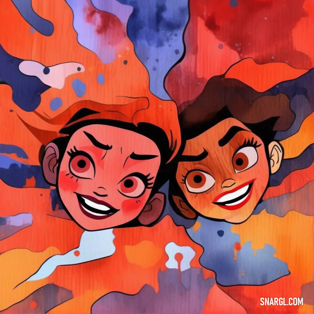
Top 5 color shades of the illustration. Arranged in descending order of frequency of occurrence (first - more often, last - more rare).
See these colors in NCS, PANTONE, RAL palettes...
NCS (Natural Color System)
Example of the palette with the Bittersweet color
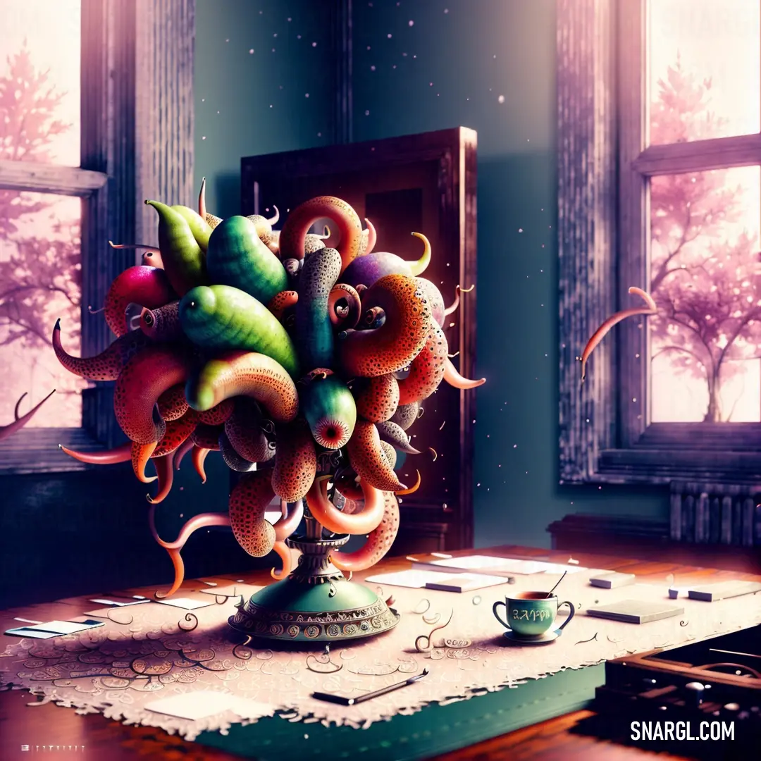
Top 5 color shades of the illustration. Arranged in descending order of frequency of occurrence (first - more often, last - more rare).
See these colors in NCS, PANTONE, RAL palettes...
NCS (Natural Color System)
Example of the palette with the Bittersweet color
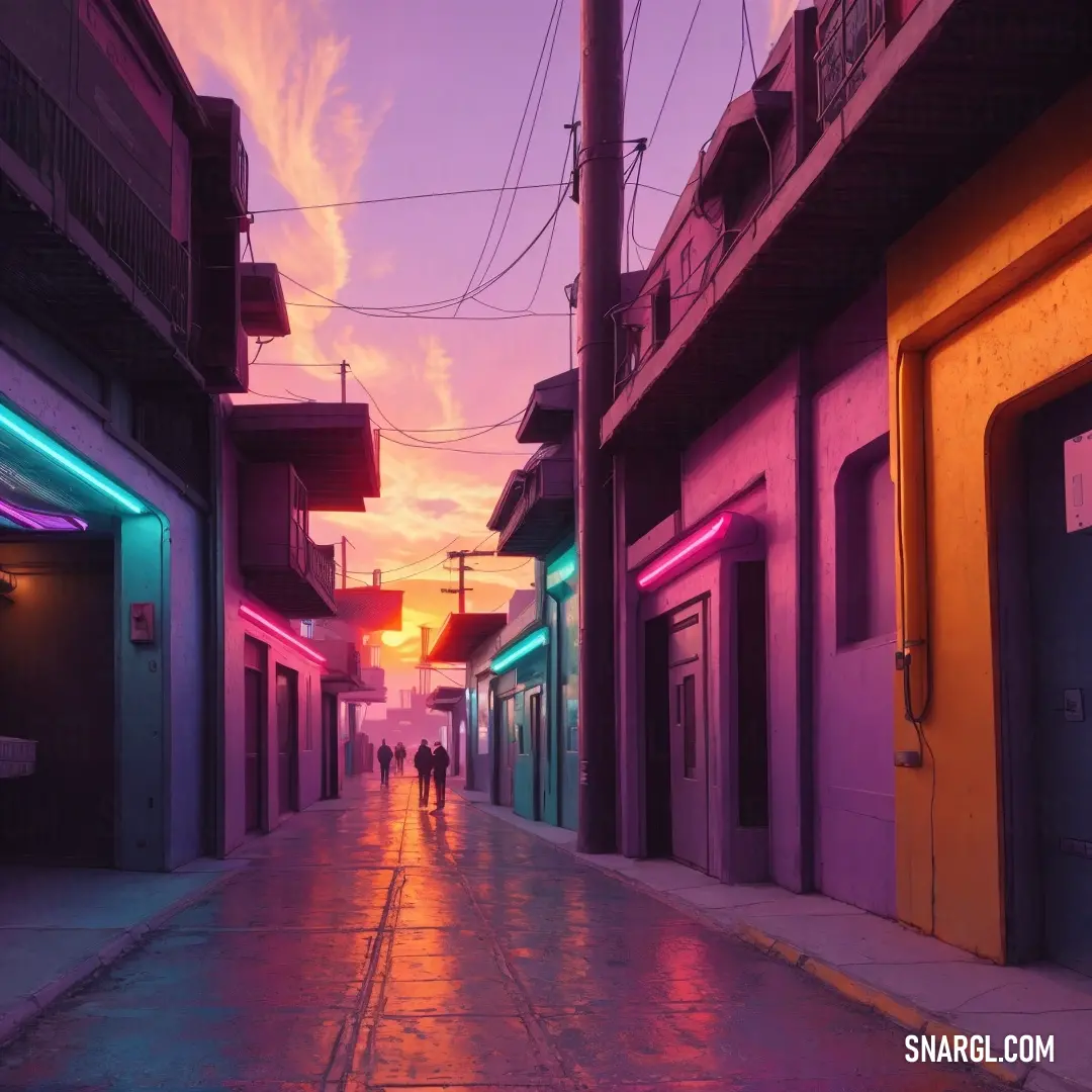
Top 5 color shades of the illustration. Arranged in descending order of frequency of occurrence (first - more often, last - more rare).
See these colors in NCS, PANTONE, RAL palettes...
NCS (Natural Color System)
Author:
Natasha.
AI Artist, Snargl Content MakerFunny stories about the 'Bittersweet'
Bittersweet Adventures: The Tale of Amir and Raphael
In a far away place, in the quaint coastal town of Seabreeze, where the ocean's whispers mingled with the laughter of its inhabitants, lived a fisherman named Amir Westwood. Amir was known for his rugged charm, his deep love for the sea, and his peculiar fascination with colors. His favorite color was "Bittersweet," a vibrant hue that danced between orange and pink, evoking both joy and nostalgia.
One sunny morning, as Amir prepared his boat for a day of fishing, he noticed a commotion at the town's pier. Curious, he wandered over and found a crowd gathered around a striking figure. It was Raphael Jacobs, a top model whose presence seemed almost otherworldly in the humble town. Raphael was in Seabreeze for a photoshoot, and his arrival had caused quite a stir.
Raphael, with his impeccable fashion sense and magnetic personality, was immediately drawn to the colorful fishing nets and boats. He approached Amir, intrigued by the fisherman's unique sense of style. Amir's boat, painted in shades of Bittersweet, stood out against the azure backdrop of the sea.
"Your boat is stunning," Raphael remarked, his eyes sparkling with genuine admiration. "I've never seen anything quite like it."
Amir smiled, his weathered face lighting up. "Thank you. Bittersweet is a special color to me. It reminds me of the sunsets over the ocean and the bittersweet memories of my childhood."
Raphael was captivated by Amir's story and the way he spoke about colors with such passion. An idea began to form in his mind. "How would you feel about collaborating on a project? I think we could create something truly unique using Bittersweet as our inspiration."
Amir was taken aback but excited by the prospect. He had never imagined working with a top model, let alone on a design project. "I'd love to. What do you have in mind?"
Over the next few weeks, Amir and Raphael worked together, blending their worlds of fishing and fashion. They decided to design a line of eco-friendly fishing gear and accessories, all featuring the Bittersweet color. The collection included everything from fishing nets and tackle boxes to stylish waterproof jackets and hats.
The project was a labor of love, with Amir sharing his knowledge of the sea and Raphael bringing his flair for design. They experimented with different materials, ensuring that their products were not only beautiful but also sustainable. The Bittersweet color became a symbol of their collaboration, representing the perfect blend of their contrasting worlds.
As the launch date approached, the town of Seabreeze buzzed with anticipation. The local community had watched Amir and Raphael's partnership blossom and were eager to see the final results. The grand unveiling took place at the pier, where it all began.
The collection was a resounding success. The vibrant Bittersweet color caught everyone's eye, and the innovative designs impressed even the most seasoned fishermen. The eco-friendly aspect of the products resonated with the environmentally conscious crowd, and soon, orders began pouring in from all over the world.
Amir and Raphael's collaboration became the talk of the town, and their friendship grew stronger with each passing day. They had created something truly special, a testament to the power of creativity and the magic that happens when two seemingly different worlds collide.
In the end, the Bittersweet color not only brought Amir and Raphael together but also transformed their lives in ways they could never have imagined. It was a reminder that sometimes, the most unexpected partnerships can lead to the most beautiful and surprising outcomes.
Continue browsing posts in category "Colors"
More palettes with the color Bittersweet:
You may find these posts interesting: