Home Colors
Bistre

Bistre

Parameters:
HEX Triplet:
#3d2b1f
RGB:
61, 43, 31
CMYK:
0, 30, 49, 76
HSL:
24°, 32.6%, 18%
Closest colors:
in RGB:
Cafe noir
in PANTONE:
PANTONE 7596
in RAL Classic:
RAL 3007
in RAL Design:
RAL 080 20 10
in RAL Effect:
RAL 790-5
What color is Bistre? What are the examples of Bistre color in life? What looks best in Bistre? The Bistre Mystery: Anna Nova and Professor Vivienne Goowanni's Colorful Adventure
2024-08-23 Snargl 10:38
# General # Fashion # Imagination # Design

What color is Bistre?

Street with a light on and a building with a clock on it at sunset or dawn with a cloudy sky. Example of #3D2B1F color.
Man dressed in a costume standing in a room with a clock on the wall behind him and a statue of a man in the background
Futuristic looking machine with a lot of lights on it's side and a black background
Rock with holes in it on a rock surface next to a rock with a ring on it
Computer processor with a lot of lights on it's side and a big building in the background
Bedroom with a bed and a window in it and a rug on the floor and a lamp on the wall. Color CMYK 0,30,49,76.
Bistre color. Wet street at night with a car parked on the side of the road
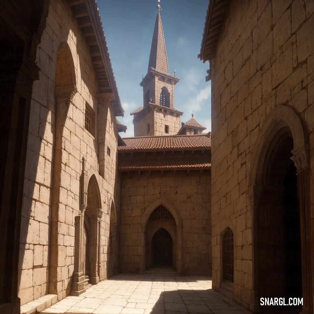
Painting of a castle with a giant tower in the middle of it and a sky background with clouds. Example of CMYK 0,30,49,76 color.
Woman in a costume standing in front of a river at sunset with a sun setting behind her and a bridge in the background
Painting of a room with a desk and a chair and a bookcase with books on it and a painting of a vase. Example of #3D2B1F color.
Man in a suit of armor standing in a room with windows and a light shining through the window. Example of Bistre color.
Sphere in the desert with a mountain in the background and a desert landscape in the foreground with a few people on a bike
Futuristic looking creature with glowing eyes and a glowing head in a futuristic city with glowing lights
Bistre is a color name that can refer to different shades of brown.

The word bistre comes from the French word for a pigment made from soot, which was used as an ink for drawings by many Old Masters.

Bistre has also been used to name other colors resembling the pigment, such as bistre brown, French bistre, and Spanish bistre.

Bistre belongs to the brown color family, and has a hue angle of 24 degrees, a saturation of 32.6%, and a lightness of 18% in the HSL color space.

In the hexadecimal color code, bistre is represented by #3D2B1F, which has RGB values of R:61, G:43, B:31 and CMYK values of C:0, M:30, Y:49, K:76.

Bistre can also evoke a sense of antiquity, warmth, earthiness, and naturalness.

Example of the palette with the Bistre color

Picture with primary colors of Banana Mania, Ruddy pink, Bistre, Boysenberry and Slate gray
Top 5 color shades of the illustration. Arranged in descending order of frequency of occurrence (first - more often, last - more rare).
See these colors in NCS, PANTONE, RAL palettes...

Example of the palette with the Bistre color

Picture with primary colors of Bistre, Umber, Gray, Pastel gray and Khaki
Top 5 color shades of the illustration. Arranged in descending order of frequency of occurrence (first - more often, last - more rare).
See these colors in NCS, PANTONE, RAL palettes...
RAL Classic
RAL 3007
RAL 7013
RAL 9023
RAL 9018
RAL 1000
RAL Design
RAL 080 20 10
RAL 020 30 10
RAL 000 55 00
RAL 080 80 05
RAL 060 70 20
Author:

What are the examples of Bistre color in life?

Man with glasses and a beard with a beard ring and a leather jacket and tie
Girl with a ponytail and a blue shirt is standing in front of a clock and a pink ribbon
Woman with a choker and a necklace on her neck is posing for a picture in a street
Painting of a castle in the middle of a forest with a lot of trees and bushes on the side
Futuristic city with a giant clock tower in the middle of a desert landscape with mountains and clouds in the background
Beautiful sunset over a mountain valley with trees in the foreground and a few hills in the background
Bistre is a very dark shade of grayish brown that is made from soot.
It was used as an ink for drawings by many Old Masters.

Some examples of bistre color in life are:
  • The bark of beechwood trees

  • The fur of some animals, such as bears or wolves

  • The soil of some regions, such as peat bogs or volcanic areas

  • The coffee beans before roasting

As for a joke: What do you call a bistre-colored bear that likes to drink coffee? A mocha-latte bear! 🐻☕

Example of the palette with the Bistre color

Picture with primary colors of Bistre, Black, Ecru, Deep carmine and Light carmine pink
Top 5 color shades of the illustration. Arranged in descending order of frequency of occurrence (first - more often, last - more rare).
See these colors in NCS, PANTONE, RAL palettes...
Author:

What looks best in Bistre?

Futuristic city with a giant crystal ball in the middle of it's forest area
Man in a hoodie is standing in front of a full moon and a sky with stars and clouds
Woman with red hair wearing a black choker and a black choker necklace with gold studs
Painting of a house with a sky background and a stone walkway leading to it and a door and window
Close up of a red fox with black and white markings on its face and ears and eyes
Futuristic city with a giant clock tower in the middle of it's center surrounded by smaller buildings
Woman in a yellow shirt and blue and yellow outfit with a red and yellow light behind her and a moon in the background
Woman with blonde hair and blue eyes is looking at the camera with a serious look on her face
Bistre is a brown pigment made from boiling the soot of wood.

It has a dark grayish brown hue with a yellowish cast.

Bistre is often used as a wash in pen and ink drawings to create shadows and depth.

Bistre can look best when paired with colors that contrast or complement its warm and earthy tone.

Some possible color combinations are:
  • Bistre and cream: This combination creates a classic and elegant look that is reminiscent of old master drawings.
    Cream can lighten up the mood of bistre and add some freshness to the palette.

  • Bistre and turquoise: This combination creates a vibrant and dynamic look that is inspired by nature.
    Turquoise can brighten up the dullness of bistre and add some energy to the palette.

  • Bistre and gold: This combination creates a luxurious and sophisticated look that is fit for royalty.
    Gold can enhance the richness of bistre and add some glamour to the palette.

Bistre is the color of history
Of ancient art and mystery
Of shadows cast by candlelight
Of secrets hidden in the night

Bistre is the color of nature
Of wood and soil and creature
Of autumn leaves and forest floor
Of warmth and comfort and more

Bistre is the color of elegance
Of style and grace and elegance
Of leather books and wooden desks
Of fine attire and accessories

```

Example of the palette with the Bistre color

Picture with primary colors of Bistre, Terra cotta, Bole, Dark slate blue and Pale mauve
Top 5 color shades of the illustration. Arranged in descending order of frequency of occurrence (first - more often, last - more rare).
See these colors in NCS, PANTONE, RAL palettes...
Author:
Funny stories about the 'Bistre'

The Bistre Mystery: Anna Nova and Professor Vivienne Goowanni's Colorful Adventure

Once upon a time, in the quaint village of Colorville, lived a cheerful farmer named Anna Nova. Anna was known for her vibrant vegetable garden, which was a riot of colors. Her tomatoes were the reddest, her carrots the orangest, and her cabbages the greenest. But there was one color that puzzled her: bistre. She had heard of it but couldn't quite grasp its essence.

One sunny morning, Anna decided to seek help from the wisest person she knew, Professor Vivienne Goowanni. Vivienne was a renowned color theorist who lived in a quirky house at the edge of the village, filled with books, paints, and curious contraptions.
Church with a steeple and a clock tower in the background

Anna knocked on Vivienne's door, and the professor greeted her with a warm smile. "Anna, my dear! What brings you here today?"

"Professor Goowanni, I need your help. I've heard about the color bistre, but I can't seem to understand it. Can you explain it to me?"

Vivienne's eyes twinkled with excitement. "Ah, bistre! A fascinating color indeed. It's a dark brown pigment made from soot. But to truly understand it, we must embark on a little adventure."

Anna's curiosity was piqued. "An adventure? Count me in!"

Vivienne grabbed her trusty color wheel and a magnifying glass, and the two set off on their journey. Their first stop was the village library, where Vivienne pulled out an ancient book titled "The Chronicles of Colors."

"Here we are," Vivienne said, flipping through the pages. "Bistre is often associated with the earthy tones of nature. It's the color of rich soil, aged wood, and even the fur of some animals."

Anna nodded, trying to visualize the color. "But how does it fit into design?"

Vivienne chuckled. "Patience, my dear. Let's visit the forest next."
Man with a sword and a demon on his head

In the heart of the forest, they found a majestic oak tree with a trunk that seemed to embody the essence of bistre. Vivienne pointed to the bark. "See how the deep brown hues blend seamlessly with the surroundings? Bistre is all about harmony and grounding. It's a color that brings warmth and stability to any design."

Anna touched the bark, feeling a connection to the color. "I think I'm starting to get it."

Their next stop was the village market, where they met a potter named Leo. His pottery was famous for its unique bistre glaze. Leo welcomed them with a grin. "Ah, Professor Goowanni and Anna! What a pleasant surprise!"

Vivienne explained their quest, and Leo showed them his latest creation, a beautiful vase with a bistre finish. "Bistre adds a touch of elegance and timelessness to my pottery. It's subtle yet profound."

Anna admired the vase, realizing how versatile the color was. "It's amazing how bistre can transform something simple into something extraordinary."

As the sun began to set, Vivienne and Anna returned to the professor's house. Vivienne brewed a pot of tea, and they sat down to reflect on their adventure.

"Anna, bistre is more than just a color. It's a feeling, a connection to the earth and its timeless beauty. In design, it can evoke a sense of comfort and sophistication."

Anna smiled, feeling enlightened. "Thank you, Professor Goowanni. I think I finally understand the essence of bistre."
Couch in front of a wall with a pattern on it's back wall and a rug on the floor

Vivienne patted her hand. "I'm glad I could help. Remember, colors are like friends. Each one has its own personality and story. Embrace them, and they'll bring your designs to life."

And so, Anna returned to her farm, inspired by the wisdom of Professor Vivienne Goowanni. She began incorporating bistre into her garden, painting her fences and pots with the rich, earthy hue. Her garden became even more beautiful, a testament to the power of understanding and embracing the essence of colors.

From that day on, Anna and Vivienne remained the best of friends, always ready for another colorful adventure. And Colorville thrived, a village where every hue had a story to tell.
Author:

# General # Fashion # Imagination # Design
Continue browsing posts in category "Colors"
More palettes with the color Bistre:
You may find these posts interesting:
American Rose Color
40
18
12
86
3
American Rose Color
Light Khaki Color
68
0
2
27
0
Light Khaki Color
Beaver Color
10
0
3
23
0
Beaver Color
Wild Blue Yonder Color
1
0
2
27
0
Wild Blue Yonder Color
Raspberry Pink Color
3
1
4
61
0
Raspberry Pink Color
Medium Champagne Color
5
0
2
25
0
Medium Champagne Color
Bright Green Color
2
0
4
23
0
Bright Green Color
Gray Color
2
0
4
67
0
Gray Color
Home
Terms of Service
Contact Us

© 2023 Snargl.com