Battleship Grey
What color is Battleship Grey? What are the examples of Battleship Grey color in life? What looks best in Battleship Grey? What strange or uncommon things can be of the Battleship Grey color? What color is battleship gray? The Grey Revolution: A Tale of Motion Design The Color of Motion
What color is Battleship Grey?



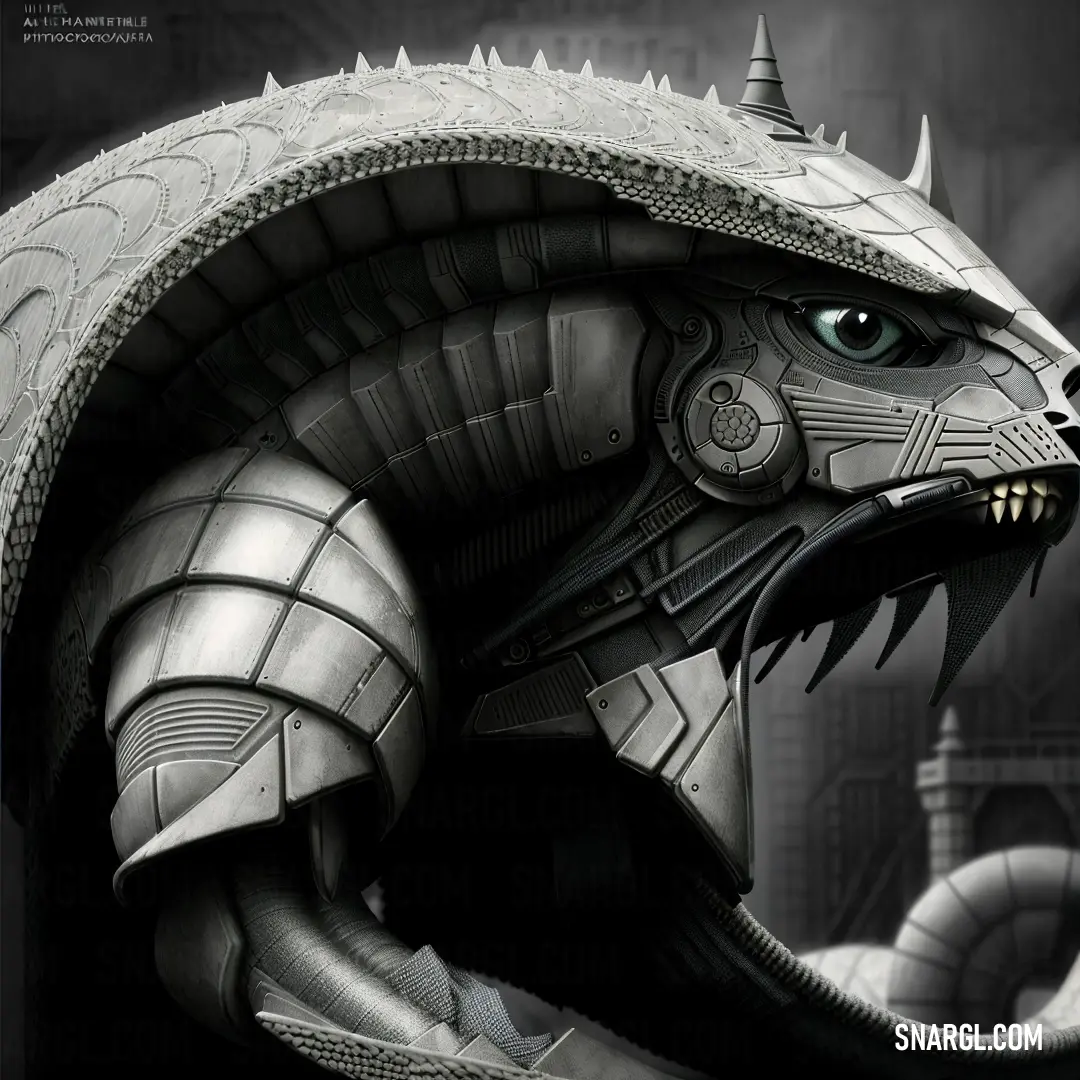
The hexadecimal color code for Battleship Grey is #848482, which means it has 51.76% red, 51.76% green, and 50.98% blue in the RGB color model.
In the HSL color space, this color has a hue of 60 degrees, a saturation of 0.8%, and a lightness of 51.4%.
In the CMYK color model, it has 0% cyan, 0% magenta, 2% yellow, and 48% black.
Battleship Grey is a neutral color that can be used for various purposes, such as interior design, web design, graphic design, and art.
This color can create a calm and elegant atmosphere, and it can also evoke the spirit of the high seas.
It is a versatile color that can be used for different styles and moods.
Battleship Grey can be a sophisticated and modern color, or a nostalgic and vintage color.
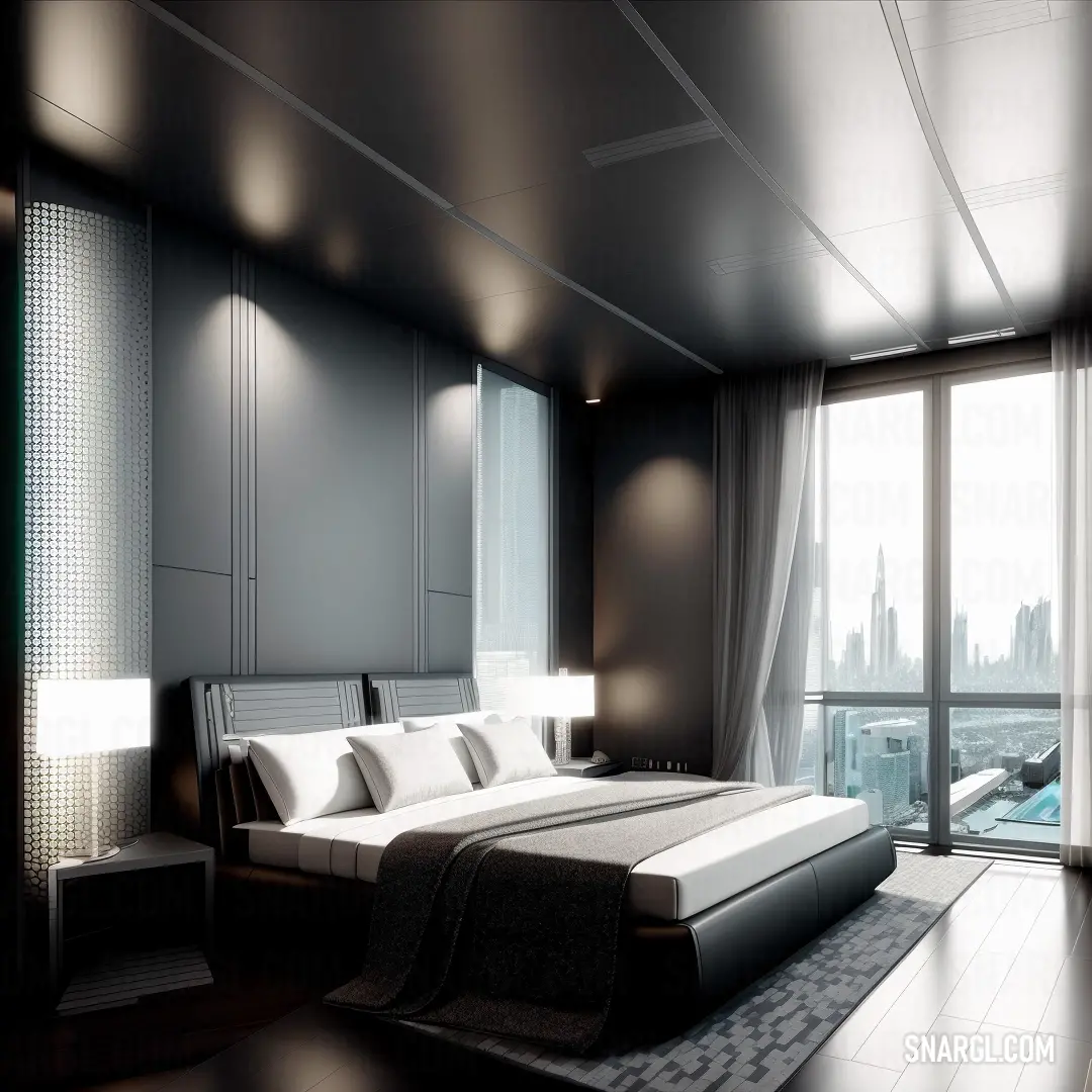
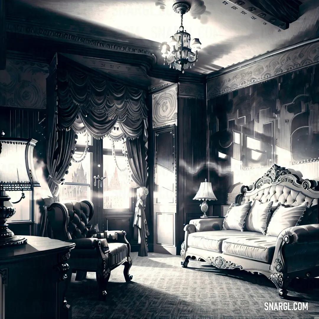
Example of the palette with the Battleship Grey color

See these colors in NCS, PANTONE, RAL palettes...
Example of the palette with the Battleship Grey color

See these colors in NCS, PANTONE, RAL palettes...
What are the examples of Battleship Grey color in life?




Example of the palette with the Battleship Grey color
See these colors in NCS, PANTONE, RAL palettes...
Example of the palette with the Battleship Grey color
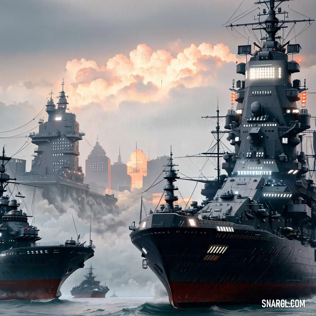
See these colors in NCS, PANTONE, RAL palettes...
Example of the palette with the Battleship Grey color

See these colors in NCS, PANTONE, RAL palettes...
What looks best in Battleship Grey?

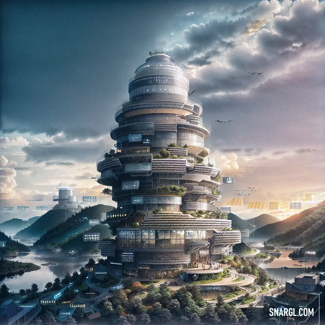


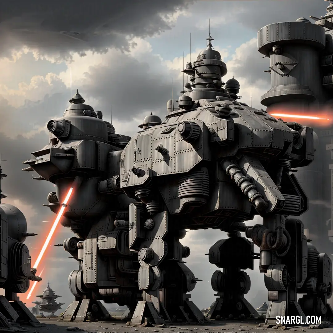

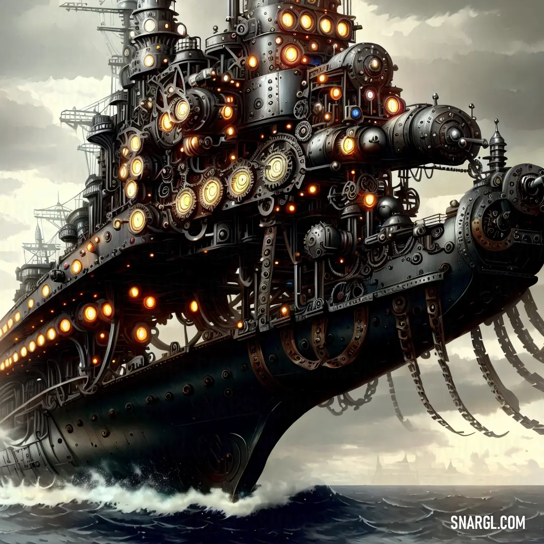

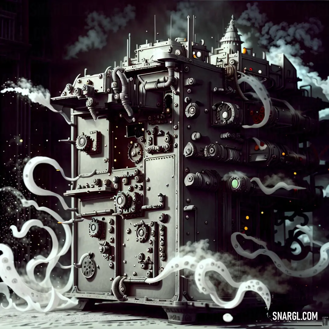
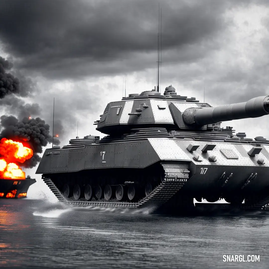

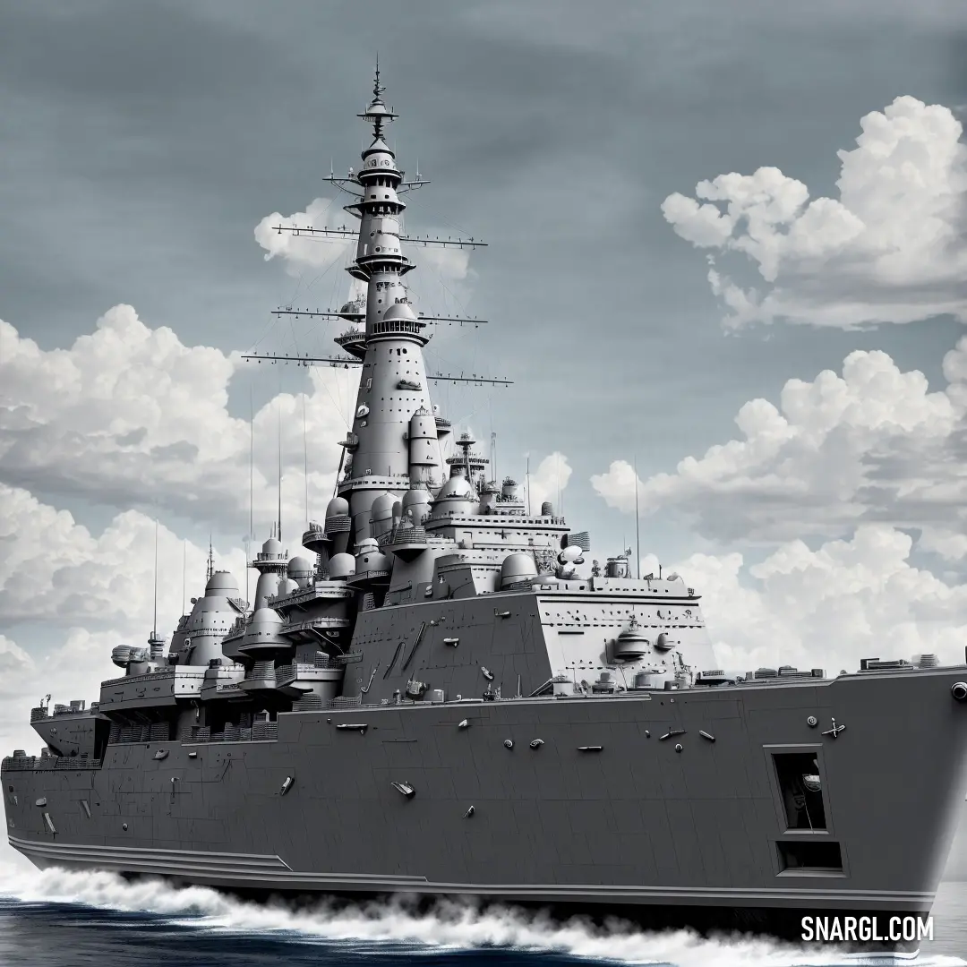
It is a color that evokes strength, durability, and reliability, as well as a sense of maritime adventure.
Battleship Grey can look best when paired with colors that contrast or complement its neutral tone, such as bright red, navy blue, white, or black.
Battleship Grey can also create a sophisticated and elegant look when used with other shades of gray, silver, or metallic accents.
Here are some examples of how Battleship Grey can look best in different contexts:
In fashion, Battleship Grey can be a versatile and stylish choice for clothing, accessories, or shoes.
It can create a sleek and modern look when worn with black or white, or a more casual and cozy look when worn with denim or knitwear.
Battleship Grey can also add some edge and personality to an outfit when paired with a pop of color, such as a red scarf, a blue hat, or a yellow belt.In interior design, Battleship Grey can be a great choice for walls, furniture, or accents.
It can create a calm and soothing atmosphere when used with light and soft colors, such as beige, cream, or pastel hues.
It can also create a dramatic and bold atmosphere when used with dark and rich colors, such as burgundy, purple, or emerald green.
Battleship Grey can also add some texture and interest to a room when used with patterns, prints, or metallic finishes.In art, Battleship Grey can be a useful and expressive color for painting, drawing, or photography.
It can create a realistic and detailed effect when used to depict metal, stone, or water.
It can also create a abstract and minimalist effect when used to create shapes, lines, or shadows.
Battleship Grey can also add some mood and emotion to a piece of art when used with contrasting or complementary colors, such as orange, pink, or turquoise.
Example of the palette with the Battleship Grey color
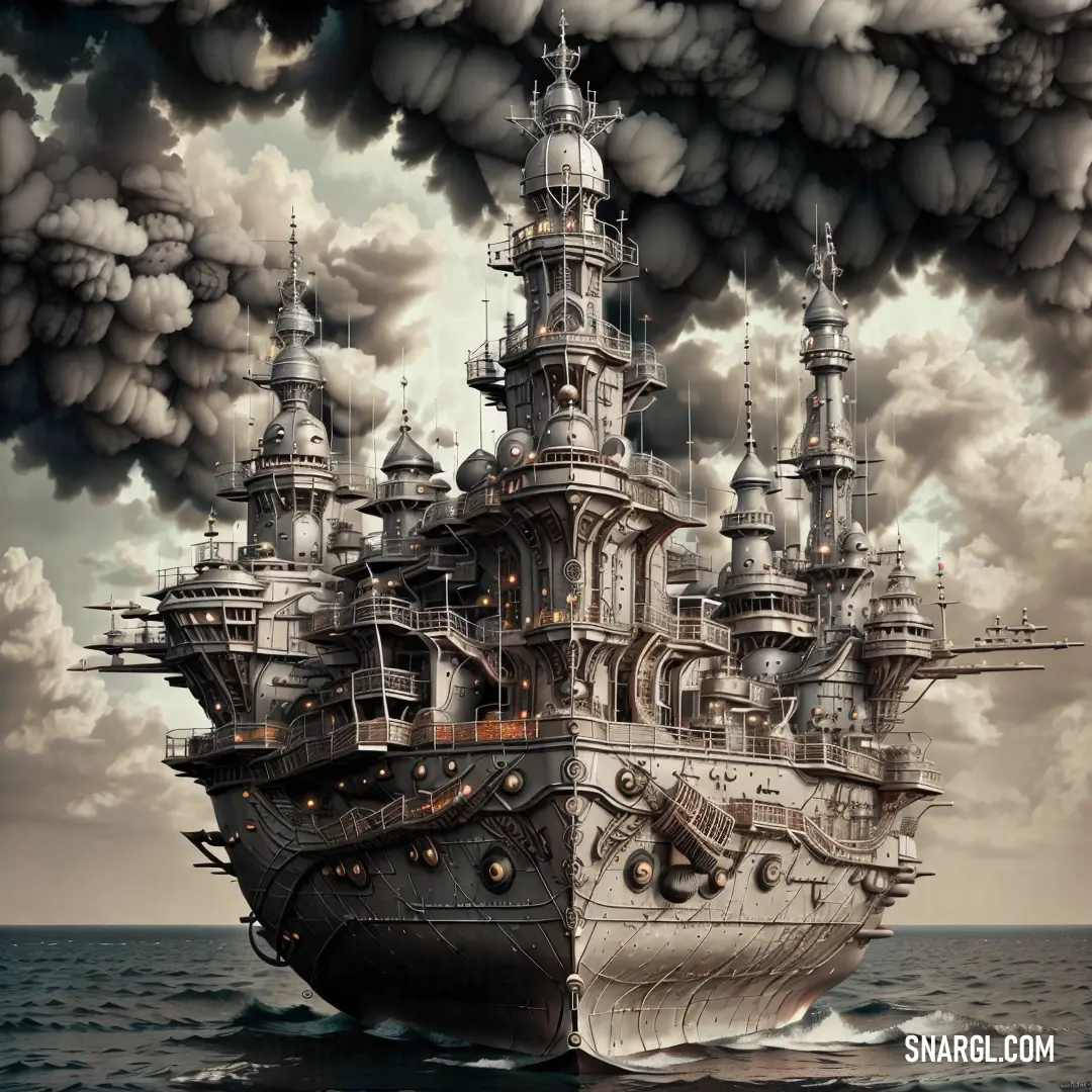
See these colors in NCS, PANTONE, RAL palettes...
Example of the palette with the Battleship Grey color
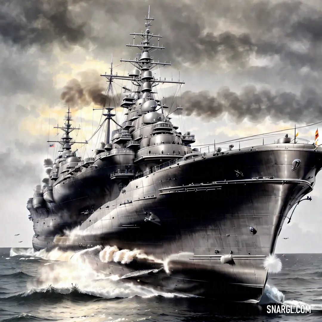
See these colors in NCS, PANTONE, RAL palettes...
What strange or uncommon things can be of the Battleship Grey color?
Example of the palette with the Battleship Grey color

See these colors in NCS, PANTONE, RAL palettes...
Example of the palette with the Battleship Grey color
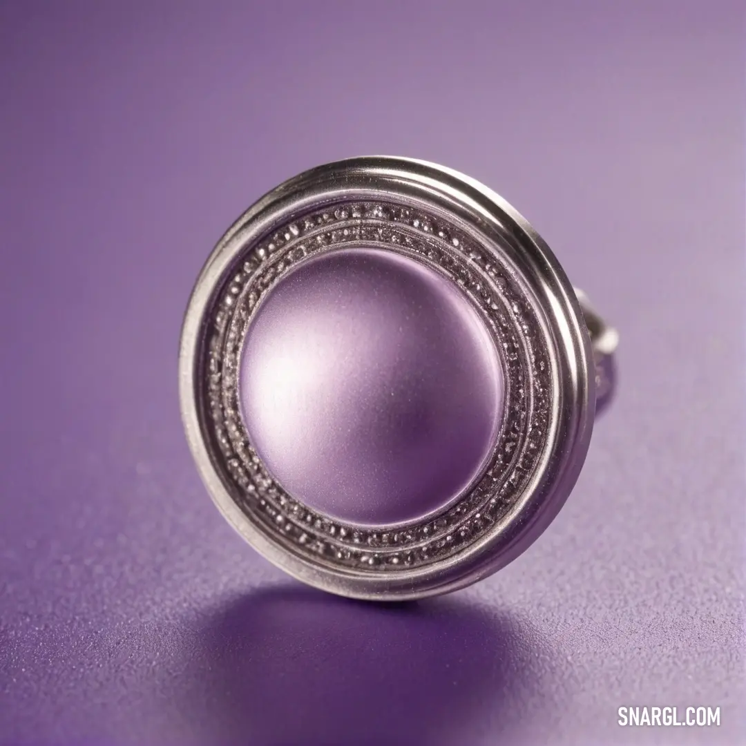
See these colors in NCS, PANTONE, RAL palettes...
What color is battleship gray?
Example of the palette with the Battleship Grey color

See these colors in NCS, PANTONE, RAL palettes...
Example of the palette with the Battleship Grey color
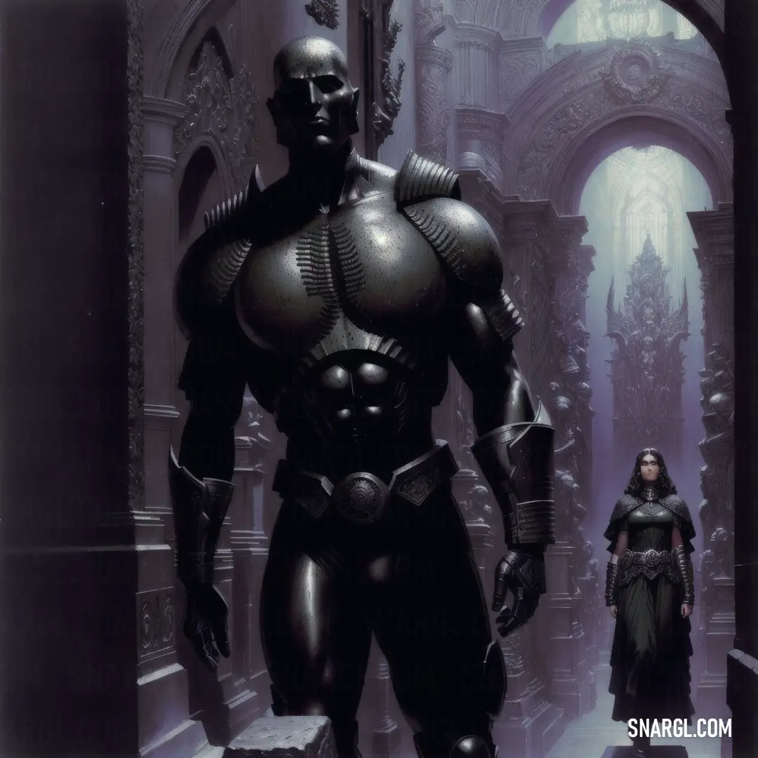
See these colors in NCS, PANTONE, RAL palettes...
The Grey Revolution: A Tale of Motion Design
Alexander had always been fascinated by the subtleties of color. His latest obsession was "Battleship Grey," a hue often overlooked in the vibrant world of design. He believed that this muted color held untapped potential in motion design, capable of evoking emotions and creating depth in ways no one had imagined.

One rainy afternoon, Alexander invited Eva to his cluttered workshop. The room was filled with prototypes, sketches, and a peculiar array of grey objects. "Eva, I need your expertise," he said, his eyes gleaming with excitement. "I believe Battleship Grey can revolutionize motion design, but I need your help to prove it."
Eva, intrigued by Alexander's passion, agreed to collaborate. They began their journey by studying the psychological impact of grey. While many considered it dull and lifeless, Alexander and Eva saw it as a canvas of infinite possibilities. They discovered that Battleship Grey could evoke a sense of calm, sophistication, and even mystery when used correctly.
Their first experiment involved a short animation. Alexander meticulously crafted a scene of a bustling cityscape at dawn, using various shades of grey. Eva added her touch by incorporating subtle movements and transitions. The result was mesmerizing. The animation conveyed a serene yet dynamic atmosphere, drawing viewers into its monochromatic world.

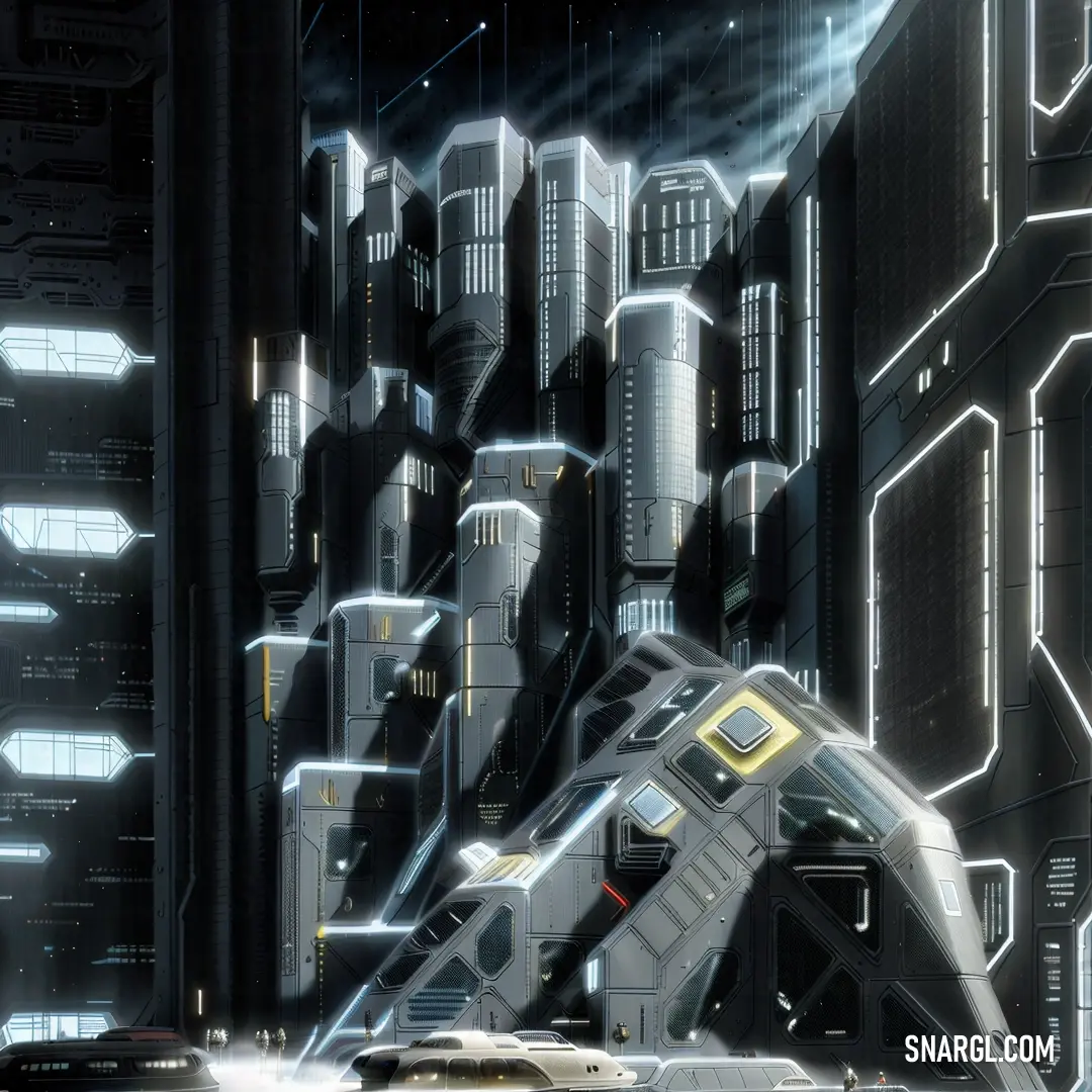
Encouraged by their success, they decided to push the boundaries further. They created a series of motion graphics, each exploring different themes and emotions. One depicted a stormy sea, where the waves, rendered in Battleship Grey, seemed to crash with a silent fury. Another showcased a futuristic city, where the grey tones highlighted the sleek, modern architecture.
As their work gained attention, the design community was abuzz with curiosity. Critics and enthusiasts alike were captivated by the unexpected beauty of Battleship Grey. Alexander and Eva were invited to present their findings at an international design conference.
On the day of the presentation, the auditorium was packed. Alexander and Eva took the stage, their excitement palpable. They shared their journey, from the initial skepticism to the awe-inspiring results. The audience watched in rapt attention as the animations played on the screen, each one a testament to the power of grey.
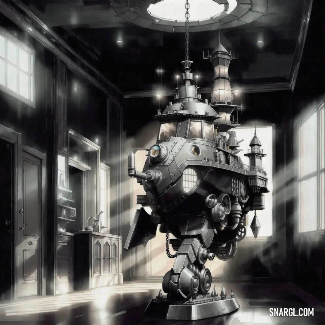
By the end of the presentation, the room erupted in applause. Designers from around the world were inspired to experiment with Battleship Grey in their own work. Alexander and Eva had not only proven their theory but had also sparked a new trend in motion design.
Their collaboration continued, leading to more innovations and discoveries. They published a book on their findings, which became a staple in design schools. The Grey Revolution, as it came to be known, transformed the way people perceived and used color in motion design.
Alexander and Eva's story became a legend, a testament to the power of curiosity, collaboration, and the belief that even the most overlooked elements can hold the key to groundbreaking innovation. And so, in the heart of Amsterdam, where the canals whispered secrets of the past, two brilliant minds had indeed changed the future of motion design.
The Color of Motion
Eva Stewart, a seasoned professor of visual aesthetics, had painstakingly studied the psychological implications of color in design. Her classroom pulsated with energy as students debated the nuances of hues and shades. But Campbell's Grey captivated her attention more than any other color. She believed it housed untapped potential for storytelling through motion.
One fateful evening, their paths crossed at a gallery opening, where a projected motion design display flickered upon the brick wall of an old warehouse. Grey waves undulated rhythmically, forming waves that symbolized chaos and order, and there stood Alexander, mesmerized. Eva spotted him, his eyes dancing across the canvas of light and shadow. She approached him, intrigued by the profound look of inspiration on his face.
"Isn't it fascinating?" she asked, gesturing to the display. "Battleship Grey - what a simple color, yet it conveys so much."
He turned, a spark igniting between them. "It's more than a color; it's a feeling," he replied. "What if we could transform the way it's perceived in motion design? Could we harness its essence to evoke emotions?"
The spark turned into a wildfire of ideas that evening, and so began an unconventional partnership between an inventor and a professor. They spent countless hours collaborating in a cluttered workshop, pouring over prototypes and sketches. Alexander, with his innovative tools, pushed the boundaries of technology, while Eva provided insight into the emotional psychology behind every movement of the grey hues.
Their biggest challenge presented itself when they sought to create an animated short film that would transport its audience through a world where Battleship Grey interacted with vibrant colors, manipulating the interplay of light and shadow. They envisioned a narrative that oscillated between serenity and chaos. Their characters - a lone wanderer and a storm - navigated through landscapes shifting from harmonious flats of grey to explosive bursts of color, forming a dialogue of emotions.

As weeks turned into months, doubt began to creep in. The weight of their ambition loomed over them like a storm cloud. One evening, as rain tapped gently on the window, Eva sighed, "What if we're unable to communicate our vision? What if the audience misses the depth of Battleship Grey?"
"Then we'll rethink our approach," Alexander replied, a determined glint in his eyes. "We'll let the color lead the motion, and motion will narrate the story."
Revitalized, they searched for inspiration in everyday life, spending time observing how Battleship Grey transformed in natural lighting, how people interacted with it, how it could be a backdrop to emotions. They captured video snippets of shadows dancing under grey skies and vibrant life thriving amidst gritty urban landscapes.
Finally, the day of the premiere arrived. As they sat in the dimly lit theater, their hearts raced. The screen flickered to life, revealing a breathtaking journey through the shades of Battleship Grey. The audience was drawn in; the subtle movements evoked emotions of nostalgia, calmness, and a deep connection to the chaos of life.
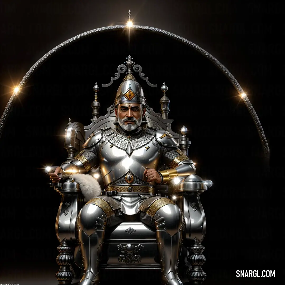
At the climax of the film, the grey hues exploded into a rainbow of color, representing hope and resilience. As the lights came back on, thunderous applause erupted. Alexander and Eva exchanged glances, their laughter mingling with cheers. They had unlocked a new paradigm, showing the world that a simple color could embody complex emotions when brought to life through motion.
Their collaboration didn't just redefine Battleship Grey; it blended art with emotion, color with story. As they exited the theater, Alexander turned to Eva, "This is just the beginning."
With a knowing smile, Eva nodded, already envisioning the next exploration waiting for them in the spectrum of design.









 Onyx
Onyx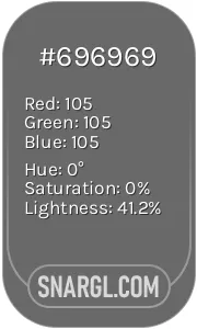 Dim gray
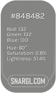 Battleship Grey
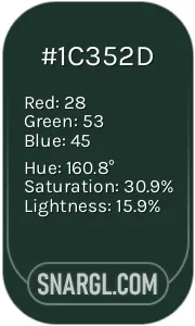 Medium jungle green
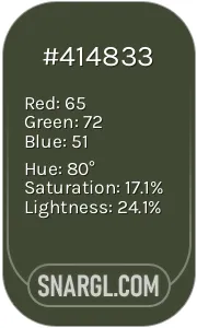 Rifle green
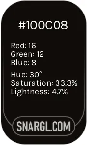 Smoky black
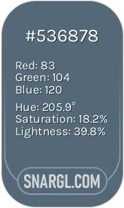 Dark electric blue
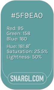 Cadet blue








 Liver
Liver Black
Black Pale mauve
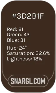 Bistre
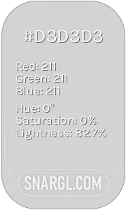 Light gray
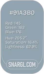 Cadet grey
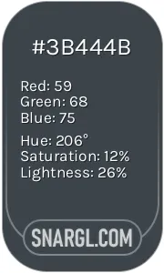 Arsenic
 Dark lava
 Snow
Snow Beau blue







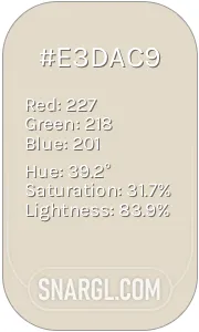 Bone
Bone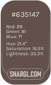 Umber
Umber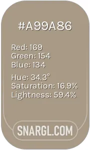 Grullo
 Platinum
 Rose ebony






 Dark jungle green
 Pastel purple
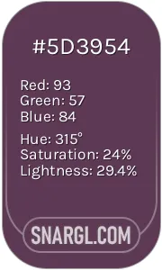 Dark byzantium
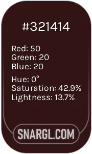 Seal brown
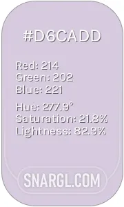 Languid lavender









 Isabelline